R’s standard correlation functionality (base::cor) seems very impractical to the new programmer: it returns a matrix and has some pretty shitty defaults it seems. Simon Jackson thought the same so he wrote a tidyverse-compatible new package: corrr!
Simon wrote some practical R code that has helped me out greatly before (e.g., color palette’s), but this new package is just great. He provides an elaborate walkthrough on his own blog, which I can highly recommend, but I copied some teasers below.

corrr works.Apart from corrr::correlate to retrieve a correlation data frame and corrr::stretch to turn that data frame into a long format, the new package includes corrr::focus, which can be used to simulteneously select the columns and filter the rows of the variables focused on. For example:
# install.packages("tidyverse")
library(tidyverse)

# install.packages("corrr")
library(corrr)

# install.packages("here")
library(here)

dir.create(here::here("images")) # create an images directory

mtcars %>%
  corrr::correlate() %>%
  # use mirror = TRUE to not only select columns but also filter rows
  corrr::focus(mpg:hp, mirror = TRUE) %>%
  corrr::network_plot(colors = c("red", "green")) %>%
  ggplot2::ggsave(
    filename = here::here("images", "mtcars_networkplot.png"),
    width = 5,
    height = 5
    )

Let’s try some different visualizations:
mtcars %>%
  corrr::correlate() %>%
  corrr::focus(mpg) %>%
  dplyr::mutate(rowname = reorder(rowname, mpg)) %>%
  ggplot2::ggplot(ggplot2::aes(rowname, mpg)) +
  # color each bar based on the direction of the correlation
  ggplot2::geom_col(ggplot2::aes(fill = mpg >= 0)) +
  ggplot2::coord_flip() +
  ggplot2::ggsave(
    filename = here::here("images", "mtcars_mpg-barplot.png"),
    width = 5,
    height = 5
  )

corrr also provides some very helpful functionality display correlations. Take, for instance, corrr::fashion and corrr::shave:
mtcars %>%
  corrr::correlate() %>%
  corrr::focus(mpg:hp, mirror = TRUE) %>%
  # converts the upper triangle (default) to missing values
  corrr::shave() %>%
  # converts a correlation df into clean matrix
  corrr::fashion() %>%
  readr::write_excel_csv(here::here("correlation-matrix.csv"))

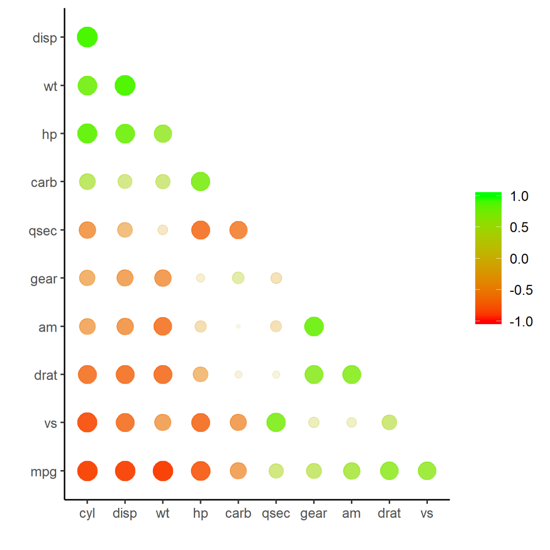
Finally, there is the great function of corrr::rplot to generate an amazing correlation overview visual in a wingle line. However, here it is combined with corr::rearrange to make sure that closely related variables are actually closely located on the axis, and again the upper half is shaved away:
mtcars %>%
  corrr::correlate() %>%
  # Re-arrange a correlation data frame
  # to group highly correlated variables closer together.
  corrr::rearrange(method = "MDS", absolute = FALSE) %>%
  corrr::shave() %>%
  corrr::rplot(shape = 19, colors = c("red", "green")) %>%
  ggplot2::ggsave(
    filename = here::here("images", "mtcars_correlationplot.png"),
    width = 5,
    height = 5
  )

For some more functionalities, please visit Simon’s blog and/or the associated GitHub page. If you copy the code above and play around with it, be sure to work in an Rproject else the here::here() functions might misbehave.

I’m trying to install corrr to use this tutorial, but it isn’t available for my version of R/has been removed from CRAN. Can you provide a brief description of how to install the package from source?
LikeLike
Have you tried searching the package on github and use the install from github function?
LikeLike
install.packages(“devtools”) # run this line if devtools is not installed
devtools::install_github(“drsimonj/corrr”)
LikeLike
Hi
I am trying to produce the first type of correlation (network). I got the variable without lines among them. I used command network_plot(correlate(mydata), min_cor=0.05).
LikeLike
Hi Ahmed, please try posting your question on a website like StackOverflow with an example of your code and output. I’m sure someone reaches out to help you soon. Unfortunately, I don’t have the time for troubleshooting at the moment : (
LikeLike