Maarten Lambrechts is a data journalist I closely follow online, with great delight. Recently, he shared on Twitter his slidedeck on the 18 most common data visualization pitfalls. You will probably already be familiar with most, but some (like #14) were new to me:
Save pies for dessert
Don’t cut bars
Don’t cut time axes
Label directly
Use colors deliberately
Avoid chart junk
Scale circles by area
Avoid double axes
Correlation is no causality
Don’t do 3D
Sort on the data
Tell the story
1 chart, 1 message
Common scales on small mult’s
#Endrainbow
Normalise data on maps
Sometimes best map is no map
All maps lie
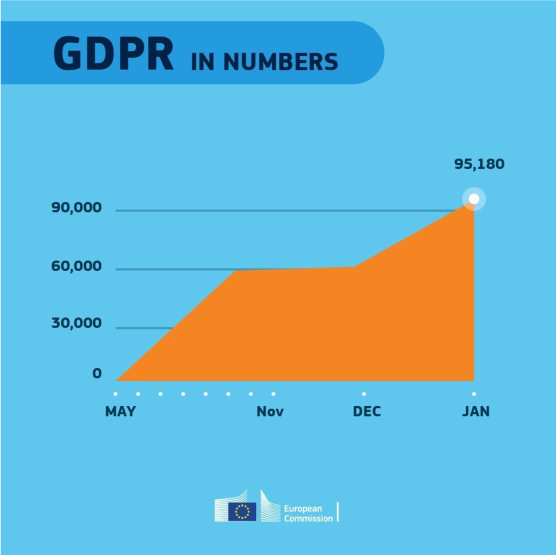
Even though most of these 18 rules below seem quite obvious, even the European Commissions seems to break them every now and then:
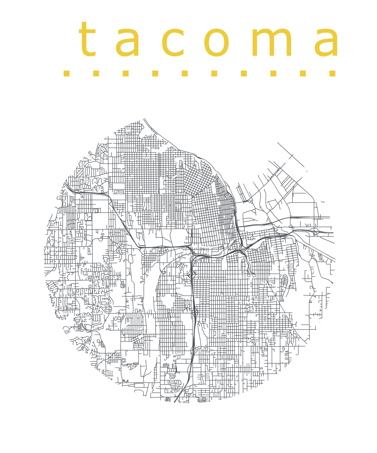
Katie Jolly wanted to surprise a friend with a nice geeky gift: a custom-made map cutout. Using R and some visual finetuning in Inkscape, she was able to made the below.
A detailed write-up of how Katie got to this product is posted here.
Basically, the R’s tigris package included all data on roads, and the ArcGIS Open Data Hub provided the neighborhood boundaries. Fortunately, the sf package is great for transforming and manipulating geospatial data, and includes some functions to retrieve a subset of roads based on their distance to a centroid. With this subset, Katie could then build these wonderful plots in no time with ggplot2.
Lisa Charlotte Rost of DataWrapper often writes about data visualization and lately she has focused on the (im)proper use of color in visualization. In this recent blog, she gives a bunch of great tips and best practices, some of which I copied below:
Xeno.graphics is the collection of unusual charts and maps Maarten Lambrechts maintains. It’s a repository of novel, innovative, and experimental visualizations to inspire you, to fight xenographphobia, and popularize new chart types.
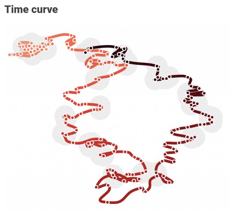
For instance, have you ever before heard of a time curve? These are very useful to visualize the development of a relationship over time.
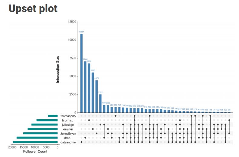
Time curves are based on the metaphor of folding a timeline visualization into itself so as to bring similar time points close to each other. This metaphor can be applied to any dataset where a similarity metric between temporal snapshots can be defined, thus it is largely datatype-agnostic. [https://xeno.graphics/time-curve]The upset plot is another example of an upcoming visualization. It can demonstrate the overlap or insection in a dataset. For instance, in the social network of #rstats twitter heroes, as the below example from the Xenographics website does.
Understanding relationships between sets is an important analysis task. The major challenge in this context is the combinatorial explosion of the number of set intersections if the number of sets exceeds a trivial threshold. To address this, we introduce UpSet, a novel visualization technique for the quantitative analysis of sets, their intersections, and aggregates of intersections. [https://xeno.graphics/upset-plot/]The below necklace map is new to me too. What it does precisely is unclear to me as well.
In a necklace map, the regions of the underlying two-dimensional map are projected onto intervals on a one-dimensional curve (the necklace) that surrounds the map regions. Symbols are scaled such that their area corresponds to the data of their region and placed without overlap inside the corresponding interval on the necklace. [https://xeno.graphics/necklace-map/]There are hundreds of other interestingcharts, maps, figures, and plots, so do have a look yourself. Moreover, the xenographics collection is still growing. If you know of one that isn’t here already, please submit it. You can also expect some posts about certain topics around xenographics.
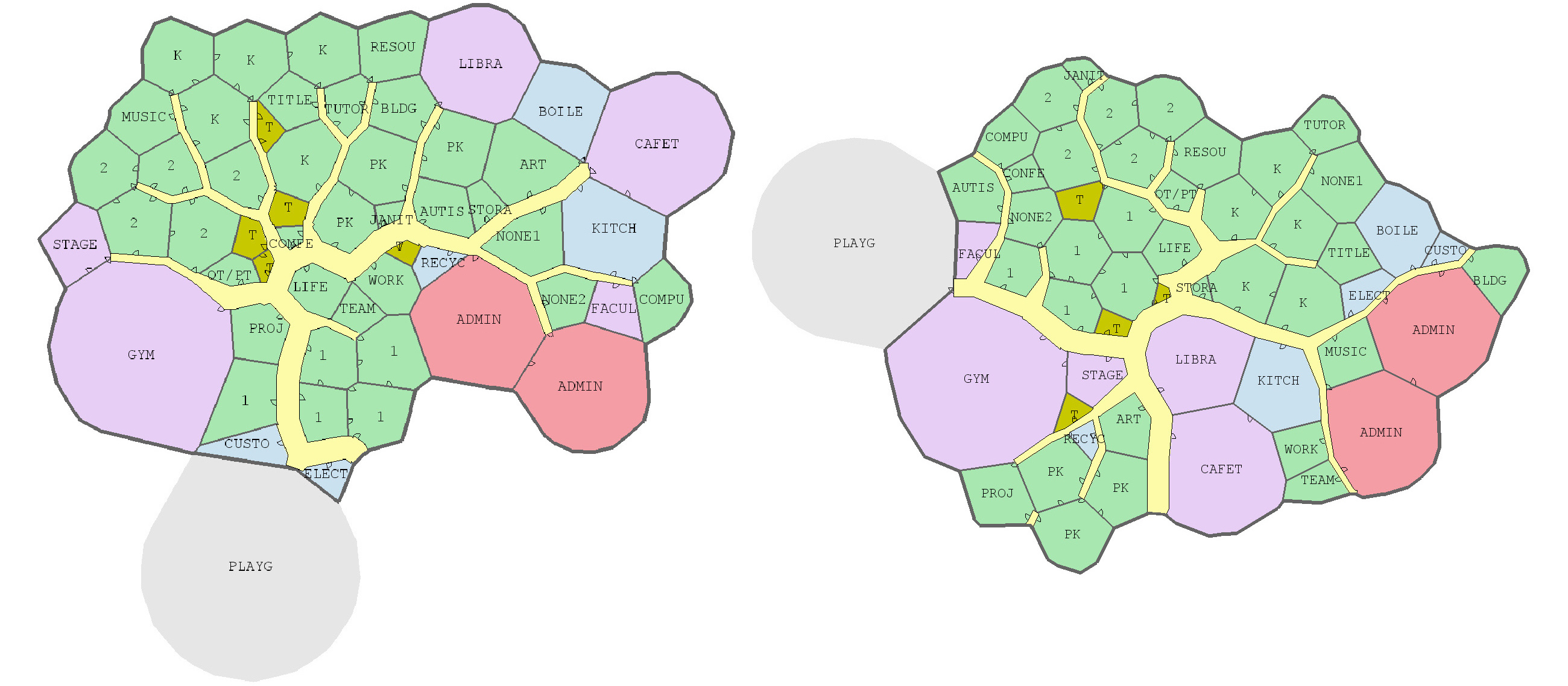
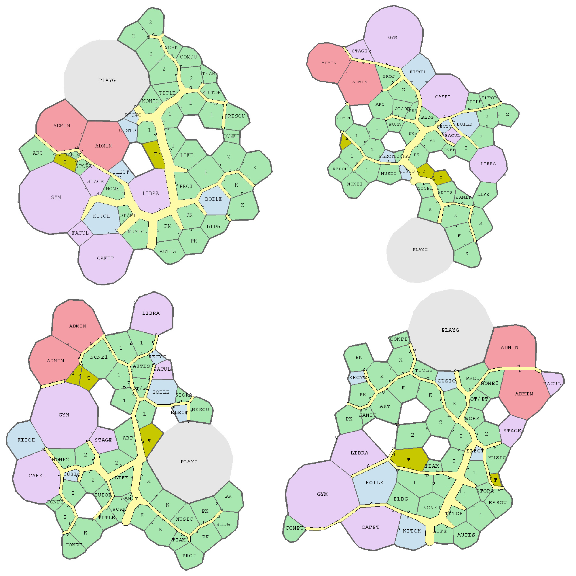
Joel Simon is the genius behind an experimental project exploring optimized school blueprints. Joel used graph-contraction and ant-colony pathing algorithms as growth processes, which could generate elementary school designs optimized for all kinds of characteristics: walking time, hallway usage, outdoor views, and escape routes just to name a few.
Two generated designs, minimizing the traffic flow (left) as well as escape routes (right) [original]Other designs tried to maximize the number of windows, resulting in seemingly random open courtyards [original]
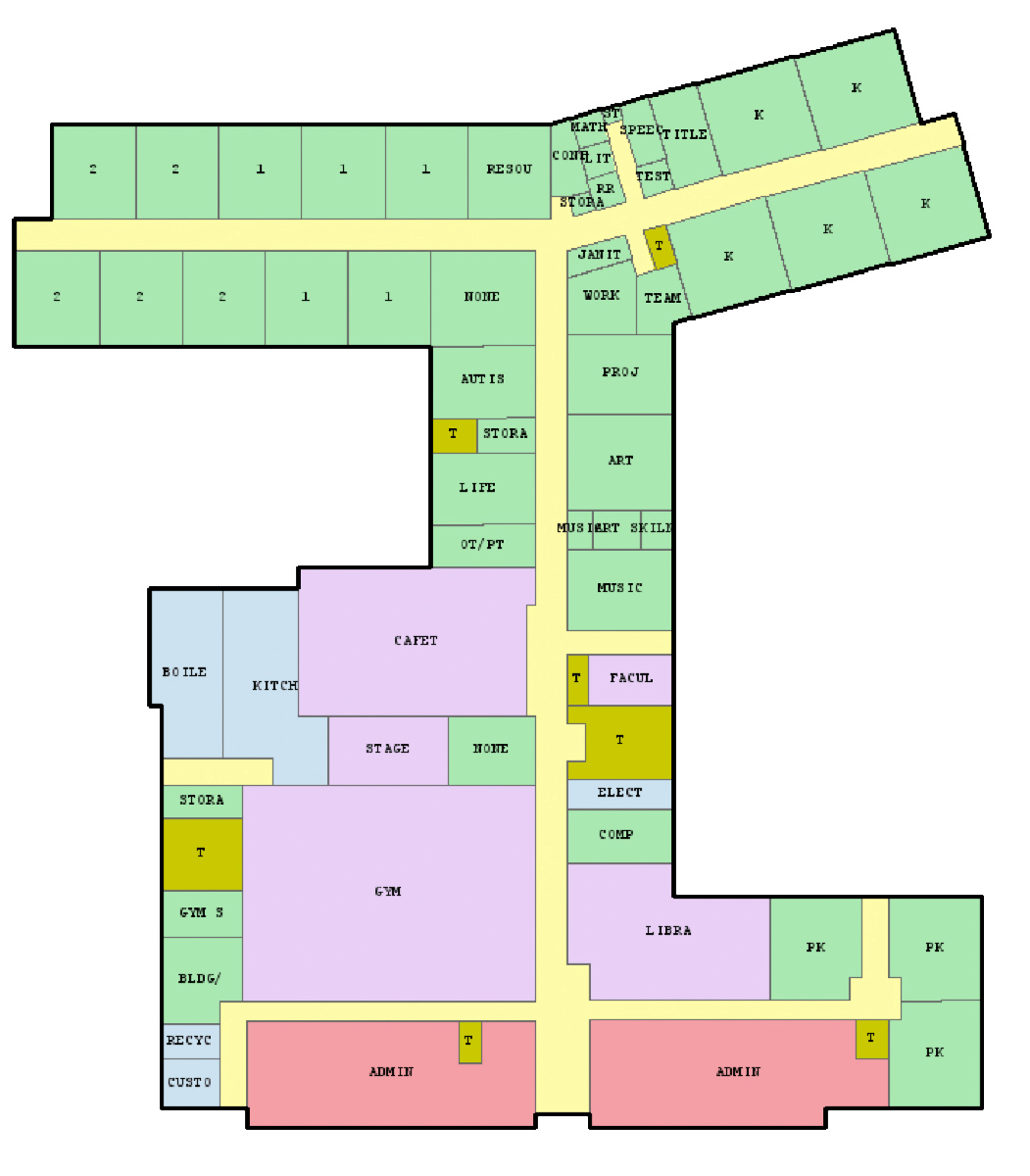
The original floor plan [original]Definitely check out the original write-up if you are interested in the details behind the generation process! Or have a look at some of Joel’s other projects.
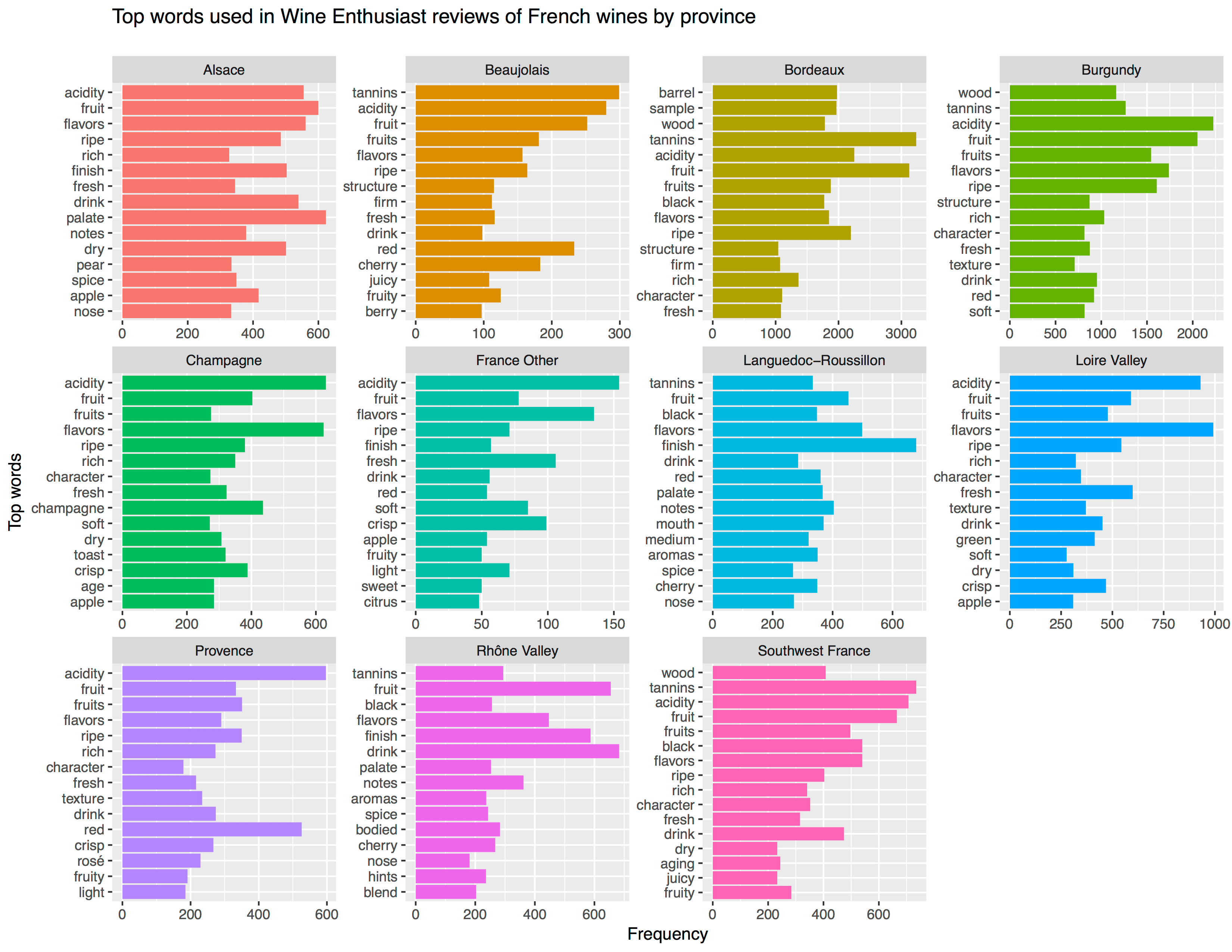
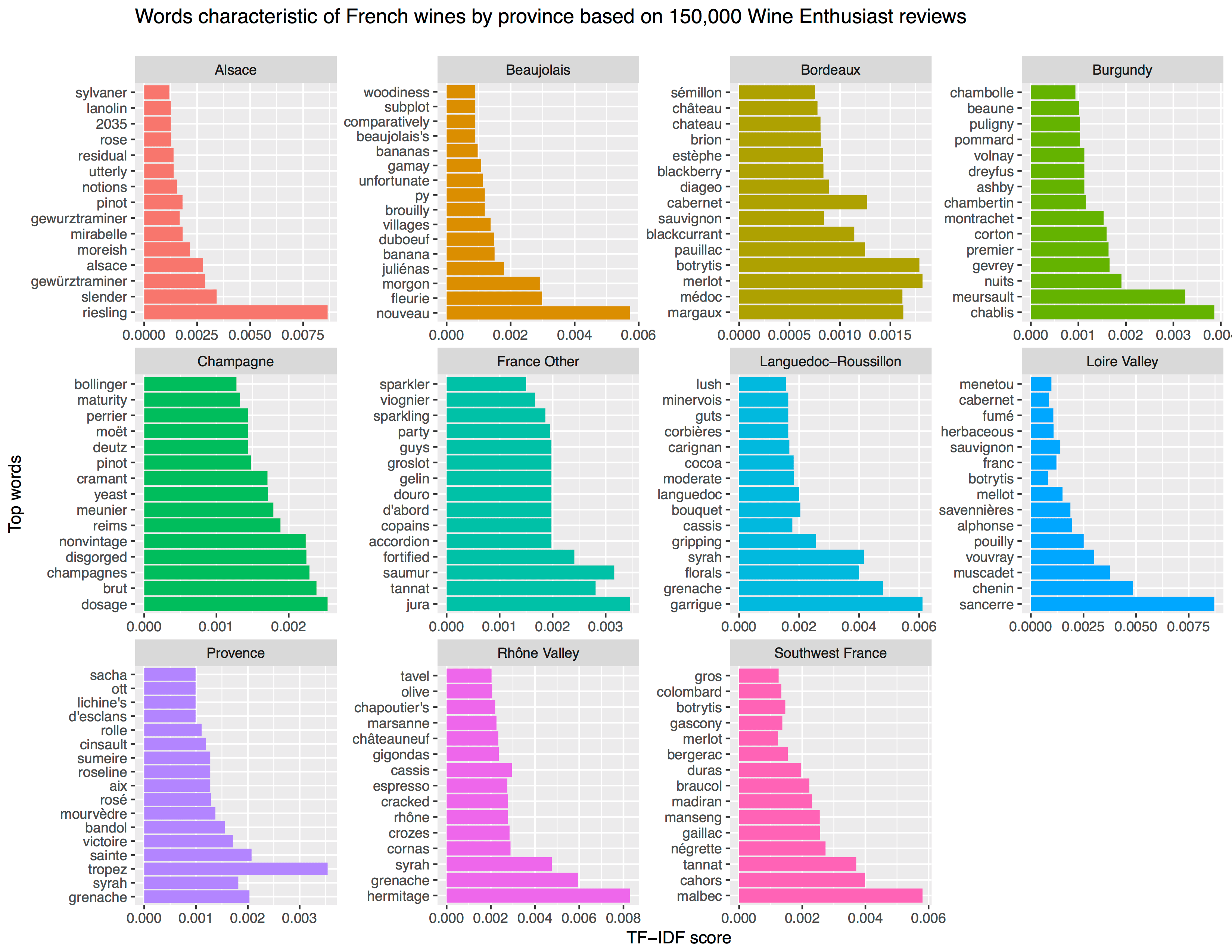
Aleszu Bajak at Storybench.org published a great demonstration of the power of text mining. He used the R tidytext package to analyse 150,000 wine reviews which Zach Thoutt had scraped from Wine Enthusiast in November of 2017.
Aleszu started his analysis on only the French wines, with a simple word count per region:
[orginal blog]Next, he applied TF-IDF to surface the words that are most characteristic for specific French wine regions — words used often in combination with that specific region, but not in relation to other regions.
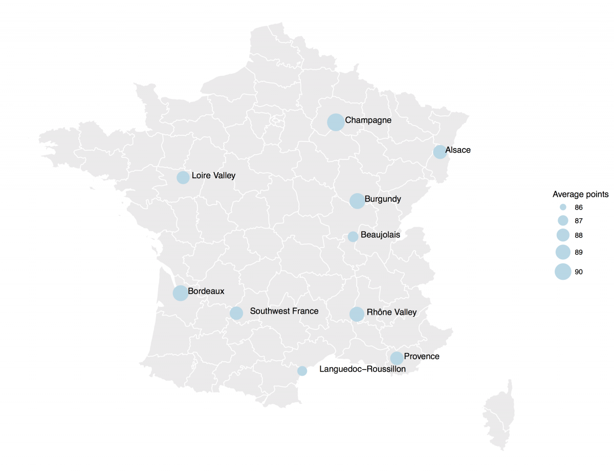
[orginal blog]The data also contained some price information, which Aleszu mapped France with ggplot2 and the maps package to demonstrate which French wine regions are generally more costly.
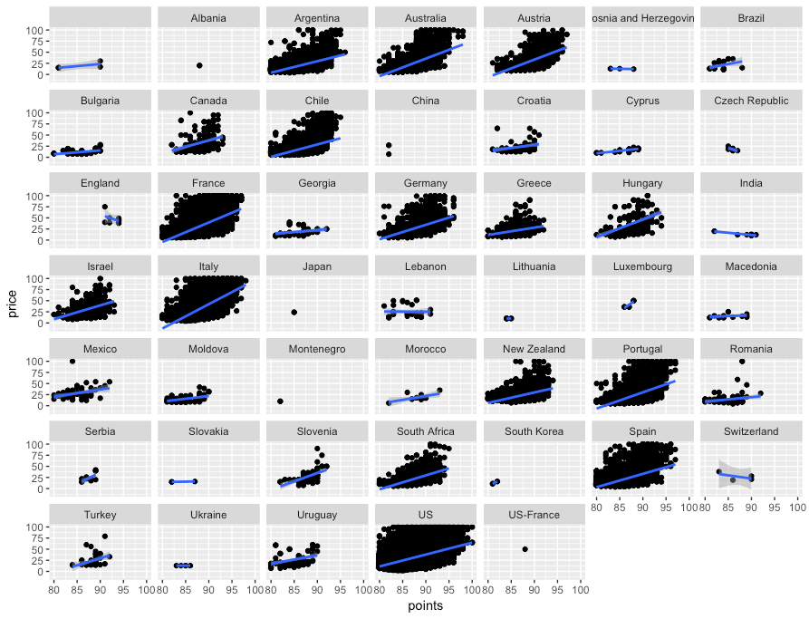
[orginal blog]On the full dataset, Alezsu also demonstrated that there is a strong relationship between price and points, meaning that, in general, more expensive wines seem to get better reviews: