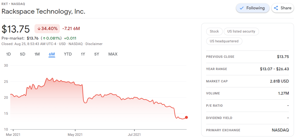
Obviously, this is less than ideal for me, but also, I should not be surprised.
Clearly, I knew nothing about the company I bought shares in. Apparently they are going through some big time reorganization, and this is not good price-wise.
According to Investopedia: A quarterly report is a summary or collection of unaudited financial statements, such as balance sheets, income statements, and cash flow statements, issued by companies every quarter (three months). In addition to reporting quarterly figures, these statements may also provide year-to-date and comparative (e.g., last year’s quarter to this year’s quarter) results. Publicly-traded companies must file their reports with the Securities Exchange Committee (SEC).
Fortunately these quarterly reports are readily available on the investors relation page, and they are not that hard to read once you have seen a few.
Visualizing financial data
I was excited to see that Rackspace offered their financial performance in bite-sized bits to me as a laymen, through their usage of nice visualizations of the financial data.
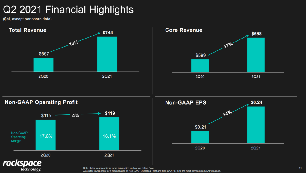
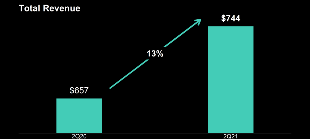
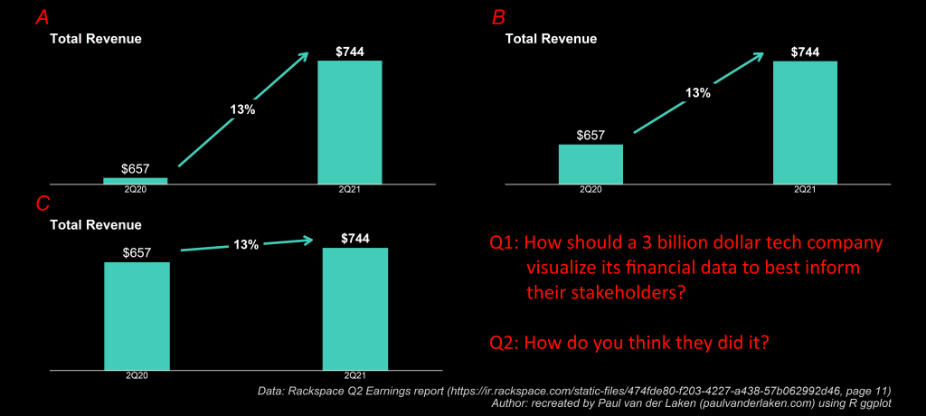
Please take a moment to process the below copy of page 11 of their 2021 Q2 report:
Though… the longer I looked at these charts… the more my head started to hurt…
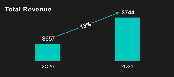
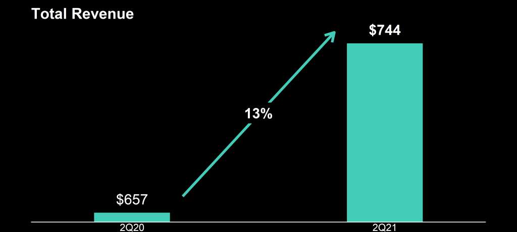
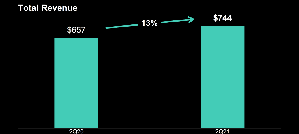
How can the growth line be about the same in the three charts Total Revenue (top-left), Core Revenue (top-right), and Non-GAAP EPS (bottom-right)? They represent different increments: 13%, 17%, and 14% respectively.
Zooming in on the top left: how does the $657 revenue of 2Q20 fit inside the $744 revenue of 2Q21 almost three times?!
For instance, if you’re making multiple plots of the dataset — say a group of 5 companies — you want to have each company have the same, consistent coloring across all these plots.
R has some great data visualization capabilities. Particularly the ggplot2 package makes it so easy to spin up a good-looking visualization quickly.
The default in R is to look at the number of groups in your data, and pick “evenly spaced” colors across a hue color wheel. This looks great straight out of the box:
# install.packages('ggplot2')
library(ggplot2)

theme_set(new = theme_minimal()) # sets a default theme

set.seed(1) # ensure reproducibility

# generate some data
n_companies = 5
df1 = data.frame(
  company = paste('Company', seq_len(n_companies), sep = '_'),
  employees = sample(50:500, n_companies),
  stringsAsFactors = FALSE
)

# make a simple column/bar plot
ggplot(data = df1) +
  geom_col(aes(x = company, y = employees, fill = company))
However, it can be challenging is to make coloring consistent across plots.
For instance, suppose we want to visualize a subset of these data points.
index_subset1 = c(1, 3, 4, 5) # specify a subset

# make a plot using the subsetted dataframe
ggplot(data = df1[index_subset1, ]) +
  geom_col(aes(x = company, y = employees, fill = company))
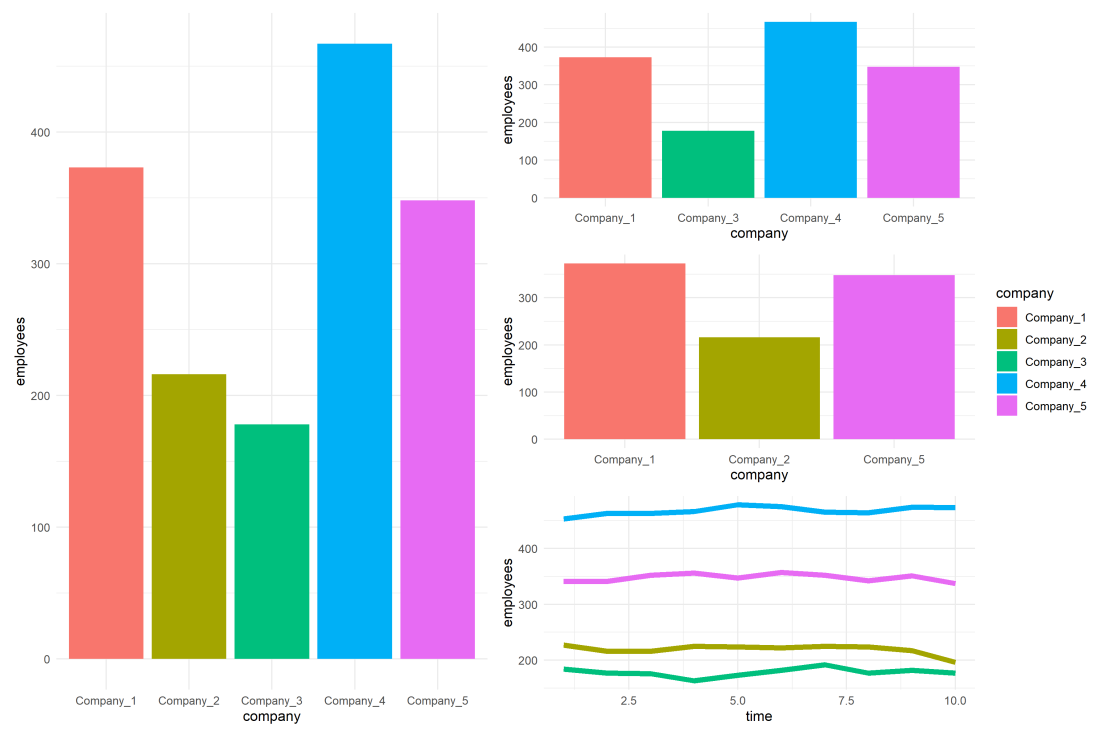
As you can see the color scheme has now changed. With one less group / company, R now picks 4 new colors evenly spaced around the color wheel. All but the first are different to the original colors we had for the companies.
One way to deal with this in R and ggplot2, is to add a scale_* layer to the plot.
Here we manually set Hex color values in the scale_fill_manual function. These hex values I provided I know to be the default R values for four groups.
# install.packages('scales')

# the hue_pal function from the scales package looks up a number of evenly spaced colors
# which we can save as a vector of character hex values
default_palette = scales::hue_pal()(5)

# these colors we can then use in a scale_* function to manually override the color schema
ggplot(data = df1[index_subset1, ]) +
  geom_col(aes(x = company, y = employees, fill = company)) +
  scale_fill_manual(values = default_palette[-2]) # we remove the element that belonged to company 2
As you can see, the colors are now aligned with the previous schema. Only Company 2 is dropped, but all other companies retained their color.
However, this was very much hard-coded into our program. We had to specify which company to drop using the default_palette[-2].
If the subset changes, which often happens in real life, our solution will break as the values in the palette no longer align with the groups R encounters:
index_subset2 = c(1, 2, 5) # but the subset might change

# and all manually-set colors will immediately misalign
ggplot(data = df1[index_subset2, ]) +
  geom_col(aes(x = company, y = employees, fill = company)) +
  scale_fill_manual(values = default_palette[-2])
Fortunately, R is a smart language, and you can work your way around this!
All we need to do is created, what I call, a named-color palette!
It’s as simple as specifying a vector of hex color values! Alternatively, you can use the grDevices::rainbow or grDevices::colors() functions, or one of the many functions included in the scales package
# you can hard-code a palette using color strings
c('red', 'blue', 'green')

# or you can use the rainbow or colors functions of the grDevices package
rainbow(n_companies)
colors()[seq_len(n_companies)]

# or you can use the scales::hue_pal() function
palette1 = scales::hue_pal()(n_companies)
print(palette1)
Now we need to assign names to this vector of hex color values. And these names have to correspond to the labels of the groups that we want to colorize.
With this named color vector and the scale_*_manual functions we can now manually override the fill and color schemes in a flexible way. This results in the same plot we had without using the scale_*_manual function:
ggplot(data = df1) +
  geom_col(aes(x = company, y = employees, fill = company)) +
  scale_fill_manual(values = palette1_named)
However, now it does not matter if the dataframe is subsetted, as we specifically tell R which colors to use for which group labels by means of the named color palette:
# the colors remain the same if some groups are not found
ggplot(data = df1[index_subset1, ]) +
  geom_col(aes(x = company, y = employees, fill = company)) +
  scale_fill_manual(values = palette1_named)
# and also if other groups are not found
ggplot(data = df1[index_subset2, ]) +
  geom_col(aes(x = company, y = employees, fill = company)) +
  scale_fill_manual(values = palette1_named)
Once you are aware of these superpowers, you can do so much more with them!
How about highlighting a specific group?
Just set all the other colors to ‘grey’…
# lets create an all grey color palette vector
palette2 = rep('grey', times = n_companies)
palette2_named = setNames(object = palette2, nm = df1$company)
print(palette2_named)
# this looks terrible in a plot
ggplot(data = df1) +
  geom_col(aes(x = company, y = employees, fill = company)) +
  scale_fill_manual(values = palette2_named)
… and assign one of the company’s colors to be a different color
# override one of the 'grey' elements using an index by name
palette2_named['Company_2'] = 'red'
print(palette2_named)
# and our plot is professionally highlighting a certain group
ggplot(data = df1) +
  geom_col(aes(x = company, y = employees, fill = company)) +
  scale_fill_manual(values = palette2_named)
We can apply these principles to other types of data and plots.
For instance, let’s generate some time series data…
timepoints = 10
df2 = data.frame(
  company = rep(df1$company, each = timepoints),
  employees = rep(df1$employees, each = timepoints) + round(rnorm(n = nrow(df1) * timepoints, mean = 0, sd = 10)),
  time = rep(seq_len(timepoints), times = n_companies),
  stringsAsFactors = FALSE
)
… and visualize these using a line plot, adding the color palette in the same way as before:
ggplot(data = df2) +
  geom_line(aes(x = time, y = employees, col = company), size = 2) +
  scale_color_manual(values = palette1_named)
If we miss one of the companies — let’s skip Company 2 — the palette makes sure the others remained colored as specified:
ggplot(data = df2[df2$company %in% df1$company[index_subset1], ]) +
  geom_line(aes(x = time, y = employees, col = company), size = 2) +
  scale_color_manual(values = palette1_named)
Also the highlighted color palete we used before will still work like a charm!
ggplot(data = df2) +
  geom_line(aes(x = time, y = employees, col = company), size = 2) +
  scale_color_manual(values = palette2_named)
Now, let’s scale up the problem! Pretend we have not 5, but 20 companies.
The code will work all the same!
set.seed(1) # ensure reproducibility

# generate new data for more companies
n_companies = 20
df1 = data.frame(
  company = paste('Company', seq_len(n_companies), sep = '_'),
  employees = sample(50:500, n_companies),
  stringsAsFactors = FALSE
)

# lets create an all grey color palette vector
palette2 = rep('grey', times = n_companies)
palette2_named = setNames(object = palette2, nm = df1$company)

# highlight one company in a different color
palette2_named['Company_2'] = 'red'
print(palette2_named)

# make a bar plot
ggplot(data = df1) +
  geom_col(aes(x = company, y = employees, fill = company)) +
  scale_fill_manual(values = palette2_named) +
  theme(axis.text.x = element_text(angle = 45, hjust = 1, vjust = 1)) # rotate and align the x labels
Also for the time series line plot:
timepoints = 10
df2 = data.frame(
  company = rep(df1$company, each = timepoints),
  employees = rep(df1$employees, each = timepoints) + round(rnorm(n = nrow(df1) * timepoints, mean = 0, sd = 10)),
  time = rep(seq_len(timepoints), times = n_companies),
  stringsAsFactors = FALSE
)

ggplot(data = df2) +
  geom_line(aes(x = time, y = employees, col = company), size = 2) +
  scale_color_manual(values = palette2_named)
The possibilities are endless; the power is now yours!
Just think at the efficiency gain if you would make a custom color palette, with for instance your company’s brand colors!
For more R tricks to up your programming productivity and effectiveness, visit the R tips and tricks page!
Continuing my recent line of posts on data visualization resources, I found another repository in my inbox: OriginLab’s GraphGallery!
If I’m being honest, I would personally advice you to look at the dataviz project instead, if you haven’t heard of that one yet.
However, OriginLab might win in terms of sentiment. It has this nostalgic look of the ’90s, and apparently people really used it during that time. Nevertheless, despite looking old, the repo seems to be quite extensive, with nearly 400 different types of data visualizations:
Quantity isn’t everything though, as some of the 400 entries are disgustingly horrible:
There’s so much wrong with this graph…
What I do like about this OriginLab repo is that it has an option to sort its contents using a random order. This really facilitates discovery of new pearls:
Thanks to Maarten Lambrechts for sharing this resource on twitter a while back!
This visualisation tool I've never heard of is used by "500.000 scientists and engineers" and has an amazing gallery of 388 different chart types and variations https://t.co/0N3Td6jhqlpic.twitter.com/A7g4DeEGEv
Last week I cohosted a professional learning course on data visualization at JADS. My fellow host was prof. Jack van Wijk, and together we organized an amazing workshop and poster event. Jack gave two lectures on data visualization theory and resources, and mentioned among others treevis.net, a resource I was unfamiliar with up until then.
treevis.net is a lot like the dataviz project in the sense that it is an extensive overview of different types of data visualizations. treevis is unique, however, in the sense that it is focused on specifically visualizations of hierarchical data: multi-level or nested data structures.
Hans-Jörg Schulz — professor of Computer Science at Aarhus University in Denmark — maintains the treevis repo. At the moment of writing, he has compiled over 300 different types of hierachical data visualizations and displays them on this website.
As an added bonus, the repo is interactive as there are several ways to filter and look for the visualization type that best fits your data and needs.
Most resources come with added links to the original authors and the original papers they were first published in, so this is truly a great resources for those interested in doing a deep dive into data visualization. Do have a look yourself!
In my data visualization courses, I often refer to the hierarchy of visual encoding proposed by Cleveland and McGill. In their 1984 paper, Cleveland and McGill proposed the table below, demonstrating to what extent different visual encodings of data allow readers of data visualizations to accurately assess differences between data values.
DOI: 10.2307/2288400
Since then, this table has been used and copied by many data visualization experts, and adapted to more visually appealing layouts. Like this one by Alberto Cairo, referred to in a blog by Maarten Lambrechts:
Now, this brings me to the point of this current blog, in which I want to share an older post by Maarten Lambrechts. I came across Maarten’s post only yesterday, but it touches on many topics and content that I’ve covered earlier on my own website or during my courses. It’s mainly about the relative effectiveness and efficiency of using dots/points in data visualizations.
Basically, dots are often the most accurate and to the point (pun intended). With the latter, I mean in terms of inkt used, dots/points are more efficient than bars, or as Maarten says:
Points go beyond where lines and bars stop. Sounds weird, especially for those who remember from their math classes that a line is an infinite collection of points. But in visualization, points can do so much more then lines. Here are seven reasons why you should use more dot graphs, with some examples.
Maarten touches on the research of Cleveland and McGill, on a PLOS article advocating avoiding bars for continuous data, and on how to redesign charts to make use of more efficiënt dot/point encodings. I really loved this one redesign example Maarten shares. Unfortunately, it is in Dutch, but both graphs show pretty much the same data, though the simpler one better communicates the main message.
Do have a look at the rest of Maarten’s original blog post. I love how he ends it with some practical advice: A nice lookup table for those looking how to efficiently use points/dots to represent their n-dimensional data:
For comparisons of a single dimension across many categories: 1-dimensional scatterplot.
For detecting of skewed or bimodal distributions in 2 variables: connect 1-dimensional scatterplots (slopegraphs)
For showing relationships between 2 variables: 2-dimensional scatterplots.
For representing 4-dimensional data (3 numeric, 1 categorical or 4 numerical): bubble charts. Can also be used for 3 numerical dimensions or 2 numeric and 1 categorical value.
For representing 4-dimensional data + time: animated bubble chart (aka Rosling-graph)