I just love psychological experiments around our human biases.
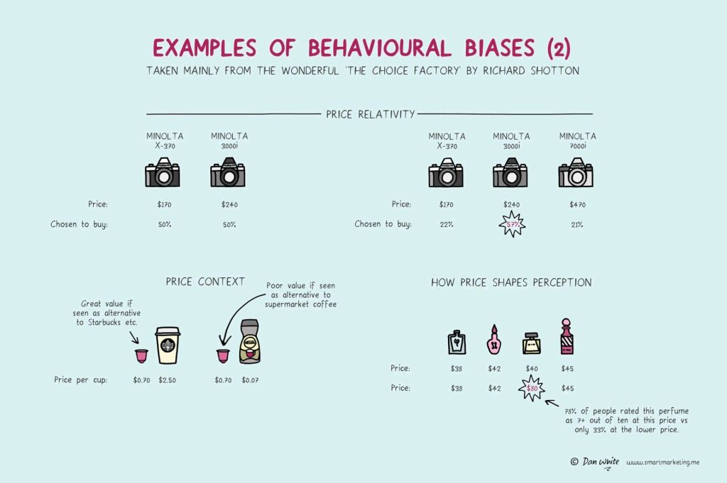
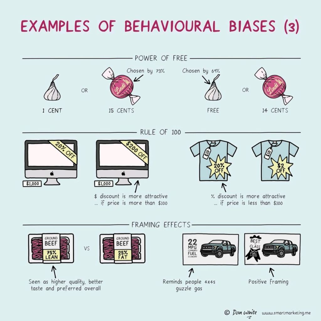
In this case, Dan White visualized some of the psychological biases mentioned in Richard Shotton‘s book “The Choice Factory“.
These biases make for irrational human behavior in the way we make daily decisions.
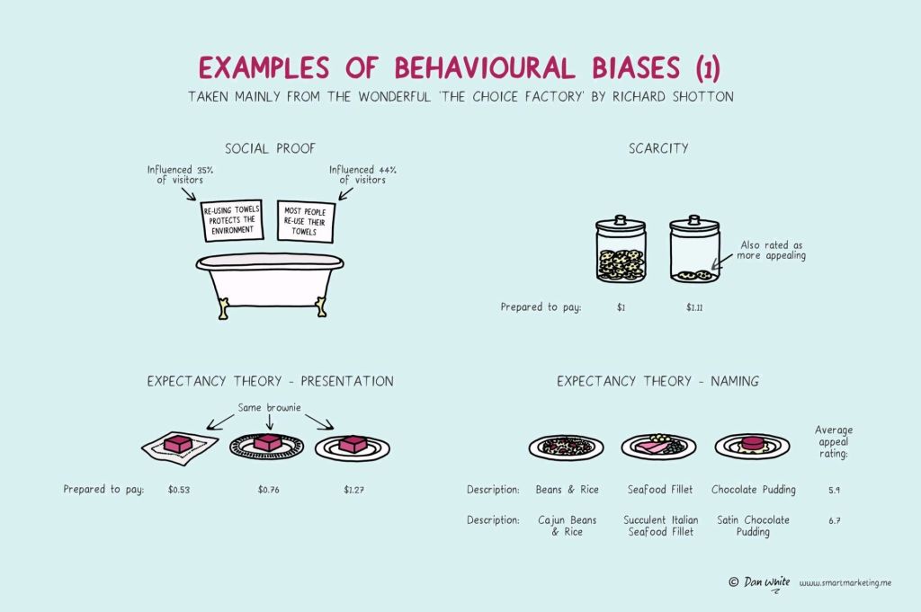
For example, you will be prepared to pay more for a cookie, when there are less of them in the jar. The generic principle here is that we assign higher valuations to objects under conditions of scarcity.
Once you are aware of such psychological biases, you will start to notice how they are (mis)used nearly everywhere these days. Particularly in sales and marketing. In restaurants, shops, online, and in virtually any case where we act as a consumer, we are subconciously influenced to make certain purchasing decision.
Nudging, is what they call these attempts to manipulate your behavior.
Maybe not so ethical, but still these infographics look amazing and these biases are good to be aware of!
Disclaimer: This page contains one or more links to Amazon. Any purchases made through those links provide us with a small commission that helps to host this blog.
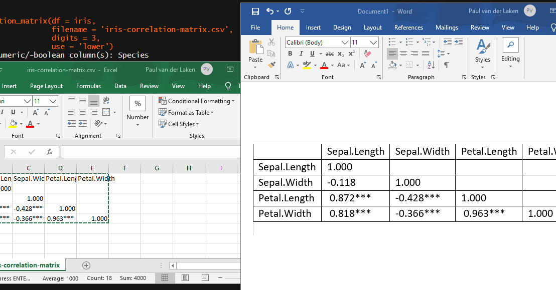
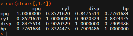
In most (observational) research papers you read, you will probably run into a correlation matrix. Often it looks something like this:
In Social Sciences, like Psychology, researchers like to denote the statistical significance levels of the correlation coefficients, often using asterisks (i.e., *). Then the table will look more like this:
Regardless of my personal preferences and opinions, I had to make many of these tables for the scientific (non-)publications of my Ph.D..
I remember that, when I first started using R, I found it quite difficult to generate these correlation matrices automatically.
Yes, there is the cor function, but it does not include significance levels.
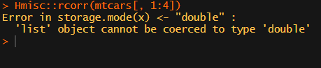
Then there the (in)famous Hmisc package, with its rcorr function. But this tool provides a whole new range of issues.
What’s this storage.mode, and what are we trying to coerce again?
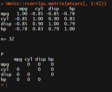
Soon you figure out that Hmisc::rcorr only takes in matrices (thus with only numeric values). Hurray, now you can run a correlation analysis on your dataframe, you think…
Yet, the output is all but publication-ready!
You wanted one correlation matrix, but now you have two… Double the trouble?
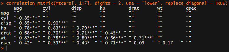
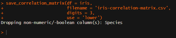
[UPDATED] To spare future scholars the struggle of the early day R programming, Laura Lambert and I created an R package corrtable, which includes the helpful function correlation_matrix.
This correlation_matrix takes in a dataframe, selects only the numeric (and boolean/logical) columns, calculates the correlation coefficients and p-values, and outputs a fully formatted publication-ready correlation matrix!
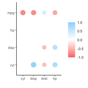
For instance, you can use only 2 decimals. You can focus on the lower triangle (as the lower and upper triangle values are identical). And you can drop the diagonal values:
Or maybe you are interested in a different type of correlation coefficients, and not so much in significance levels:
This blog highlights a recent PNAS paper in which 457 data scientists and academic scholars were challenged use machine learning to predict life outcomes using a rich dataset.
Yet, I can not summarize the result better than this tweet by the author of the paper:
If hundreds of scientists created predictive algorithms with high-quality data, how well would the best predict life outcomes? Not very well. Fragile Families Challenge: paper in PNAS w 112 authors https://t.co/WxDJbw0joz & Special Collection of Socius https://t.co/WM9f4oYaABpic.twitter.com/ZPFChD79VR
Over 750 scientific papers have used the Fragile Families dataset.
The dataset is famous for its richness of cohort (survey) data on the included families’ lives and their childrens’ upbringings. It includes a whopping 12.942 variables!!
Some of these variables reflect interesting life outcomes of the included families.
For instance, the childrens’ grade point averages (GPA) and grit, but also whether the family was ever evicted or experienced hardship, or whether their primary caregiver had received job training or was laid off at work.
You can read more about the exact data contents in the paper’s appendix.
Now Matthew and his co-authors shared this enormous dataset with over 160 teams consisting of 457 academics researchers and data scientists alike. Each of them well versed in statistics and predictive modelling.
These data scientists were challenged with this task: by all means possible, make the most predictive model for the six life outcomes (i.e., GPA, conviction, etc).
The scientists could use all the Fragile Families data, and any algorithm they liked, and their final model and its predictions would be compared against the actual life outcomes in a holdout sample.
According to the paper, many of these teams used machine-learning methods that are not typically used in social science research and that explicitly seek to maximize predictive accuracy.
Now, here’s the summary again:
If hundreds of [data] scientists created predictive algorithms with high-quality data, how well would the best predict life outcomes?
Not very well.
@msalganik
Even the best among the 160 teams’ predictions showed disappointing resemblance of the actual life outcomes. None of the trained models/algorithms achieved an R-squared of over 0.25.
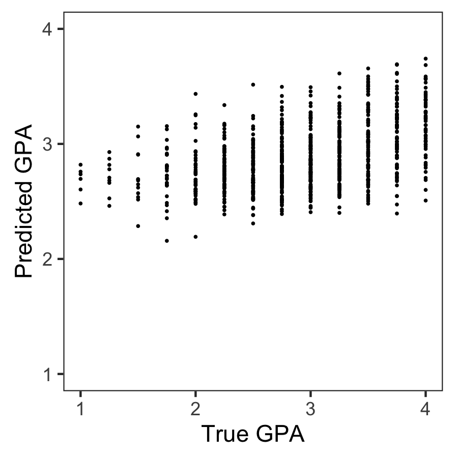
Wondering what these best R-squared of around 0.20 look like? Here’s the disappointg reality of plot C enlarged: the actual TRUE GPA’s on the x-axis, plotted against the best team’s predicted GPA’s on the y-axis.
Sure, there’s some relationship, with higher actual scores getting higher (average) predictions. But it ain’t much.
Moreover, there’s very little variation in the predictions. They all clump together between the range of about 2.1 and 3.8… that’s not really setting apart the geniuses from the less bright!
Matthew sums up the implications quite nicely in one of his tweets:
For policymakers deploying predictive algorithms in high-stakes decisions, our result is a reminder of a basic fact: one should not assume that algorithms predict well. That must be demonstrated with transparent, empirical evidence.
According to Matthew this “collective failure of 160 teams” is hard to ignore. And it failure highlights the understanding vs. predicting paradox: these data have been used to generate knowledge on how the world works in over 750 papers, yet few checked to see whether these same data and the scientific models would be useful to predict the life outcomes we’re trying to understand.
I was super excited to read this paper and I love the approach. It is actually quite closely linked to a series of papers I have been working on with Brian Spisak and Brian Doornenbal on trying to predict which people will emerge as organizational leaders. (hint: we could not really, at least not based on their personality)
Apparently, others were as excited as I am about this paper, as Filiz Garip already published a commentary paper on this research piece. Unfortunately, it’s behind a paywall so I haven’t read it yet.
Moreover, if you want to learn more about the approaches the 160 data science teams took in modelling these life outcomes, here are twelve papers in which some teams share their attempts.
Very curious to hear what you think of the paper and its implications. You can access it here, and I’d love to read your comments below.
In this original blog, with equally original title, Delip Rao poses twelve (+1) harsh truths about the real world practice of machine learning. I found it quite enlightning to read a non-hyped article about ML for once. Particularly because Delip’s experiences seem to overlap quite nicely with the principles of software design and Agile working.
Delip’s 12 truths I’ve copied in headers below. If they spark your interest, read more here:
It has to work
No matter how hard you push and no matter what the priority, you can’t increase the speed of light
With sufficient thrust, pigs fly just fine. However, this is not necessarily a good idea
Some things in life can never be fully appreciated nor understood unless experienced firsthand
It is always possible to agglutinate multiple separate problems into a single complex interdependent solution. In most cases, this is a bad idea
It is easier to ignore or move a problem around than it is to solve it
You always have to tradeoff something
Everything is more complicated than you think
You will always under-provision resources
One size never fits all. Your model will make embarrassing errors all the time despite your best intentions
Every old idea will be proposed again with a different name and a different presentation, regardless of whether it works
Perfection has been reached not when there is nothing left to add, but when there is nothing left to take away
Delip added in a +1, with his zero-indexed truth: You are Not a Scientist.
Yes, that’s all of you building stuff with machine learning with a “scientist” in the title, including all of you with PhDs, has-been-academics, and academics with one foot in the industry. Machine learning (and other AI application areas, like NLP, Vision, Speech, …) is an engineering research discipline (as opposed to science research).
Delip [bio] is the VP of Research at AI Foundation where he leads speech, language, and vision research efforts for generating and detecting artificial content. You can find his personal webblog here.
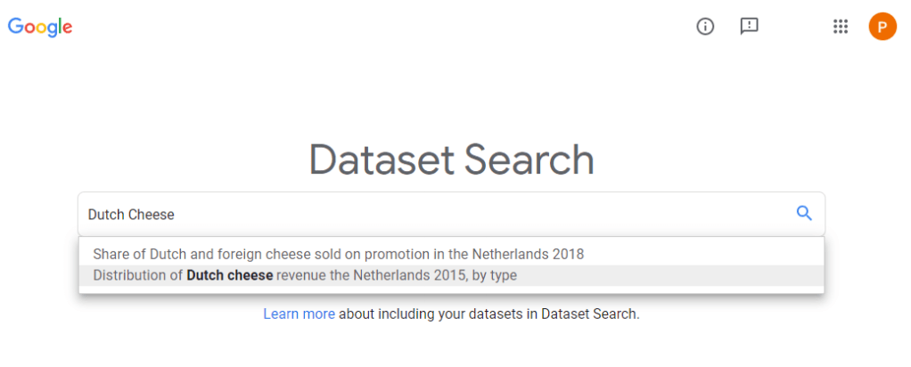
The “world wide web” hosts millions of datasets, on nearly any topic you can think of. Google’s Dataset Search has indexed almost 25 million of these datasets, giving you a single entry point to search for datasets online. After a year of testing, Dataset Search is now officially out of beta.
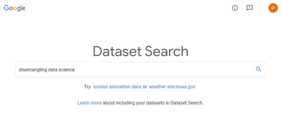
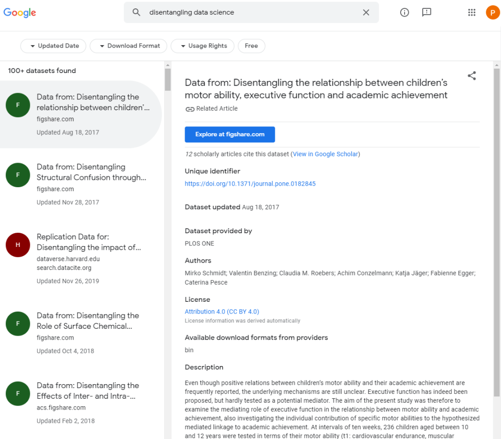
After alpha testing, Dataset Search now includes filter based on the types of dataset that you want (e.g., tables, images, text), on whether the dataset is open source/access. For dataset on geographic area’s, you can see the map. The quality of dataset’s descriptions has improved greatly, and the tool now has a mobile version.
Reddit is a treasure trove of random stuff. However, every now and then, in the better groups, quite valuable topics pop up. Here’s one I came across on r/statistics:
Particularly the advice by grandzooby seemed worth a like, and he linked to several useful resources which I’ve summarized for you below.
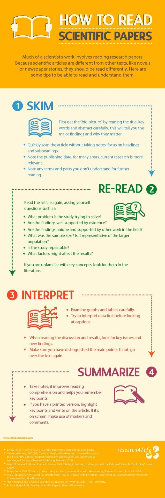
An 11-step guide to reading a paper
Jennifer Raff — assistant professor at the University of Kansas — wrote this 3-page guide on how to read papers. It elaborates on 11 main pieces of advice for reading academic papers:
Begin by reading the introduction, skip the abstract.
Identify the general problem: “What problem is this research field trying to solve?”
Try to uncover the reason and need for this specific study.
Identify the specific problem: “What problems is this paper trying to solve?”
Identify what the researchers are going to do to solve that problem
Read & identify the methods: draw the studies in diagrams
Read & identify the results: write down the main findings
Determine whether the results solve the specific problem
Read the conclusions and determine whether you agree
Mary Purugganan and Jan Hewitt of Rice University propose slightly different steps for reading academic papers. Though they seem more general pointers to keep in mind to me:
Skim the article and identify its structure
Distinguish its main points
Generate questions before and during reading
Draw inferences while reading
Take notes while reading
Regarding the note taking Mary and Jan propose the following template which may proof useful:
Citation:
URL:
Keywords:
General subject:
Specific subject:
Hypotheses:
Methodology:
Results:
Key points:
Context (in the broader field/your work):
Significance (to the field/your work):
Important figures/tables (description/page numbers):
References for further reading:
Other comments:
Scholars sharing their experiences
Science Magazine dedicated a long read to how to seriously read scientific papers, in which they asked multiple scholars to share their experiences and tips.
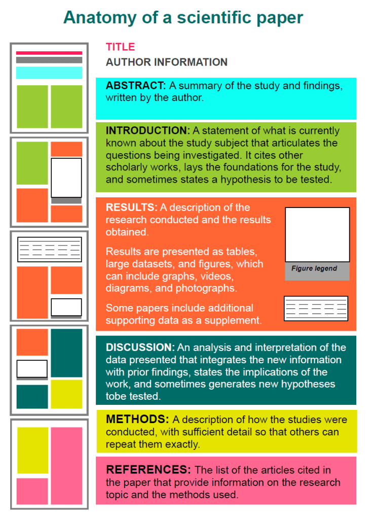
Anatomy of a scientific paper
This 13-page guide by the American Society of Plant Biologists was recommended by some, but I personally don’t find it as useful as the other advices here. Nevertheless, for the laymen, it does include a nice visualization of the anatomy of scientific papers:
This course gives you easy access to the invaluable learning techniques used by experts in art, music, literature, math, science, sports, and many other disciplines. We’ll learn about the how the brain uses two very different learning modes and how it encapsulates (“chunks”) information. We’ll also cover illusions of learning, memory techniques, dealing with procrastination, and best practices shown by research to be most effective in helping you master tough subjects.