Coming from a social sciences background, I learned to use R-squared as a way to assess model performance and goodness of fit for regression models.
Yet, in my current day job, I nearly never use the metric any more. I tend to focus on predictive power, with metrics such as MAE, MSE, or RMSE. These make much more sense to me when comparing models and their business value, and are easier to explain to stakeholders as an added bonus.
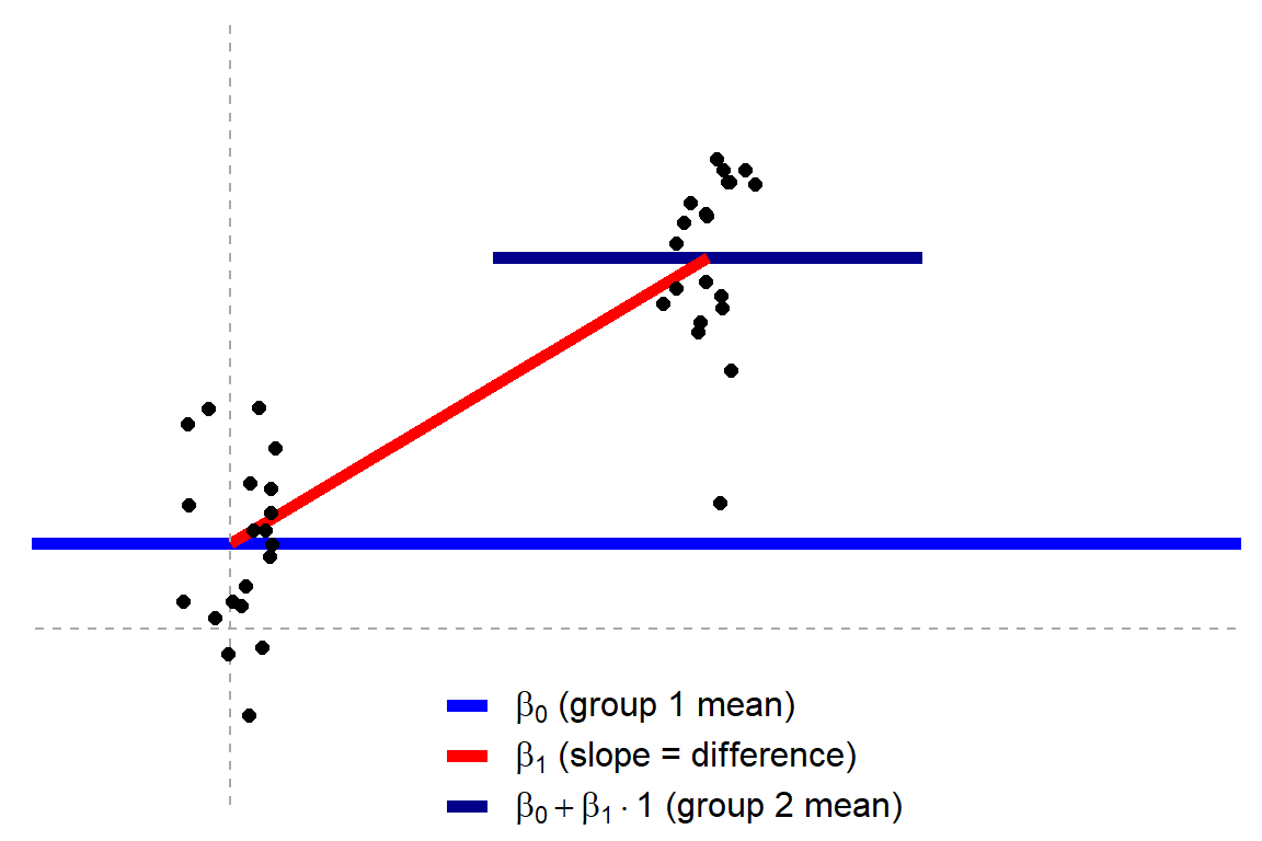
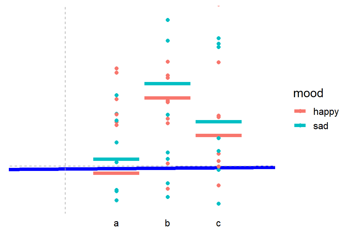
Jonas’ original blog uses R programming to visually show how the tests work, what the linear models look like, and how different approaches result in the same statistics.
How do scurvy, astronomy, alchemy and data science relate to each other?
In this goto conference presentation, Lucas Vermeer — Director of Experimentation at Booking.com — uses some amazing storytelling to demonstrate how the value of data (science) is largely by organizations capability to gather the right data — the data they actually need.
It’s a definite recommendation to watch for data scientists and data science leaders out there.
Here are the slides, and they contain some great oneliners:
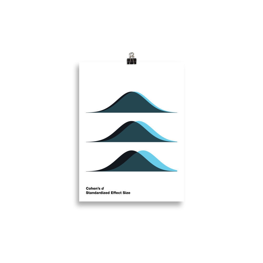
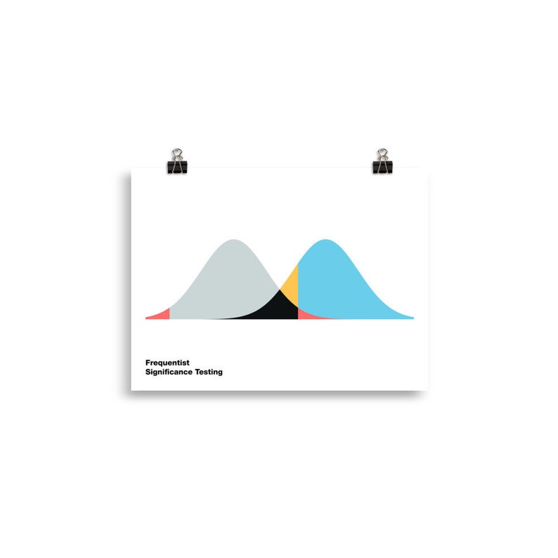
Cohen’s d (wiki) is a statistic used to indicate the standardised difference between two means. Resarchers often use it to compare the averages between groups, for instance to determine that there are higher outcomes values in a experimental group than in a control group.
Researchers often use general guidelines to determine the size of an effect. Looking at Cohen’s d, psychologists often consider effects to be small when Cohen’s d is between 0.2 or 0.3, medium effects (whatever that may mean) are assumed for values around 0.5, and values of Cohen’s d larger than 0.8 would depict large effects (e.g., University of Bath).
The two groups’ distributions belonging to small, medium, and large effects visualized
By the way, Kristoffer hosts many other interesting visualization tools (most made with JavaScript’s D3 library) on statistics and statistical phenomena on his website, have a look!
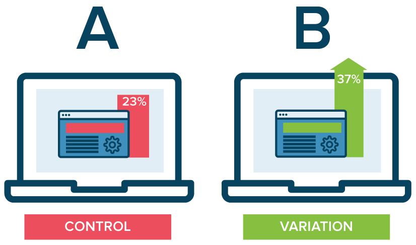
A/B testing is a method of comparing two versions of some thing against each other to determine which is better. A/B tests are often mentioned in e-commerce contexts, where the things we are comparing are web pages.
Business leaders and data scientists alike face a difficult trade-off when running A/B tests: How big should the A/B test be? Or in other words, After collecting how many data points, or running for how many days, should we make a decision whether A or B is the best way to go?
This is a tradeoff because the sample size of an A/B test determines its statistical power. This statistical power, in simple terms, determines the probability of a A/B test showing an effect if there is actually really an effect. In general, the more data you collect, the higher the odds of you finding the real effect and making the right decision.
By default, researchers often aim for 80% power, with a 5% significance cutoff. But is this general guideline really optimal for the tradeoff between costs and benefits in your specific business context? Chris thinks not.
Chris said wrote a great three-piece blog in which he explains how you can mathematically determine the optimal duration of A/B-testing in your own company setting:
Part I: General Overview. Starts with a mostly non-technical overview and ends with a section called “Three lessons for practitioners”.
Part II: Expected lift. A more technical section that quantifies the benefits of experimentation as a function of sample size.
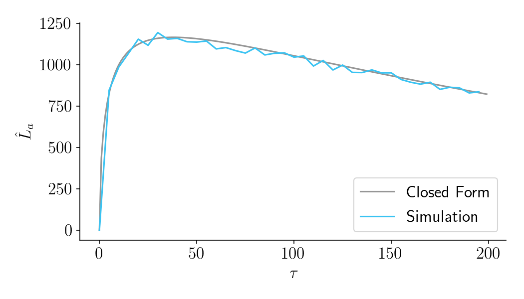
Part III: Aggregate time-discounted lift. A more technical section that quantifies the costs of experimentation as a function of sample size. It then combines costs and benefits into a closed-form expression that can be optimized. Ends with an FAQ.