Tag: GIF

Python Web Scraping: WordPress Visitor Statistics

Python Web Scraping: WordPress Visitor Statistics

I’ve had this WordPress domain for several years now, and in the beginning it was very convenient.

WordPress enabled me to set up a fully functional blog in a matter of hours. Everything from HTML markup, external content embedding, databases, and simple analytics was already conveniently set up.

However, after a while, I wanted to do some more advanced stuff. Here, the disadvantages of WordPress hosting became evident fast. Anything beyond the most simple capabilities is locked firmly behind paywalls. Arguably rightfully so. If you want to use WordPress’ add-ins, I feel you should pay for them. That’s their business model after all.

However, what greatly annoys me is that WordPress actively hinders you from arranging matters yourself. Want to incorporate some JavaScript in your page? Upgrade to a paid account. Want to use Google Analytics? Upgrade and buy an add-in. Want to customize your HTML / CSS code? Upgrade or be damned. Even the simplest of tasks — just downloading visitor counts — WordPress made harder than it should be.

You can download visitor statistics manually — day by day, week by week, or year by year. However, there is no way to download your visitor history in batches. If you want to have your daily visiting history, you will manually have to download and store every day’s statistics.

For me, getting historic daily data would entail 1100 times entering a date, scrolling down, clicking a button, specifying a filename, and clicking to save. I did this once, for 36 monthly data snapshots, and the insights were barely worth the hassle, I assure you.

Fortunately, today, after nearly three years of hosting on WordPress, I finally managed to circumvent past this annoyance! Using the Python script detailed below, my computer now automonously logs in to WordPress and downloads the historic daily visitor statistics for all my blogs and pages!

Let me walk you through the program and code.

Modules & Setup

Before we jump into Python, you need to install Chromedriver. Just download the zip and unpack the execution file somewhere you can find it, and make sure to copy the path into Python. You will need it later. Chromedriver allows Python’s selenium webdriver to open up and steer a chrome browser.

We need another module for browsing: webdriver_manager. The other modules and their functions are for more common purposes: os for directory management, re for regular expression, datetime for working with dates, and time for letting the computer sleep in between operations.

from selenium import webdriver
from webdriver_manager.chrome import ChromeDriverManager
from time import sleep
from datetime import datetime, timedelta
import os
import re

Helper Functions

I try to write my code in functions, so let’s dive into the functions that allow us to download visitor statistics.

To begin, we need to set up a driver (i.e., automated browser) and this is what get_driver does. Two things are important here. Firstly, the function takes an argument dir_download. You need to give it a path so it knows where to put any downloaded files. This path is stored under preferences in the driver options. Secondly, you need to specify the path_chromedriver argument. This needs to be the exact location you unpacked the chromedriver.exe. All these paths you can change later in the main program, so don’t worry about them for now. The get_driver function returns a ready-to-go driver object.

def get_driver(dir_download, path_chromedriver):
    chrome_options = webdriver.ChromeOptions()
    prefs = {'download.default_directory': dir_download}
    chrome_options.add_experimental_option('prefs', prefs)
    driver = webdriver.Chrome(executable_path=path_chromedriver, options=chrome_options)
    return driver

Next, our driver will need to know where to browse to. So the function below, compile_traffic_url, uses an f-string to generate the url for the visitor statistics overview of a specific domain and date. Important here is that you will need to change the domain default from paulvanderlaken.com to your own WordPress adress. Take a look at the statistics overview in your regular browser to see how you may tailor your urls.

Now, in the rest of the program, I work dates formatted and stored as datetime.datetime.date(). By default, the compile_traffic_url function also uses a datetime date argument for today’s date. However, WordPress expects simple string dates in the urls. Hence, I need a way to convert these complex datetime dates into simpler strings. That’s what the strftimefunction below does. It formats a datetime date to a date_string, in the format YYYY-MM-DD.

def compile_traffic_url(domain='paulvanderlaken.com', date=datetime.today().date()):
    date_string = date.strftime('%Y-%m-%d')
    return f'https://wordpress.com/stats/day/posts/{domain}?startDate={date_string}'

So we know how to generate the urls for the pages we want to scrape. We compile them using this handy function.

If we would let the driver browse directly to one of these compiled traffic urls, you will find yourself redirected to the WordPress login page, like below. That’s a bummer!

Hence, whenever we start our program, we will first need to log in once using our password. That’s what the signing_in function below is for. This function takes in a driver, a username, and a password. It uses the compile_traffic_url function to generate a traffic url (by default of today’s traffic [see above]). Then the driver loads the website using its get method. This will redirect us to the WordPress login page. In order for the webpages to load before our driver starts clicking away, we let our computer sleep a bit, using time.sleep.

def signing_in(driver, username, password):
    print('Sign in routine')

    url = compile_traffic_url()

    driver.get(url)
    sleep(1)

    field_email = driver.find_element_by_css_selector('#usernameOrEmail')
    field_email.send_keys(username)

    button_submit = driver.find_element_by_class_name('button')
    button_submit.click()

    sleep(1)

    field_password = driver.find_element_by_css_selector('#password')
    field_password.send_keys(password)

    button_submit = driver.find_element_by_class_name('button')
    button_submit.click()

    sleep(2)

Now, our automated driver is looking at the WordPress login page. We need to help it find where to input the username and password. If you press CTRL+SHIFT+C while on any webpage, the HTML behind it will show. Now you can just browse over the webpage elements, like the login input fields, and see what their CSS selectors, names, and classes are.

If you press CTRL+SHIFT+C on a webpage, the html behind it will show.

So, next, I order the driver to find the HTML element of the username-input field and input my username keys into it. We ask the driver to find the Continue-button and click it. Time for the driver to sleep again, while the page loads the password input field. Afterwards, we ask the driver to find the password input field, input our password, and click the Continue-button a second time. While our automatic login completes, we let the computer sleep some more.

Once we have logged in once, we will remain logged in until the Python program ends, which closes the driver.

Okay, so now that we have a function that logs us in, let’s start downloading our visitor statistics!

The download_traffic function takes in a driver, a date, and a list of dates_downloaded (an empty list by default). First, it checks whether the date to download occurs in dates_downloaded. If so, we do not want to waste time downloading statistics we already have. Otherwise, it puts the driver to work downloading the traffic for the specified date following these steps:

  1. Compile url for the specified date
  2. Driver browses to the webpage of that url
  3. Computer sleeps while the webpage loads
  4. Driver executes script, letting it scroll down to the bottom of the webpage
  5. Driver is asked to find the button to download the visitor statistics in csv
  6. Driver clicks said button
  7. Computer sleeps while the csv is downloaded

If anything goes wrong during these steps, an error message is printed and no document is downloaded. With no document downloaded, our program can try again for that link the next time.

def download_traffic(driver, date, dates_downloaded=[]):
    if date in dates_downloaded:
        print(f'Already downloaded {date} traffic')
    else:
        try:
            print(f'Downloading {date} traffic')
            url = compile_traffic_url(date=date)
            driver.get(url)
            sleep(1)
            driver.execute_script("window.scrollTo(0, document.body.scrollHeight);")
            button = driver.find_element_by_class_name('stats-download-csv')
            button.click()
            sleep(1)
        except:
            print(f'Error during downloading of {date}')

We need one more function to generate the dates_downloaded list of download_traffic. The date_from_filename function below takes in a filename (e.g., paulvanderlaken.com_posts_day_12_28_2019_12_28_2019) and searches for a regular expression date format. The found match is turned into a datetime date using strptime and returned. This allows us to walk through a directory on our computer and see for which dates we have already downloaded visitor statistics. You will see how this works in the main program below.

def date_from_filename(filename):
    match = re.search(r'\d{2}_\d{2}_\d{4}', filename)
    date = datetime.strptime(match.group(), '%m_%d_%Y').date()
    return date

Main program

In the end, we combine all these above functions in our main program. Here you will need to change five things to make it work on your computer:

  • path_data – enter a folder path where you want to store the retrieved visitor statistics csv’s
  • path_chromedriver – enter the path to the chromedriver.exe you unpacked
  • first_date – enter the date from which you want to start scraping (by default up to today)
  • username – enter your WordPress username or email address
  • password – enter your WordPress password
if __name__ == '__main__':
    path_data = 'C:\\Users\\paulv\\stack\\projects\\2019_paulvanderlaken.com-anniversary\\traffic-day\\'
    path_chromedriver = 'C:\\Users\\paulv\\chromedriver.exe'

    first_date = datetime(2017, 1, 18).date()
    last_date = datetime.today().date()

    username = "insert_username"
    password = "insert_password"

    driver = get_driver(dir_download=path_data, path_chromedriver=path_chromedriver)

    days_delta = last_date - first_date
    days = [first_date + timedelta(days) for days in range(days_delta.days + 1)]
    dates_downloaded = [date_from_filename(file) for _, _, f in os.walk(path_data) for file in f]

    signing_in(driver, username=username, password=password)

    for d in days:
        download_traffic(driver, d, dates_downloaded)
    driver.close()

If you have downloaded Chromedriver, have copied all the code blocks from this blog into a Python script, and have added in your personal paths, usernames, and passwords, this Python program should work like a charm on your computer as well. By default, the program will scrape statistics from all days from the first_date up to the day you run the program, but this you can change obviously.

Results

For me, the program took about 10 seconds to download one csv consisting of statistics for one day. So three years of WordPress blogging, or 1095 daily datasets of statistics, were extracted in about 3 hours. I did some nice cooking and wrote this blog in the meantime : )

The result after 3 hours of scraping

Compare that to the horror of having to surf, scroll, and click that godforsaken Download data as CSV button ~1100 times!!

The horror button (in Dutch)

Final notes

The main goal of this blog was to share the basic inner workings of this scraper with you, and to give you the same tool to scrape your own visitor statistics.

Now, this project can still be improved tremendously and in many ways. For instance, with very little effort you could add some command line arguments (with argparse) so you can run this program directly or schedule it daily. My next step is to set it up to run daily on my Raspberry Pi.

An additional potential improvement: when the current script encounters no statistics do download for a specific day, no csv is saved. This makes the program try again a next time it is run, as the dates_downloaded list will not include that date. Probably this some minor smart tweaks will solve this issue.

Moreover, there are many more statistics you could scrape of your WordPress account, like external clicks, the visitors home countries, search terms, et cetera.

The above are improvement points you can further develop yourself, and if you do please share them with the greater public so we can all benefit!

For now, I am happy with these data, and will start on building some basic dashboards and visualizations to derive some insights from my visitor patterns. If you have any ideas or experiences please let me know!

I hope this walkthrough and code may have help you in getting in control of your WordPress website as well. Or that you learned a thing or two about basic web scraping with Python. I am still in the midst of starting with Python myself, so if you have any tips, tricks, feedback, or general remarks, please do let me know! I am always happy to talk code and love to start pet projects to improve my programming skills, so do reach out if you have any ideas!

Join 1,415 other subscribers
A tiny guide to Variable Fonts & Color Fonts

A tiny guide to Variable Fonts & Color Fonts

So, you’ve probably never heard of variable fonts.

Well, I sure had not when I first came across the concept a week or so ago. And I was shocked. This looked so cool. As I adjusted the size of my browser, the text and images adjusted itself along. As I made my Chrome window bigger, the text enlarged to keep filling the space it was allowed. Insane!

Here’s a little write-up on variable fonts called A tiny guide to Variable Color Fonts by Typearture.com.

Variable color fonts: How do they work?

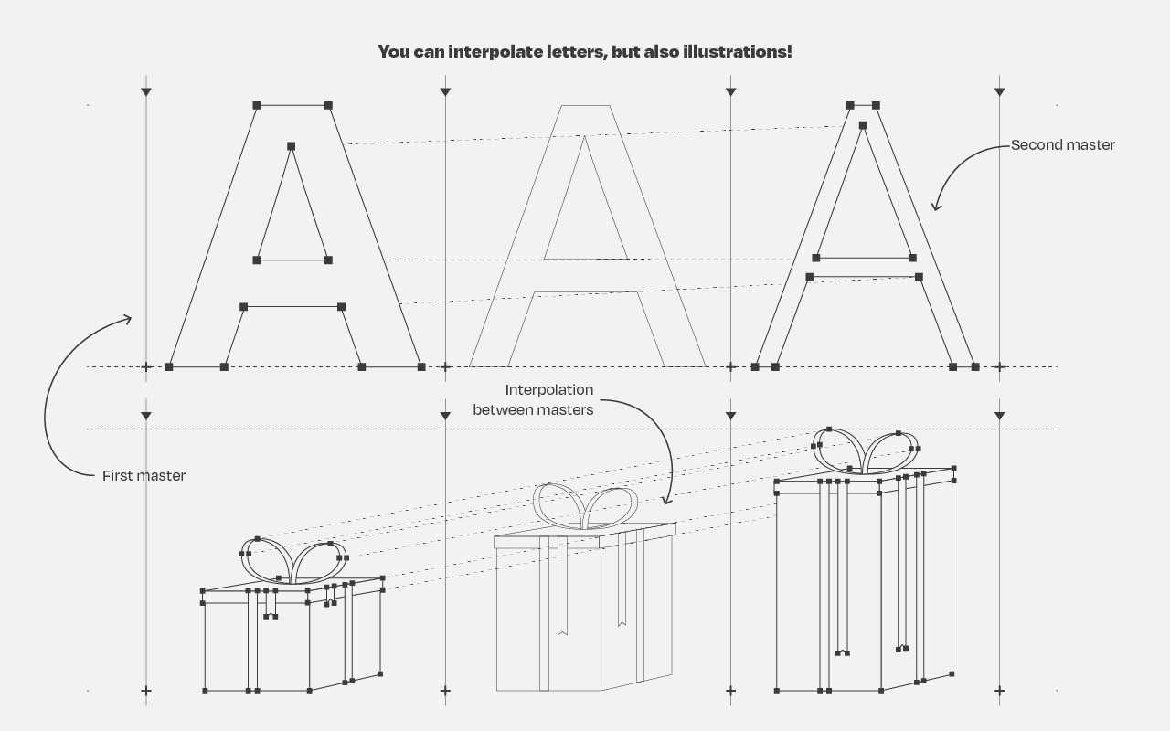
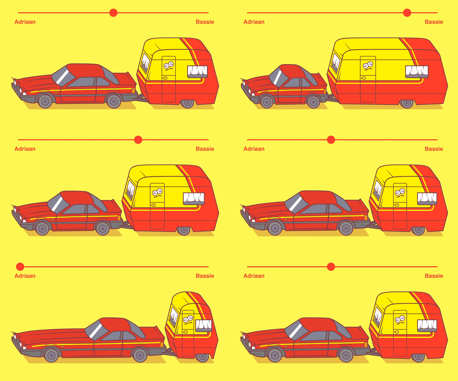
The variability works for letters, but also illustrations. And any part can be colored and sized as pleased:

Variable fonts and illustrations

I find the visual art particularly stunning, which you can find via this link:

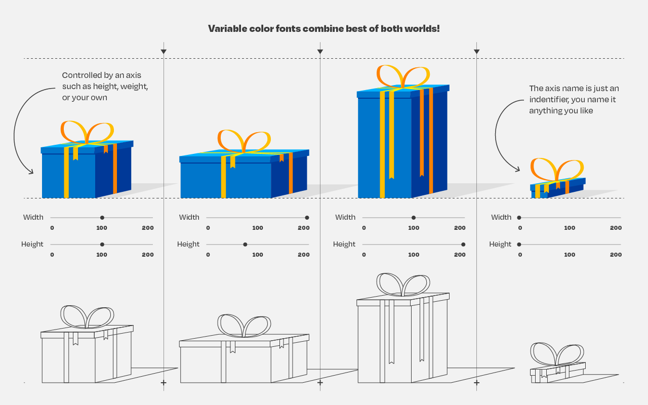
Here’s the explanation for the GIF in the header:

Combining variable and color fonts

The original article (which I highly recommend you read) links to many useful links:

Typearture is Arthur Reinders Folmer’s adventure in type, creating type designs with a focus on conceptual, illustrative and ornamental typefaces.

The typefaces in the Typearture library are not just collections of glyphs, but typefaces that use the conventions of type design and written language to tell their stories. These stories are woven throughout the typefaces, connecting A to Z and the Lemniscate to Question mark. Each character has it’s place and meaning, making each keystroke a small tale in itself.

typearture.com
Making GIFs with Processing

Making GIFs with Processing

Processing is a flexible software sketchbook and a language for learning how to code within the context of the visual arts. It’s open-source, there are many online materials, and the language itself is very accessible.

I recently stumbled upon 17-year-old Joseff Nic from Cardiff who has been making GIFs in Processing only since 2018, but which are turning out fantastic already. You can hire him here, and have a look at his Twitter, Tumbler or Drimble channels for the originals:

Here are some more of Joseff’s creations:

Wave Swirl loop design processing gif animation

Some of Joseff’s work seems inspired by David Whyte, a graphic designer from Ireland. His portfolio is quite impressive as well, very visually pleasing, and you can hire him here.

Bees & Bombs Roulette gif processing web web design
StudioPhi spiral gif processing geometry motion
Knot geometry motion design processing gif

If you’re interesting in learning Processing, Daniel Shiffman demonstrates how to create the most amazing things in Processing via his Youtube channel the Coding Train, which I’ve covered before.

ROC, AUC, precision, and recall visually explained

ROC, AUC, precision, and recall visually explained

A receiver operating characteristic (ROC) curve displays how well a model can classify binary outcomes. An ROC curve is generated by plotting the false positive rate of a model against its true positive rate, for each possible cutoff value. Often, the area under the curve (AUC) is calculated and used as a metric showing how well a model can classify data points.

If you’re interest in learning more about ROC and AUC, I recommend this short Medium blog, which contains this neat graphic:

Dariya Sydykova, graduate student at the Wilke lab at the University of Texas at Austin, shared some great visual animations of how model accuracy and model cutoffs alter the ROC curve and the AUC metric. The quotes and animations are from the associated github repository.

ROC & AUC

The plot on the left shows the distributions of predictors for the two outcomes, and the plot on the right shows the ROC curve for these distributions. The vertical line that travels left-to-right is the cutoff value. The red dot that travels along the ROC curve corresponds to the false positive rate and the true positive rate for the cutoff value given in the plot on the left.

The traveling cutoff demonstrates the trade-off between trying to classify one outcome correctly and trying to classify the other outcome correcly. When we try to increase the true positive rate, we also increase the false positive rate. When we try to decrease the false positive rate, we decrease the true positive rate.

cutoff.gif

The shape of an ROC curve changes when a model changes the way it classifies the two outcomes.

The animation [below] starts with a model that cannot tell one outcome from the other, and the two distributions completely overlap (essentially a random classifier). As the two distributions separate, the ROC curve approaches the left-top corner, and the AUC value of the curve increases. When the model can perfectly separate the two outcomes, the ROC curve forms a right angle and the AUC becomes 1.

Precision-Recall

Two other metrics that are often used to quantify model performance are precision and recall.

Precision (also called positive predictive value) is defined as the number of true positives divided by the total number of positive predictions. Hence, precision quantifies what percentage of the positive predictions were correct: How correct your model’s positive predictions were.

Recall (also called sensitivity) is defined as the number of true positives divided by the total number of true postives and false negatives (i.e. all actual positives). Hence, recall quantifies what percentage of the actual positives you were able to identify: How sensitive your model was in identifying positives.

Dariya also made some visualizations of precision-recall curves:

Precision-recall curves also displays how well a model can classify binary outcomes. However, it does it differently from the way an ROC curve does. Precision-recall curve plots true positive rate (recall or sensitivity) against the positive predictive value (precision). 

In the middle, here below, the ROC curve with AUC. On the right, the associated precision-recall curve.

Similarly to the ROC curve, when the two outcomes separate, precision-recall curves will approach the top-right corner. Typically, a model that produces a precision-recall curve that is closer to the top-right corner is better than a model that produces a precision-recall curve that is skewed towards the bottom of the plot.

Class imbalance

Class imbalance happens when the number of outputs in one class is different from the number of outputs in another class. For example, one of the distributions has 1000 observations and the other has 10. An ROC curve tends to be more robust to class imbalanace that a precision-recall curve. 

In this animation [below], both distributions start with 1000 outcomes. The blue one is then reduced to 50. The precision-recall curve changes shape more drastically than the ROC curve, and the AUC value mostly stays the same. We also observe this behaviour when the other disribution is reduced to 50. 

Here’s the same, but now with the red distribution shrinking to just 50 samples.

Dariya invites you to use these visualizations for educational purposes:

Please feel free to use the animations and scripts in this repository for teaching or learning. You can directly download the gif files for any of the animations, or you can recreate them using these scripts. Each script is named according to the animation it generates (i.e. animate_ROC.r generates ROC.gifanimate_SD.r generates SD.gif, etc.).

Want to learn more about the different evaluation metrics for machine learning? Here’s a nice how-to guide by Neptune.ai demonstrating different metrics applied in Python.

GIF visualizations of Type 1 and Type 2 error in relation to sample size

GIF visualizations of Type 1 and Type 2 error in relation to sample size

On twitter, I came across the tweet below showing some great GIF visualizations on the dangers of taking small samples.

Created by Andrew Stewart, and tweeted by John Holbein, the visuals show samples taken from a normal distributed variable with a mean of 10 and a standard deviation of 2. In the left section, Andrew took several samples of 20. In the right section, the sample size was increased to 500.

Just look at how much the distribution and the estimated mean change for small samples!

Andrew shared his code via Github, so I was able to download and tweak it a bit to make my own version.

Andrew’s version seems to be concerned with potential Type 1 errors when small samples are taken. A type 1 error occurs when you reject your null hypothesis (you reject “there is no effect”) while you should not have (“there is actually no effect”).

You can see this in the distributions Andrew sampled from in the tweet above. The data for conditions A (red) and B (blue) are sampled from the same distribution, with mean 10 and standard deviation 2. While there should thus be no difference between the groups, small samples may cause researchers to erroneously conclude that there is a difference between conditions A and B due to the observed data.

We could use Andrew’s basic code and tweak it a bit to simulate a setting in which Type 2 errors could occur. A type 2 error occurs when you do not reject your null hypothesis (you maintain “there is no effect”) whereas there is actually an effect, which you thus missed.

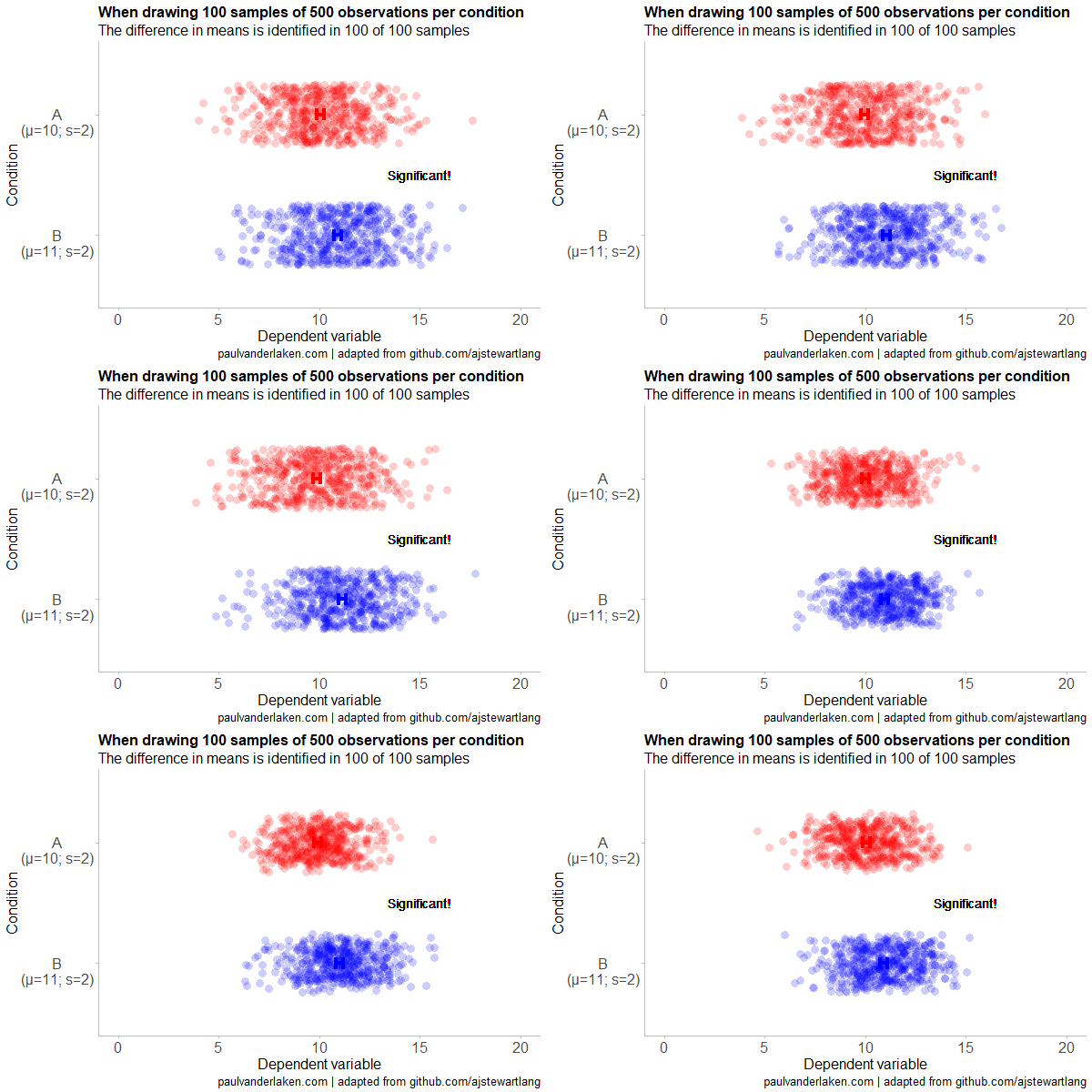
To illustrate this, I adapted Andrew’s code: I sampled data for condition B using a normal distribution with a slightly higher mean value of 11, as opposed to the mean of 10 for condition A. The standard deviation remained the same in both conditions (2).

Next, I drew 10 data samples from both conditions, for various sample sizes: 10, 20, 50, 100, 250, 500, and even 1000. After drawing these samples for both conditions, I ran a simple t-test to compare their means, and estimate whether any observed difference could be considered significant (at the alpha = 0.05 level [95%]).

In the end, I visualized the results in a similar fashion as Andrew did. Below are the results.

As you can see, only in 1 of our 10 samples with size 10 were we able to conclude that there was a difference in means. This means that we are 90% incorrect.

After increasing the sample size to 100, we strongly decrease our risk of Type 2 errors. Now we are down to 20% incorrect conclusions.

At this point though, I decided to rework Andrew’s code even more, to clarify the message.

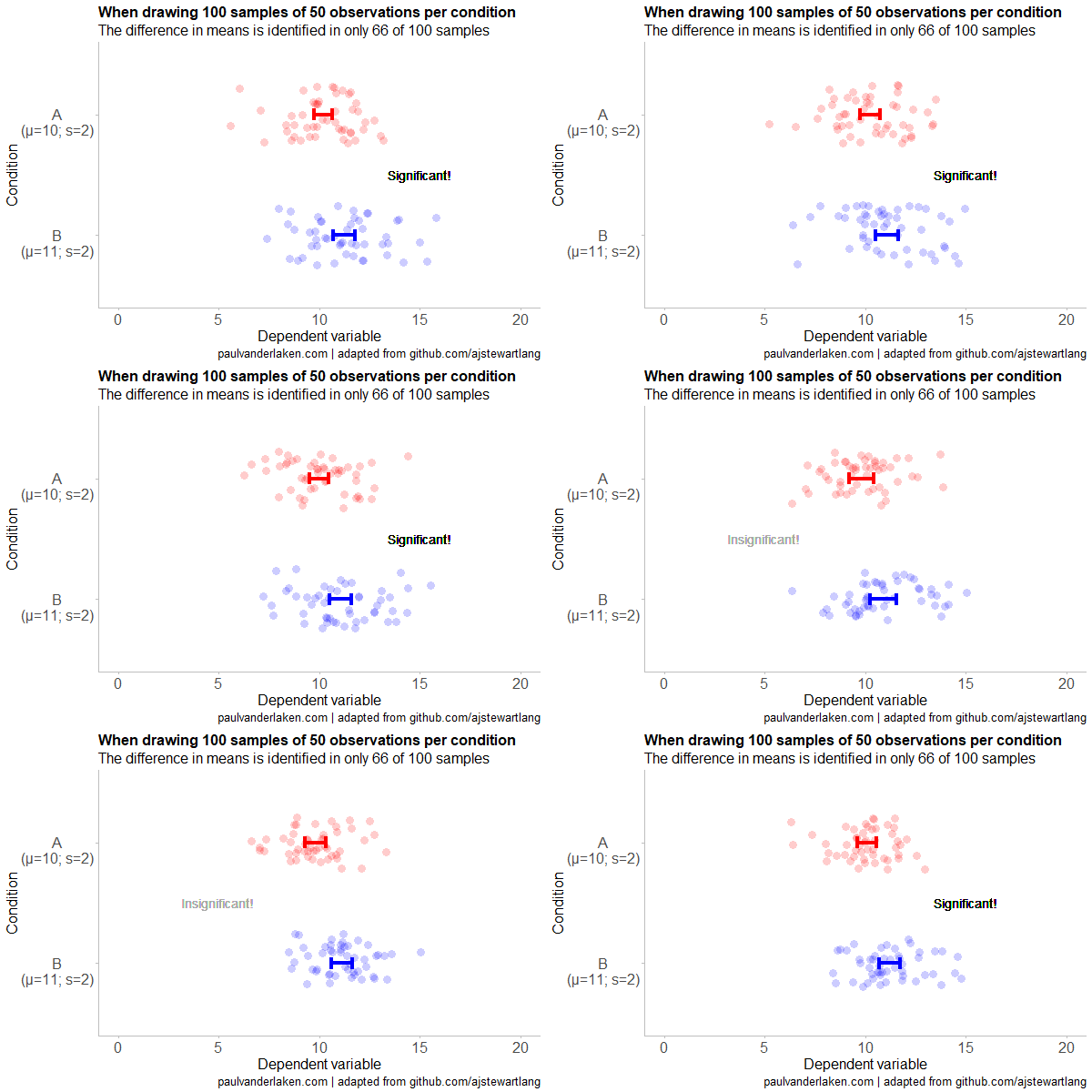
I was not so much interested in the estimated distribution, which currently only distracts. Similarly, the points and axes can be toned down a bit. Moreover, I’d like to be able to see when my condition samples have significant different means, so let’s add a 95% confidence interval, and some text. Finally, let’s increase the number of drawn samples per sample size to, say, 100, to reduce the influence that chance may have on our Type 2 error rate estimations.

Let’s rerun the code and generate some GIFs!

The below demonstrates that small samples of only 10 observations per condition have only about a 11% probability of detecting the difference in means when the true difference is 1 (or half the standard deviation [i.e., 2]). In other words, there is a 89% chance of a Type 2 error occuring, where we fail to reject the null hypothesis due to sampling error.

Doubling the sample size to 20, more than doubles our detection rate. We now correctly identify the difference 28% of the time.

With 50 observations the Type 2 error rate drops to 34%.

Finally, with sample sizes of 100+ our results become somewhat reliable. We are now able to correctly identify the true difference over 95% of the times.

With a true difference of half the standard deviation, further increases in the sample size start to lose their added value. For instance, a sample size of 250 already uncovers the effect in all 100 samples, so doubling to 500 would not make sense.

I hope you liked the visuals. If you are interested in these kind of analysis, or want to estimate how large of a sample you need in your own study, have a look at power analysis. These analysis can help you determine the best setup for your own research initiatives.


If you’d like to reproduce or change the graphics above, here is the R code. Note that it is strongly inspired by Andrew’s original code.

# setup -------------------------------------------------------------------

# The new version of gganimate by Thomas Lin Pedersen - @thomasp85 may not yet be on CRAN so use devtools
# devtools::install_github('thomasp85/gganimate')

library(ggplot2)
library(dplyr)
library(glue)
library(magrittr)
library(gganimate)


# main function to create and save the animation --------------------------

save_created_animation = function(sample_size, 
                                  samples = 100, 
                                  colors = c("red", "blue"), 
                                  Amean = 10, Asd = 2, 
                                  Bmean = 11, Bsd = 2, 
                                  seed = 1){
  
  ### generate the data
  
  # set the seed
  set.seed(seed)

  # set the names of our variables
  cnames <- c("Score", "Condition", "Sample") 

  # create an empty data frame to store our simulated samples
  df <- data.frame(matrix(rep(NA_character_, samples * sample_size * 2 * length(cnames)), ncol = length(cnames), dimnames = list(NULL, cnames)), stringsAsFactors = FALSE)
  
  # create an empty vector to store whether t.test identifies significant difference in means
  result <- rep(NA_real_, samples)
  
  # run a for loop to iteratively simulate the samples
  for (i in seq_len(samples)) {
    # draw random samples for both conditions
    a <- rnorm(sample_size, mean = Amean, sd = Asd) 
    b <- rnorm(sample_size, mean = Bmean, sd = Bsd) 
    # test whether there the difference in the means of samples is significant 
    result[i] = t.test(a, b)$p.value < 0.05
    # add the identifiers for both conditions, and for the sample iteration
    a <- cbind(a, rep(glue("A\n(μ={Amean}; σ={Asd})"), sample_size), rep(i, sample_size))
    b <- cbind(b, rep(glue("B\n(μ={Bmean}; σ={Bsd})"), sample_size), rep(i, sample_size))
    # bind the two sampled conditions together in a single matrix and set its names
    ab <- rbind(a, b)
    colnames(ab) <- cnames
    # push the matrix into its reserved spot in the reserved dataframe
    df[((i - 1) * sample_size * 2 + 1):((i * (sample_size * 2))), ] <- ab
  }


  ### prepare the data
  
  # create a custom function to calculate the standard error
  se <- function(x) sd(x) / sqrt(length(x))
  
  df %>%
    # switch data types for condition and score
    mutate(Condition = factor(Condition)) %>%
    mutate(Score = as.numeric(Score)) %>%
    # calculate the mean and standard error to be used in the error bar
    group_by(Condition, Sample) %>%
    mutate(Score_Mean = mean(Score)) %>% 
    mutate(Score_SE = se(Score)) ->
    df
  
  # create a new dataframe storing the result per sample 
  df_result <- data.frame(Sample = unique(df$Sample), Result = result, stringsAsFactors = FALSE)
  
  # and add this result to the dataframe
  df <- left_join(df, df_result, by = "Sample")
  
  # identify whether not all but also not zero samples identified the difference in means
  # if so, store the string "only ", later to be added into the subtitle
  result_mention_adj <- ifelse(sum(result) != 0 & sum(result) < length(result), "only ", "")


  ### create a custom theme
  
  textsize <- 16
  
  my_theme <- theme(
    text = element_text(size = textsize),
    axis.title.x = element_text(size = textsize),
    axis.title.y = element_text(size = textsize),
    axis.text.y = element_text(hjust = 0.5, vjust = 0.75),
    axis.text = element_text(size = textsize),
    legend.title = element_text(size = textsize),
    legend.text =  element_text(size = textsize),
    legend.position = "right",
    plot.title = element_text(lineheight = .8, face = "bold", size = textsize),
    panel.border = element_blank(),
    panel.grid.minor = element_blank(),
    panel.grid.major = element_blank(),
    axis.line = element_line(color = "grey", size = 0.5, linetype = "solid"),
    axis.ticks = element_line(color = "grey")
  )
  
  # store the chosen colors in a named vector for use as palette, 
  # and add the colors for (in)significant results
  COLORS = c(colors, "black", "darkgrey")
  names(COLORS) = c(levels(df$Condition), "1", "0")
  
  
  ### create the animated plot
  
  df %>%
    ggplot(aes(y = Score, x = Condition, fill = Condition, color = Condition)) +
    geom_point(aes(y = Score), position = position_jitter(width = 0.25), alpha = 0.20, stroke = NA, size = 1) +
    geom_errorbar(aes(ymin = Score_Mean - 1.96 * Score_SE, ymax = Score_Mean + 1.96 * Score_SE), width = 0.10, size = 1.5) +
    geom_text(data = . %>% filter(as.numeric(Condition) == 1), 
              aes(x = levels(df$Condition)[1], y = Result * 10 + 5, 
                  label = ifelse(Result == 1, "Significant!", "Insignificant!"),
                  col = as.character(Result)), position = position_nudge(x = -0.5), size = 5) +
    transition_states(Sample, transition_length = 1, state_length = 2) +
    guides(fill = FALSE) +
    guides(color = FALSE) +
    scale_x_discrete(limits = rev(levels(df$Condition)), breaks = rev(levels(df$Condition))) +
    scale_y_continuous(limits = c(0, 20), breaks = seq(0, 20, 5)) +
    scale_color_manual(values = COLORS) +
    scale_fill_manual(values = COLORS) +
    coord_flip() +
    theme_minimal() +
    my_theme +
    labs(x = "Condition") +
    labs(y = "Dependent variable") +
    labs(title = glue("When drawing {samples} samples of {sample_size} observations per condition")) +
    labs(subtitle = glue("The difference in means is identified in {result_mention_adj}{sum(result)} of {length(result)} samples")) +
    labs(caption = "paulvanderlaken.com | adapted from github.com/ajstewartlang") ->
    ani
  
  ### save the animated plot
  
  anim_save(paste0(paste("sampling_error", sample_size, sep = "_"), ".gif"), 
            animate(ani, nframes = samples * 10, duration = samples, width = 600, height = 400))
  
}


# call animation function for different sample sizes ----------------------

# !!! !!! !!!
# the number of samples is set to 100 by default
# if left at 100, each function call will take a long time!
# add argument `samples = 10` to get quicker results, like so:
# save_created_animation(10, samples = 10)
# !!! !!! !!!

save_created_animation(10)
save_created_animation(20)
save_created_animation(50)
save_created_animation(100)
save_created_animation(250)
save_created_animation(500)

Animating causal inference methods

Animating causal inference methods

Some time back the animations below went sort of viral in the statistical programming community. In them, economics professor Nick Huntington-Klein demonstrates step-by-step how statistical tests estimate effect sizes.

You will find several other animations in Nick’s original blog, and the associatedtwitter thread.

Moreover, if you are interested in the R code to generate these animations, have a look at this github repository for the causalgraphs.

Controlling for a variable

Matching on a Variable

Differences in differences

Link to the Twitter thread: