Obviously, this is less than ideal for me, but also, I should not be surprised.
Clearly, I knew nothing about the company I bought shares in. Apparently they are going through some big time reorganization, and this is not good price-wise.
According to Investopedia: A quarterly report is a summary or collection of unaudited financial statements, such as balance sheets, income statements, and cash flow statements, issued by companies every quarter (three months). In addition to reporting quarterly figures, these statements may also provide year-to-date and comparative (e.g., last year’s quarter to this year’s quarter) results. Publicly-traded companies must file their reports with the Securities Exchange Committee (SEC).
Fortunately these quarterly reports are readily available on the investors relation page, and they are not that hard to read once you have seen a few.
Visualizing financial data
I was excited to see that Rackspace offered their financial performance in bite-sized bits to me as a laymen, through their usage of nice visualizations of the financial data.
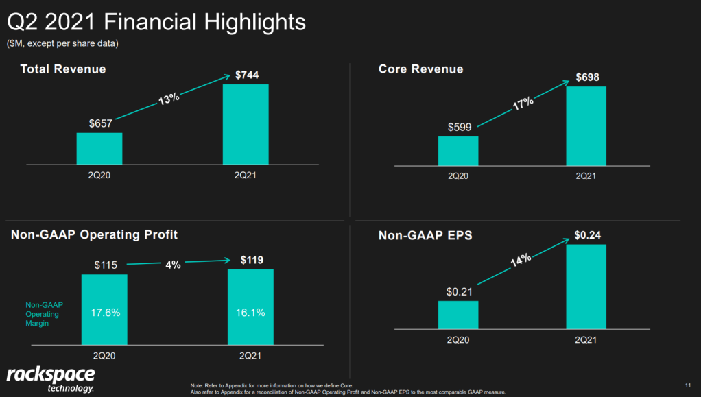
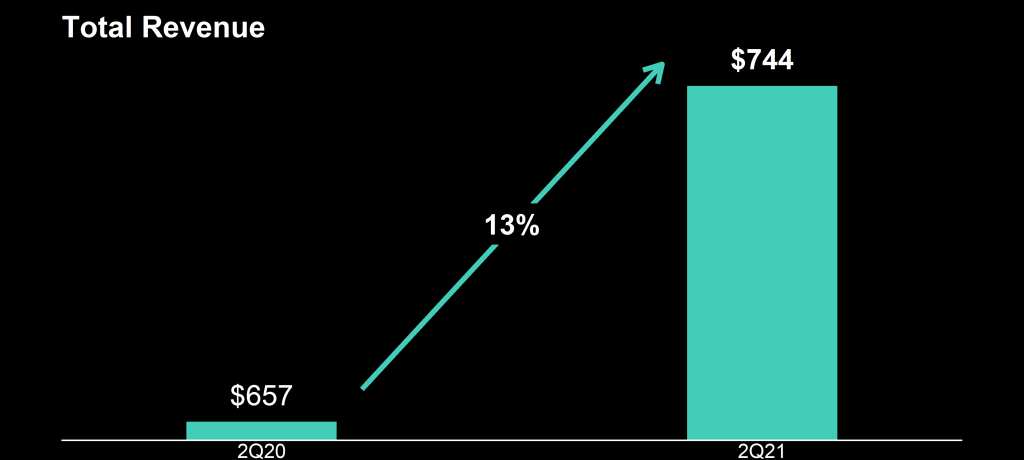
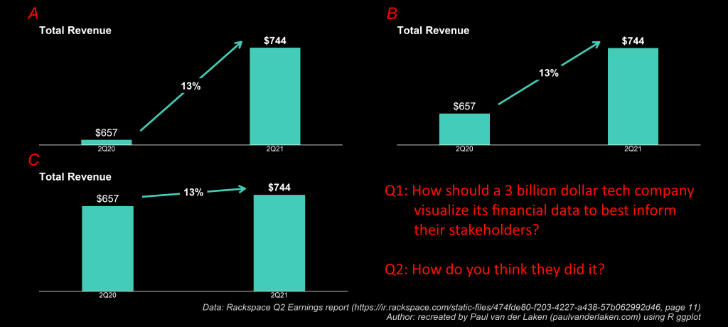
Please take a moment to process the below copy of page 11 of their 2021 Q2 report:
Though… the longer I looked at these charts… the more my head started to hurt…
How can the growth line be about the same in the three charts Total Revenue (top-left), Core Revenue (top-right), and Non-GAAP EPS (bottom-right)? They represent different increments: 13%, 17%, and 14% respectively.
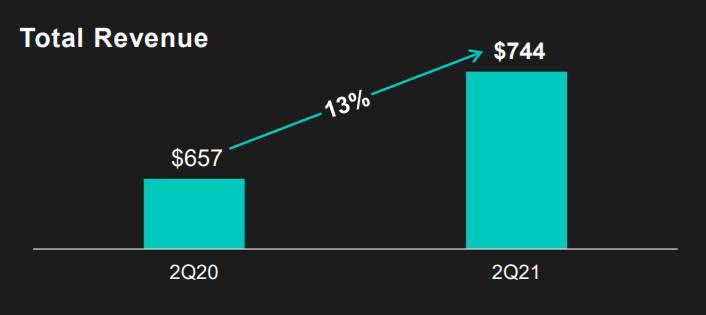
Zooming in on the top left: how does the $657 revenue of 2Q20 fit inside the $744 revenue of 2Q21 almost three times?!
Finding predictive patterns in your dataset with one line of code!
Today — March 2nd 2021 — my first R package was published on the comprehensive R archive network (CRAN).
ppsr is the R implementation of the Predictive Power Score (PPS).
The PPS is an asymmetric, data-type-agnostic score that can detect linear or non-linear relationships between two variables. You can read more about the concept in earlier blog posts (here and here), or here on Github, or via Medium.
With the ppsr package live on CRAN, it is now super easy to install the package and examine the predictive relationships in your dataset:
Update March, 2021: My R package for the predictive power score (ppsr) is live on CRAN! Try install.packages("ppsr") in your R terminal to get the latest version.
A few months ago, I wrote about the Predictive Power Score (PPS): a handy metric to quickly explore and quantify the relationships in a dataset.
As a social scientist, I was taught to use a correlation matrix to describe the relationships in a dataset. Yet, in my opinion, the PPS provides three handy advantages:
PPS works for any type of data, also nominal/categorical variables
PPS quantifies non-linear relationships between variables
PPS acknowledges the asymmetry of those relationships
# You can get the official version from CRAN:
install.packages("ppsr")

## Or you can get the development version from GitHub:
# install.packages('devtools')
# devtools::install_github('https://github.com/paulvanderlaken/ppsr')
Usage
The ppsr package has three main functions that compute PPS:
score() – which computes an x-y PPS
score_predictors() – which computes X-y PPS
score_matrix() – which computes X-Y PPS
Visualizing PPS
Subsequently, there are two main functions that wrap around these computational functions to help you visualize your PPS using ggplot2:
visualize_predictors() – producing a barplot of all X-y PPS
visualize_matrix() – producing a heatmap of all X-Y PPS
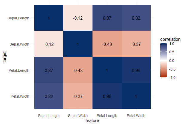
PPS matrix for iris
Note that Species is a nominal/categorical variable, with three character/text options.
A correlation matrix would not be able to show us that the type of iris Species can be predicted extremely well by the petal length and width, and somewhat by the sepal length and width. Yet, particularly sepal width is not easily predicted by the type of species.
Correlation matrix for iris
Exploring mtcars
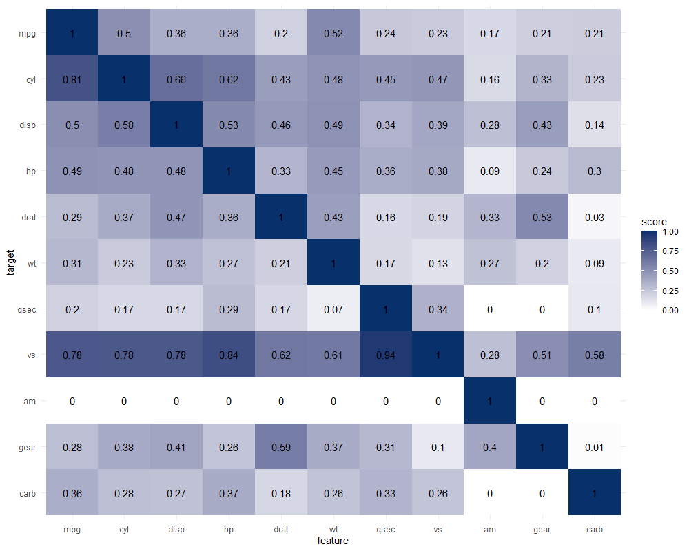
It takes about 10 seconds to run 121 decision trees with visualize_matrix(mtcars). Yet, the output is much more informative than the correlation matrix:
cyl can be much better predicted by mpg than the other way around
the classification of vs can be done well using nearly all variables as predictors, except for am
yet, it’s hard to predict anything based on the vs classification
a cars’ am can’t be predicted at all using these variables
PPS matrix for mtcars
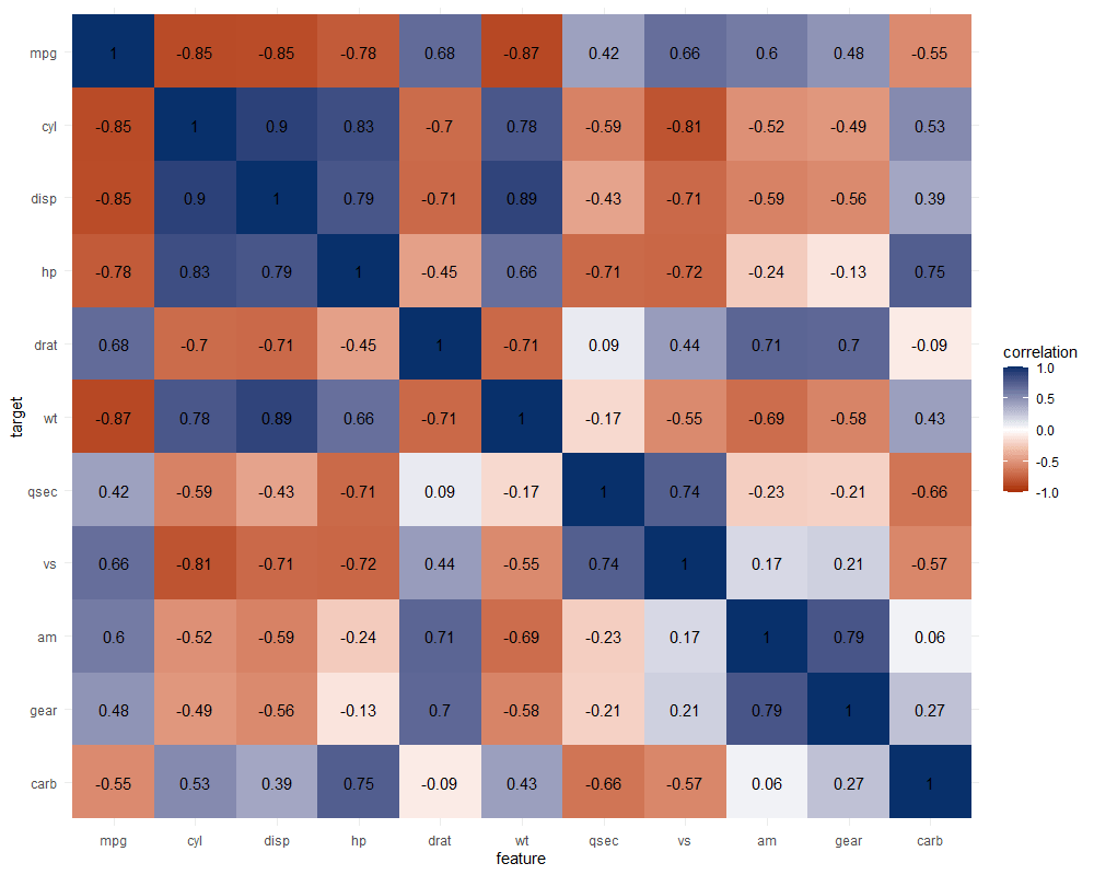
The correlation matrix does provides insights that are not provided by the PPS matrix. Most importantly, the sign and strength of any linear relationship that may exist. For instance, we can deduce that mpg relates strongly negatively with cyl.
Yet, even though half of the matrix does not provide any additional information (due to the symmetry), I still find it hard to derive the most important relations and insights at a first glance.
Moreover, the rows and columns for vs and am are not very informative in this correlation matrix as it contains pearson correlations coefficients by default, whereas vs and am are binary variables. The same can be said for cyl, gear and carb, which contain ordinal categories / integer data, so you can discuss the value of these coefficients depicted here.
Correlation matrix for mtcars
Exploring trees
In R, there are many datasets built in via the datasets package. Let’s explore some using the ppsr::visualize_matrix() function.
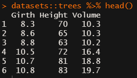
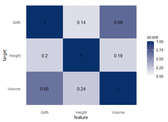
datasets::trees has data on 31 trees’ girth, height and volume.
visualize_matrix(datasets::trees) shows that both girth and volume can be used to predict the other quite well, but not perfectly.
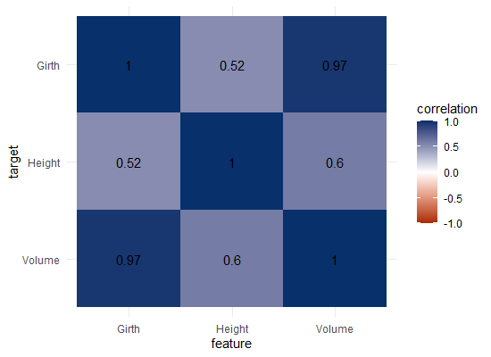
Let’s have a look at the correlation matrix.
The scores here seem quite higher in general. A near perfect correlation between volume and girth.
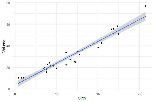
Is it near perfect though? Let’s have a look at the underlying data and fit a linear model to it.
You will still be pretty far off the real values when you use a linear model based on Girth to predict Volume. This is what the original PPS of 0.65 tried to convey.
Actually, I’ve run the math for this linaer model and the RMSE is still 4.11. Using just the mean Volume as a prediction of Volume will result in 16.17 RMSE. If we map these RMSE values on a linear scale from 0 to 1, we would get the PPS of our linear model, which is about 0.75.
So, actually, the linear model is a better predictor than the decision tree that is used as a default in the ppsr package. That was used to generate the PPS matrix above.
Yet, the linear model definitely does not provide a perfect prediction, even though the correlation may be near perfect.
Conclusion
In sum, I feel using the general idea behind PPS can be very useful for data exploration.
Particularly in more data science / machine learning type of projects. The PPS can provide a quick survey of which targets can be predicted using which features, potentially with more complex than just linear patterns.
Yet, the old-school correlation matrix also still provides unique and valuable insights that the PPS matrix does not. So I do not consider the PPS so much an alternative, as much as a complement in the toolkit of the data scientist & researcher.
Enjoy the R package, or the Python module for that matter, and let me know if you see any improvements!
The R programming language has seen the integration of many languages; C, C++, Python, to name a few, can be seamlessly embedded into R so one can conveniently call code written in other languages from the R console. Little known to many, R works just as well with JavaScript—this book delves into the various ways both languages can work together.
John Coene is an well-known R and JavaScript developer. He recently wrote a book on JavaScript for R users, of which he published an online version free to access here.
The book is definitely worth your while if you want to better learn how to develop front-end applications (in JavaScript) on top of your statistical R programs. Think of better understanding, and building, yourself Shiny modules or advanced data visualizations integrated right into webpages.
A nice step on your development path towards becoming a full stack developer by combining R and JavaScript!
Yet most R developers are not familiar with one of web browsers’ core technology: JavaScript. This book aims to remedy that by revealing how much JavaScript can greatly enhance various stages of data science pipelines from the analysis to the communication of results.