Tag: design

A New Piece in my Algorithmic Art Collection

A New Piece in my Algorithmic Art Collection

Those who have been following me for some time now will know that I am a big fan of generative art: art created through computers, mathematics, and algorithms.

Several years back, my now wife bought me my first piece for my promotion, by Marcus Volz.

And several years after that, I made my own attempt at a second generative art piece, again inspired by the work of Marcus on what he dubbed Metropolis.
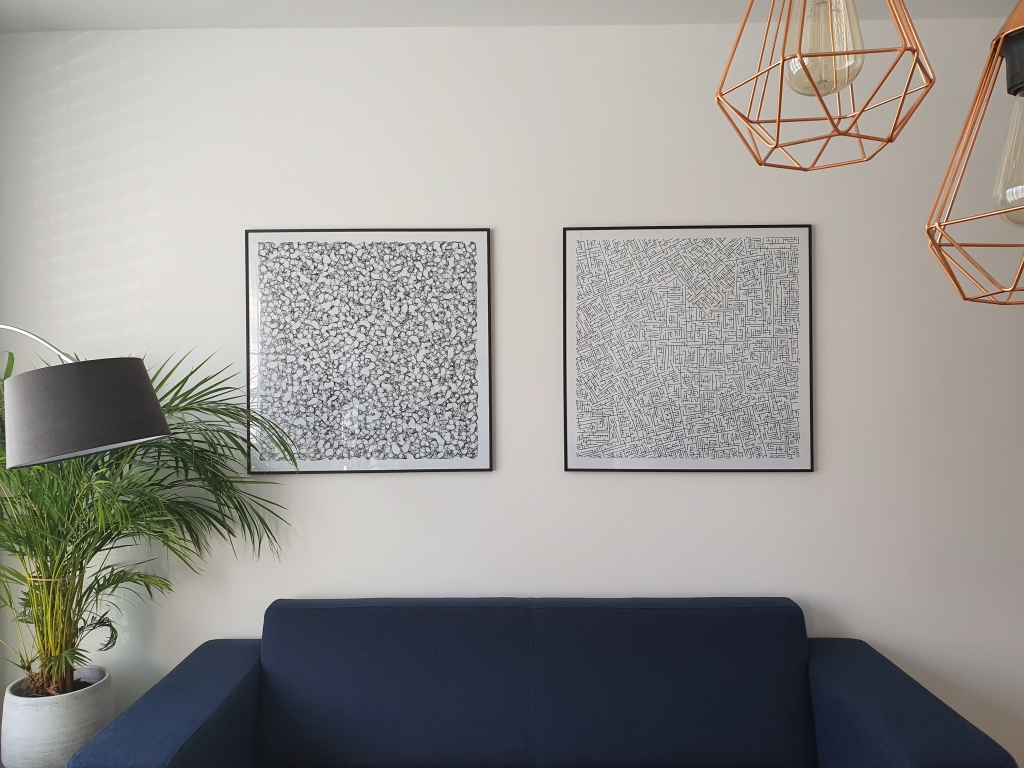
Now, our living room got a third addition in terms of the generative art, this time by Nicholas Rougeux.

Nicholas I bumped into on twitter, triggered by his collection of “Lunar Landscapes” (my own interpretation).

Nicholas was hesistant to sell me a piece and insisted that this series was not finished yet.

Yet, I already found it wonderful and lovely to look at and after begging Nicholas to sell us one of his early pieces, I sent it over to ixxi to have it printed and hanged it on our wall above our dinner table.
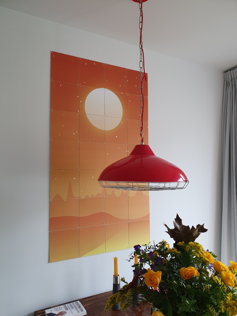
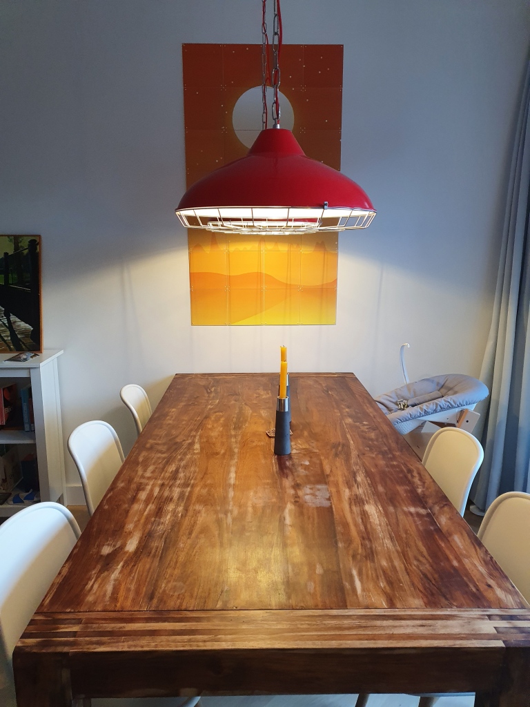
If you’re interested in Nicholas’ work, have a look at c82.net

Color curves: Choose a color palette with gradient

Color curves: Choose a color palette with gradient

Jan-Willem Tulp pointed out this amazing tool to choose a color palette: https://colorcurves.app

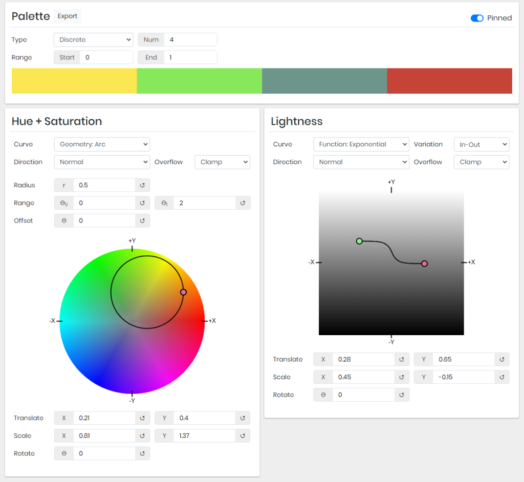
You can choose between either a continuous palette or a discrete palette, with groups that is.

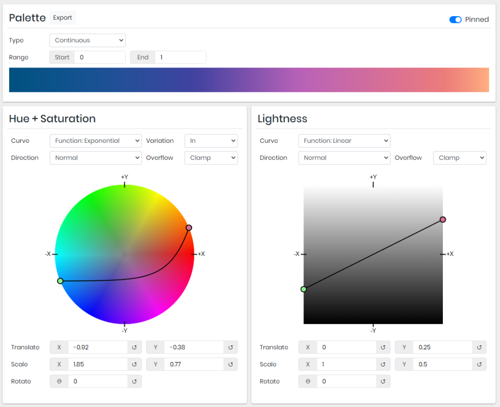
Here’s an example of an exponential color curve for a continuous palette using colorcurves.app:

There are numerous functions you can use to make your “gradient color curve“.

Similarly, you can specify the lightness of the different colors along your curve.

Here’s another example, of an color arc for a categorical / discrete palette using colorcurves.app:

10 Tips for Effective Dashboard Design by Deloitte

10 Tips for Effective Dashboard Design by Deloitte

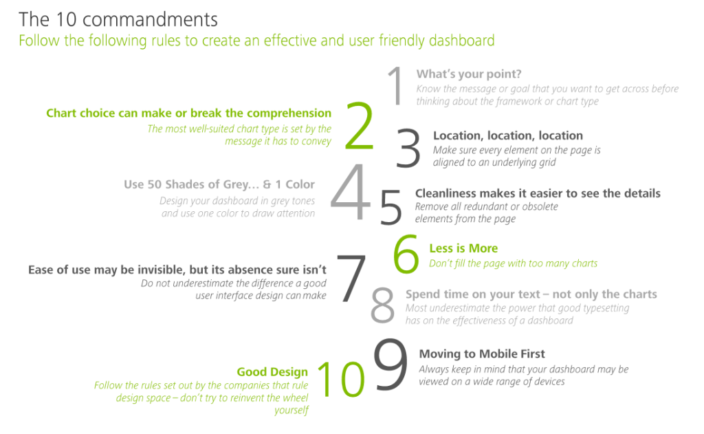
My colleague prof. Jack van Wijk pointed me towards these great guidelines by Deloitte on how to design an effective dashboard.

Some of these rules are more generally applicable to data visualization. Yet, the Deloitte 10 commandments form a good checklist when designing a dashboard.

Here’s my interpretation of the 10 rules:

  1. Know your message or goal
  2. Choose the chart that conveys your message best
  3. Use a grid to bring order to your dashboard
  4. Use color only to highlight and draw attention
  5. Remove unneccessary elements
  6. Avoid information overload
  7. Design for ease of use
  8. Text is as important as charts
  9. Design for multiple devices (desktop, tablet, mobile, …)
  10. Recycle good designs (by others)

In terms of recycling the good work by others operating in the data visualization field, check out:

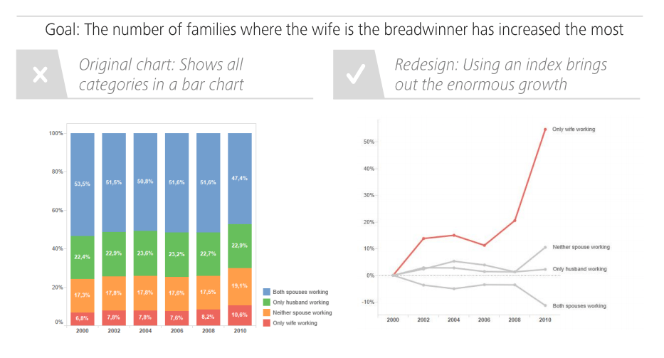
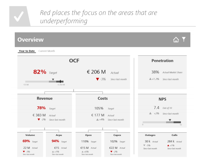
I just love how Deloitte uses example visualizations to help convey what makes a good (dashboard) chart:

Screenshot from the Deloitte slidedeck
Google’s Guidebook for Developing AI Product Development

Google’s Guidebook for Developing AI Product Development

I came across another great set of curated resources by one of the teams at Google:

The People + AI Guidebook.

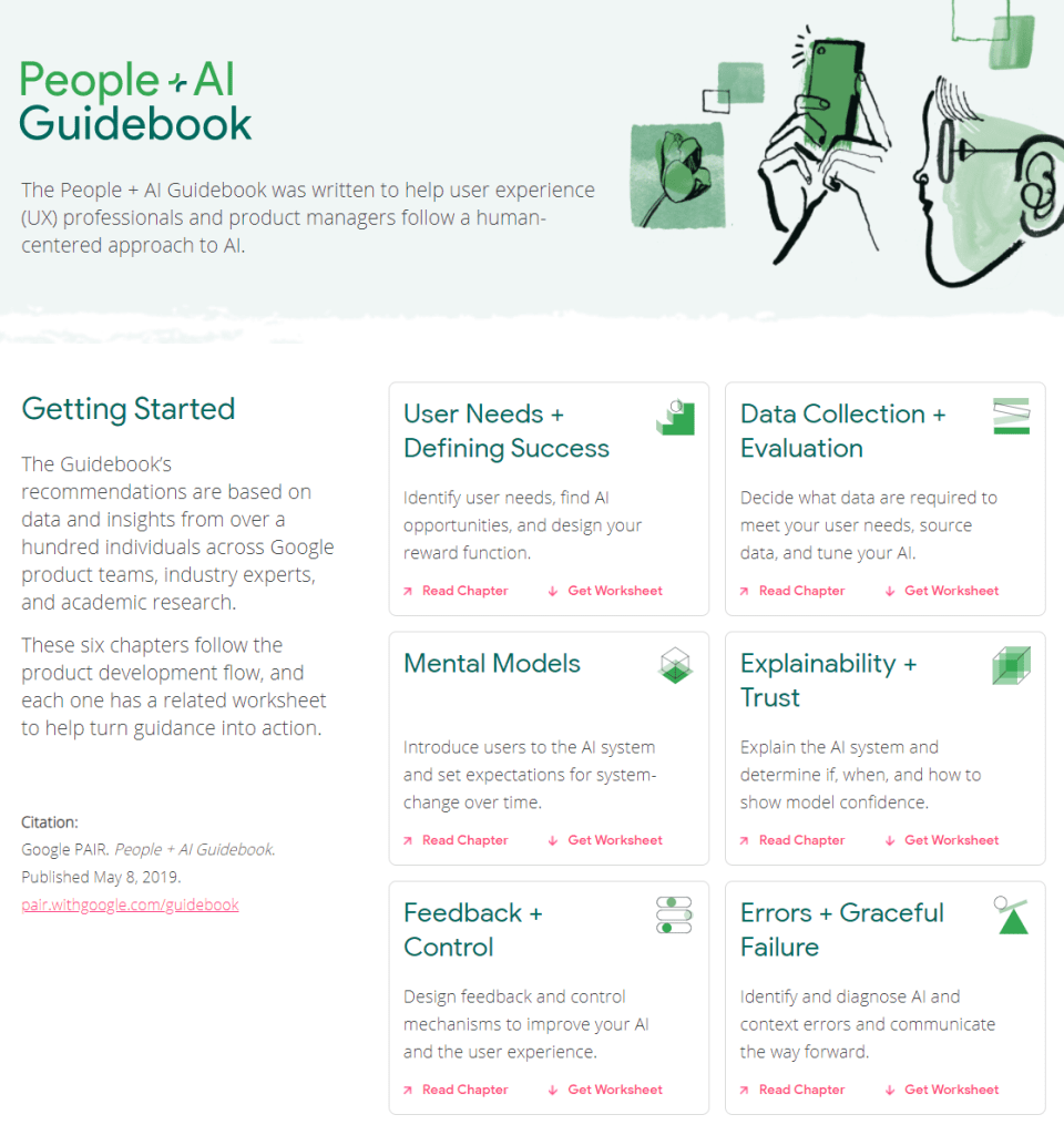
The People + AI Guidebook was written to help user experience (UX) professionals and product managers follow a human-centered approach to AI.

The Guidebook’s recommendations are based on data and insights from over a hundred individuals across Google product teams, industry experts, and academic research.

These six chapters follow the product development flow, and each one has a related worksheet to help turn guidance into action.

The People & AI guidebook is one of the products of the major PAIR project team (People & AI Research).

Here are the direct links to the six guidebook chapters:

Links to the related worksheets you can find here.

10 Guidelines to Better Table Design

10 Guidelines to Better Table Design

Jon Schwabisch recently proposed ten guidelines for better table design.

Next to the academic paper, Jon shared his recommendations in a Twitter thread.

Let me summarize them for you:

  • Right-align your numbers
  • Left-align your texts
  • Use decimals appropriately (one or two is often enough)
  • Display units (e.g., $, %) sparsely (e.g., only on first row)
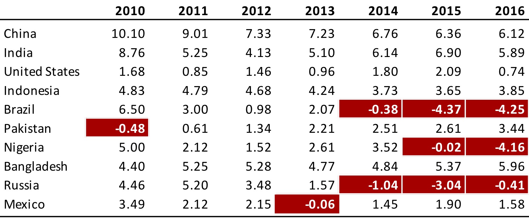
  • Highlight outliers
  • Highlight column headers
  • Use subtle highlights and dividers
  • Use white space between rows and columns
  • Use white space (or dividers) to highlight groups
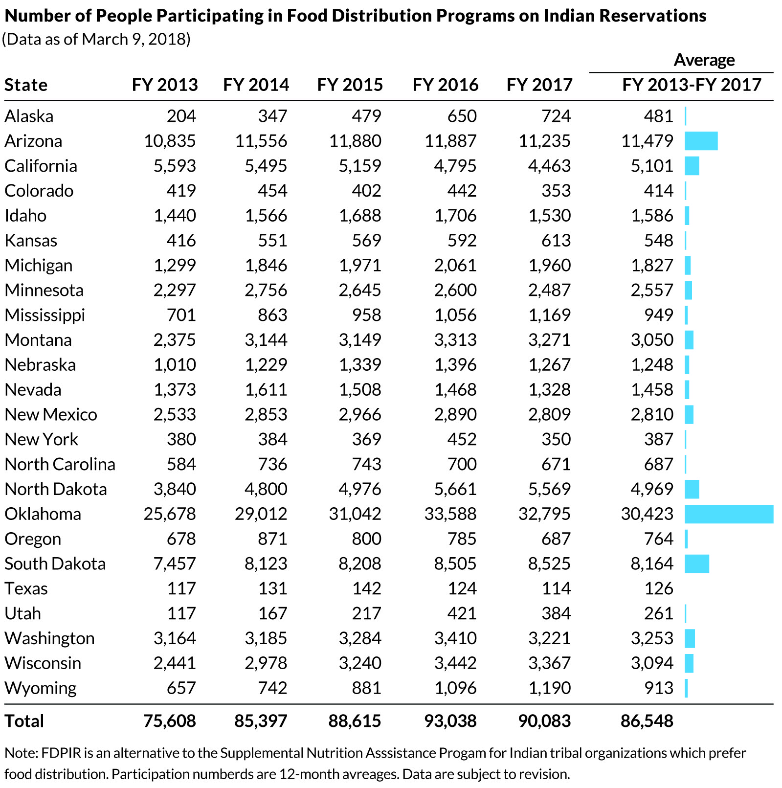
  • Use visualizations for large tables
Afbeelding
Highlights in a table. Via twitter.com/jschwabish/status/1290324966190338049/photo/2
Afbeelding
Visualizations in a table. Via twitter.com/jschwabish/status/1290325409570197509/photo/3
Afbeelding
Example of a well-organized table. Via twitter.com/jschwabish/status/1290325663543627784/photo/2
Best Tech & Programming Talks Ever

Best Tech & Programming Talks Ever

Every now and then, Twitter will offer these golden resources.

Ashley Willis recently asked people to name the best tech talk they’ve ever seen and the results are a resource I don’t want to lose.

Hundreds of people responded, sharing their contenders for the title.

Below, I selected some of the top-rated talks and clustered them accordingly. Click a category to jump to the section.


Big Idea & Programming Meta-Talks

The Future of Programming

Growing a Language

The Mess We’re In

Making Users Awesome

Ethical Dilemmas in Software Engineering


Testing code

Adding Eyes to Your Test Automation Framework

TATFT – Test All The F*cking Time


Language-Specific talks

Concurrency (Python)

How we program multicores (erlang)

Y Not- Adventures in Functional Programming (Ruby)

JavaScript: The Good Parts


Code Design

Core Design Principles for Software Developers

Design Patterns vs Anti pattern in APL


Containers & Kubernetes

The Container Operator’s Manual

Write a Container in Go From Scratch

Container Hacks and Fun Images

Kubernetes and the Path to Serverless

Let’s Build Kubernetes, With a Spreadsheet and Volunteers

Cover image via: https://toggl.com/blog/best-tech-websites