They offer 21 datasets including a range of different data (time series, geospatial, user preferences) on a variety of topics like business, sports, wine, financial stocks, transportation and whatnot.
This is a great starting point if you want to practice your data science, machine learning and analysis skills on real life data!
Maven Analytics provides e-learnings in analysis and programming software. To provide a practical learning experience, their courses are often accompanied by real-life datasets for students to analyze.
In Glad You Asked, Vox dives deep into timely questions around the impact of systemic racism on our communities and in our daily lives.
In this video, they look into the role of tech in societal discrimination. People assume that tech and data are neutral, and we have turned to tech as a way to replace biased human decision-making. But as data-driven systems become a bigger and bigger part of our lives, we see more and more cases where they fail. And, more importantly, that they don’t fail on everyone equally.
Why do we think tech is neutral? How do algorithms become biased? And how can we fix these algorithms before they cause harm? Find out in this mini-doc:
Vincent Warmerdam shared this Youtube video which I thoroughly enjoyed watched. It’s about Saul Pwanson, a software engineer whose hobby project got a little out of hand.
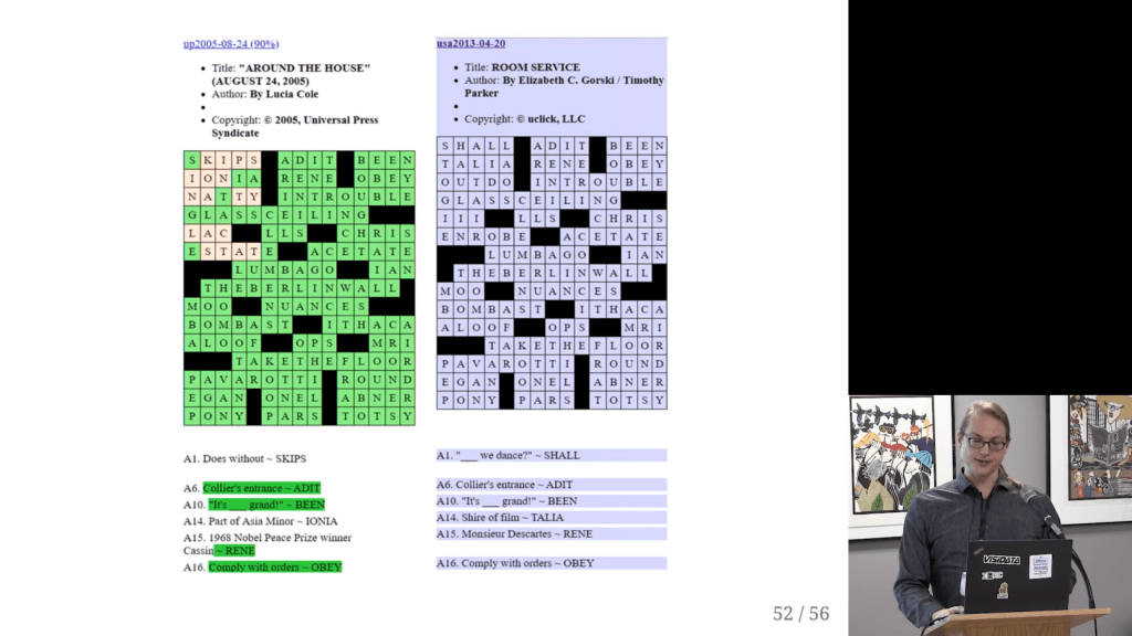
In 2016, Saul Pwanson designed a plain-text file format for crossword puzzle data, and then spent a couple of months building a micro-data-pipeline, scraping tens of thousands of crosswords from various sources.
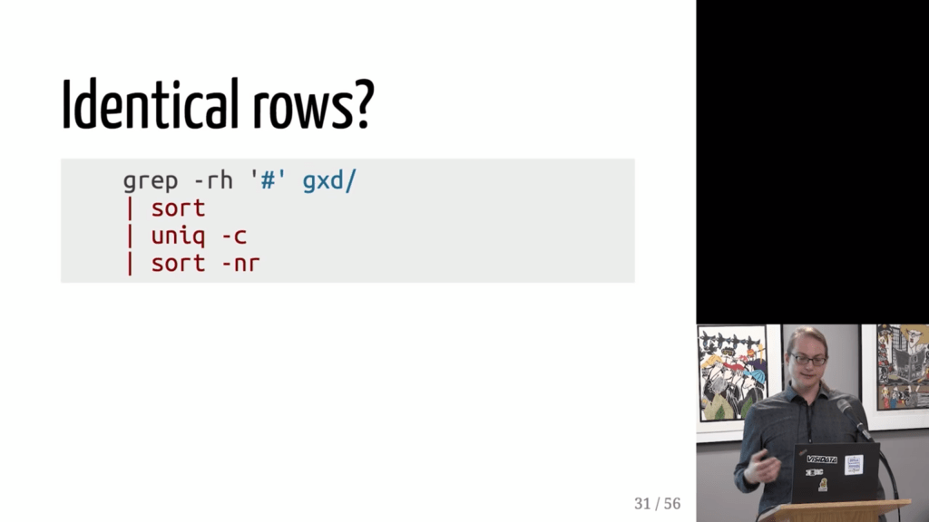
After putting all these crosswords in a simple uniform format, Saul used some simple command line commands to check for common patterns and irregularities.
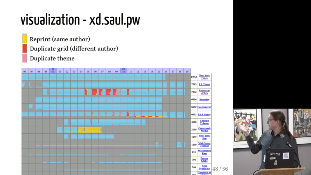
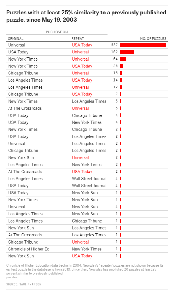
Surprisingly enough, after visualizing the results, Saul discovered egregious plagiarism by a major crossword editor that had gone on for years.
I thoroughly enjoyed watching this talk on Youtube.
Saul covers the file format, data pipeline, and the design choices that aided rapid exploration; the evidence for the scandal, from the initial anomalies to the final damning visualization; and what it’s like for a data project to get 15 minutes of fame.
I tried to localize the dataset online, but it seems Saul’s website has since gone offline. If you do happen to find it, please do share it in the comments!
Update March, 2021: My R package for the predictive power score (ppsr) is live on CRAN! Try install.packages("ppsr") in your R terminal to get the latest version.
A few months ago, I wrote about the Predictive Power Score (PPS): a handy metric to quickly explore and quantify the relationships in a dataset.
As a social scientist, I was taught to use a correlation matrix to describe the relationships in a dataset. Yet, in my opinion, the PPS provides three handy advantages:
PPS works for any type of data, also nominal/categorical variables
PPS quantifies non-linear relationships between variables
PPS acknowledges the asymmetry of those relationships
# You can get the official version from CRAN:
install.packages("ppsr")

## Or you can get the development version from GitHub:
# install.packages('devtools')
# devtools::install_github('https://github.com/paulvanderlaken/ppsr')
Usage
The ppsr package has three main functions that compute PPS:
score() – which computes an x-y PPS
score_predictors() – which computes X-y PPS
score_matrix() – which computes X-Y PPS
Visualizing PPS
Subsequently, there are two main functions that wrap around these computational functions to help you visualize your PPS using ggplot2:
visualize_predictors() – producing a barplot of all X-y PPS
visualize_matrix() – producing a heatmap of all X-Y PPS
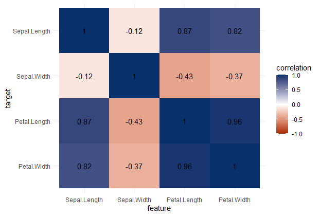
PPS matrix for iris
Note that Species is a nominal/categorical variable, with three character/text options.
A correlation matrix would not be able to show us that the type of iris Species can be predicted extremely well by the petal length and width, and somewhat by the sepal length and width. Yet, particularly sepal width is not easily predicted by the type of species.
Correlation matrix for iris
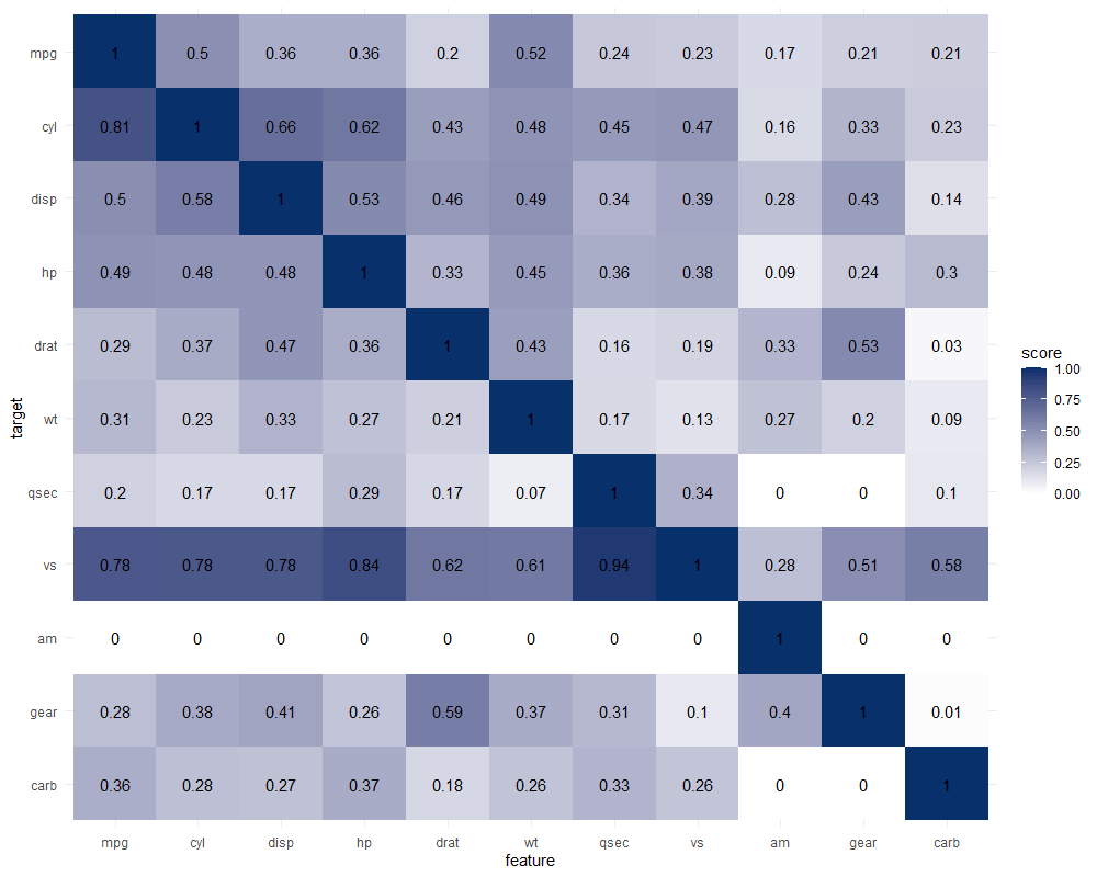
Exploring mtcars
It takes about 10 seconds to run 121 decision trees with visualize_matrix(mtcars). Yet, the output is much more informative than the correlation matrix:
cyl can be much better predicted by mpg than the other way around
the classification of vs can be done well using nearly all variables as predictors, except for am
yet, it’s hard to predict anything based on the vs classification
a cars’ am can’t be predicted at all using these variables
PPS matrix for mtcars
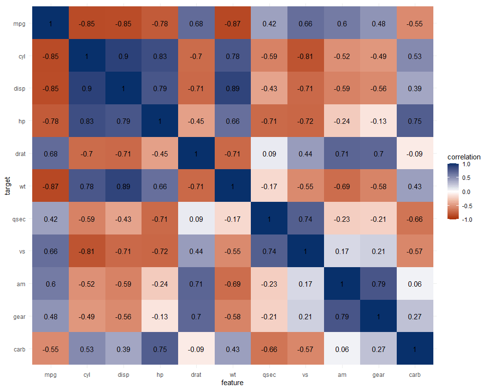
The correlation matrix does provides insights that are not provided by the PPS matrix. Most importantly, the sign and strength of any linear relationship that may exist. For instance, we can deduce that mpg relates strongly negatively with cyl.
Yet, even though half of the matrix does not provide any additional information (due to the symmetry), I still find it hard to derive the most important relations and insights at a first glance.
Moreover, the rows and columns for vs and am are not very informative in this correlation matrix as it contains pearson correlations coefficients by default, whereas vs and am are binary variables. The same can be said for cyl, gear and carb, which contain ordinal categories / integer data, so you can discuss the value of these coefficients depicted here.
Correlation matrix for mtcars
Exploring trees
In R, there are many datasets built in via the datasets package. Let’s explore some using the ppsr::visualize_matrix() function.
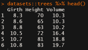
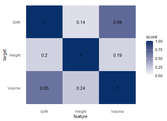
datasets::trees has data on 31 trees’ girth, height and volume.
visualize_matrix(datasets::trees) shows that both girth and volume can be used to predict the other quite well, but not perfectly.
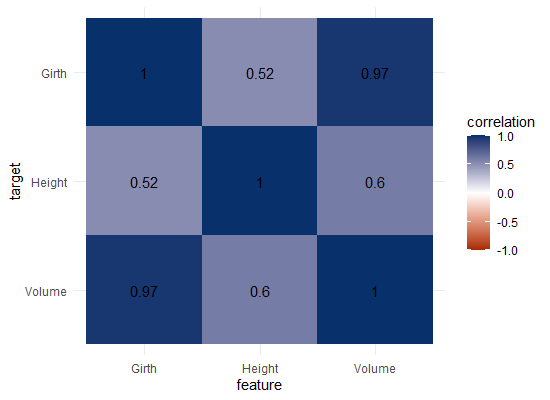
Let’s have a look at the correlation matrix.
The scores here seem quite higher in general. A near perfect correlation between volume and girth.
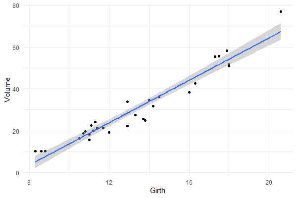
Is it near perfect though? Let’s have a look at the underlying data and fit a linear model to it.
You will still be pretty far off the real values when you use a linear model based on Girth to predict Volume. This is what the original PPS of 0.65 tried to convey.
Actually, I’ve run the math for this linaer model and the RMSE is still 4.11. Using just the mean Volume as a prediction of Volume will result in 16.17 RMSE. If we map these RMSE values on a linear scale from 0 to 1, we would get the PPS of our linear model, which is about 0.75.
So, actually, the linear model is a better predictor than the decision tree that is used as a default in the ppsr package. That was used to generate the PPS matrix above.
Yet, the linear model definitely does not provide a perfect prediction, even though the correlation may be near perfect.
Conclusion
In sum, I feel using the general idea behind PPS can be very useful for data exploration.
Particularly in more data science / machine learning type of projects. The PPS can provide a quick survey of which targets can be predicted using which features, potentially with more complex than just linear patterns.
Yet, the old-school correlation matrix also still provides unique and valuable insights that the PPS matrix does not. So I do not consider the PPS so much an alternative, as much as a complement in the toolkit of the data scientist & researcher.
Enjoy the R package, or the Python module for that matter, and let me know if you see any improvements!
As a company that uses a lot of automation, optimization, and machine learning in their day-to-day business, Google is set on developing AI in a socially responsible way.
Fortunately for us, Google decided to share their principles and best practices for us to read.