Those who have been following me for some time now will know that I am a big fan of generative art: art created through computers, mathematics, and algorithms.
Several years back, my now wife bought me my first piece for my promotion, by Marcus Volz.
Nicholas was hesistant to sell me a piece and insisted that this series was not finished yet.
Yet, I already found it wonderful and lovely to look at and after begging Nicholas to sell us one of his early pieces, I sent it over to ixxi to have it printed and hanged it on our wall above our dinner table.
If you’re interested in Nicholas’ work, have a look at c82.net
This blog highlights a recent PNAS paper in which 457 data scientists and academic scholars were challenged use machine learning to predict life outcomes using a rich dataset.
Yet, I can not summarize the result better than this tweet by the author of the paper:
If hundreds of scientists created predictive algorithms with high-quality data, how well would the best predict life outcomes? Not very well. Fragile Families Challenge: paper in PNAS w 112 authors https://t.co/WxDJbw0joz & Special Collection of Socius https://t.co/WM9f4oYaABpic.twitter.com/ZPFChD79VR
Over 750 scientific papers have used the Fragile Families dataset.
The dataset is famous for its richness of cohort (survey) data on the included families’ lives and their childrens’ upbringings. It includes a whopping 12.942 variables!!
Some of these variables reflect interesting life outcomes of the included families.
For instance, the childrens’ grade point averages (GPA) and grit, but also whether the family was ever evicted or experienced hardship, or whether their primary caregiver had received job training or was laid off at work.
You can read more about the exact data contents in the paper’s appendix.
Now Matthew and his co-authors shared this enormous dataset with over 160 teams consisting of 457 academics researchers and data scientists alike. Each of them well versed in statistics and predictive modelling.
These data scientists were challenged with this task: by all means possible, make the most predictive model for the six life outcomes (i.e., GPA, conviction, etc).
The scientists could use all the Fragile Families data, and any algorithm they liked, and their final model and its predictions would be compared against the actual life outcomes in a holdout sample.
According to the paper, many of these teams used machine-learning methods that are not typically used in social science research and that explicitly seek to maximize predictive accuracy.
Now, here’s the summary again:
If hundreds of [data] scientists created predictive algorithms with high-quality data, how well would the best predict life outcomes?
Not very well.
@msalganik
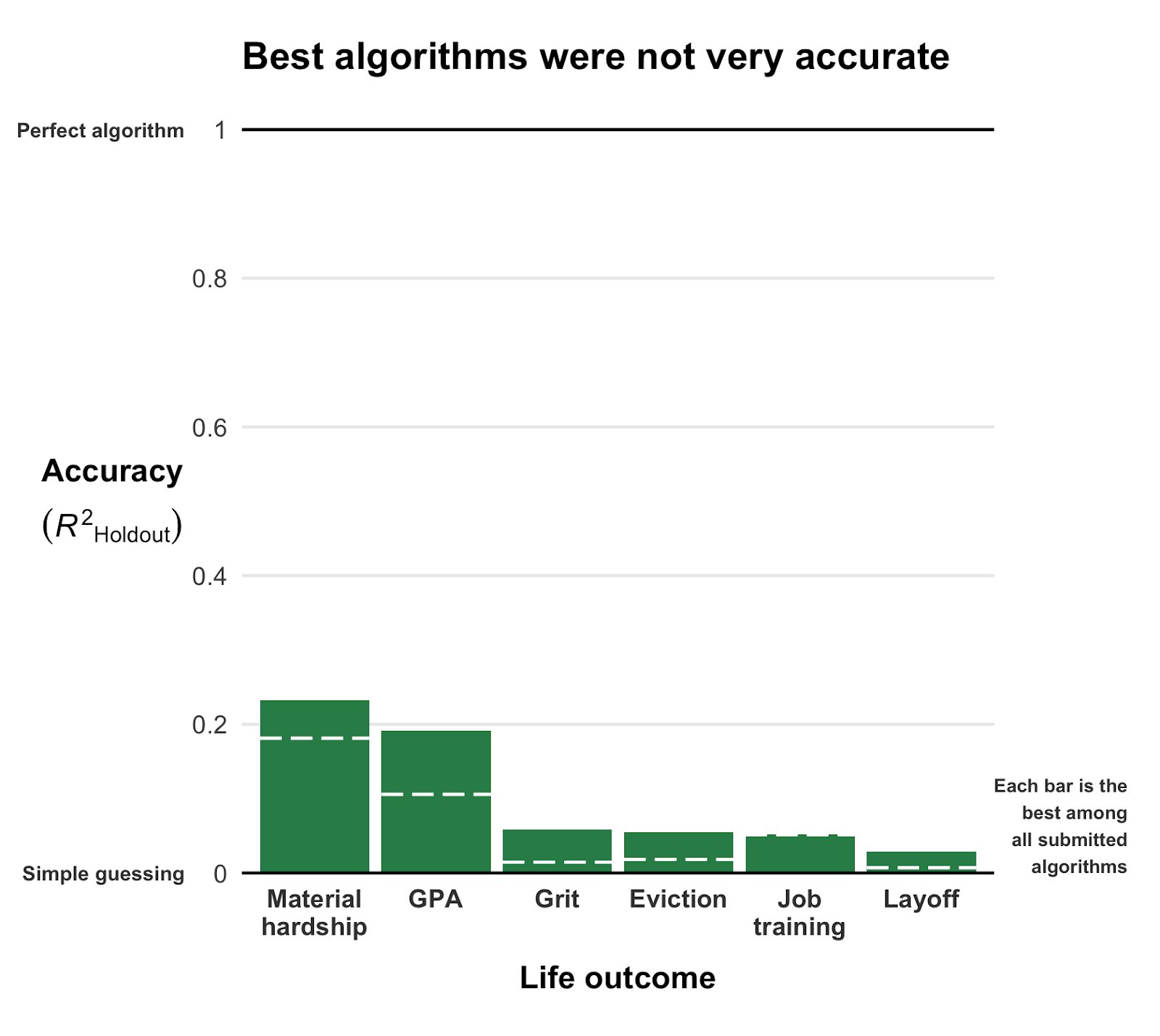
Even the best among the 160 teams’ predictions showed disappointing resemblance of the actual life outcomes. None of the trained models/algorithms achieved an R-squared of over 0.25.
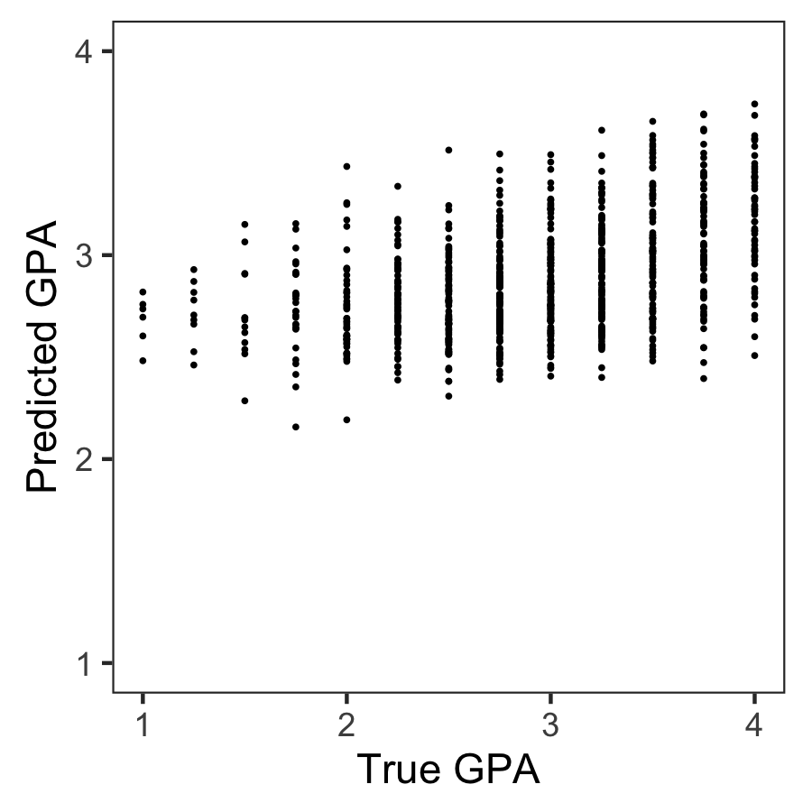
Wondering what these best R-squared of around 0.20 look like? Here’s the disappointg reality of plot C enlarged: the actual TRUE GPA’s on the x-axis, plotted against the best team’s predicted GPA’s on the y-axis.
Sure, there’s some relationship, with higher actual scores getting higher (average) predictions. But it ain’t much.
Moreover, there’s very little variation in the predictions. They all clump together between the range of about 2.1 and 3.8… that’s not really setting apart the geniuses from the less bright!
Matthew sums up the implications quite nicely in one of his tweets:
For policymakers deploying predictive algorithms in high-stakes decisions, our result is a reminder of a basic fact: one should not assume that algorithms predict well. That must be demonstrated with transparent, empirical evidence.
According to Matthew this “collective failure of 160 teams” is hard to ignore. And it failure highlights the understanding vs. predicting paradox: these data have been used to generate knowledge on how the world works in over 750 papers, yet few checked to see whether these same data and the scientific models would be useful to predict the life outcomes we’re trying to understand.
I was super excited to read this paper and I love the approach. It is actually quite closely linked to a series of papers I have been working on with Brian Spisak and Brian Doornenbal on trying to predict which people will emerge as organizational leaders. (hint: we could not really, at least not based on their personality)
Apparently, others were as excited as I am about this paper, as Filiz Garip already published a commentary paper on this research piece. Unfortunately, it’s behind a paywall so I haven’t read it yet.
Moreover, if you want to learn more about the approaches the 160 data science teams took in modelling these life outcomes, here are twelve papers in which some teams share their attempts.
Very curious to hear what you think of the paper and its implications. You can access it here, and I’d love to read your comments below.
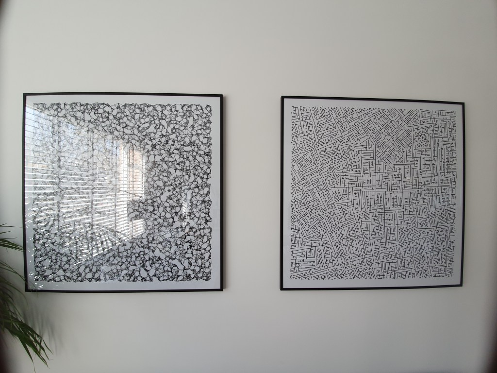
I really like generative art, or so-called algorithmic art. Basically, it means you take a pattern or a complex system of rules, and apply it to create something new following those patterns/rules.
When I finished my PhD, I got a beautiful poster of where the k-nearest neighbors algorithms was used to generate a set of connected points.
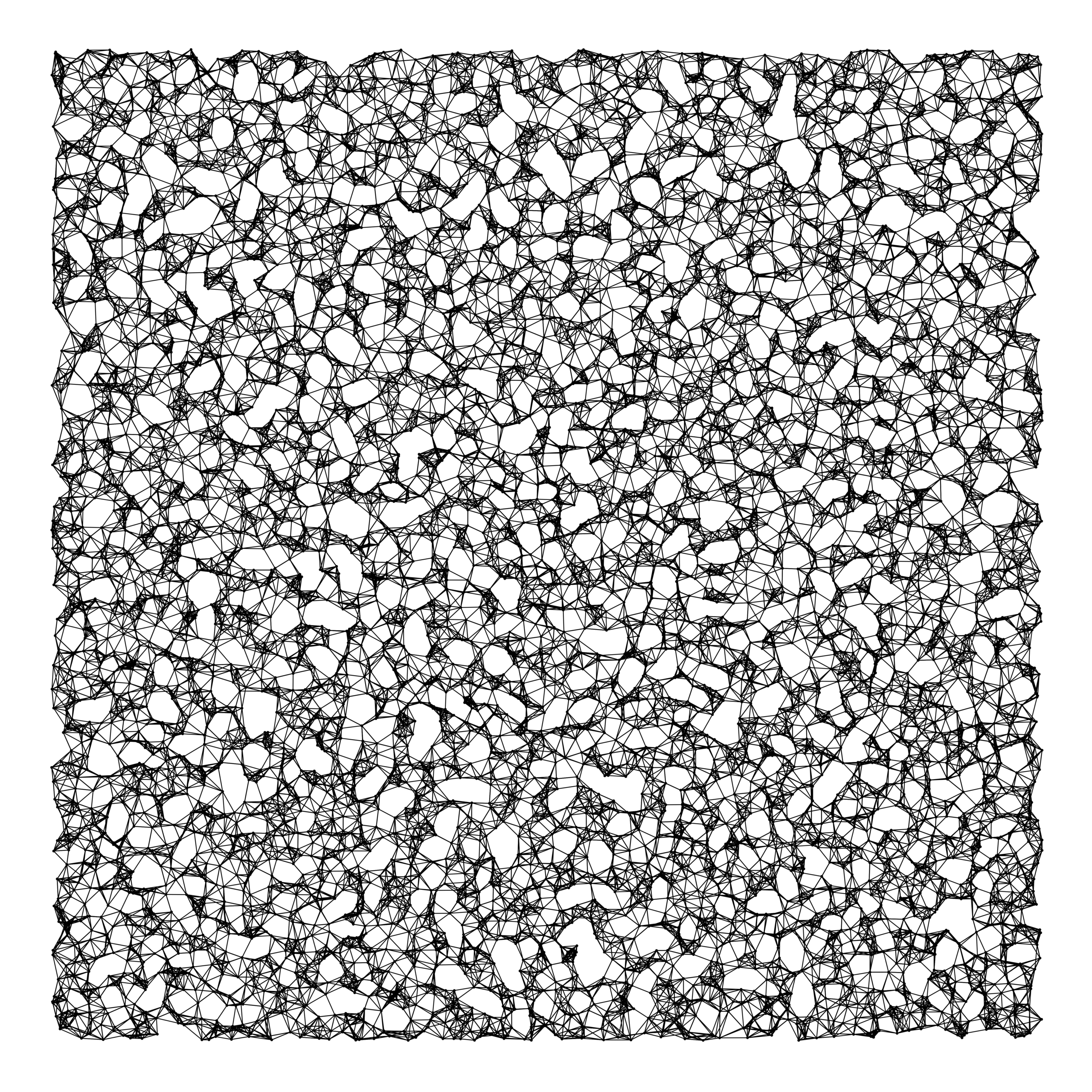
As we recently moved into our new house, I decided I wanted to have a brother for the knn-poster. So I did some research in algorithms I wanted to use to generate a painting. I found some very cool ones, of which I unforunately can’t recollect the artists anymore:
Note: these are NOT mine
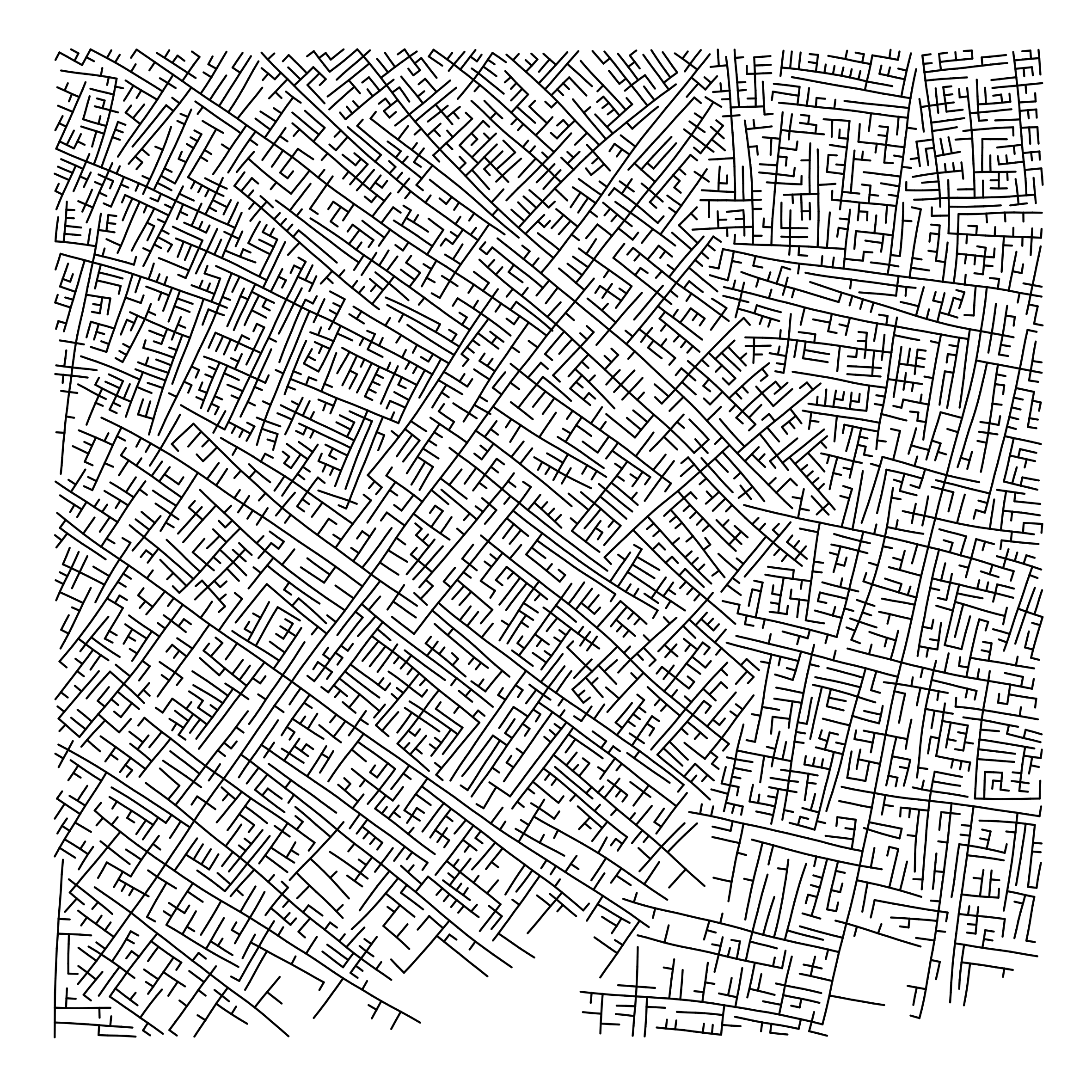
However, I preferred to make one myself. So we again turned to the work of the author that made the knn-poster: Marcus Volz.
He has written (in R) many other algorithms. And we found that one specifically nicely matched the knn-poster. His metropolis – or generative city:
However, I wanted to make one myself, so I download Marcus code, and tweaked it a bit. Most importantly, I made it start in the center, made it fill up the whole space, and I made it run more efficient so I could generate a couple dozen large cities quickly, and pick the one I liked most. Here’s the end result:
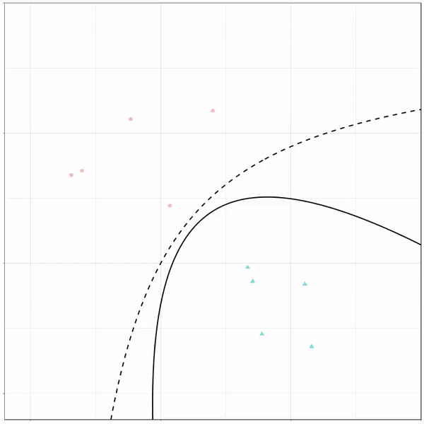
Ryan Holbrook made awesome animated GIFs in R of several classifiers learning a decision rule boundary between two classes. Basically, what you see is a machine learning model in action, learning how to distinguish data of two classes, say cats and dogs, using some X and Y variables.
These visuals can be great to understand these algorithms, the models, and their learning process a bit better.
Here’s the original tweet, with the logistic regression animation. If you follow it, you will find a whole thread of classifier GIFs. These I extracted, pasted, and explained below.
A thread of classifiers learning a decision rule. Dashed line is optimal boundary. Animations with #gganimate by @thomasp85 and @drob. #rstats
Logistic regression {stats::glm} with each class having normally distributed features. (1/n) pic.twitter.com/kKmqdO2zGy
Below is the GIF which I extracted using EZgif.com.
What you see is observations from two classes, say cats and dogs, each represented using colored dots. The dots are placed along X and Y axes, which represent variables about the observations. Their tail lengths and their hairyness, for instance.
Now there’s an optimal way to seperate these classes, which is the dashed line. That line best seperates the cats from the dogs based on these two variables X and Y. As this is an optimal boundary given this data, it is stable, it does not change.
However, there’s also a solid black line, which does change. This line represents the learned boundary by the machine learning model, in this case using logistic regression. As the model is shown more data, it learns, and the boundary is updated. This learned boundary represents the best line with which the model has learned to seperate cats from dogs.
Anything above the boundary is predicted to be class 1, a dog. Everything below predicted to be class 2, a cat. As logistic regression results in a linear model, the seperation boundary is very much linear/straight.
Logistic regression gif by Ryan Holbrook
These animations are great to get a sense of how the models come to their boundaries in the back-end.
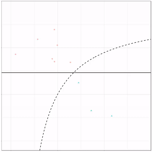
For instance, other machine learning models are able to use non-linear boundaries to dinstinguish classes, such as this quadratic discriminant analysis (qda). This “learned” boundary is much closer to the optimal boundary:
Quadratic discriminant analysis gif by Ryan Holbrook
Multivariate adaptive regression splines gif by Ryan Holbrook
Next, we have the k-nearest neighbors algorithm, which predicts for each point (animal) the class (cat/dog) based on the “k” points closest to it. As you see, this results in a highly fluctuating, localized boundary.
K-nearest neighbors gif by Ryan Holbrook
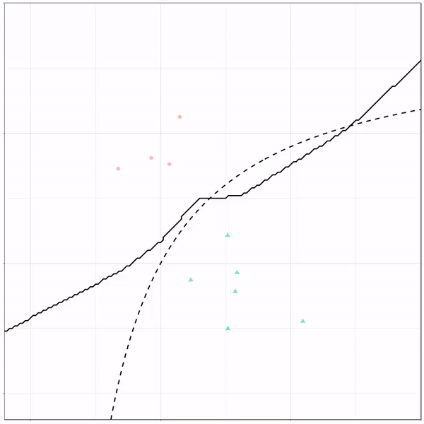
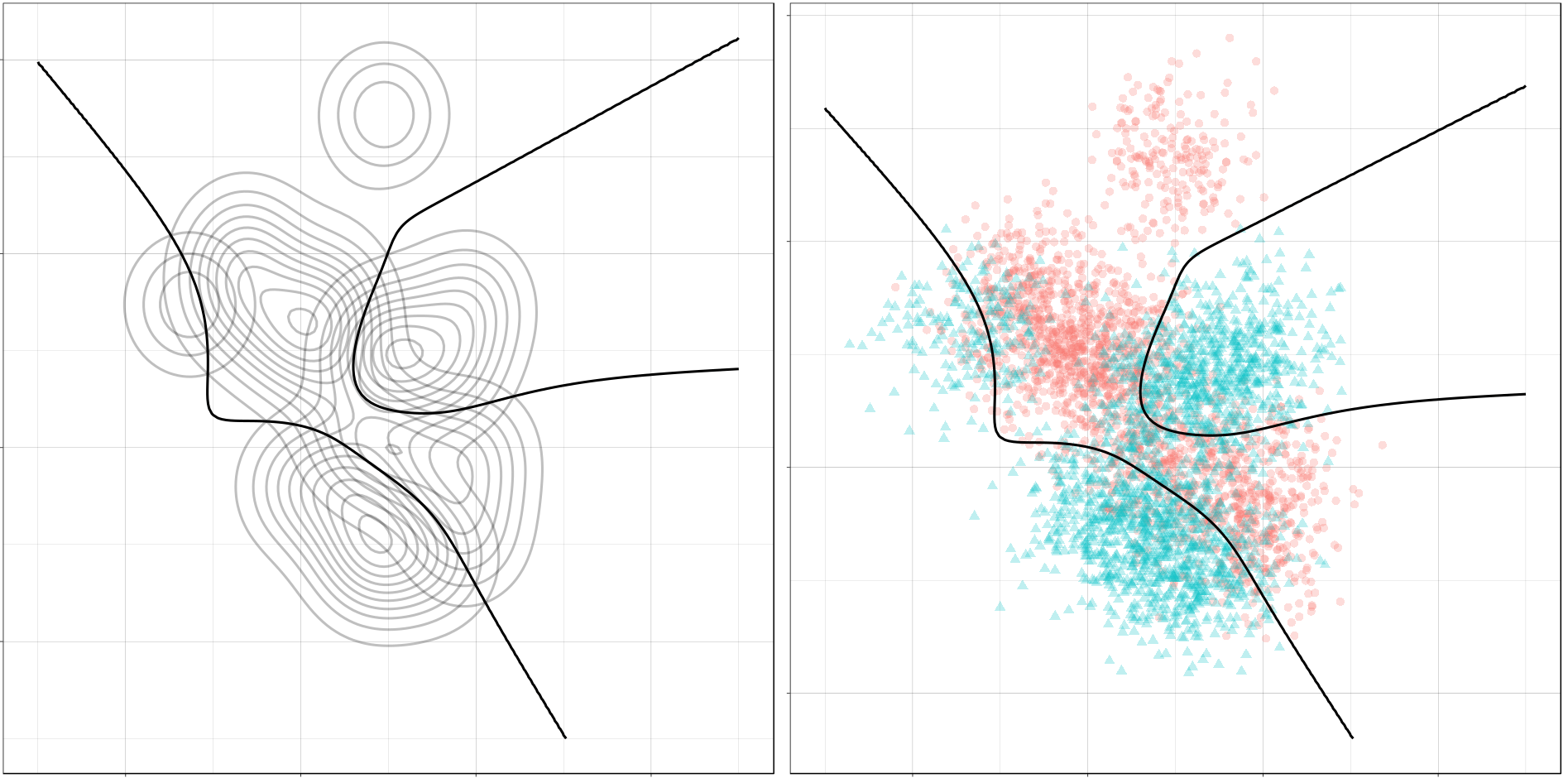
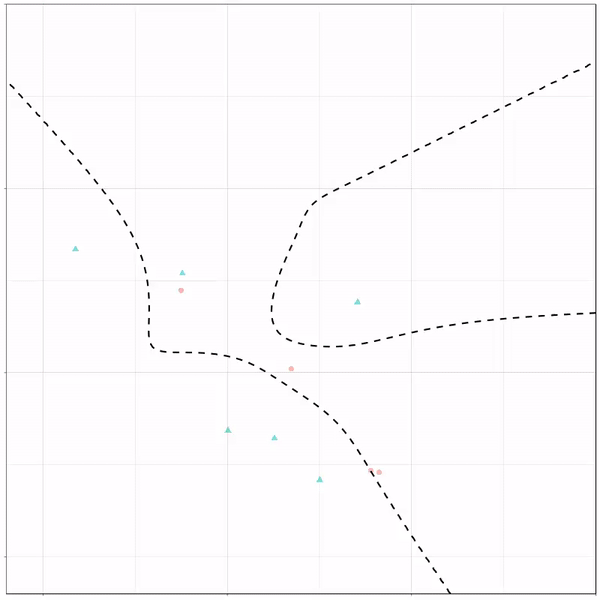
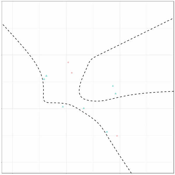
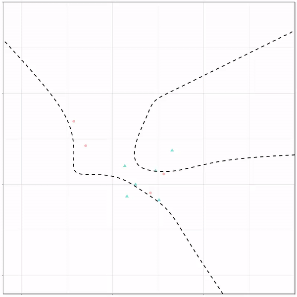
Now, Ryan decided to push the challenge, and simulate new data for two classes with a more difficult decision boundary. The new data and optimal boundaries look like this:
On these data, Ryan put a whole range of non-linear models to work.
Like this support-vector machine, which tries to create optimal boundaries built of support vectors around all the cats and all the dohs (this is definitely not a technical, error-free explanation of what’s happening here).
Let’s jump into some tree-based algorithms and the resulting models. A decision tree classifies data based on multiple, sequential, binary splits. Here, Ryan trained a simple decision tree:
Decision tree gif by Ryan Holbrook
As well as it’s big brother, a random forest, which uses hundreds of trees in the back end and thus results in a more flexible boundary:
Random forest gif by Ryan Holbrook
Extreme gradient boosting is also a tree-based algorithm, which leverages many machine learning techniques to optimize the bias-variance tradeoff. Here’s an earlier blog on how to get started with Xgboost in Python or R:
I found this interesting blog by Guilherme Duarte Marmerola where he shows how the predictions of algorithmic models (such as gradient boosted machines, or random forests) can be calibrated by stacking a logistic regression model on top of it: by using the predicted leaves of the algorithmic model as features / inputs in a subsequent logistic model.
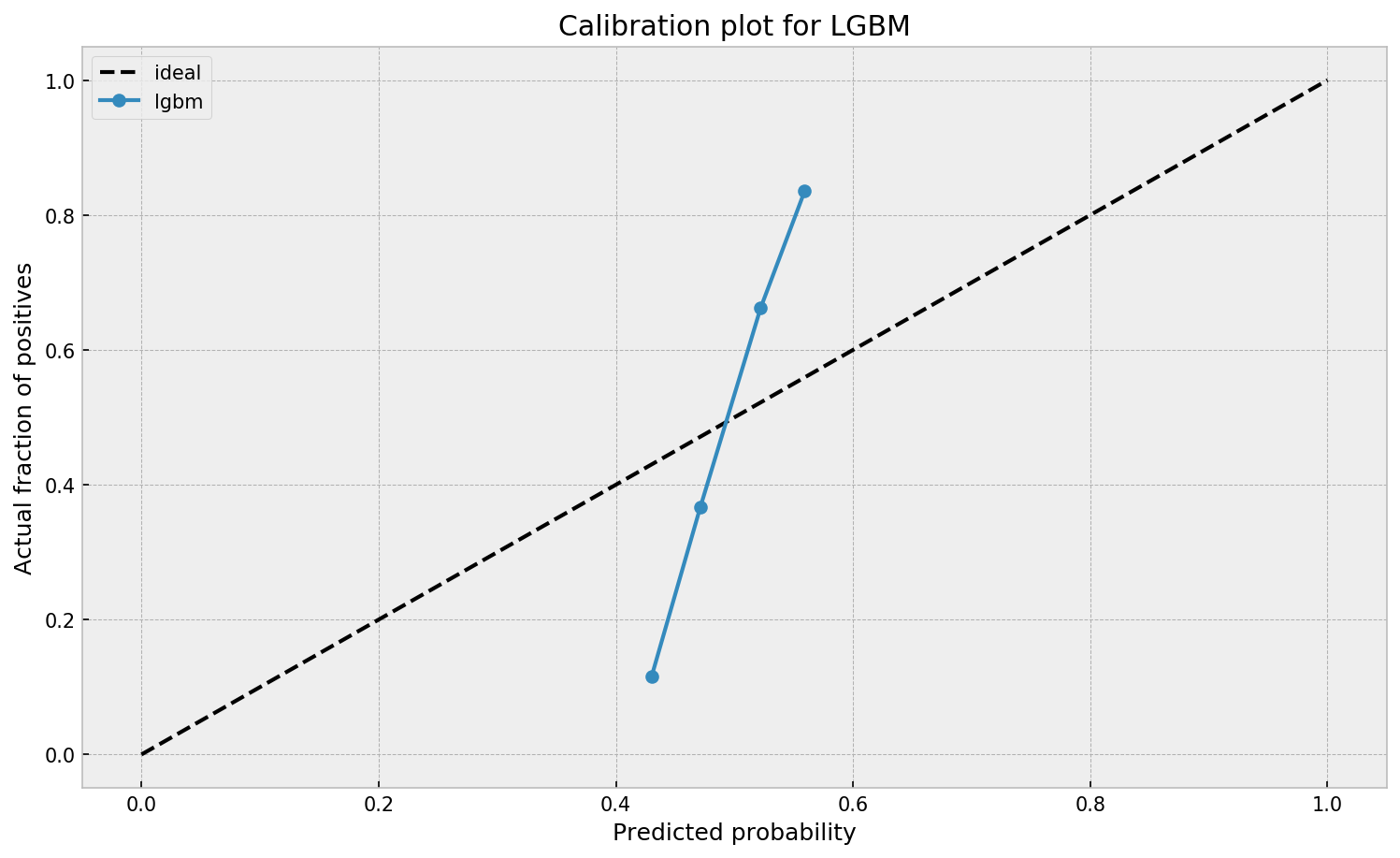
When working with ML models such as GBMs, RFs, SVMs or kNNs (any one that is not a logistic regression) we can observe a pattern that is intriguing: the probabilities that the model outputs do not correspond to the real fraction of positives we see in real life.
This is visible in the predictions of the light gradient boosted machine (LGBM) Guilherme trained: its predictions range only between ~ 0.45 and ~ 0.55. In contrast, the actual fraction of positive observations in those groups is much lower or higher (ranging from ~ 0.10 to ~0.85).
I highly recommend you look at Guilherme’s code to see for yourself what’s happening behind the scenes, but basically it’s this:
Train an algorithmic model (e.g., GBM) using your regular features (data)
Retrieve the probabilities GBM predicts
Retrieve the leaves (end-nodes) in which the GBM sorts the observations
Turn the array of leaves into a matrix of (one-hot-encoded) features, showing for each observation which leave it ended up in (1) and which not (many 0’s)
Basically, until now, you have used the GBM to reduce the original features to a new, one-hot-encoded matrix of binary features
Now you can use that matrix of new features as input for a logistic regression model predicting your target (Y) variable
Apparently, those logistic regression predictions will show a greater spread of probabilities with the same or better accuracy
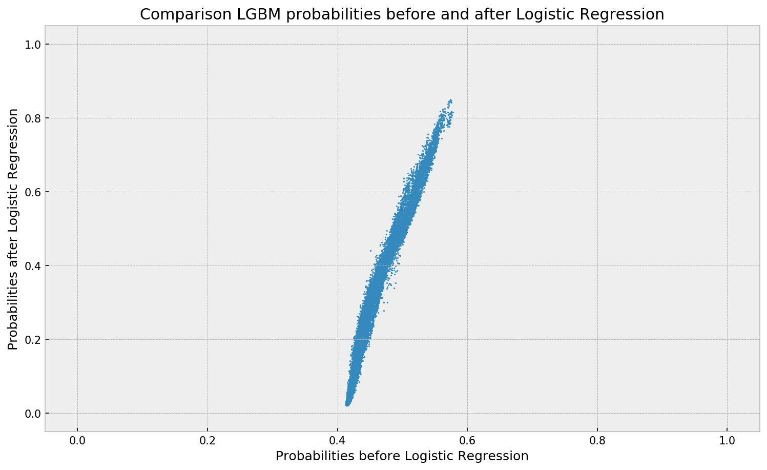
Here’s a visual depiction from Guilherme’s blog, with the original GBM predictions on the X-axis, and the new logistic predictions on the Y-axis.
As you can see, you retain roughly the same ordering, but the logistic regression probabilities spread is much larger.
Now according to Guilherme and the Facebook paper he refers to, the accuracy of the logistic predictions should not be less than those of the original algorithmic method.
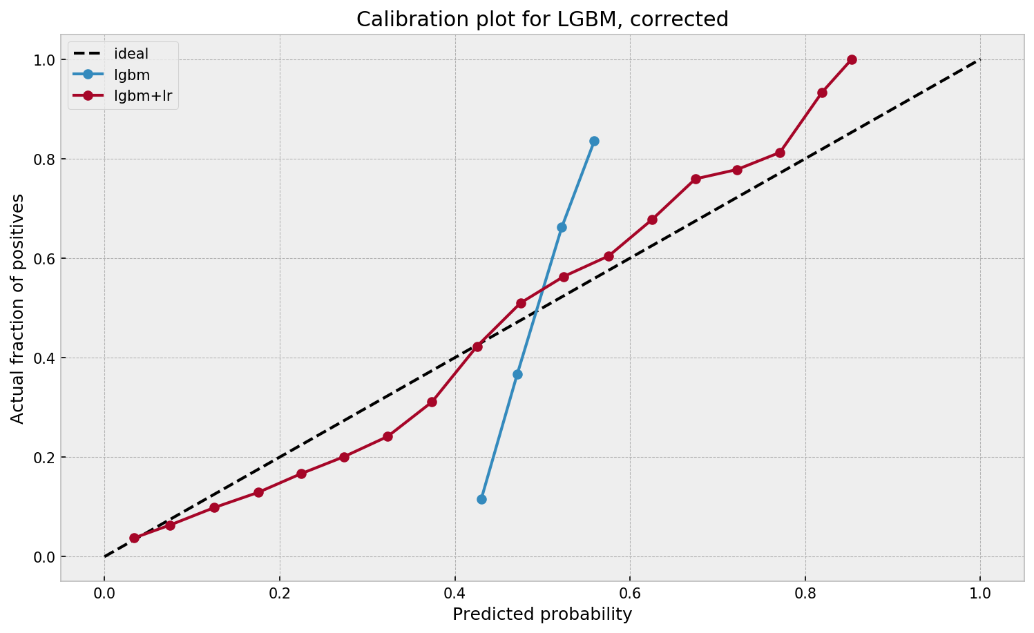
Much better. The calibration plot of lgbm+lr is much closer to the ideal. Now, when the model tells us that the probability of success is 60%, we can actually be much more confident that this is the true fraction of success! Let us now try this with the ET model.
In his blog, Guilherme shows the same process visually for an Extremely Randomized Trees model, so I highly recommend you read the original article. Also, you can find the complete code on his GitHub.
I came across this 1999-2003 e-book by Eric Raymond, on the Art of Unix Programming. It contains several relevant overviews of the basic principles behind the Unix philosophy, which are probably useful for anybody working in hardware, software, or other algoritmic design.