Kevin Markham shares his tips and tricks for the most common data handling tasks on twitter. He compiled the top 100 in this one amazing overview page. Find the hyperlinks to specific sections below!
🐼🤹♂️ pandas trick:
Want to plot a DataFrame? It's as easy as: df.plot(kind='…')
You can use: line 📈 bar 📊 barh hist box 📦 kde area scatter hexbin pie 🥧
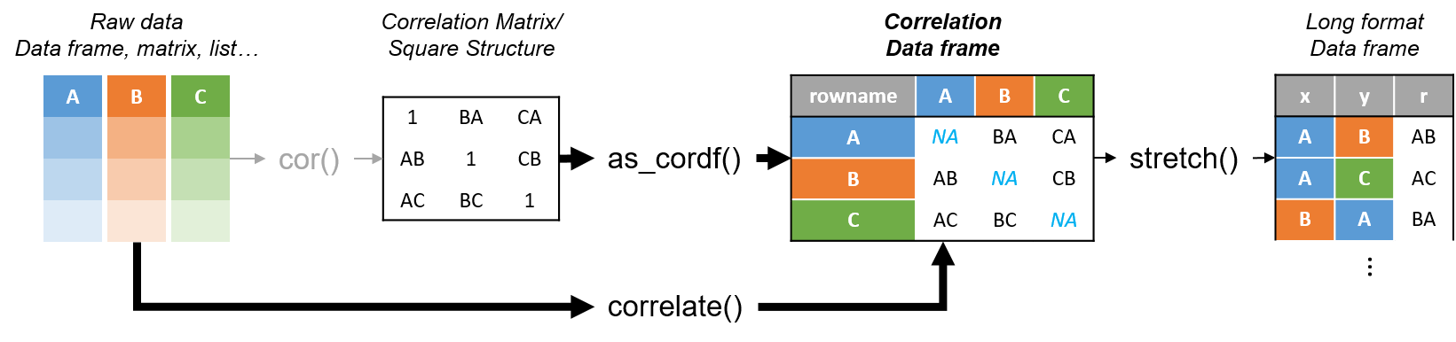
R’s standard correlation functionality (base::cor) seems very impractical to the new programmer: it returns a matrix and has some pretty shitty defaults it seems. Simon Jackson thought the same so he wrote a tidyverse-compatible new package: corrr!
Simon wrote some practical R code that has helped me out greatly before (e.g., color palette’s), but this new package is just great. He provides an elaborate walkthrough on his own blog, which I can highly recommend, but I copied some teasers below.
Diagram showing how the new functionality of corrr works.
Apart from corrr::correlate to retrieve a correlation data frame and corrr::stretch to turn that data frame into a long format, the new package includes corrr::focus, which can be used to simulteneously select the columns and filter the rows of the variables focused on. For example:
# install.packages("tidyverse")
library(tidyverse)

# install.packages("corrr")
library(corrr)

# install.packages("here")
library(here)

dir.create(here::here("images")) # create an images directory

mtcars %>%
  corrr::correlate() %>%
  # use mirror = TRUE to not only select columns but also filter rows
  corrr::focus(mpg:hp, mirror = TRUE) %>%
  corrr::network_plot(colors = c("red", "green")) %>%
  ggplot2::ggsave(
    filename = here::here("images", "mtcars_networkplot.png"),
    width = 5,
    height = 5
    )
With corrr::networkplot you get an immediate sense of the relationships in your data.
Let’s try some different visualizations:
mtcars %>%
  corrr::correlate() %>%
  corrr::focus(mpg) %>%
  dplyr::mutate(rowname = reorder(rowname, mpg)) %>%
  ggplot2::ggplot(ggplot2::aes(rowname, mpg)) +
  # color each bar based on the direction of the correlation
  ggplot2::geom_col(ggplot2::aes(fill = mpg >= 0)) +
  ggplot2::coord_flip() +
  ggplot2::ggsave(
    filename = here::here("images", "mtcars_mpg-barplot.png"),
    width = 5,
    height = 5
  )
The tidy correlation data frames can be easily piped into a ggplot2 function call
corrr also provides some very helpful functionality display correlations. Take, for instance, corrr::fashion and corrr::shave:
mtcars %>%
  corrr::correlate() %>%
  corrr::focus(mpg:hp, mirror = TRUE) %>%
  # converts the upper triangle (default) to missing values
  corrr::shave() %>%
  # converts a correlation df into clean matrix
  corrr::fashion() %>%
  readr::write_excel_csv(here::here("correlation-matrix.csv"))
Exporting a nice looking correlation matrix has never been this easy.
Finally, there is the great function of corrr::rplot to generate an amazing correlation overview visual in a wingle line. However, here it is combined with corr::rearrange to make sure that closely related variables are actually closely located on the axis, and again the upper half is shaved away:
Generate fantastic single-line correlation overviews with <code>corrr::rplot</code>
For some more functionalities, please visit Simon’s blog and/or the associated GitHub page. If you copy the code above and play around with it, be sure to work in an Rproject else the here::here() functions might misbehave.