There are many tools to connect virtually with your coworkers. Think of Teams, Zoom, Google Meet, or Slack. And during the recent pandemic, we have seen their usage surge. Yet, most of these tools try to recreating the office experience using video conference calls.
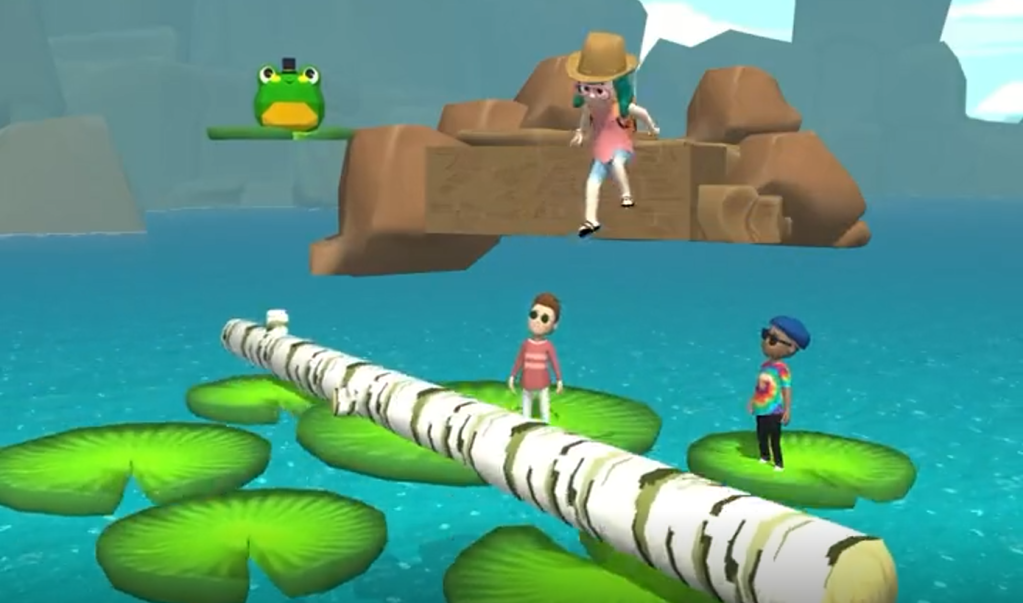
At Shopify, Daniel Beauchamp and his team took a different approach. They created SHOPIFY PARTY: a fullblown virtual world designed for social play and hanging out.
We built an internal game at Shopify to make virtual hangouts more fun. It’s called Shopify Party, and I’d love to tell you all about it 👇🏻 [1/6] pic.twitter.com/DwzxwWty3V
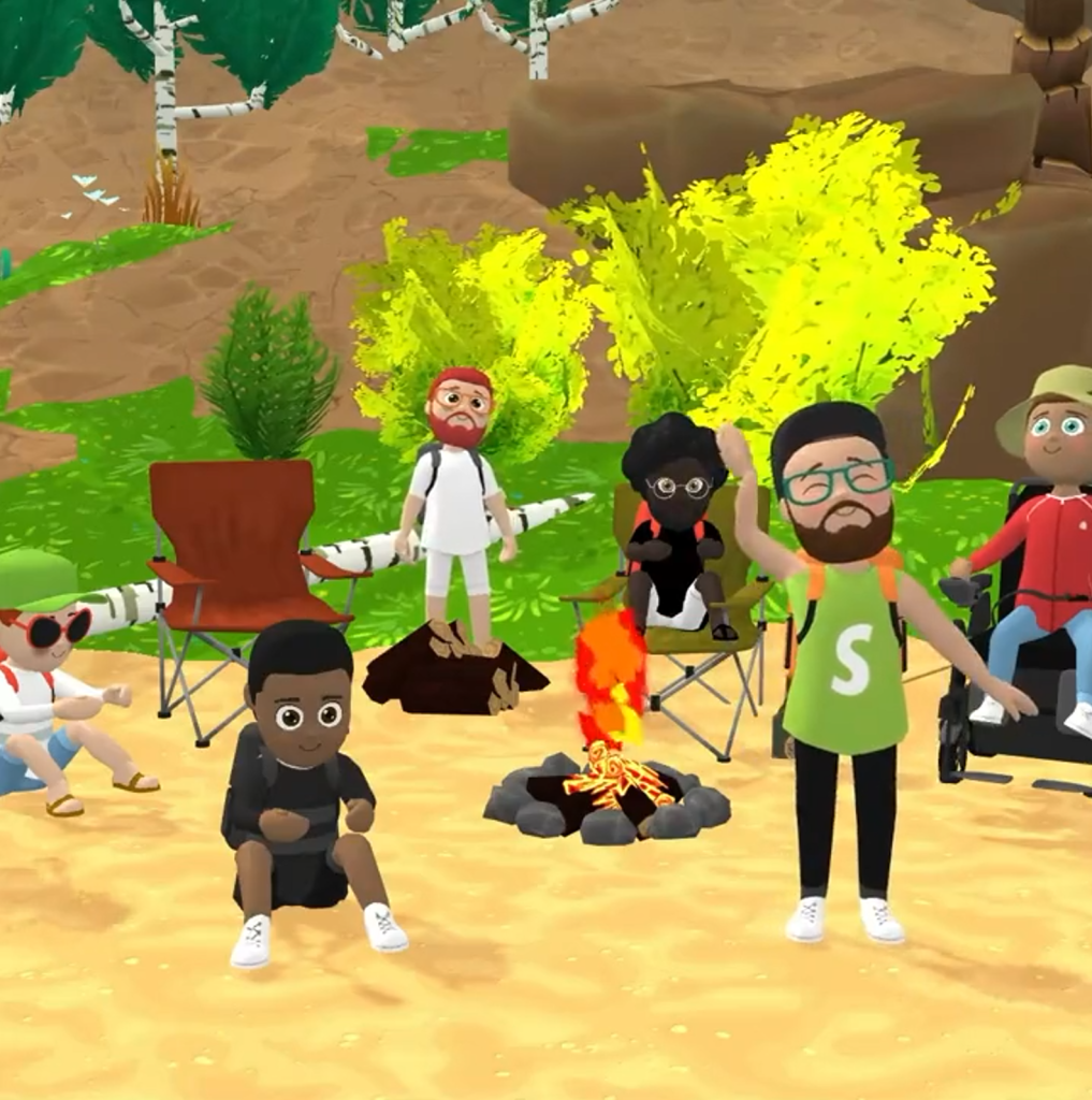
Here, Shopify employees can now play games during their 1:1s, standups, and other team events. They can hold boat races, log jumps, dance contests, exploration hikes, or just chill with their coworkers by a virtual campfire.
This must provide an incredible boost for the employee experience, well-being, and for forming workplace relationships in general!
The virtual environment is created in Unity and runs right in the webbrowser through use of WebGL.
A few years back I completed my dissertation on data-driven Human Resource Management.
This specialized field is often dubbed HR analytics, for basically it’s the application of analytics to the topic of human resources.
Yet, as always in a specialized and hyped field, diifferent names started to emerge. The term People analytics arose, as did Workforce analytics, Talent analytics, and many others.
I addressed this topic in the introduction to my Ph.D. thesis and because I love data visualization, I decided to make a visual to go along with it.
So I gathered some Google Trends data, added a nice locally smoothed curve through it, and there you have it. As the original visual was so well received that it was even cited in this great handbook on HR analytics. With almost three years passed now, I decided it was time for an update. So here’s the 2021 version.
If you would compare this to the previous version, the trends look quite different. In the previous version, People Analytics had the dominant term since 2011 already.
Unfortunately, that’s not something I can help. Google indexes these search interest ratings behind the scenes, and every year or so, they change how they are calculated.
In my dissertation, I wrote the following on the topic:
This process of internally examining the impact of HRM activities goes by many different labels. Contemporary popular labels include people analytics (e.g., Green, 2017; Kane, 2015), HR analytics (e.g., Lawler, Levenson, & Boudreau, 2004; Levenson, 2005; Rasmussen & Ulrich, 2015; Paauwe & Farndale, 2017), workforce analytics (e.g., Carlson & Kavanagh, 2018; Hota & Ghosh, 2013; Simón & Ferreiro, 2017), talent analytics (e.g., Bersin, 2012; Davenport, Harris, & Shapiro, 2010), and human capital analytics (e.g., Andersen, 2017; Minbaeva, 2017a, 2017b; Levenson & Fink, 2017; Schiemann, Seibert, & Blankenship, 2017). Other variations including metrics or reporting are also common (Falletta, 2014) but there is consensus that these differ from the analytics-labels (Cascio & Boudreau, 2010; Lawler, Levenson, & Boudreau, 2004). While HR metrics would refer to descriptive statistics on a single construct, analytics involves exploring and quantifying relationships between multiple constructs.
Yet, even within analytics, a large variety of labels is used interchangeably. For instance, the label people analytics is favored in most countries globally, except for mainland Europe and India where HR analytics is used most (Google Trends, 2018). While human capital analytics seems to refer to the exact same concept, it is used almost exclusively in scientific discourse. Some argue that the lack of clear terminology is because of the emerging nature of the field (Marler & Boudreau, 2017). Others argue that differences beyond semantics exist, for instance, in terms of the accountabilities the labels suggest, and the connotations they invoke (Van den Heuvel & Bondarouk, 2017). In practice, HR, human capital, and people analytics are frequently used to refer to analytical projects covering the entire range of HRM themes whereas workforce and talent analytics are commonly used with more narrow scopes in mind: respectively (strategic) workforce planning initiatives and analytical projects in recruitment, selection, and development. Throughout this dissertation, I will stick to the label people analytics, as this is leading label globally, and in the US tech companies, and thus the most likely label to which I expect the general field to converge.
Survival of the Best Fit was built by Gabor Csapo, Jihyun Kim, Miha Klasinc, and Alia ElKattan. They are software engineers, designers and technologists, advocating for better software that allows members of the public to question its impact on society.
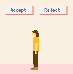
You don’t need to be an engineer to question how technology is affecting our lives. The goal is not for everyone to be a data scientist or machine learning engineer, though the field can certainly use more diversity, but to have enough awareness to join the conversation and ask important questions.
With Survival of the Best Fit, we want to reach an audience that may not be the makers of the very technology that impact them everyday. We want to help them better understand how AI works and how it may affect them, so that they can better demand transparency and accountability in systems that make more and more decisions for us.
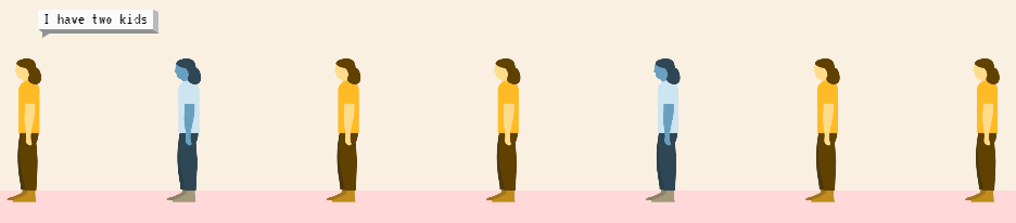
I found that the game provides a great intuitive explanation of how (humas) bias can slip into A.I. or machine learning applications in recruitment, selection, or other human resource management practices and processes.
Note, as Joachin replied below, that the game apparently does not learn from user-input, but is programmed to always result in bias towards blues. I kind of hoped that there was actually an algorithm “learning” in the backend, and while the developers could argue that the bias arises from the added external training data (you picked either Google, Apple, or Amazon to learn from), it feels like a bit of a disappointment that there is no real interactivity here.
Voor Privacyweb schreef ik onlangs over people analytics en het mogelijk resulterende nudgen van medewerkers: kleine aanpassingen of duwtjes die mensen in de goede richting zouden moeten sturen. Medewerkers verleiden tot goed gedrag, als het ware. Maar wie bepaalt dan wat goed is, en wanneer zouden werkgevers wel of niet mogen of zelfs moeten nudgen?
With great pleasure I’ve studied and worked in the field of people analytics, where we seek to leverage employee, management-, and business information to better organize and manage our personnel. Here, data has proven valuable itself indispensible for the organization of the future.
Data and analytics have not traditionally been high on the list of HR professionals. Fortunately, there is an increased awareness that the 21st century (HR) manager has to be data-savvy. But where to start learning? The plentiful available resources can be daunting…
Have a look at these 100+ amazing books for (starting) people analytics specialists. My personal recommendations are included as pictures, but feel free to ask for more detailed suggestions!
Categories (clickable)
Behavioural Psychology: focus on behavioural psychology and economics, including decision-making and the biases therein.
Technology: focus on the implications of new technology….
Ethics: … on society and humanity, and what can go wrong.
Digital & Data-driven HR: … for the future of work, workforce, and organization. Includes people analytics case studies.
Management: focus on industrial and organizational psychology, HR, leadership, and business strategy.
Statistics: focus on the technical books explaining statistical concepts and applied data analysis.
People analytics: …. more technical books on how to conduct people analytics studies step-by-step in (statistical) software.
Programming: … technical books specifically aimed at (statistical) programming and data analysis.
Communication: focus on information exchange, presentation, and data visualization.
Disclaimer: This page contains one or more links to Amazon. Any purchases made through those links provide us with a small commission that helps to host this blog.
I want to thank the active people analytics community, publishing in management journals, but also on social media. I knew Littral Shemer Haim already hosted a people analytics reading list, and so did Analytics in HR (Erik van Vulpen) and Workplaceif (Manoj Kumar). After Jared Valdron called for book recommendation on people analytics on LinkedIn, and nearly 60 people replied, I thought let’s merge these overviews.
Hence, a big thank you and acknowledgement to all those who’ve contributed directly or indirectly. I hope this comprehensive merged overview is helpful.
GIFs or animations are rising quickly in the data visualization world (see for instance here).
However, in my personal experience, they are not as widely used in business settings. You might even say animations are frowned by, for instance, LinkedIn, which removed the option to even post GIFs on their platform!
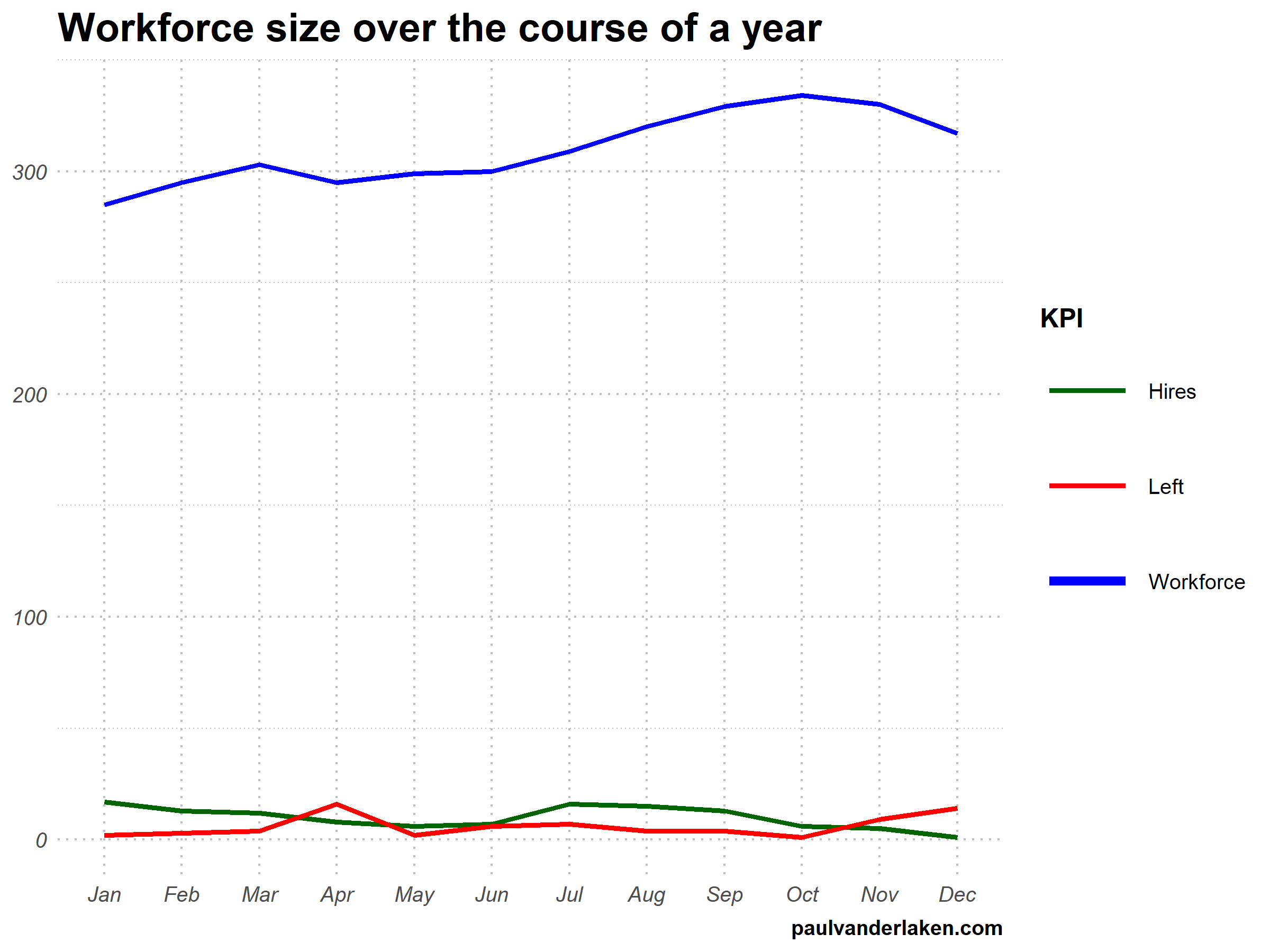
Nevertheless, animations can be pretty useful sometimes. For instance, they can display what happens during a process, like a analytical model converging, which can be useful for didactic purposes. Alternatively, they can be great for showing or highlighting trends over time.
I am curious what you think are the pro’s and con’s of animations. Below, I posted two visualizations of the same data. The data consists of the simulated workforce trends, including new hires and employee attrition over the course of twelve months.
versus
Would you prefer the static, or the animated version? Please do share your thoughts in the comments below, or on the respective LinkedIn and Twitter posts!
Want to reproduce these plots? Or play with the data? Here’s the R code:
# transform to long format wf_long <- gather(wf, key = "variable", value = "value", -month) capitalize the name of variables wf_long$variable <- capitalize_string(wf_long$variable)
# VISUALIZE & ANIMATE #### # draw workforce plot ggplot(wf_long, aes(x = month, y = value, group = variable)) + geom_line(aes(col = variable, size = variable == "workforce")) + scale_color_manual(values = COLORS) + scale_size_manual(values = c(LINE_SIZE2, LINE_SIZE1), guide = FALSE) + guides(color = guide_legend(override.aes = list(size = c(rep(LINE_SIZE2, 2), LINE_SIZE1)))) + # theme_PVDL() + labs(x = NULL, y = NULL, color = "KPI", caption = "paulvanderlaken.com") + ggtitle("Workforce size over the course of a year") + NULL -> workforce_plot


