Finding predictive patterns in your dataset with one line of code!
Today — March 2nd 2021 — my first R package was published on the comprehensive R archive network (CRAN).
ppsr is the R implementation of the Predictive Power Score (PPS).
The PPS is an asymmetric, data-type-agnostic score that can detect linear or non-linear relationships between two variables. You can read more about the concept in earlier blog posts (here and here), or here on Github, or via Medium.
With the ppsr package live on CRAN, it is now super easy to install the package and examine the predictive relationships in your dataset:
Google’s guidebook to human-centered AI design refered to the Design Kit, containing numerous helpful tools to help you design products with user experience in mind.
The design kit website contains many practical methods, tools, case studies and much more resources to help you in the design process.
Human-centered design is a practical, repeatable approach to arriving at innovative solutions. Think of these Methods as a step-by-step guide to unleashing your creativity, putting the people you serve at the center of your design process to come up with new answers to difficult problems.
The design kit methods section provides some seriously handy guidelines to help you design your products with the customer in mind. A step-by-step process guideline is offered, as well as neat worksheets to records the information you collect in the process, and a video explanation of the method.
As AI systems become more prevalent in society, we face bigger and tougher societal challenges. Given many of these challenges have not been faced before, practitioners will face scenarios that will require dealing with hard ethical and societal questions.
There has been a large amount of content published which attempts to address these issues through “Principles”, “Ethics Frameworks”, “Checklists” and beyond. However navigating the broad number of resources is not easy.
This repository aims to simplify this by mapping the ecosystem of guidelines, principles, codes of ethics, standards and regulation being put in place around artificial intelligence.
The repository consists of tools for multiple languages (R, Python, Matlab, Java) and resources in the form of:
Books & Academic Papers
Online Courses and Videos
Outlier Datasets
Algorithms and Applications
Open-source and Commercial Libraries/Toolkits
Key Conferences & Journals
Outlier Detection (also known as Anomaly Detection) is an exciting yet challenging field, which aims to identify outlying objects that are deviant from the general data distribution. Outlier detection has been proven critical in many fields, such as credit card fraud analytics, network intrusion detection, and mechanical unit defect detection.
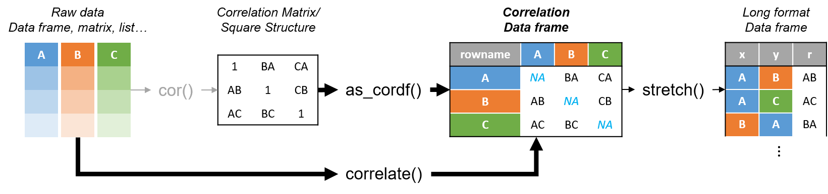
R’s standard correlation functionality (base::cor) seems very impractical to the new programmer: it returns a matrix and has some pretty shitty defaults it seems. Simon Jackson thought the same so he wrote a tidyverse-compatible new package: corrr!
Simon wrote some practical R code that has helped me out greatly before (e.g., color palette’s), but this new package is just great. He provides an elaborate walkthrough on his own blog, which I can highly recommend, but I copied some teasers below.
Diagram showing how the new functionality of corrr works.
Apart from corrr::correlate to retrieve a correlation data frame and corrr::stretch to turn that data frame into a long format, the new package includes corrr::focus, which can be used to simulteneously select the columns and filter the rows of the variables focused on. For example:
# install.packages("tidyverse")
library(tidyverse)

# install.packages("corrr")
library(corrr)

# install.packages("here")
library(here)

dir.create(here::here("images")) # create an images directory

mtcars %>%
  corrr::correlate() %>%
  # use mirror = TRUE to not only select columns but also filter rows
  corrr::focus(mpg:hp, mirror = TRUE) %>%
  corrr::network_plot(colors = c("red", "green")) %>%
  ggplot2::ggsave(
    filename = here::here("images", "mtcars_networkplot.png"),
    width = 5,
    height = 5
    )
With corrr::networkplot you get an immediate sense of the relationships in your data.
Let’s try some different visualizations:
mtcars %>%
  corrr::correlate() %>%
  corrr::focus(mpg) %>%
  dplyr::mutate(rowname = reorder(rowname, mpg)) %>%
  ggplot2::ggplot(ggplot2::aes(rowname, mpg)) +
  # color each bar based on the direction of the correlation
  ggplot2::geom_col(ggplot2::aes(fill = mpg >= 0)) +
  ggplot2::coord_flip() +
  ggplot2::ggsave(
    filename = here::here("images", "mtcars_mpg-barplot.png"),
    width = 5,
    height = 5
  )
The tidy correlation data frames can be easily piped into a ggplot2 function call
corrr also provides some very helpful functionality display correlations. Take, for instance, corrr::fashion and corrr::shave:
mtcars %>%
  corrr::correlate() %>%
  corrr::focus(mpg:hp, mirror = TRUE) %>%
  # converts the upper triangle (default) to missing values
  corrr::shave() %>%
  # converts a correlation df into clean matrix
  corrr::fashion() %>%
  readr::write_excel_csv(here::here("correlation-matrix.csv"))
Exporting a nice looking correlation matrix has never been this easy.
Finally, there is the great function of corrr::rplot to generate an amazing correlation overview visual in a wingle line. However, here it is combined with corr::rearrange to make sure that closely related variables are actually closely located on the axis, and again the upper half is shaved away:
Generate fantastic single-line correlation overviews with <code>corrr::rplot</code>
For some more functionalities, please visit Simon’s blog and/or the associated GitHub page. If you copy the code above and play around with it, be sure to work in an Rproject else the here::here() functions might misbehave.