David Robinson (aka drob) is one of the best known R programmers.
Since a couple of years David has been sharing his knowledge through streaming screencasts of him programming. It’s basically part of R’s #tidytuesday movement.
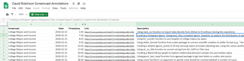
Alex Cookson decided to do us all a favor and annotate all these screencasts into a nice overview.
Here you can search for video material of David using a specific function or method. There are already over a thousand linked fragments!
Very useful if you want to learn how to visualize data using ggplot2 or plotly, how to work with factors in forcats, or how to tidy data using tidyr and dplyr.
For instance, you could search for specific R functions and packages you want to learn about:
Thanks David for sharing your knowledge, and thanks Alex for maintaining this overview!
This workshop is designed for those who want to learn how to use R to analyze data. The material is based on Hadley Wickham and Garrett Grolemund’s R for Data Science. We’ll talk about how to conduct a complete data analysis from data import to final reporting in R using a suite of packages known as the tidyverse. The two goals of this workshop are: 1) learn how to use R to answer questions about our data; and 2) write code that is human readable and reproducible. We will also talk about how to share our code and analyses with others.
You should take this workshop if you are new to R, or to the tidyverse, and want to learn how to take advantage of this ecosystem to do data analysis. You’ll get the most from the workshop if you are primarily interested in applying pre-existing R packages and functions to your own data. We will give minimal tutorials on how to write your own functions; however, the main focus will be on using existing tools, rather than building our own.
Jared Wilber posted this great walkthrough where he codes a simple R data pipeline using purrr and tidyr to train a large variety of models and methods on the same base data, all in a non-repetitive, reproducible, clean, and thus tidy fashion. Really impressive workflow!
GIFs or animations are rising quickly in the data visualization world (see for instance here).
However, in my personal experience, they are not as widely used in business settings. You might even say animations are frowned by, for instance, LinkedIn, which removed the option to even post GIFs on their platform!
Nevertheless, animations can be pretty useful sometimes. For instance, they can display what happens during a process, like a analytical model converging, which can be useful for didactic purposes. Alternatively, they can be great for showing or highlighting trends over time.
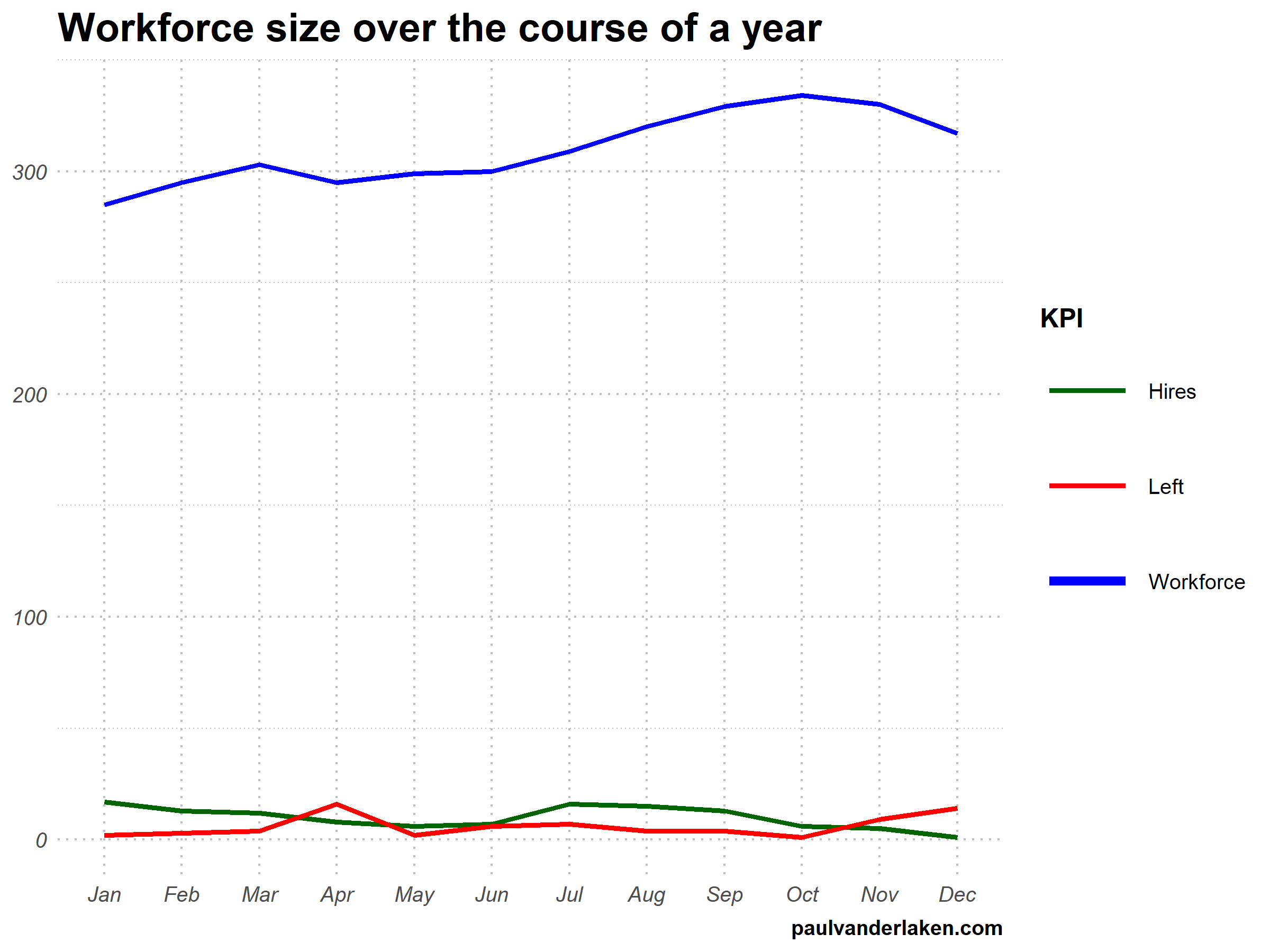
I am curious what you think are the pro’s and con’s of animations. Below, I posted two visualizations of the same data. The data consists of the simulated workforce trends, including new hires and employee attrition over the course of twelve months.
versus
Would you prefer the static, or the animated version? Please do share your thoughts in the comments below, or on the respective LinkedIn and Twitter posts!
Want to reproduce these plots? Or play with the data? Here’s the R code:
# transform to long format wf_long <- gather(wf, key = "variable", value = "value", -month) capitalize the name of variables wf_long$variable <- capitalize_string(wf_long$variable)
# VISUALIZE & ANIMATE #### # draw workforce plot ggplot(wf_long, aes(x = month, y = value, group = variable)) + geom_line(aes(col = variable, size = variable == "workforce")) + scale_color_manual(values = COLORS) + scale_size_manual(values = c(LINE_SIZE2, LINE_SIZE1), guide = FALSE) + guides(color = guide_legend(override.aes = list(size = c(rep(LINE_SIZE2, 2), LINE_SIZE1)))) + # theme_PVDL() + labs(x = NULL, y = NULL, color = "KPI", caption = "paulvanderlaken.com") + ggtitle("Workforce size over the course of a year") + NULL -> workforce_plot
A recent open access paper by Nicholas Tierney and Dianne Cook — professors at Monash University — deals with simpler handling, exploring, and imputation of missing values in data.They present new methodology building upon tidy data principles, with a goal to integrating missing value handling as an integral part of data analysis workflows. New data structures are defined (like the nabular) along with new functions to perform common operations (like gg_miss_case).
These new methods have bundled among others in the R packages naniar and visdat, which I highly recommend you check out. To put in the author’s own words:
The naniar and visdat packages build on existing tidy tools and strike a compromise between automation and control that makes analysis efficient, readable, but not overly complex. Each tool has clear intent and effects – plotting or generating data or augmenting data in some way. This reduces repetition and typing for the user, making exploration of missing values easier as they follow consistent rules with a declarative interface.
The below showcases some of the highly informational visuals you can easily generate with naniar‘s nabulars and the associated functionalities.
For instance, these heatmap visualizations of missing data for the airquality dataset. (A) represents the default output and (B) is ordered by clustering on rows and columns. You can see there are only missings in ozone and solar radiation, and there appears to be some structure to their missingness.
Another example is this upset plot of the patterns of missingness in the airquality dataset. Only Ozone and Solar.R have missing values, and Ozone has the most missing values. There are 2 cases where both Solar.R and Ozone have missing values.
You can also generate a histogram using nabular data in order to show the values and missings in Ozone. Values are imputed below the range to show the number of missings in Ozone and colored according to missingness of ozone (‘Ozone_NA‘). This displays directly that there are approximately 35-40 missings in Ozone.
Alternatively, scatterplots can be easily generated. Displaying missings at 10 percent below the minimum of the airquality dataset. Scatterplots of ozone and solar radiation (A), and ozone and temperature (B). These plots demonstrate that there are missings in ozone and solar radiation, but not in temperature.
Finally, this parallel coordinate plot displays the missing values imputed 10% below range for the oceanbuoys dataset. Values are colored by missingness of humidity. Humidity is missing for low air and sea temperatures, and is missing for one year and one location.
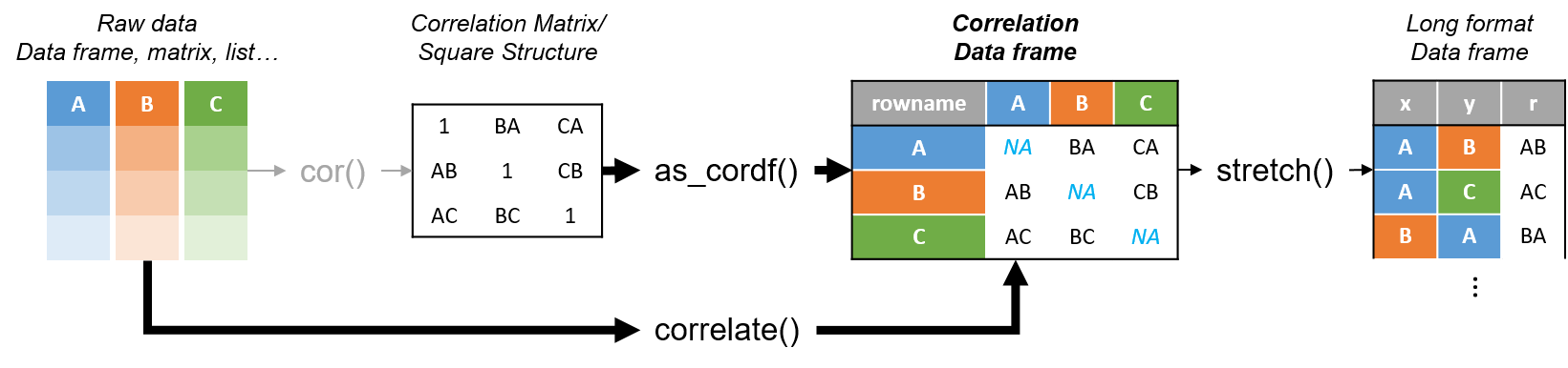
R’s standard correlation functionality (base::cor) seems very impractical to the new programmer: it returns a matrix and has some pretty shitty defaults it seems. Simon Jackson thought the same so he wrote a tidyverse-compatible new package: corrr!
Simon wrote some practical R code that has helped me out greatly before (e.g., color palette’s), but this new package is just great. He provides an elaborate walkthrough on his own blog, which I can highly recommend, but I copied some teasers below.
Diagram showing how the new functionality of corrr works.
Apart from corrr::correlate to retrieve a correlation data frame and corrr::stretch to turn that data frame into a long format, the new package includes corrr::focus, which can be used to simulteneously select the columns and filter the rows of the variables focused on. For example:
# install.packages("tidyverse")
library(tidyverse)

# install.packages("corrr")
library(corrr)

# install.packages("here")
library(here)

dir.create(here::here("images")) # create an images directory

mtcars %>%
  corrr::correlate() %>%
  # use mirror = TRUE to not only select columns but also filter rows
  corrr::focus(mpg:hp, mirror = TRUE) %>%
  corrr::network_plot(colors = c("red", "green")) %>%
  ggplot2::ggsave(
    filename = here::here("images", "mtcars_networkplot.png"),
    width = 5,
    height = 5
    )
With corrr::networkplot you get an immediate sense of the relationships in your data.
Let’s try some different visualizations:
mtcars %>%
  corrr::correlate() %>%
  corrr::focus(mpg) %>%
  dplyr::mutate(rowname = reorder(rowname, mpg)) %>%
  ggplot2::ggplot(ggplot2::aes(rowname, mpg)) +
  # color each bar based on the direction of the correlation
  ggplot2::geom_col(ggplot2::aes(fill = mpg >= 0)) +
  ggplot2::coord_flip() +
  ggplot2::ggsave(
    filename = here::here("images", "mtcars_mpg-barplot.png"),
    width = 5,
    height = 5
  )
The tidy correlation data frames can be easily piped into a ggplot2 function call
corrr also provides some very helpful functionality display correlations. Take, for instance, corrr::fashion and corrr::shave:
mtcars %>%
  corrr::correlate() %>%
  corrr::focus(mpg:hp, mirror = TRUE) %>%
  # converts the upper triangle (default) to missing values
  corrr::shave() %>%
  # converts a correlation df into clean matrix
  corrr::fashion() %>%
  readr::write_excel_csv(here::here("correlation-matrix.csv"))
Exporting a nice looking correlation matrix has never been this easy.
Finally, there is the great function of corrr::rplot to generate an amazing correlation overview visual in a wingle line. However, here it is combined with corr::rearrange to make sure that closely related variables are actually closely located on the axis, and again the upper half is shaved away:
Generate fantastic single-line correlation overviews with <code>corrr::rplot</code>
For some more functionalities, please visit Simon’s blog and/or the associated GitHub page. If you copy the code above and play around with it, be sure to work in an Rproject else the here::here() functions might misbehave.


 Alternatively, scatterplots can be easily generated. Displaying missings at 10 percent below the minimum of the airquality dataset. Scatterplots of ozone and solar radiation (A), and ozone and temperature (B). These plots demonstrate that there are missings in ozone and solar radiation, but not in temperature.


