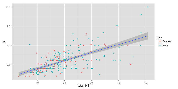
If you have ever programmed in R, you are probably familiar with the Grammar of Graphics due to ggplot2. You can read more about the Grammar of Graphics here, but the general idea behind it is that visualizations can be build up through various layers, each of which have certain characteristics (aesthetics in ggplot2).
ggplot(tips, aes(x = total_bill, y = tip)) +
  geom_point(aes(color = sex)) +
  geom_smooth(method = 'lm')

This post is not about ggplot2 nor specifically the Grammar of Graphics, but rather a summary of the official release of Vega-Lite 2, a high-level language for rapidly creating interactive visualizations which you might know from the R-package ggvis.
Vega-Lite has four operators to compose charts: layer, facet, concat and repeat. Layer stacks charts on top of each other in an orderly fashion. Facet divides and charts the data into groups. Concat combines multiple charts into dashboard layouts and, finally, repeat concatenate charts. Most importantly is that these operators can be combined! The example below compares weather data in New York and Seattle, layering data for individual years and averages within a repeated template for different measurements.

Vega-Lite 2 is especially useful because of the included interaction options. Programmers can specify how users can interactive select the data in their visualizations (e.g., a point or interval selection), along with possible transformations. With these interactions, users can for instance filter data, highlight points, or pan or zoom a plot. The plot below uses an interval selection, which causes the chart to include an interactive brush (shown in grey). The brush selection parameterizes the red guideline, which visualizes the average value within the selected interval.

However, this is not all! When multiple visualizations are combined in a dashboard, interactive selections can apply to all. Below, you see an interval selection being applied over a set of histograms. As a viewer adjusts the selection, they can immediately see how the other distributions change in response.

According to the developers Vega and Vega-Lite will be included in Jupyter Lab (the next generation of Jupyter Notebooks). Please find more details about Vega-Lite in the documentation or view the InfoVis 2016 research paper on the Vega-Lite language design. Moreover, check out the example gallery or these Vega-Lite applications. The source code you can find on GitHub. For updates, follow the Vega project on Twitter at @vega_vis. For an overview of the features you may watch the OpenVis Conference Video with the developers.
