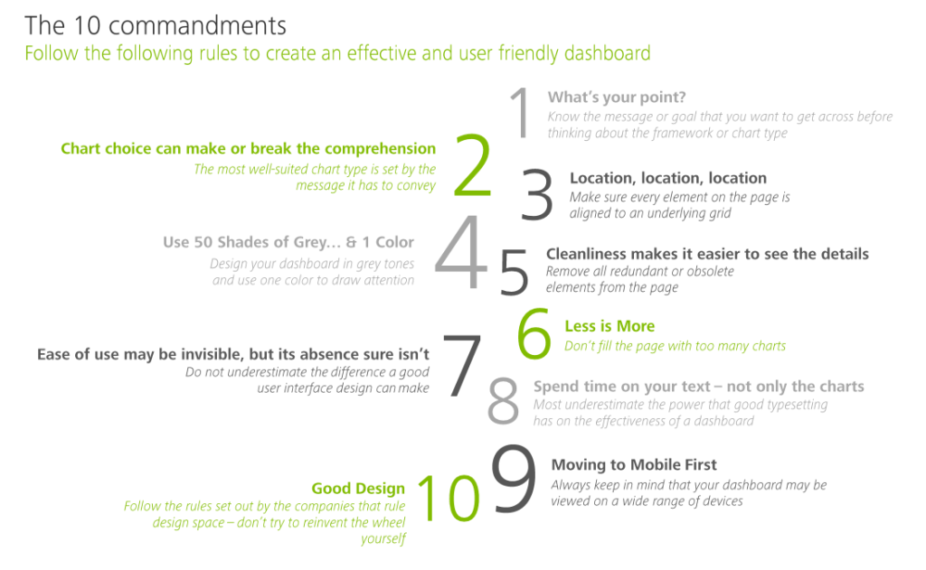
Some of these rules are more generally applicable to data visualization. Yet, the Deloitte 10 commandments form a good checklist when designing a dashboard.
Here’s my interpretation of the 10 rules:
Know your message or goal
Choose the chart that conveys your message best
Use a grid to bring order to your dashboard
Use color only to highlight and draw attention
Remove unneccessary elements
Avoid information overload
Design for ease of use
Text is as important as charts
Design for multiple devices (desktop, tablet, mobile, …)
Recycle good designs (by others)
In terms of recycling the good work by others operating in the data visualization field, check out:
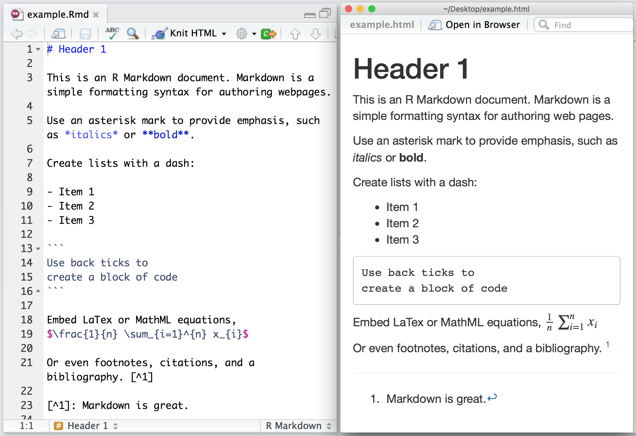
Yan Holtz recently created a neat little overview of handy R Markdown tips and tricks that improve the appearance of output documents. He dubbed this overview Pimp my RMD. Have a look, it’s worth it!
I would like to demonstrate how regular expressions can be used to retrieve (sub)strings that follow a specific format. We could use regex to examine, for instance, when, and by whom, which magical spells are cast.
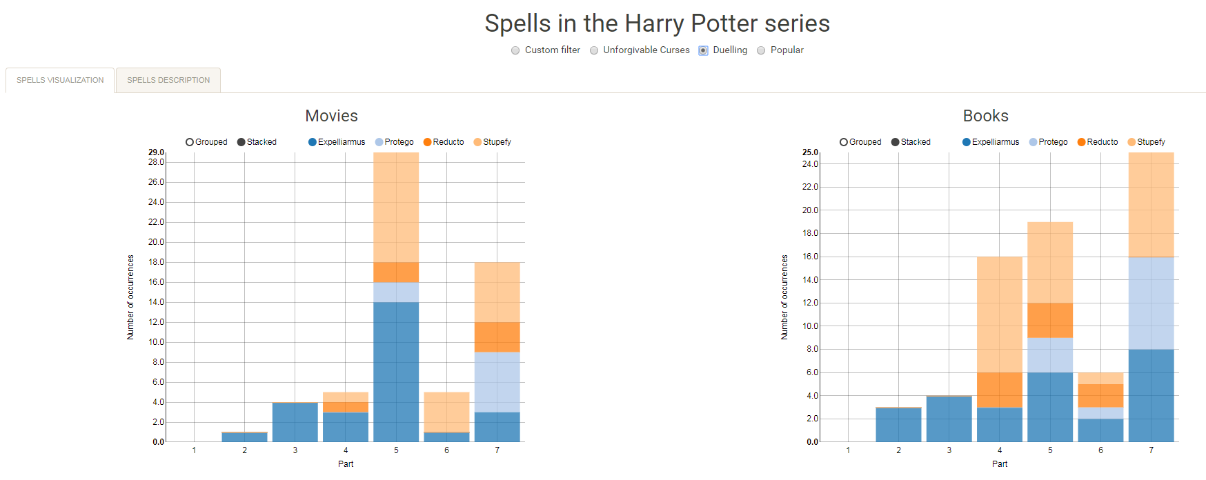
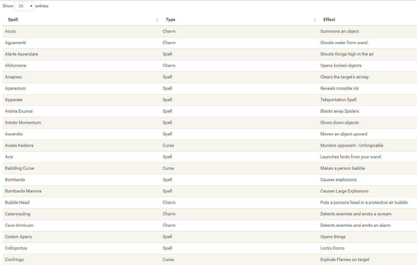
Well, Prusinowskik (real name unknown) beat me to it, and how! S/He formed a comprehensive list of all spells found in the Harry Potter saga (see below), and categorized these into “spells“, “charms“, and “curses“, and into “popular“, “dueling” and “unforgivable” purposes. Next, Prusinowskik built an interactive Shiny application with lovely JavaScript graphs (package: rCharts) for us to discover precisely when during the saga which spells are cast (see also below). Moreover, the analysis was repeated for both the books and the movies.
Truly excellent work Prusinowskik! The Shiny app can be found here.
If you have ever programmed in R, you are probably familiar with the Grammar of Graphics due to ggplot2. You can read more about the Grammar of Graphics here, but the general idea behind it is that visualizations can be build up through various layers, each of which have certain characteristics (aesthetics in ggplot2).
This post is not about ggplot2 nor specifically the Grammar of Graphics, but rather a summary of the official release of Vega-Lite 2, a high-level language for rapidly creating interactive visualizations which you might know from the R-package ggvis.
Vega-Lite has four operators to compose charts: layer, facet, concat and repeat. Layer stacks charts on top of each other in an orderly fashion. Facet divides and charts the data into groups. Concat combines multiple charts into dashboard layouts and, finally, repeat concatenate charts. Most importantly is that these operators can be combined! The example below compares weather data in New York and Seattle, layering data for individual years and averages within a repeated template for different measurements.
A layered and reapeted Vega-Lite graph of weather data
Vega-Lite 2 is especially useful because of the included interaction options. Programmers can specify how users can interactive select the data in their visualizations (e.g., a point or interval selection), along with possible transformations. With these interactions, users can for instance filter data, highlight points, or pan or zoom a plot. The plot below uses an interval selection, which causes the chart to include an interactive brush (shown in grey). The brush selection parameterizes the red guideline, which visualizes the average value within the selected interval.
An interactive moving average in Vega-Lite 2. Try it out!
However, this is not all! When multiple visualizations are combined in a dashboard, interactive selections can apply to all. Below, you see an interval selection being applied over a set of histograms. As a viewer adjusts the selection, they can immediately see how the other distributions change in response.
A crossfilter interaction in Vega-Lite 2. Try it out!