Tag: interactive

Visualizing and interpreting Cohen’s d effect sizes

Visualizing and interpreting Cohen’s d effect sizes

Cohen’s d (wiki) is a statistic used to indicate the standardised difference between two means. Resarchers often use it to compare the averages between groups, for instance to determine that there are higher outcomes values in a experimental group than in a control group.

Researchers often use general guidelines to determine the size of an effect. Looking at Cohen’s d, psychologists often consider effects to be small when Cohen’s d is between 0.2 or 0.3, medium effects (whatever that may mean) are assumed for values around 0.5, and values of Cohen’s d larger than 0.8 would depict large effects (e.g., University of Bath).

The two groups’ distributions belonging to small, medium, and large effects visualized

Kristoffer Magnusson hosts this Cohen’s d effect size comparison tool on his website the R Psychologist, but recently updated the visualization and its interactivity. And the tool looks better than ever:

Moreover, Kristoffer adds some nice explanatons of the numbers and their interpretation in real life situations:

If you find the tool useful, please consider buying Kristoffer a coffee or buying one of his beautiful posters, like the one above, or below:

Frequentisme betekenis testen poster horizontaal image 0

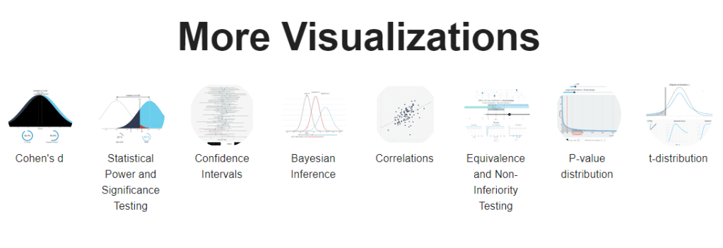
By the way, Kristoffer hosts many other interesting visualization tools (most made with JavaScript’s D3 library) on statistics and statistical phenomena on his website, have a look!

Visualize graph, diagrams, and proces flows with graphviz.it

Visualize graph, diagrams, and proces flows with graphviz.it

Graphviz.it is a free online tool to create publication-ready diagrams in an interactive fashion. It uses

It uses graphviz-d3-renderer Bower module and adds editor and live preview of code. Try it on Graphviz fiddling website.

Here are some examples:

A diagram of state transitions
A very complex… graph?
Some clusters with subgraphs

The github page hosts more details and you can even follow the development on twitter.

Record2, apparently
A tiny guide to Variable Fonts & Color Fonts

A tiny guide to Variable Fonts & Color Fonts

So, you’ve probably never heard of variable fonts.

Well, I sure had not when I first came across the concept a week or so ago. And I was shocked. This looked so cool. As I adjusted the size of my browser, the text and images adjusted itself along. As I made my Chrome window bigger, the text enlarged to keep filling the space it was allowed. Insane!

Here’s a little write-up on variable fonts called A tiny guide to Variable Color Fonts by Typearture.com.

Variable color fonts: How do they work?

The variability works for letters, but also illustrations. And any part can be colored and sized as pleased:

Variable fonts and illustrations

I find the visual art particularly stunning, which you can find via this link:

Here’s the explanation for the GIF in the header:

Combining variable and color fonts

The original article (which I highly recommend you read) links to many useful links:

Typearture is Arthur Reinders Folmer’s adventure in type, creating type designs with a focus on conceptual, illustrative and ornamental typefaces.

The typefaces in the Typearture library are not just collections of glyphs, but typefaces that use the conventions of type design and written language to tell their stories. These stories are woven throughout the typefaces, connecting A to Z and the Lemniscate to Question mark. Each character has it’s place and meaning, making each keystroke a small tale in itself.

typearture.com
Northstar: The interactive, drag-and-drop data science platform by MIT

Northstar: The interactive, drag-and-drop data science platform by MIT

MIT researchers have spent years developing the new drag-and-drop analytics tools they call Northstar.

Northstar is an interactive data science platform that rethinks how people interact with data. It empowers users without programming experience, background in statistics or machine learning expertise to explore and mine data through an intuitive user interface, and effortlessly build, analyze, and evaluate machine learning (ML) pipelines.

northstar.mit.edu/

Northstar starts as a blank, white interface. Users upload datasets into the system, which appear in a “datasets” box on the left. Any data labels will automatically populate a separate “attributes” box below. There’s also an “operators” box that contains various algorithms, as well as the new AutoML tool. All data are stored and analyzed in the cloud.

news.mit.edu/2019/drag-drop-data-analytics-0627

You can read more about the tool’s functionalities in this MIT news article, which includes several promising GIFs:

Moreover, on the Northstar website you can find this longer video explaining the tool in detail.

https://vimeo.com/342787403

While Northstar looks insanely cool and promising, I do worry about putting such power in the hands of people who may not have much experience with statistics and/or machine learning. We all know how easily errors and bias may slip into data-driven processes, so I am curious to see how these next-gen kind of tools will be deployed and used.

Generalized Additive Models Tutorial in R, by Noam Ross

Generalized Additive Models Tutorial in R, by Noam Ross

Generalized Additive Models — or GAMs in short — have been somewhat of a mystery to me. I’ve known about them, but didn’t know exactly what they did, or when they’re useful. That came to an end when I found out about this tutorial by Noam Ross.

In this beautiful, online, interactive course, Noam allows you to program several GAMs yourself (in R) and to progressively learn about the different functions and features. I am currently halfway through, but already very much enjoy it.

If you’re already familiar with linear models and want to learn something new, I strongly recommend this course!

The interactive course asks you to program several GAMs yourself https://noamross.github.io/gams-in-r-course/
You progressively learn how to run, interpret, and visualize GAMs yourself https://noamross.github.io/gams-in-r-course/
After a while you are even able to visualize smoothed interactions between variables https://noamross.github.io/gams-in-r-course/
Zeit’s interactive visualization of the 2019 European election results

Zeit’s interactive visualization of the 2019 European election results

Zeit — the German newspaper — analyzed recent election results in over 80,000 regions of Europe. They discovered many patterns – from the radical left to the extremist right. Moreover, they allow you to find patterns yourself, among others in your own region.

They published the summarized election results in this beautiful interactive map of Europe.

The map is beautifully color-coded for the dominant political view (Conservative, Green, Liberal, Socialist, Far left, or Far right) per region. Moreover, you can select these views and look for regions where they received respectively many votes. Like in the below, where I opted for the Liberal view, which finds strongest support in regions of the Netherlands, France, Czechia, Romania, Denmark, Estonia, and Finland.

For instance, the region of Tilburg in the Netherlands — where I live — voted mostly Liberal, as depicted by the yellow Netherlands. In contrast, in the German border regions conservative and socialist parties received most votes, whereas in the Belgian border regions uncategorizable parties received most votes.

Zeit discovered some cool patterns themselves as well, as discussed in the original article. These include:

  • Right-Wing Populists in Poland
  • North-South divides in Italy and Spain
  • Considerable support for regional parties in Catalonia, Belgium, Scotland and Italy
  • Dominant Green and Liberal views in the Netherlands, France, and Germany

Have a look yourself, it’s a great example of open access data-driven journalism!