Tag: graphics

Building a new desktop!

Building a new desktop!

I recently decided to buy a new computer.

While looking for laptops, it struck me that they can be so expensive for the hardware you get. I actually don’t need to my computer to be mobile, as most of the time it just sits in my study.

Hence, I opted for buying a desktop. And even better, I decided to build one myself!

I thought building a PC was going to be all complex and technical, but it’s actually really easy! I hope I can inspire you to try out for yourself as well.

Basically, you need only need 6 parts to build a computer:

  1. Casing
  2. Power supply
  3. Motherboard
  4. Processor (CPU)
  5. Hard drive (SSD)
  6. Memory (RAM)
  7. Optional: Graphics card (GPU)
  8. Optional: (extra) Fans
Desktop Computer Components (With images) | Computer history, Old ...
Via Pinterest (look at that old school case & speakers)

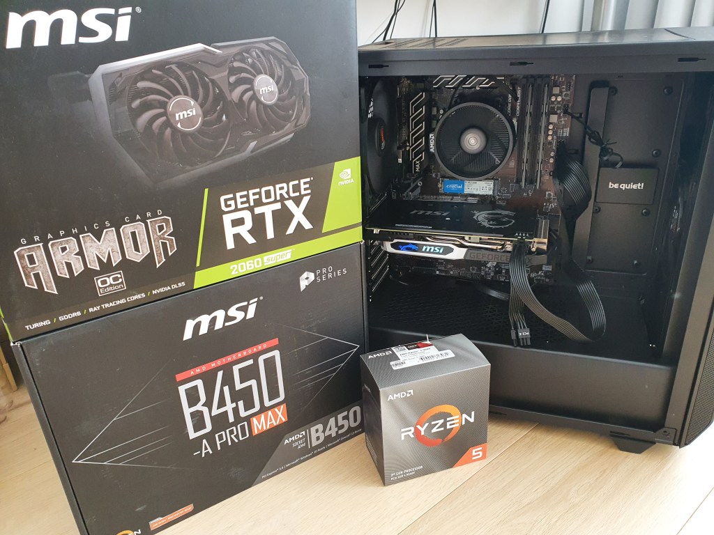
So I did some research into what hardware to buy. Specifically, I wanted a PC that could handle some deep learning and some of the newer video games. Hence, I decided on this setup:

  1. Casing: Be Quiet! Base with pre-installed fans
  2. Power supply: Cooler Master V550 Gold
  3. Motherboard: MSI B450-A Pro Max
  4. Processor (CPU): AMD Ryzen 5 3600X
  5. Hard drive (SSD): Crucial P1 1TB
  6. Memory (RAM): Crucial Ballistix 3200MHz 2x8GB (I got grey ones)
  7. Graphics card (GPU): MSI GeForce RTX 2060 Super Armor OC

Note: these are affiliate links.
If you buy a similar setup, it will generate a few bucks used to keep my website live!

My new setup put together

My setup totalled to about €1100 or $1200, but it may depend on the vendors you pick. Nonetheless, the CPU and the GPU are definitely the most expensive (and important).

I did not buy any additional fans, as the Be Quiet base already had some pre-installed. However, I think it might be better to install extra’s.

Actually, it’s very easy to upgrade (or downgrade) your system. You can easily switch out modules to decrease or increase the performance (and cost). For instance, you can install another two memory cards on your motherboard, or simply spend more on a GPU.

After everything was delivered to my house, I thought the hard part started: building the desktop and putting everything together. But actually, this only took me about an hour or two, with the help of some great tutorials on Youtube:

I hope this convinces and helps you to build your own system at home!

Learn from the Pros: How media companies visualize data

Learn from the Pros: How media companies visualize data

Past months, multiple companies shared their approaches to data visualization and their lessons learned.

Click the companies in the list below to jump to their respective section


Financial Times

The Financial Times (FT) released a searchable database of the many data visualizations they produced over the years. Some lovely examples include:

Graphic showing what May needs to happen to get her deal over the line when MPs vote on Friday
Data visualization belonging to a recent Brexit piece by the FT, viahttps://www.ft.com/graphics
Dutch housing graphic
Searching the FT database for European House Prices via https://www.ft.com/graphics returns this map of the Netherlands.

BBC

The BBC released a free cookbook for data visualization using R programming. Here is the associated Medium post announcing the book.

The BBC data team developed an R package (bbplot) which makes the process of creating publication-ready graphics in their in-house style using R’s ggplot2 library a more reproducible process, as well as making it easier for people new to R to create graphics.

Apart from sharing several best practices related to data visualization, they walk you through the steps and R code to create graphs such as the below:

One of the graphs the BBC cookbook will help you create, via https://bbc.github.io/rcookbook/

Economist

The data team at the Economist also felt a need to share their lessons learned via Medium. They show some of their most misleading, confusing, and failing graphics of the past years, and share the following mistakes and their remedies:

  • Truncating the scale (image #1 below)
  • Forcing a relationship by cherry-picking scales
  • Choosing the wrong visualisation method (image #2 below)
  • Taking the “mind-stretch” a little too far (image #3 below)
  • Confusing use of colour (image #4 below)
  • Including too much detail
  • Lots of data, not enough space

Moreover, they share the data behind these failing and repaired data visualizations:

Via https://medium.economist.com/mistakes-weve-drawn-a-few-8cdd8a42d368

FiveThirtyEight

I could not resist including this (older) overview of the 52 best charts FiveThirtyEight claimed they made.

All 538’s data visualizations are just stunningly beautiful and often very
ingenious, using new chart formats to display complex patterns. Moreover, the range of topics they cover is huge. Anything ranging from their traditional background — politics — to great cover stories on sumo wrestling and pricy wine.

Viahttps://fivethirtyeight.com/features/the-52-best-and-weirdest-charts-we-made-in-2016/
Via https://fivethirtyeight.com/features/the-52-best-and-weirdest-charts-we-made-in-2016/ You should definitely check out the original cover story via https://projects.fivethirtyeight.com/sumo/
Via https://fivethirtyeight.com/features/the-52-best-and-weirdest-charts-we-made-in-2016/

Xenographics: Unusual charts and maps

Xenographics: Unusual charts and maps

Xeno.graphics is the collection of unusual charts and maps Maarten Lambrechts maintains. It’s a repository of novel, innovative, and experimental visualizations to inspire you, to fight xenographphobia, and popularize new chart types.

For instance, have you ever before heard of a time curve? These are very useful to visualize the development of a relationship over time.

temp.JPG
Time curves are based on the metaphor of folding a timeline visualization into itself so as to bring similar time points close to each other. This metaphor can be applied to any dataset where a similarity metric between temporal snapshots can be defined, thus it is largely datatype-agnostic. [https://xeno.graphics/time-curve]
The upset plot is another example of an upcoming visualization. It can demonstrate the overlap or insection in a dataset. For instance, in the social network of #rstats twitter heroes, as the below example from the Xenographics website does.

temp.JPG
Understanding relationships between sets is an important analysis task. The major challenge in this context is the combinatorial explosion of the number of set intersections if the number of sets exceeds a trivial threshold. To address this, we introduce UpSet, a novel visualization technique for the quantitative analysis of sets, their intersections, and aggregates of intersections. [https://xeno.graphics/upset-plot/]
The below necklace map is new to me too. What it does precisely is unclear to me as well.

temp
In a necklace map, the regions of the underlying two-dimensional map are projected onto intervals on a one-dimensional curve (the necklace) that surrounds the map regions. Symbols are scaled such that their area corresponds to the data of their region and placed without overlap inside the corresponding interval on the necklace. [https://xeno.graphics/necklace-map/]
There are hundreds of other interestingcharts, maps, figures, and plots, so do have a look yourself. Moreover, the xenographics collection is still growing. If you know of one that isn’t here already, please submit it. You can also expect some posts about  certain topics around xenographics.

temp.JPG

Vega: The Grammar of Interactive Graphics

Vega: The Grammar of Interactive Graphics

If you have ever programmed in R, you are probably familiar with the Grammar of Graphics due to ggplot2. You can read more about the Grammar of Graphics here, but the general idea behind it is that visualizations can be build up through various layers, each of which have certain characteristics (aesthetics in ggplot2).

ggplot(tips, aes(x = total_bill, y = tip)) +
  geom_point(aes(color = sex)) +
  geom_smooth(method = 'lm')

plot of chunk layer5

This post is not about ggplot2 nor specifically the Grammar of Graphics, but rather a summary of the official release of Vega-Lite 2, a high-level language for rapidly creating interactive visualizations which you might know from the R-package ggvis.

Vega-Lite has four operators to compose charts: layerfacetconcat and repeat. Layer stacks charts on top of each other in an orderly fashion. Facet divides and charts the data into groups. Concat combines multiple charts into dashboard layouts and, finally, repeat concatenate charts. Most importantly is that these operators can be combined! The example below compares weather data in New York and Seattle, layering data for individual years and averages within a repeated template for different measurements.

A layered and reapeted Vega-Lite graph of weather data

Vega-Lite 2 is especially useful because of the included interaction options. Programmers can specify how users can interactive select the data in their visualizations (e.g., a point or interval selection), along with possible transformations. With these interactions, users can for instance filter data, highlight points, or pan or zoom a plot. The plot below uses an interval selection, which causes the chart to include an interactive brush (shown in grey). The brush selection parameterizes the red guideline, which visualizes the average value within the selected interval.

An interactive moving average in Vega-Lite 2. Try it out!

However, this is not all! When multiple visualizations are combined in a dashboard, interactive selections can apply to all. Below, you see an interval selection being applied over a set of histograms. As a viewer adjusts the selection, they can immediately see how the other distributions change in response.

A crossfilter interaction in Vega-Lite 2. Try it out!

According to the developers Vega and Vega-Lite will be included in Jupyter Lab (the next generation of Jupyter Notebooks). Please find more details about Vega-Lite in the documentation or view the InfoVis 2016 research paper on the Vega-Lite language design. Moreover, check out the example gallery or these Vega-Lite applications. The source code you can find on GitHub. For updates, follow the Vega project on Twitter at @vega_vis. For an overview of the features you may watch the OpenVis Conference Video with the developers.