Tag: finance

Best Charts for Income & Profit & Loss Statements

Best Charts for Income & Profit & Loss Statements

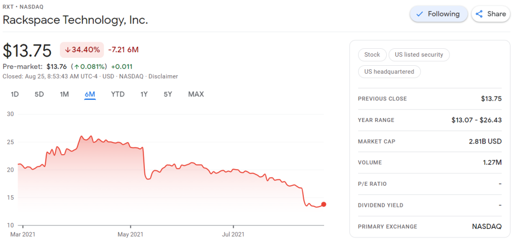
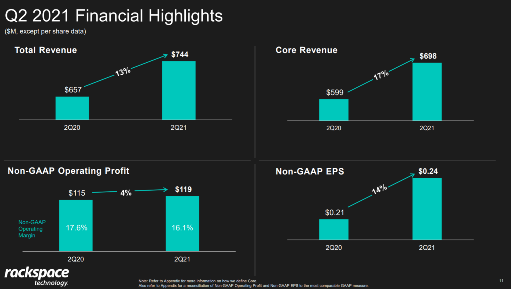
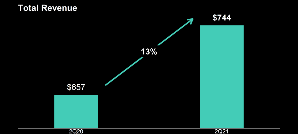
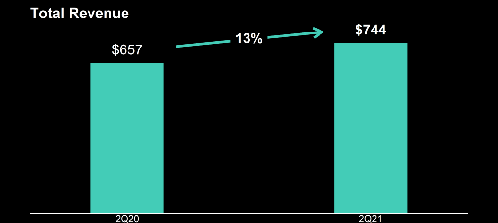
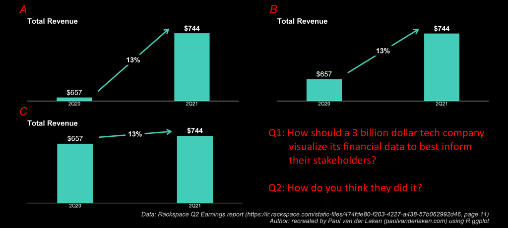
A few months back I wrote about how Rackspace confuses their shareholders using bad data visualization in their quarterly reports.

Mort Goldman — one of my dear readers — pointed me to this great tutorial by Kamil Franek where he shows 7 ways to visualize income and profit and loss statements. Please visit Kamil’s blog for the details, I just copied the visuals here to share with you.

Maybe we should forward them to Rackspace as well 😉

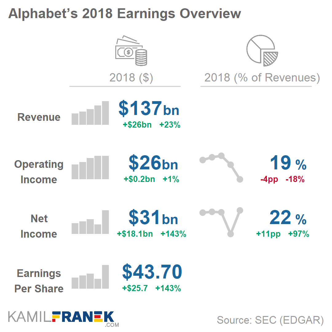
Kamil uses Google/Alphabet’s 2018 financial reports as data for his examples.

Here are two Sankey diagrams, with different levels of detail. Kamil argues they work best for the big picture overview.

Example of summarized Sankey diagram chart of an income statement
Example of detailed income statement Sankey diagram visualization

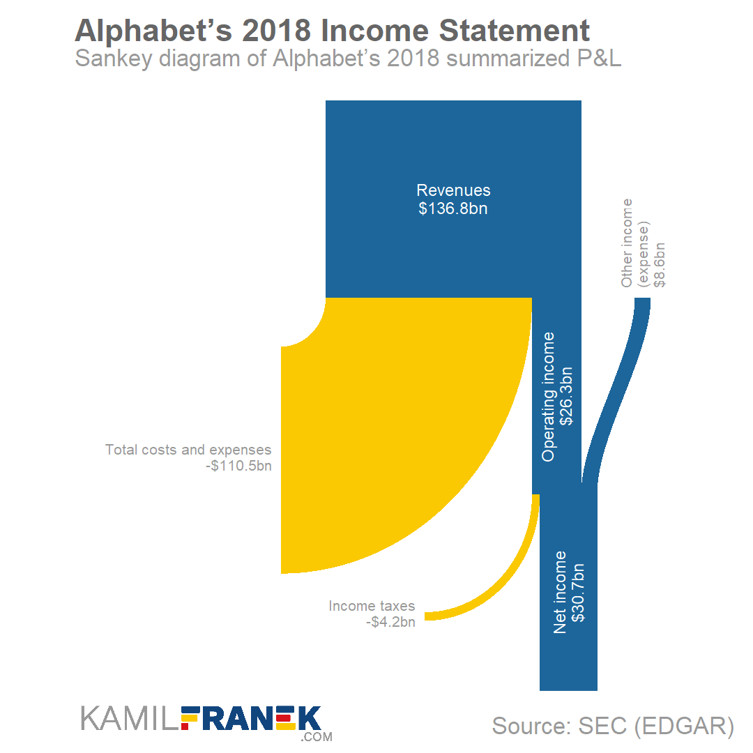
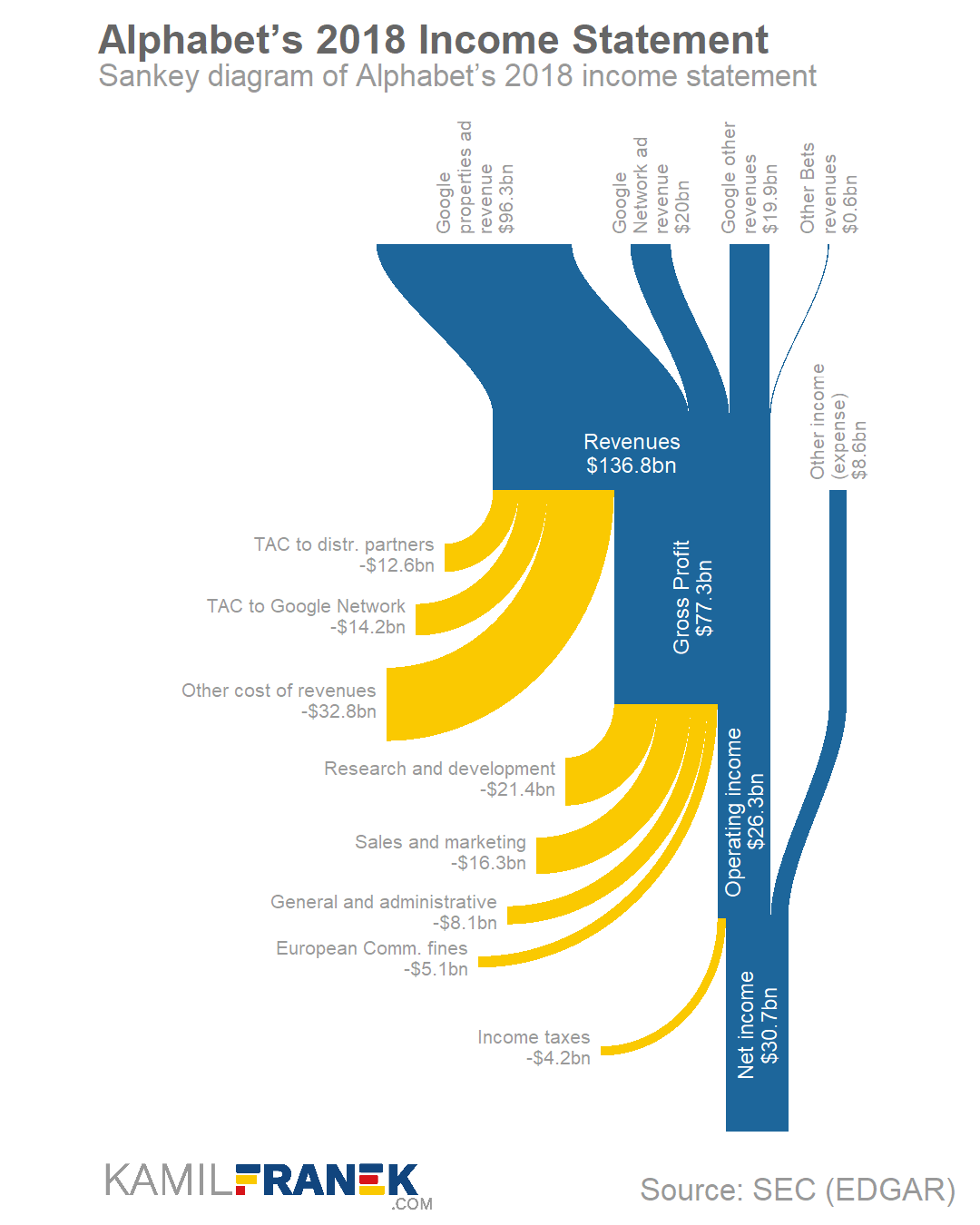
I dislike how most text 90 degrees rotated, forcing me to tilt my head in order to read it.

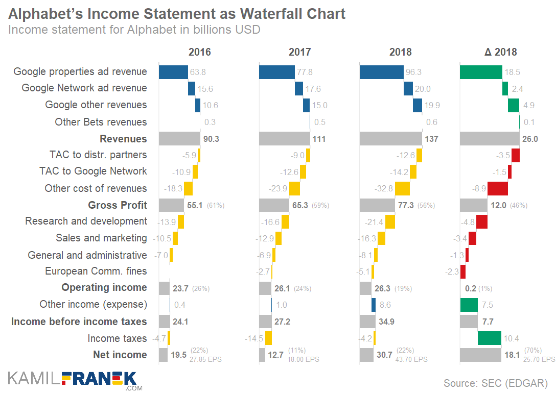
An alternative Kamil proposes is the well-known Waterfall chart. Kamil dedicated a whole blog post to creating good waterfalls.

Example of detailed income statement waterfall chart

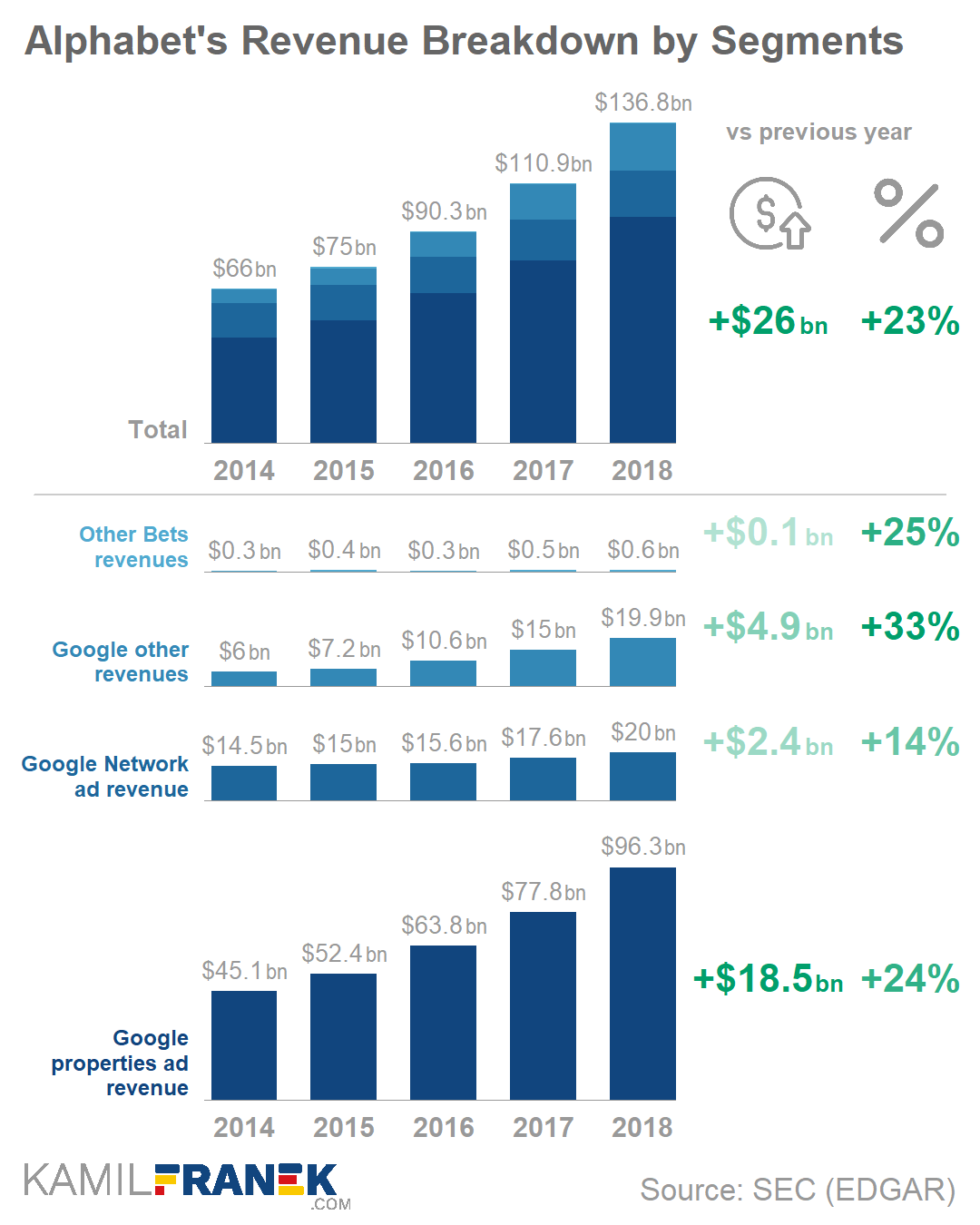
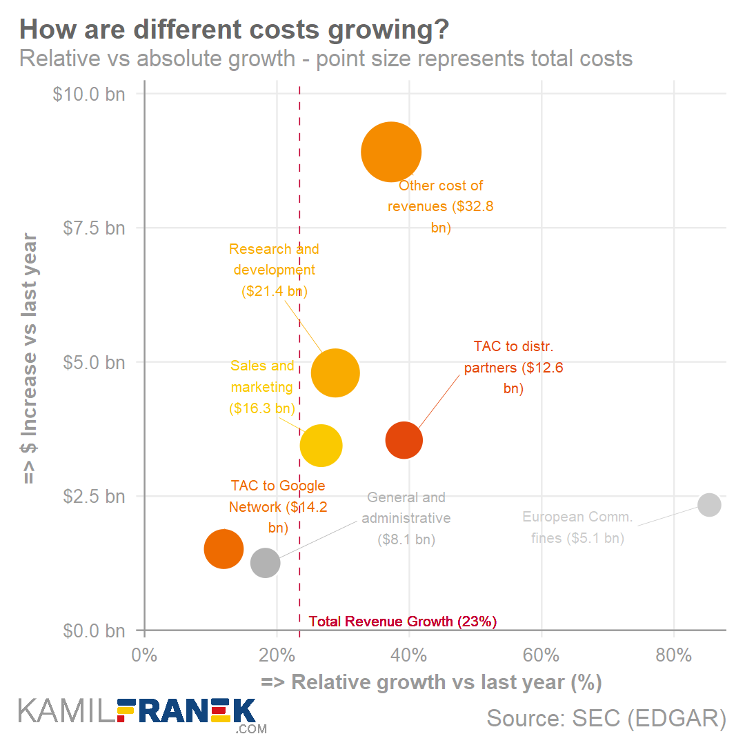
One of my favorite visualization of the blog were these two combined bar charts. One showing the whole bars stacked, the other showing them seperately. The stacked one allows you to discern the bigger trend. The small ones allow for within category comparison.

Love it!

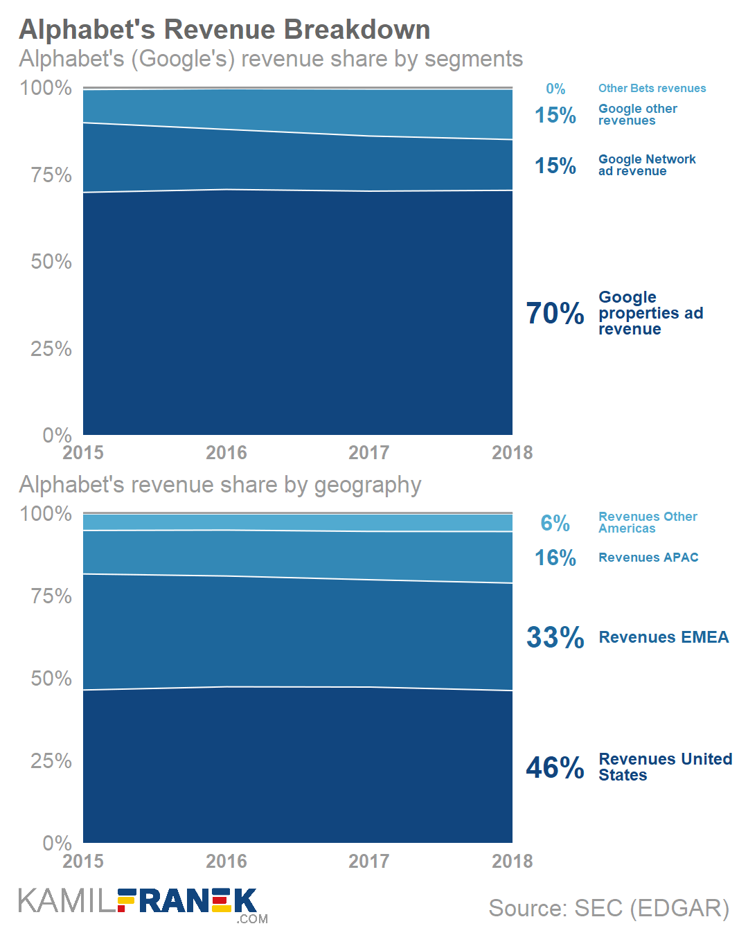
Not so much a fan of the next stacked area chart though. In my opinion, a lot of ink for very little information displayed.

Example of  percentage revenue breakdown area chart

The colors in this next one are lovely though:

Example of percentage expenses  breakdown area chart
The next scatter plot/bubble plot was one that I had not expected.

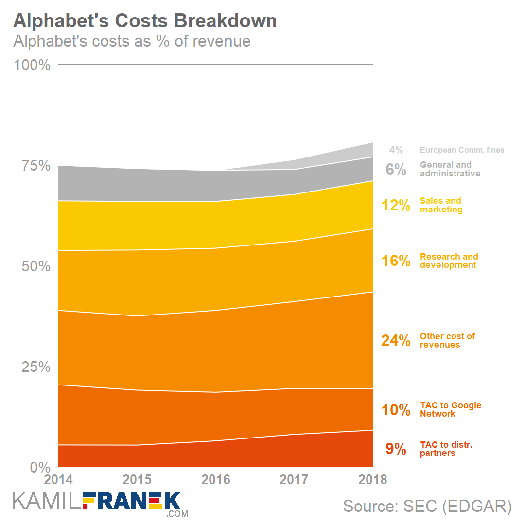
I love how this unorthodox visualization really add insights, showing how different cost categories have developed over time.

There are some things I would tweak to make the graph more visually appealing though. Particularly the benchmark line is too rough in my opinion.

Example of expenses changes breakdown scatter/bubble plot

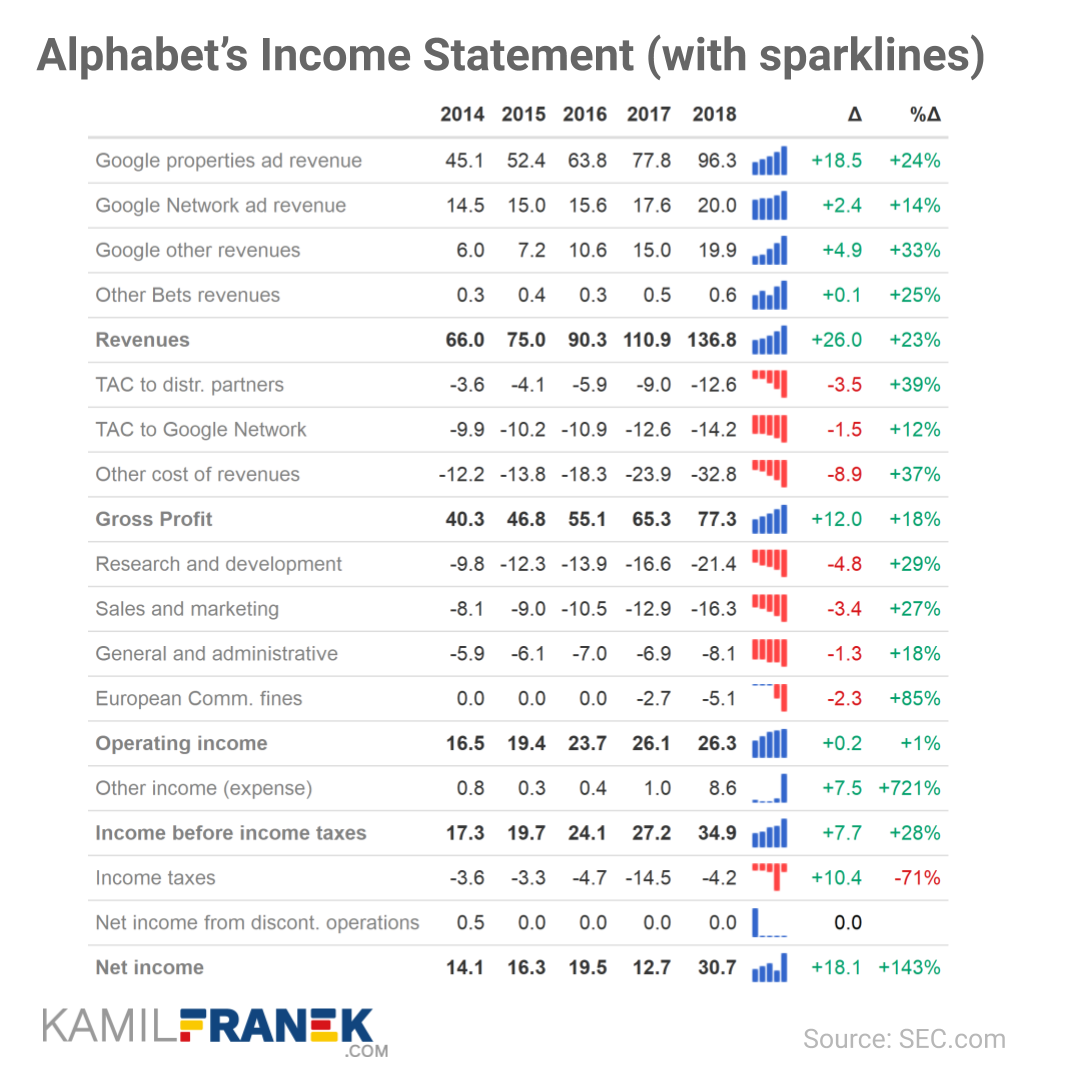
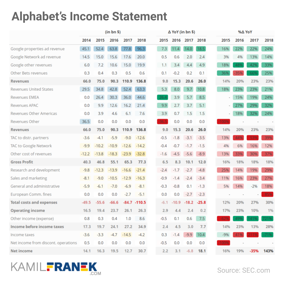
Very often, you don’t need a specialized graph, but a well-formatted table might be much more effective.

Kamil shows two great examples. The first one with an integrated bar chart/sparkline, the second one relying strongly on color cues. I prefer the second one, as it better shows the hierarchy in the categories with the highlighted rows.

Example of income statement table with sparklines
Example of income statement table with conditional formatting

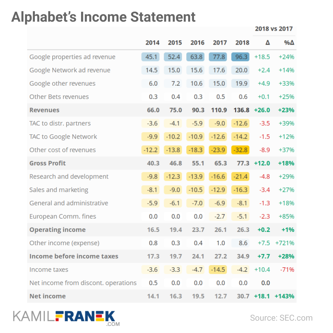
Kamil takes it a step further in the next table, but I think they become less and less insightful as more information is included:

Example of a detailed income statement table for change analysis
Kamil’s final recommendation is this key metrics dashboard. Though I like the general idea, I am not sure whether this one works for me. Particularly the line graphs on the right don’t provide much insight. I don’t know whether the last but one dot is 20% or 5% or 50% or 0%. The lack of reference points allows it to be any of these values.
Example of a summary dashboard for income statement key metrics

If you haven’t yet clicked through, definitely check out Kamil’s original post.

There he shares his perspective on the advantages and disadvantages of each of these visualization types, and where they work best in his experience.

Also check out Kamil’s earlier post on How to Visually Redesign Your Income Statement (P&L).

How to confuse your shareholders by bad data visualization

How to confuse your shareholders by bad data visualization

Like many people during the COVID19 crisis, I turned to the stock market as a new hobby.

Like the ignorant investor that I am, I thought it wise to hop on the cloud computing bandwagon.

Hence, I bought, among others, a small position in Rackspace Technologies.

A long way down

Now, my Rackspace shares have plummeted in price since I bought them.

Screenshot of Google Finance on August 25th 2021: https://www.google.com/finance/quote/RXT:NASDAQ?sa=X&ved=2ahUKEwjxqdr0oczyAhWKtqQKHZk3A90Q_AUoAXoECAEQAw&window=6M

Obviously, this is less than ideal for me, but also, I should not be surprised.

Clearly, I knew nothing about the company I bought shares in. Apparently they are going through some big time reorganization, and this is not good price-wise.

Fast forward to yesterday.

Doing research

To re-evalute my investment, I thought it wise to have a look at Rackspace’s Quarterly Report.

According to Investopedia: quarterly report is a summary or collection of unaudited financial statements, such as balance sheets, income statements, and cash flow statements, issued by companies every quarter (three months). In addition to reporting quarterly figures, these statements may also provide year-to-date and comparative (e.g., last year’s quarter to this year’s quarter) results. Publicly-traded companies must file their reports with the Securities Exchange Committee (SEC).

Fortunately these quarterly reports are readily available on the investors relation page, and they are not that hard to read once you have seen a few.

Visualizing financial data

I was excited to see that Rackspace offered their financial performance in bite-sized bits to me as a laymen, through their usage of nice visualizations of the financial data.

Please take a moment to process the below copy of page 11 of their 2021 Q2 report:

Screenshot of page 11 of the 2021 Q2 Quarterly Report of Rackspace Technologies: https://ir.rackspace.com/static-files/474fde80-f203-4227-a438-57b062992d46

Though… the longer I looked at these charts… the more my head started to hurt…

How can the growth line be about the same in the three charts Total Revenue (top-left), Core Revenue (top-right), and Non-GAAP EPS (bottom-right)? They represent different increments: 13%, 17%, and 14% respectively.

Zooming in on the top left: how does the $657 revenue of 2Q20 fit inside the $744 revenue of 2Q21 almost three times?!

The increase is only 13%, not 300%!

Screenshot of page 11 of the 2021 Q2 Quarterly Report of Rackspace Technologies: https://ir.rackspace.com/static-files/474fde80-f203-4227-a438-57b062992d46

Recreating the problem

I decided to recreate the vizualizations of the quarterly report.

To see what the visualization should have actually looked like. And to see how they could have made this visualization worse.

You can find the R ggplot2 code for these plots here on Github.

If you know me, you know I can’t do something 50%, so I decided to make the plots look as closely to the original Rackspace design as possible.

Here are the results:

Here are all three combined, along with two simple questions:

This I shared on social media (LinkedIn, Twitter), to ask for people’s opinions:

And I tagged Rackspace and offered them my help!

I hope they’re not offended and respond : )