Like many people during the COVID19 crisis, I turned to the stock market as a new hobby.
Like the ignorant investor that I am, I thought it wise to hop on the cloud computing bandwagon.
Hence, I bought, among others, a small position in Rackspace Technologies.
A long way down
Now, my Rackspace shares have plummeted in price since I bought them.
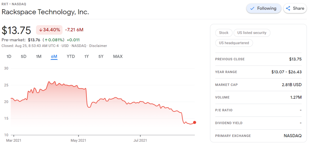
Obviously, this is less than ideal for me, but also, I should not be surprised.
Clearly, I knew nothing about the company I bought shares in. Apparently they are going through some big time reorganization, and this is not good price-wise.
Fast forward to yesterday.
Doing research
To re-evalute my investment, I thought it wise to have a look at Rackspace’s Quarterly Report.
According to Investopedia: A quarterly report is a summary or collection of unaudited financial statements, such as balance sheets, income statements, and cash flow statements, issued by companies every quarter (three months). In addition to reporting quarterly figures, these statements may also provide year-to-date and comparative (e.g., last year’s quarter to this year’s quarter) results. Publicly-traded companies must file their reports with the Securities Exchange Committee (SEC).
Fortunately these quarterly reports are readily available on the investors relation page, and they are not that hard to read once you have seen a few.
Visualizing financial data
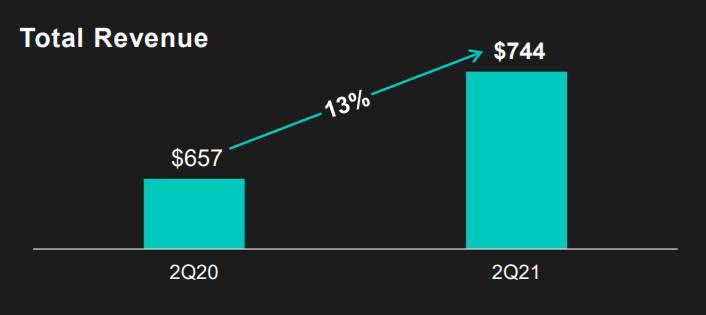
I was excited to see that Rackspace offered their financial performance in bite-sized bits to me as a laymen, through their usage of nice visualizations of the financial data.
Please take a moment to process the below copy of page 11 of their 2021 Q2 report:
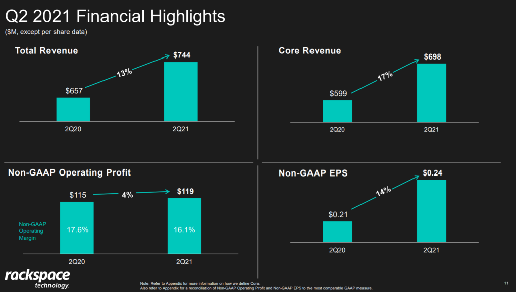
Though… the longer I looked at these charts… the more my head started to hurt…
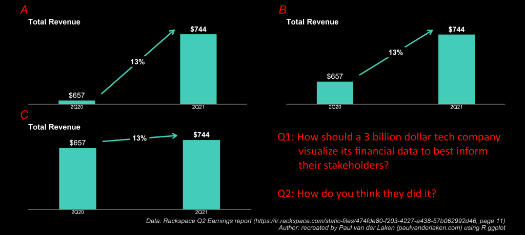
How can the growth line be about the same in the three charts Total Revenue (top-left), Core Revenue (top-right), and Non-GAAP EPS (bottom-right)? They represent different increments: 13%, 17%, and 14% respectively.
Zooming in on the top left: how does the $657 revenue of 2Q20 fit inside the $744 revenue of 2Q21 almost three times?!
The increase is only 13%, not 300%!
Recreating the problem
I decided to recreate the vizualizations of the quarterly report.
To see what the visualization should have actually looked like. And to see how they could have made this visualization worse.
You can find the R ggplot2 code for these plots here on Github.
If you know me, you know I can’t do something 50%, so I decided to make the plots look as closely to the original Rackspace design as possible.
Here are the results:
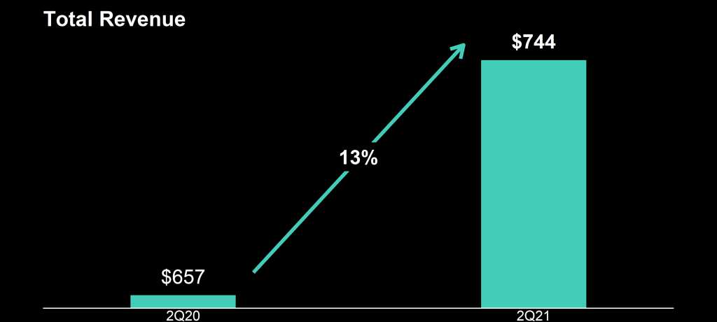
It could have been worse 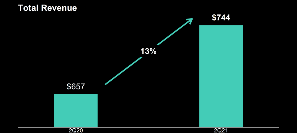
This is my recreation of the original 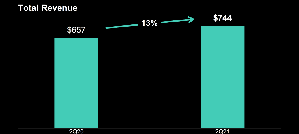
This is what it should have looked like
Here are all three combined, along with two simple questions:
This I shared on social media (LinkedIn, Twitter), to ask for people’s opinions:
And I tagged Rackspace and offered them my help!
I hope they’re not offended and respond : )