
Rafa Irizarry is a biostatistics professor and one of the three people behind SimplyStatistics.org (the others are Jeff Leek, Roger Peng). They post ideas that they find interesting and their blog contributes greatly to discussion of science/popular writing.
Rafa is the creator of many data visualization GIFs that have recently trended on the web, and in a recent post he provides all the source code behind the beautiful imagery. I sincerely recommend you check out the orginal blog if you want to find out more, but here are the GIFS:
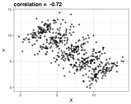
Simpson’s paradox is a statistical phenomenon where an observed relationship within a population reverses within all subgroups that make up that population. Rafa visualized it wonderfully in a GIF that took only twenty-some lines of R code:
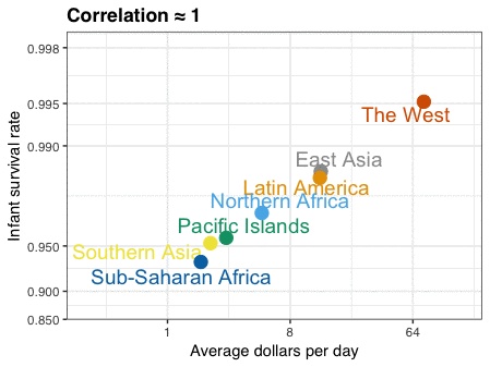
A different statistical phenomenon is discussed at the end of the original blog: namely the ecological fallacy. It occurs when correlations that occur on the group-level are erroneously extrapolated to the individual-level. Rafa used the gapminder data included in the dslabs package to illustrate the fallacy: there is a very high correlation at the region level and a lower correlation at the individual country level:
The gapminder data is also used in the next GIF. This mimics Hans Rosling’s famous animation during his talk on New Insights on Poverty, but then made with R and gganimate by Rafa:

A next visualization demonstrates how the UN voting data (of Erik Voeten and Anton Strezhnev) can be used to examine different voting behaviors. It seems to reduce the voting data to a two-dimensional factor structure, and seemingly there are three distinct groups of voters these days, with particularly the USA and Israel far removed from other members: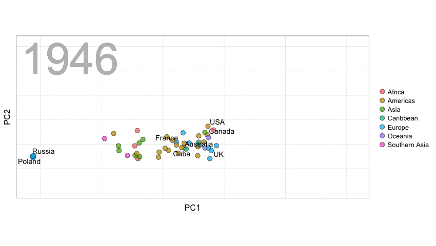
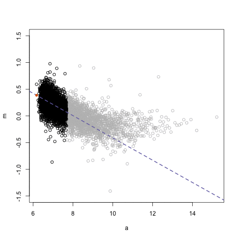
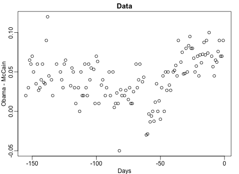
The next GIFs are more statistical. The one below demonstrates how the local regression (LOESS) works. Simply speaking, LOESS determines the relationship for a local subset of the population and when you iteratively repeat this for all local subsets in a population you get a nicely fitting LOESS curve, the red line in Rafa’s GIF:
Not quite sure how to interpret the next one, but Rafa explains it visualized a random forest’s predictions using only one predictor variable. I think that different trees would then provide different predictions because they leverage different training samples, and an ensemble of those trees would then improve predictive accuracy?
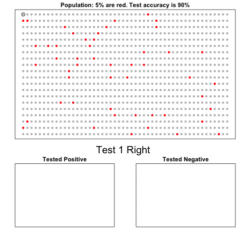
The next one is my favorite I think. This animation illustrates how a highly accurate test would function in a population with low prevalence of true values (e.g., disease, applicant success). More details are in the original blog or here.
The blog ends with a rather funny animation of the only good use of pie charts, according to Rafa:

