Mort Goldman — one of my dear readers — pointed me to this great tutorial by Kamil Franek where he shows 7 ways to visualize income and profit and loss statements. Please visit Kamil’s blog for the details, I just copied the visuals here to share with you.
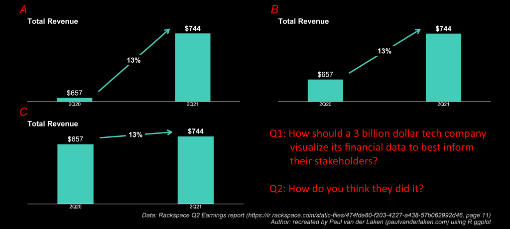
Maybe we should forward them to Rackspace as well 😉
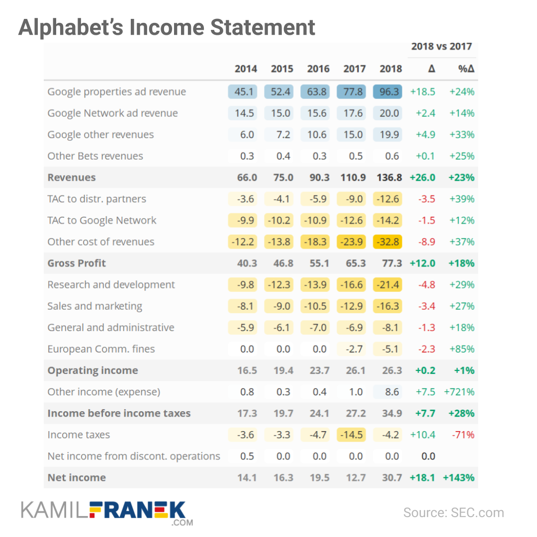
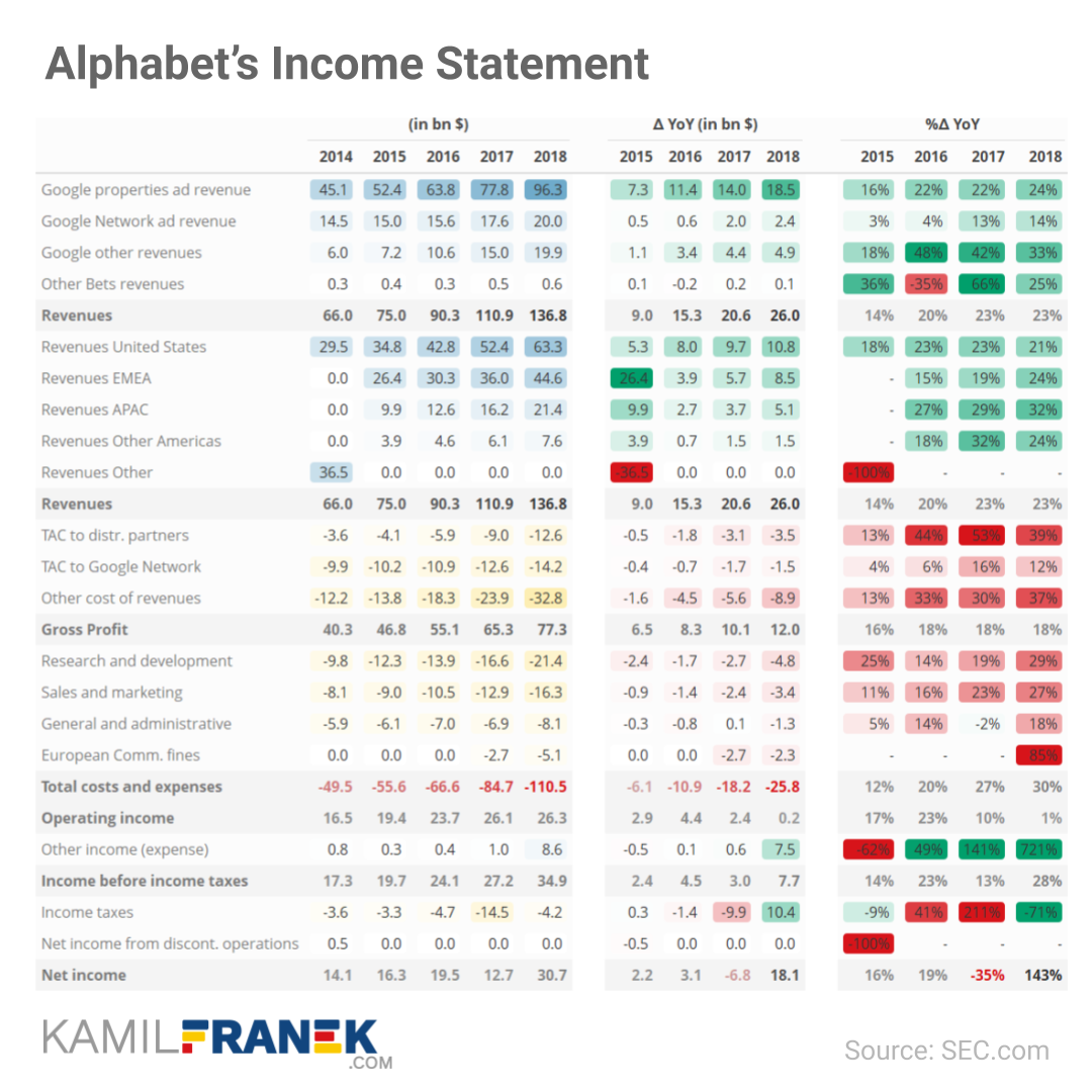
Kamil uses Google/Alphabet’s 2018 financial reports as data for his examples.
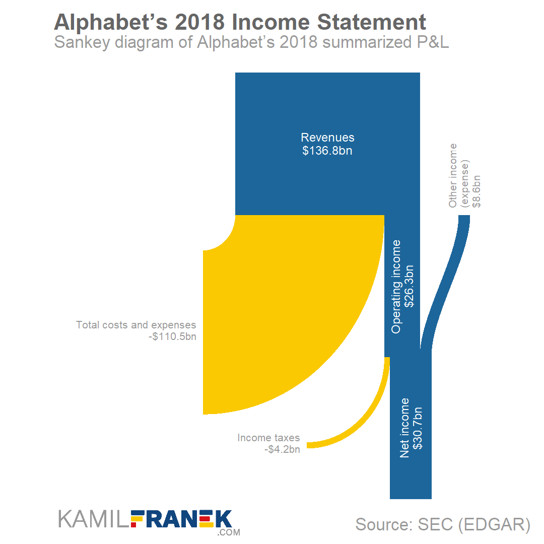
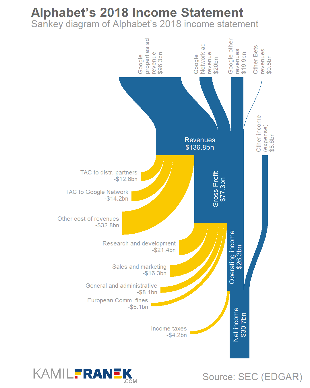
Here are two Sankey diagrams, with different levels of detail. Kamil argues they work best for the big picture overview.
I dislike how most text 90 degrees rotated, forcing me to tilt my head in order to read it.
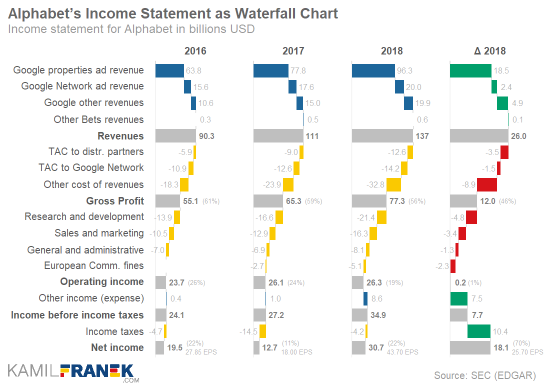
An alternative Kamil proposes is the well-known Waterfall chart. Kamil dedicated a whole blog post to creating good waterfalls.
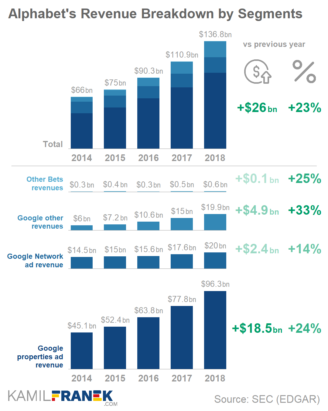
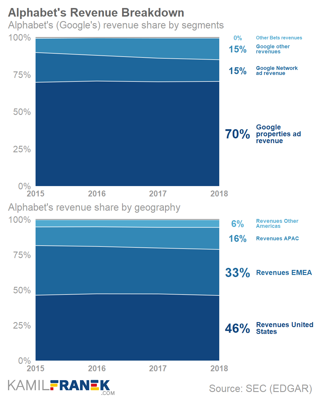
One of my favorite visualization of the blog were these two combined bar charts. One showing the whole bars stacked, the other showing them seperately. The stacked one allows you to discern the bigger trend. The small ones allow for within category comparison.
Love it!
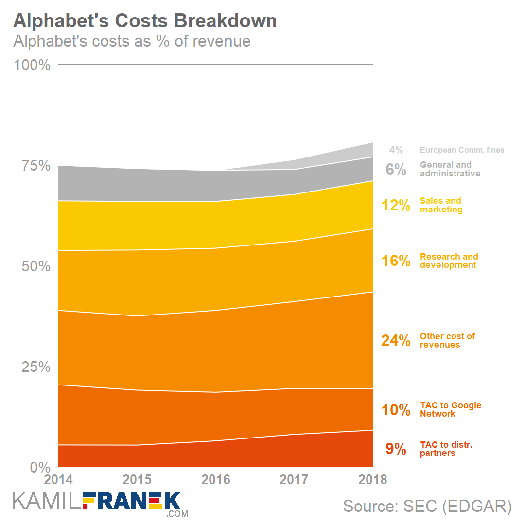
Not so much a fan of the next stacked area chart though. In my opinion, a lot of ink for very little information displayed.
The colors in this next one are lovely though:
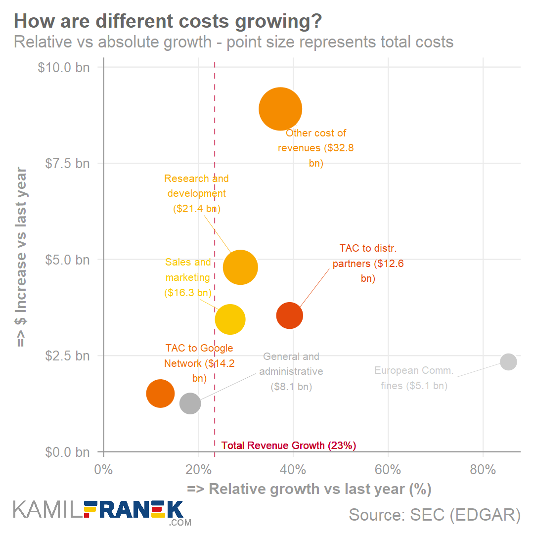
The next scatter plot/bubble plot was one that I had not expected.
I love how this unorthodox visualization really add insights, showing how different cost categories have developed over time.
There are some things I would tweak to make the graph more visually appealing though. Particularly the benchmark line is too rough in my opinion.
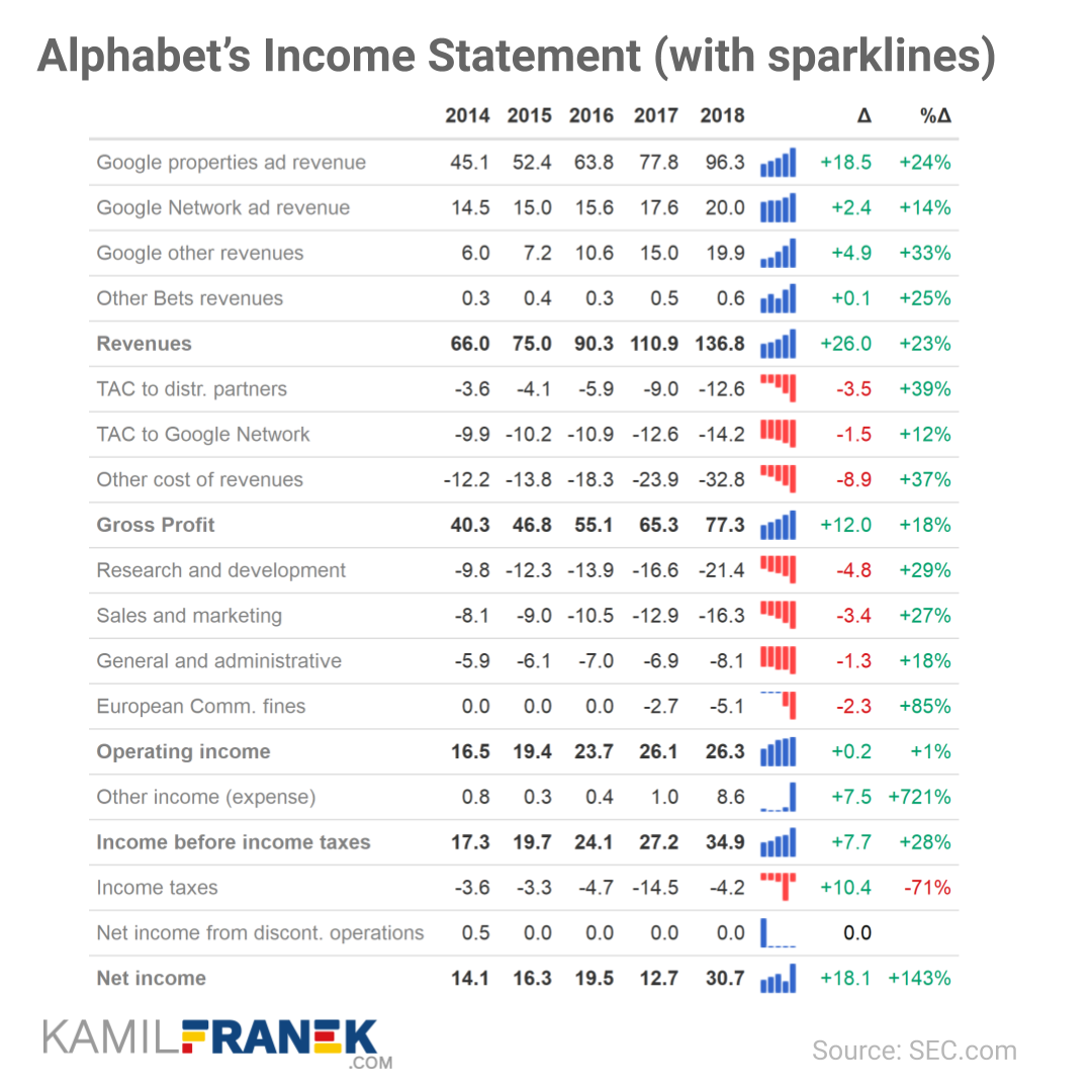
Very often, you don’t need a specialized graph, but a well-formatted table might be much more effective.
Kamil shows two great examples. The first one with an integrated bar chart/sparkline, the second one relying strongly on color cues. I prefer the second one, as it better shows the hierarchy in the categories with the highlighted rows.
Kamil takes it a step further in the next table, but I think they become less and less insightful as more information is included:
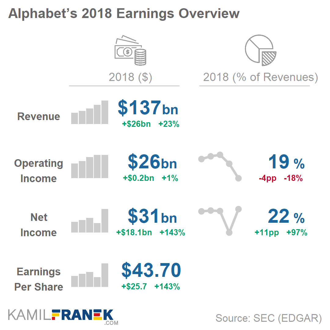
Kamil’s final recommendation is this key metrics dashboard. Though I like the general idea, I am not sure whether this one works for me. Particularly the line graphs on the right don’t provide much insight. I don’t know whether the last but one dot is 20% or 5% or 50% or 0%. The lack of reference points allows it to be any of these values.
Those who have been following me for some time now will know that I am a big fan of generative art: art created through computers, mathematics, and algorithms.
Several years back, my now wife bought me my first piece for my promotion, by Marcus Volz.
Nicholas was hesistant to sell me a piece and insisted that this series was not finished yet.
Yet, I already found it wonderful and lovely to look at and after begging Nicholas to sell us one of his early pieces, I sent it over to ixxi to have it printed and hanged it on our wall above our dinner table.
If you’re interested in Nicholas’ work, have a look at c82.net
Obviously, this is less than ideal for me, but also, I should not be surprised.
Clearly, I knew nothing about the company I bought shares in. Apparently they are going through some big time reorganization, and this is not good price-wise.
According to Investopedia: A quarterly report is a summary or collection of unaudited financial statements, such as balance sheets, income statements, and cash flow statements, issued by companies every quarter (three months). In addition to reporting quarterly figures, these statements may also provide year-to-date and comparative (e.g., last year’s quarter to this year’s quarter) results. Publicly-traded companies must file their reports with the Securities Exchange Committee (SEC).
Fortunately these quarterly reports are readily available on the investors relation page, and they are not that hard to read once you have seen a few.
Visualizing financial data
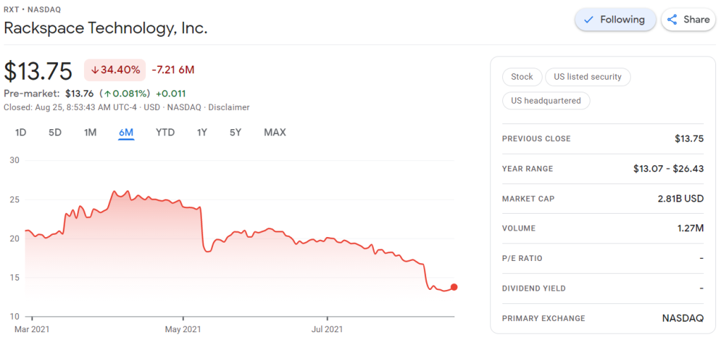
I was excited to see that Rackspace offered their financial performance in bite-sized bits to me as a laymen, through their usage of nice visualizations of the financial data.
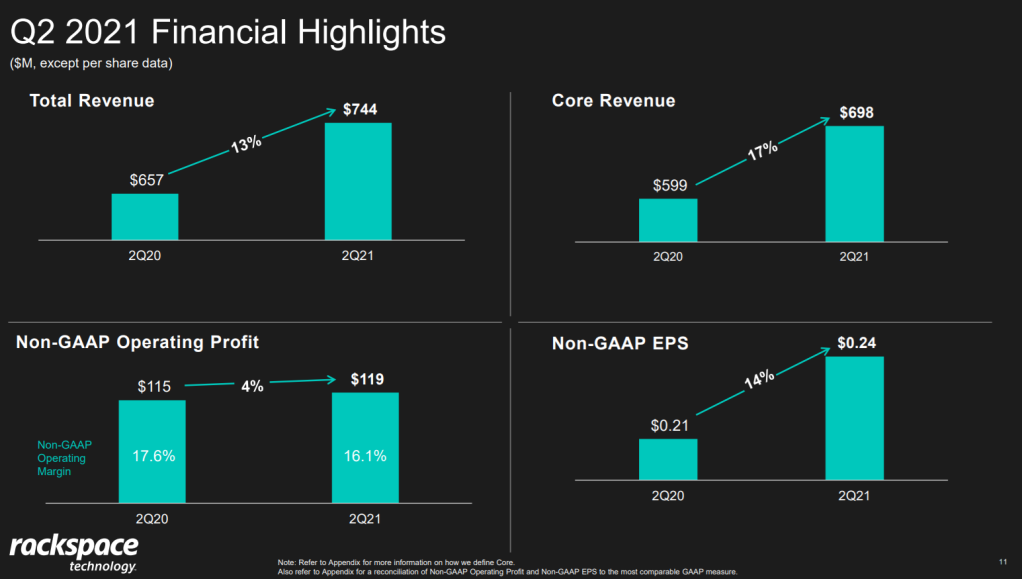
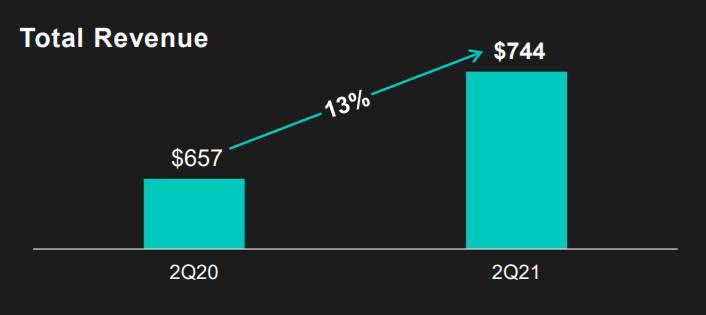
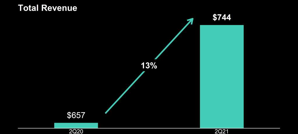
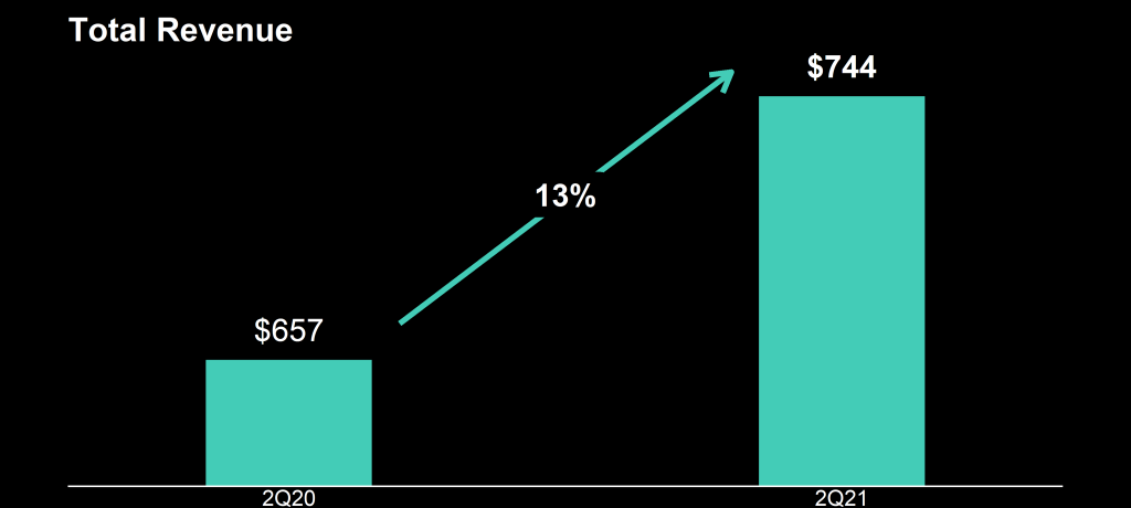
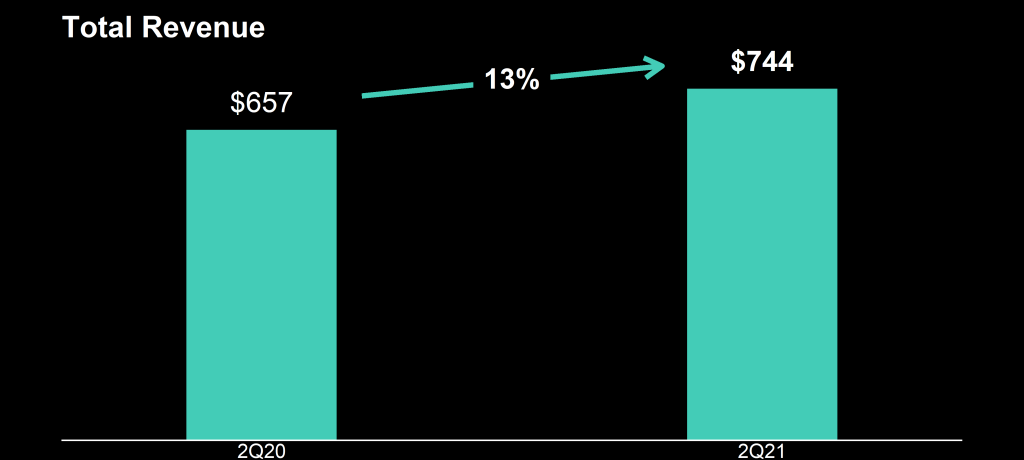
Please take a moment to process the below copy of page 11 of their 2021 Q2 report:
Though… the longer I looked at these charts… the more my head started to hurt…
How can the growth line be about the same in the three charts Total Revenue (top-left), Core Revenue (top-right), and Non-GAAP EPS (bottom-right)? They represent different increments: 13%, 17%, and 14% respectively.
Zooming in on the top left: how does the $657 revenue of 2Q20 fit inside the $744 revenue of 2Q21 almost three times?!
A few years back I completed my dissertation on data-driven Human Resource Management.
This specialized field is often dubbed HR analytics, for basically it’s the application of analytics to the topic of human resources.
Yet, as always in a specialized and hyped field, diifferent names started to emerge. The term People analytics arose, as did Workforce analytics, Talent analytics, and many others.
I addressed this topic in the introduction to my Ph.D. thesis and because I love data visualization, I decided to make a visual to go along with it.
So I gathered some Google Trends data, added a nice locally smoothed curve through it, and there you have it. As the original visual was so well received that it was even cited in this great handbook on HR analytics. With almost three years passed now, I decided it was time for an update. So here’s the 2021 version.
If you would compare this to the previous version, the trends look quite different. In the previous version, People Analytics had the dominant term since 2011 already.
Unfortunately, that’s not something I can help. Google indexes these search interest ratings behind the scenes, and every year or so, they change how they are calculated.
In my dissertation, I wrote the following on the topic:
This process of internally examining the impact of HRM activities goes by many different labels. Contemporary popular labels include people analytics (e.g., Green, 2017; Kane, 2015), HR analytics (e.g., Lawler, Levenson, & Boudreau, 2004; Levenson, 2005; Rasmussen & Ulrich, 2015; Paauwe & Farndale, 2017), workforce analytics (e.g., Carlson & Kavanagh, 2018; Hota & Ghosh, 2013; Simón & Ferreiro, 2017), talent analytics (e.g., Bersin, 2012; Davenport, Harris, & Shapiro, 2010), and human capital analytics (e.g., Andersen, 2017; Minbaeva, 2017a, 2017b; Levenson & Fink, 2017; Schiemann, Seibert, & Blankenship, 2017). Other variations including metrics or reporting are also common (Falletta, 2014) but there is consensus that these differ from the analytics-labels (Cascio & Boudreau, 2010; Lawler, Levenson, & Boudreau, 2004). While HR metrics would refer to descriptive statistics on a single construct, analytics involves exploring and quantifying relationships between multiple constructs.
Yet, even within analytics, a large variety of labels is used interchangeably. For instance, the label people analytics is favored in most countries globally, except for mainland Europe and India where HR analytics is used most (Google Trends, 2018). While human capital analytics seems to refer to the exact same concept, it is used almost exclusively in scientific discourse. Some argue that the lack of clear terminology is because of the emerging nature of the field (Marler & Boudreau, 2017). Others argue that differences beyond semantics exist, for instance, in terms of the accountabilities the labels suggest, and the connotations they invoke (Van den Heuvel & Bondarouk, 2017). In practice, HR, human capital, and people analytics are frequently used to refer to analytical projects covering the entire range of HRM themes whereas workforce and talent analytics are commonly used with more narrow scopes in mind: respectively (strategic) workforce planning initiatives and analytical projects in recruitment, selection, and development. Throughout this dissertation, I will stick to the label people analytics, as this is leading label globally, and in the US tech companies, and thus the most likely label to which I expect the general field to converge.
Update March, 2021: My R package for the predictive power score (ppsr) is live on CRAN! Try install.packages("ppsr") in your R terminal to get the latest version.
A few months ago, I wrote about the Predictive Power Score (PPS): a handy metric to quickly explore and quantify the relationships in a dataset.
As a social scientist, I was taught to use a correlation matrix to describe the relationships in a dataset. Yet, in my opinion, the PPS provides three handy advantages:
PPS works for any type of data, also nominal/categorical variables
PPS quantifies non-linear relationships between variables
PPS acknowledges the asymmetry of those relationships
# You can get the official version from CRAN:
install.packages("ppsr")

## Or you can get the development version from GitHub:
# install.packages('devtools')
# devtools::install_github('https://github.com/paulvanderlaken/ppsr')
Usage
The ppsr package has three main functions that compute PPS:
score() – which computes an x-y PPS
score_predictors() – which computes X-y PPS
score_matrix() – which computes X-Y PPS
Visualizing PPS
Subsequently, there are two main functions that wrap around these computational functions to help you visualize your PPS using ggplot2:
visualize_predictors() – producing a barplot of all X-y PPS
visualize_matrix() – producing a heatmap of all X-Y PPS
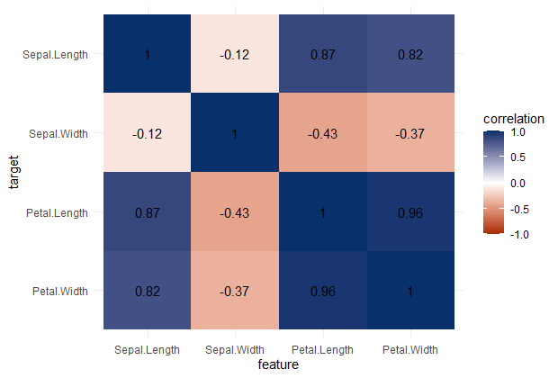
PPS matrix for iris
Note that Species is a nominal/categorical variable, with three character/text options.
A correlation matrix would not be able to show us that the type of iris Species can be predicted extremely well by the petal length and width, and somewhat by the sepal length and width. Yet, particularly sepal width is not easily predicted by the type of species.
Correlation matrix for iris
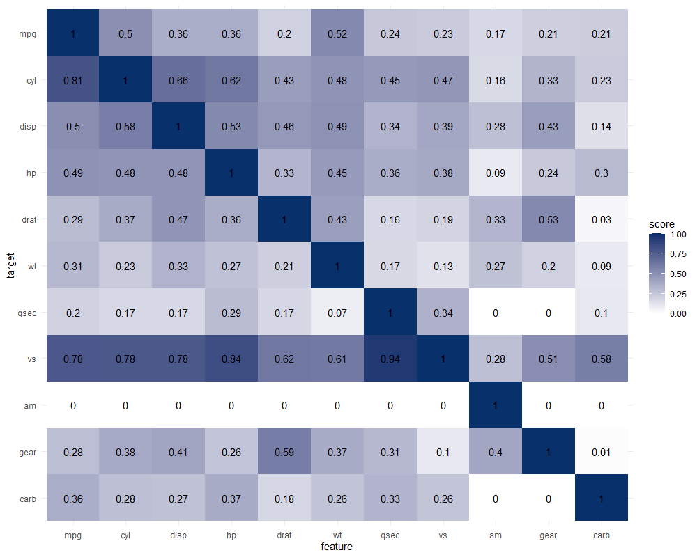
Exploring mtcars
It takes about 10 seconds to run 121 decision trees with visualize_matrix(mtcars). Yet, the output is much more informative than the correlation matrix:
cyl can be much better predicted by mpg than the other way around
the classification of vs can be done well using nearly all variables as predictors, except for am
yet, it’s hard to predict anything based on the vs classification
a cars’ am can’t be predicted at all using these variables
PPS matrix for mtcars
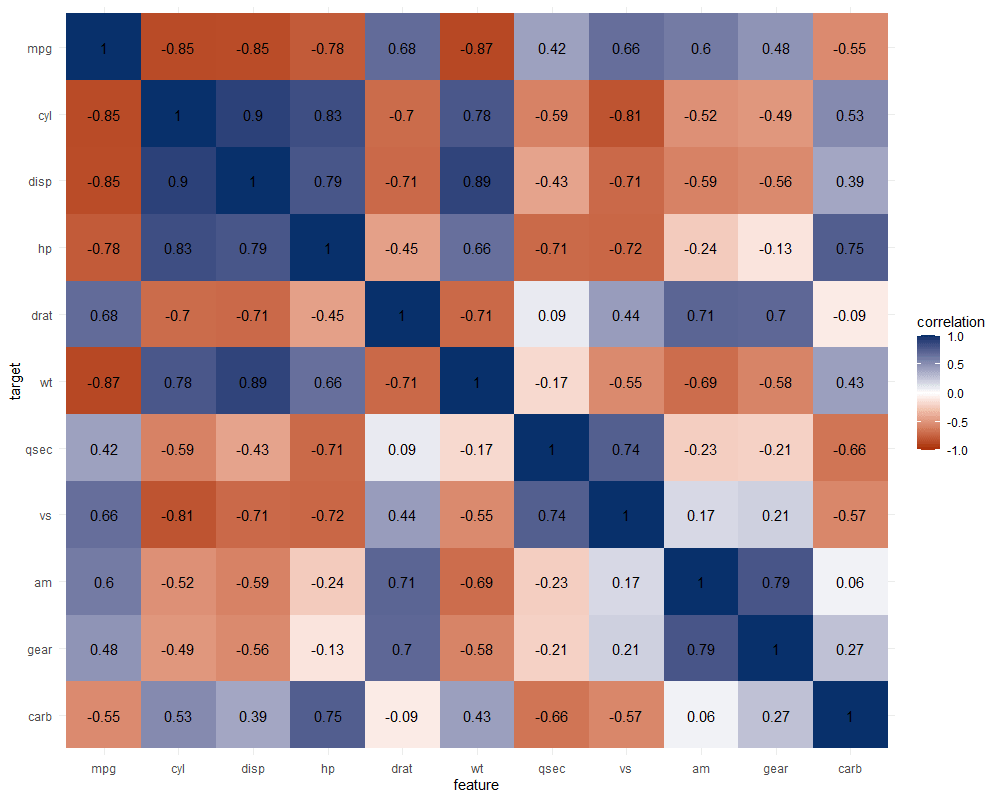
The correlation matrix does provides insights that are not provided by the PPS matrix. Most importantly, the sign and strength of any linear relationship that may exist. For instance, we can deduce that mpg relates strongly negatively with cyl.
Yet, even though half of the matrix does not provide any additional information (due to the symmetry), I still find it hard to derive the most important relations and insights at a first glance.
Moreover, the rows and columns for vs and am are not very informative in this correlation matrix as it contains pearson correlations coefficients by default, whereas vs and am are binary variables. The same can be said for cyl, gear and carb, which contain ordinal categories / integer data, so you can discuss the value of these coefficients depicted here.
Correlation matrix for mtcars
Exploring trees
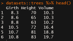
In R, there are many datasets built in via the datasets package. Let’s explore some using the ppsr::visualize_matrix() function.
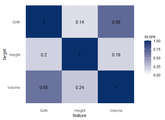
datasets::trees has data on 31 trees’ girth, height and volume.
visualize_matrix(datasets::trees) shows that both girth and volume can be used to predict the other quite well, but not perfectly.
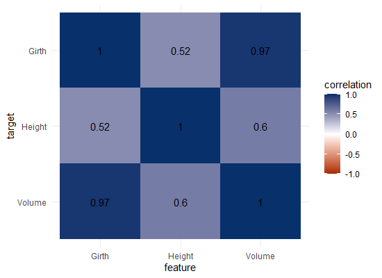
Let’s have a look at the correlation matrix.
The scores here seem quite higher in general. A near perfect correlation between volume and girth.
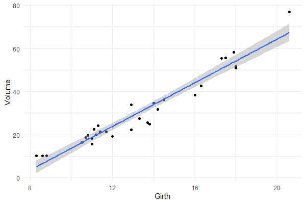
Is it near perfect though? Let’s have a look at the underlying data and fit a linear model to it.
You will still be pretty far off the real values when you use a linear model based on Girth to predict Volume. This is what the original PPS of 0.65 tried to convey.
Actually, I’ve run the math for this linaer model and the RMSE is still 4.11. Using just the mean Volume as a prediction of Volume will result in 16.17 RMSE. If we map these RMSE values on a linear scale from 0 to 1, we would get the PPS of our linear model, which is about 0.75.
So, actually, the linear model is a better predictor than the decision tree that is used as a default in the ppsr package. That was used to generate the PPS matrix above.
Yet, the linear model definitely does not provide a perfect prediction, even though the correlation may be near perfect.
Conclusion
In sum, I feel using the general idea behind PPS can be very useful for data exploration.
Particularly in more data science / machine learning type of projects. The PPS can provide a quick survey of which targets can be predicted using which features, potentially with more complex than just linear patterns.
Yet, the old-school correlation matrix also still provides unique and valuable insights that the PPS matrix does not. So I do not consider the PPS so much an alternative, as much as a complement in the toolkit of the data scientist & researcher.
Enjoy the R package, or the Python module for that matter, and let me know if you see any improvements!