Tag: randomforest

Animated Machine Learning Classifiers

Animated Machine Learning Classifiers

Ryan Holbrook made awesome animated GIFs in R of several classifiers learning a decision rule boundary between two classes. Basically, what you see is a machine learning model in action, learning how to distinguish data of two classes, say cats and dogs, using some X and Y variables.

These visuals can be great to understand these algorithms, the models, and their learning process a bit better.

Here’s the original tweet, with the logistic regression animation. If you follow it, you will find a whole thread of classifier GIFs. These I extracted, pasted, and explained below.

Below is the GIF which I extracted using EZgif.com.

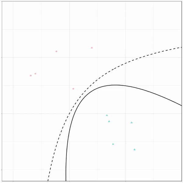
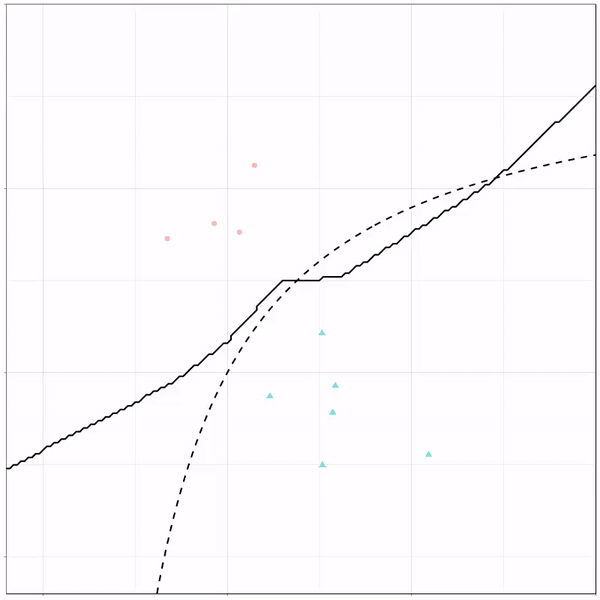
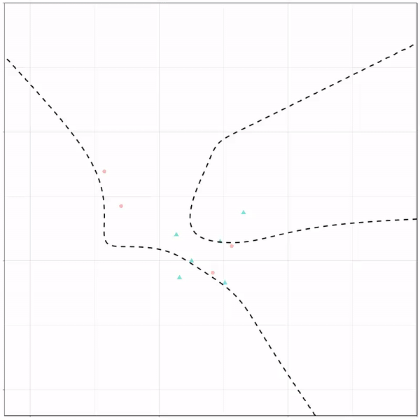
What you see is observations from two classes, say cats and dogs, each represented using colored dots. The dots are placed along X and Y axes, which represent variables about the observations. Their tail lengths and their hairyness, for instance.

Now there’s an optimal way to seperate these classes, which is the dashed line. That line best seperates the cats from the dogs based on these two variables X and Y. As this is an optimal boundary given this data, it is stable, it does not change.

However, there’s also a solid black line, which does change. This line represents the learned boundary by the machine learning model, in this case using logistic regression. As the model is shown more data, it learns, and the boundary is updated. This learned boundary represents the best line with which the model has learned to seperate cats from dogs.

Anything above the boundary is predicted to be class 1, a dog. Everything below predicted to be class 2, a cat. As logistic regression results in a linear model, the seperation boundary is very much linear/straight.

Logistic regression gif by Ryan Holbrook

These animations are great to get a sense of how the models come to their boundaries in the back-end.

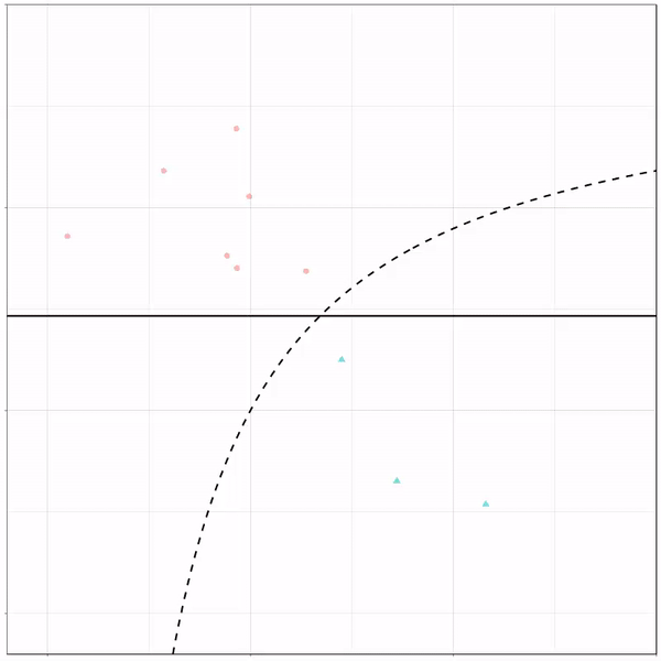
For instance, other machine learning models are able to use non-linear boundaries to dinstinguish classes, such as this quadratic discriminant analysis (qda). This “learned” boundary is much closer to the optimal boundary:

Quadratic discriminant analysis gif by Ryan Holbrook

Models using multivariate adaptive regression splines (or MARS) seem to result in multiple linear boundaries pasted together:

Multivariate adaptive regression splines gif by Ryan Holbrook

Next, we have the k-nearest neighbors algorithm, which predicts for each point (animal) the class (cat/dog) based on the “k” points closest to it. As you see, this results in a highly fluctuating, localized boundary.

K-nearest neighbors gif by Ryan Holbrook

Now, Ryan decided to push the challenge, and simulate new data for two classes with a more difficult decision boundary. The new data and optimal boundaries look like this:

The optimal decision boundary.
Via https://mathformachines.com/posts/decision/

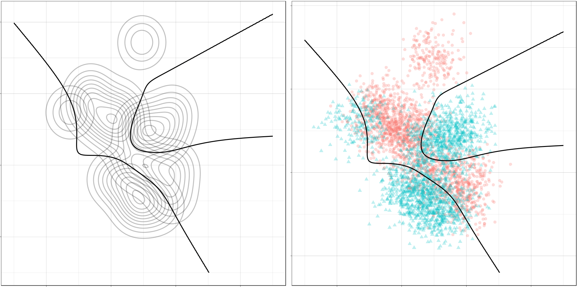
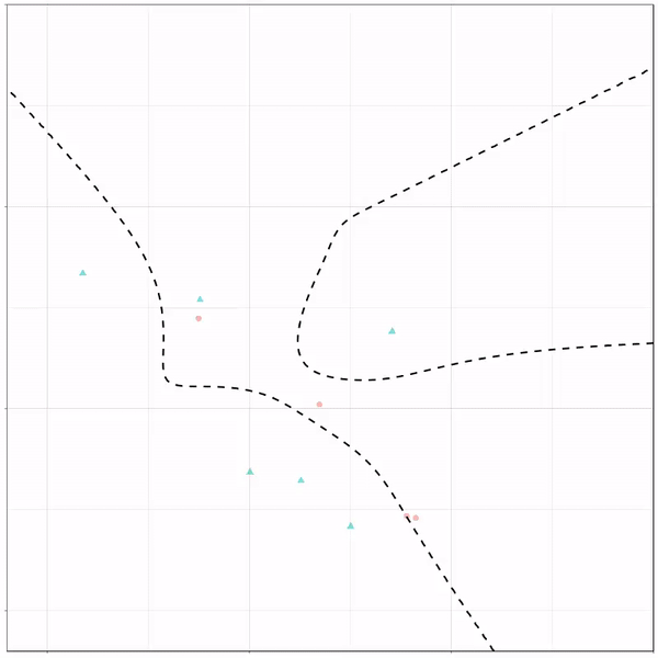
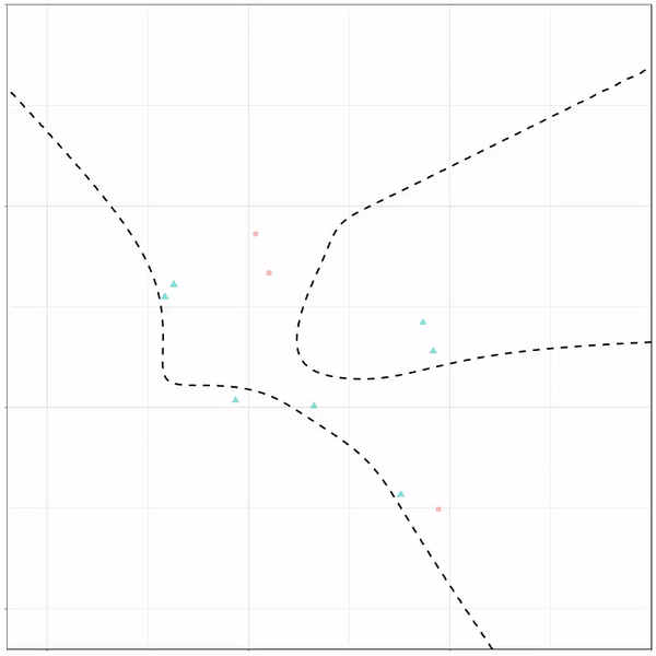
On these data, Ryan put a whole range of non-linear models to work.

Like this support-vector machine, which tries to create optimal boundaries built of support vectors around all the cats and all the dohs (this is definitely not a technical, error-free explanation of what’s happening here).

Support vector machine gif by Ryan Holbrook

Generalized additive models are also cool to see in action. Why Ryan’s versions render so slowly, I don’t know. To learn more about GAMs, I strongly advise this tutorial here.

Generalized additive model gif by Ryan Holbrook

Let’s jump into some tree-based algorithms and the resulting models. A decision tree classifies data based on multiple, sequential, binary splits. Here, Ryan trained a simple decision tree:

Decision tree gif by Ryan Holbrook

As well as it’s big brother, a random forest, which uses hundreds of trees in the back end and thus results in a more flexible boundary:

Random forest gif by Ryan Holbrook

Extreme gradient boosting is also a tree-based algorithm, which leverages many machine learning techniques to optimize the bias-variance tradeoff. Here’s an earlier blog on how to get started with Xgboost in Python or R:

Extreme gradient boosting gif by Ryan Holbrook

Finally, a machine learning project is not complete without an artificial neural network. Learn more on these here:

Artificial neural network gif by Ryan Holbrook

If you want to know more about this project of Ryan Holbrook, do have a look at his accompanying blog here. You can also find Ryan’s code here on github.

Calibrating algorithmic predictions with logistic regression

Calibrating algorithmic predictions with logistic regression

I found this interesting blog by Guilherme Duarte Marmerola where he shows how the predictions of algorithmic models (such as gradient boosted machines, or random forests) can be calibrated by stacking a logistic regression model on top of it: by using the predicted leaves of the algorithmic model as features / inputs in a subsequent logistic model.

When working with ML models such as GBMs, RFs, SVMs or kNNs (any one that is not a logistic regression) we can observe a pattern that is intriguing: the probabilities that the model outputs do not correspond to the real fraction of positives we see in real life.

Guilherme’s in his blog post

This is visible in the predictions of the light gradient boosted machine (LGBM) Guilherme trained: its predictions range only between ~ 0.45 and ~ 0.55. In contrast, the actual fraction of positive observations in those groups is much lower or higher (ranging from ~ 0.10 to ~0.85).

Motivated by sklearn’s topic Probability Calibration and the paper Practical Lessons from Predicting Clicks on Ads at Facebook, Guilherme continues to show how the output probabilities of a tree-based model can be calibrated, while simultenously improving its accuracy.

I highly recommend you look at Guilherme’s code to see for yourself what’s happening behind the scenes, but basically it’s this:

  • Train an algorithmic model (e.g., GBM) using your regular features (data)
  • Retrieve the probabilities GBM predicts
  • Retrieve the leaves (end-nodes) in which the GBM sorts the observations
  • Turn the array of leaves into a matrix of (one-hot-encoded) features, showing for each observation which leave it ended up in (1) and which not (many 0’s)
  • Basically, until now, you have used the GBM to reduce the original features to a new, one-hot-encoded matrix of binary features
  • Now you can use that matrix of new features as input for a logistic regression model predicting your target (Y) variable
  • Apparently, those logistic regression predictions will show a greater spread of probabilities with the same or better accuracy

Here’s a visual depiction from Guilherme’s blog, with the original GBM predictions on the X-axis, and the new logistic predictions on the Y-axis.

As you can see, you retain roughly the same ordering, but the logistic regression probabilities spread is much larger.

Now according to Guilherme and the Facebook paper he refers to, the accuracy of the logistic predictions should not be less than those of the original algorithmic method.

Much better. The calibration plot of lgbm+lr is much closer to the ideal. Now, when the model tells us that the probability of success is 60%, we can actually be much more confident that this is the true fraction of success! Let us now try this with the ET model.

Guilherme in https://gdmarmerola.github.io/probability-calibration/

In his blog, Guilherme shows the same process visually for an Extremely Randomized Trees model, so I highly recommend you read the original article. Also, you can find the complete code on his GitHub.

Causal Random Forests, by Mark White

Causal Random Forests, by Mark White

I stumbled accros this incredibly interesting read by Mark White, who discusses the (academic) theory behind, inner workings, and example (R) applications of causal random forests:

EXPLICITLY OPTIMIZING ON CAUSAL EFFECTS VIA THE CAUSAL RANDOM FOREST: A PRACTICAL INTRODUCTION AND TUTORIAL (By Mark White)

These so-called “honest” forests seem a great technique to identify opportunities for personalized actions: think of marketing, HR, medicine, healthcare, and other personalized recommendations. Note that an experimental setup for data collection is still necessary to gather the right data for these techniques.

https://www.markhw.com/blog/causalforestintro

Predicting Employee Turnover at SIOP 2018

The 2018 annual Society for Industrial and Organizational Psychology (SIOP) conference featured its first-ever machine learning competition. Teams competed for several months in predicting the enployee turnover (or churn) in a large US company. A more complete introduction as presented at the conference can be found here. All submissions had to be open source and the winning submissions have been posted in this GitHub repository. The winning teams consist of analysts working at WalMart, DDI, and HumRRO. They mostly built ensemble models, in Python and/or R, combining algorithms such as (light) gradient boosted trees, neural networks, and random forest analysis.

Identifying “Dirty” Twitter Bots with R and Python

Past week, I came across two programming initiatives to uncover Twitter bots and one attempt to identify fake Instagram accounts.

Mike Kearney developed the R package botornot which applies machine learning to estimate the probability that a Twitter user is a bot. His default model is a gradient boosted model trained using both users-level (bio, location, number of followers and friends, etc.) and tweets-level information (number of hashtags, mentions, capital letters, etc.). This model is 93.53% accurate when classifying bots and 95.32% accurate when classifying non-bots. His faster model uses only the user-level data and is 91.78% accurate when classifying bots and 92.61% accurate when classifying non-bots. Unfortunately, the models did not classify my account correctly (see below), but you should definitely test yourself and your friends via this Shiny application.

Fun fact: botornot can be integrated with Mike’s rtweet package

Scraping Dirty Bots

At around the same time, I read this very interesting blog by Andy Patel. Annoyed by the fake Twitter accounts that kept liking and sharing his tweets, Andy wrote a Python script called pronbot_search. It’s an iterative search algorithm which Andy seeded with the dozen fake Twitter accounts that he identified originally. Subsequently, the program iterated over the friends and followers of each of these fake users, looking for other accounts displaying similar traits (e.g., similar description, including an URL to a sex-website called “Dirty Tinder”).

Whenever a new account was discovered, it was added to the query list, and the process continued. Because of the Twitter API restrictions, the whole crawling process took literal days before Andy manually terminated it. The results are just amazing:

After a day, the results looked like so. Notice the weird clusters of relationships in this network. [original]
The full bot network uncovered by Andy included 22.000 fake Twitter accounts:

At the end of the weekend of March 10th, Andy had to stop the scraper after running for several days even though he had only processed 18% of the networks of the 22.000 included Twitter bots [original]
The bot network on Twitter is probably enormous! Zooming in on the network, Andy notes that:

Pretty much the same pattern I’d seen after one day of crawling still existed after one week. Just a few of the clusters weren’t “flower” shaped.

Andy Patel, March 2018, link

Zoomed in to a specific part of the network you can see the separate clusters of bots doing little more than liking each others messages. [original]
In his blog, Andy continues to look at all kind of data on these fake accounts. I found most striking that many of these account are years and years old already. Potentially, Twitter can use Mike Kearney’s botornot application to spot and remove them!

Most of the bots in the Dirty Tinder network found by Andy Patel were 3 to 8 years old already. [original]
Andy was nice enough to share the data on these bot accounts here, for you to play with. His Python code is stored in the same github repo and more details around this project you can read in his original blog.

Fake Instagram Accounts

Finally, SRFdata (Timo Grossenbacher) attempted to uncover fake Instagram followers among the 7 million followers in the network of 115 important Swiss Instagram influencers in R. Magi Metrics was used to retrieve information for public Instagram accounts and rvest for private accounts. Next, clear fake accounts (e.g., little followers, following many, no posts, no profile picture, numbers in name) were labelled manually, and approximately 10% of the inspected 1000 accounts appeared fake. Finally, they trained a random forest model to classify fake accounts with a sensitivity (true negative) rate of 77.4% and an overall accuracy of around 94%.

Advanced GIFs in R

Advanced GIFs in R

Rafa Irizarry is a biostatistics professor and one of the three people behind SimplyStatistics.org (the others are Jeff LeekRoger Peng). They post ideas that they find interesting and their blog contributes greatly to discussion of science/popular writing.

Rafa is the creator of many data visualization GIFs that have recently trended on the web, and in a recent post he provides all the source code behind the beautiful imagery. I sincerely recommend you check out the orginal blog if you want to find out more, but here are the GIFS:

Simpson’s paradox is a statistical phenomenon where an observed relationship within a population reverses within all subgroups that make up that population. Rafa visualized it wonderfully in a GIF that took only twenty-some lines of R code:

A different statistical phenomenon is discussed at the end of the original blog: namely  the ecological fallacy. It occurs when correlations that occur on the group-level are erroneously extrapolated to the individual-level. Rafa used the gapminder data included in the dslabs package to illustrate the fallacy: there is a very high correlation at the region level and a lower correlation at the individual country level:

The gapminder data is also used in the next GIF. This mimics Hans Rosling’s famous animation during his talk on New Insights on Poverty, but then made with R and gganimate by Rafa:

A next visualization demonstrates how the UN voting data (of Erik Voeten and Anton Strezhnev) can be used to examine different voting behaviors. It seems to reduce the voting data to a two-dimensional factor structure, and seemingly there are three distinct groups of voters these days, with particularly the USA and Israel far removed from other members:

The next GIFs are more statistical. The one below demonstrates how the local regression (LOESS) works. Simply speaking, LOESS determines the relationship for a local subset of the population and when you iteratively repeat this for all local subsets in a population you get a nicely fitting LOESS curve, the red line in Rafa’s GIF:

Not quite sure how to interpret the next one, but Rafa explains it visualized a random forest’s predictions using only one predictor variable. I think that different trees would then provide different predictions because they leverage different training samples, and an ensemble of those trees would then improve predictive accuracy?

The next one is my favorite I think. This animation illustrates how a highly accurate test would function in a population with low prevalence of true values (e.g., disease, applicant success). More details are in the original blog or here.

The blog ends with a rather funny animation of the only good use of pie charts, according to Rafa: