
In my data visualization courses, I often refer to the hierarchy of visual encoding proposed by Cleveland and McGill. In their 1984 paper, Cleveland and McGill proposed the table below, demonstrating to what extent different visual encodings of data allow readers of data visualizations to accurately assess differences between data values.

Since then, this table has been used and copied by many data visualization experts, and adapted to more visually appealing layouts. Like this one by Alberto Cairo, referred to in a blog by Maarten Lambrechts:

Now, this brings me to the point of this current blog, in which I want to share an older post by Maarten Lambrechts. I came across Maarten’s post only yesterday, but it touches on many topics and content that I’ve covered earlier on my own website or during my courses. It’s mainly about the relative effectiveness and efficiency of using dots/points in data visualizations.
Basically, dots are often the most accurate and to the point (pun intended). With the latter, I mean in terms of inkt used, dots/points are more efficient than bars, or as Maarten says:
Points go beyond where lines and bars stop. Sounds weird, especially for those who remember from their math classes that a line is an infinite collection of points. But in visualization, points can do so much more then lines. Here are seven reasons why you should use more dot graphs, with some examples.
http://www.maartenlambrechts.com/2015/05/03/to-the-point-7-reasons-you-should-use-dot-graphs.html
Maarten touches on the research of Cleveland and McGill, on a PLOS article advocating avoiding bars for continuous data, and on how to redesign charts to make use of more efficiënt dot/point encodings. I really loved this one redesign example Maarten shares. Unfortunately, it is in Dutch, but both graphs show pretty much the same data, though the simpler one better communicates the main message.
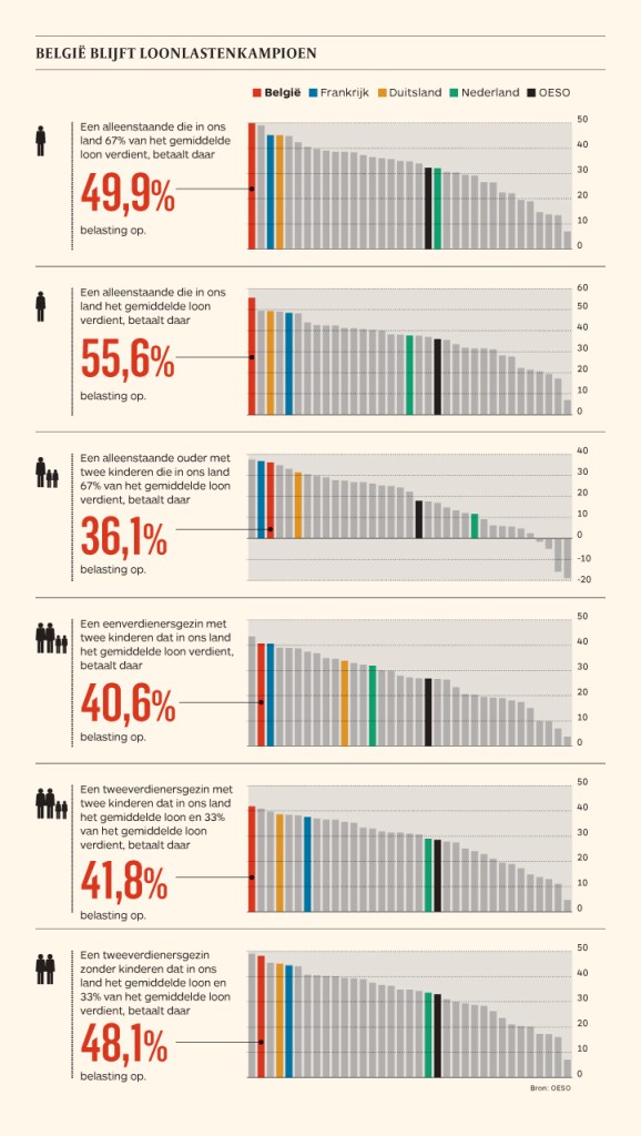
before 
after
Do have a look at the rest of Maarten’s original blog post. I love how he ends it with some practical advice: A nice lookup table for those looking how to efficiently use points/dots to represent their n-dimensional data:
- For comparisons of a single dimension across many categories: 1-dimensional scatterplot.
- For detecting of skewed or bimodal distributions in 2 variables: connect 1-dimensional scatterplots (slopegraphs)
- For showing relationships between 2 variables: 2-dimensional scatterplots.
- For representing 4-dimensional data (3 numeric, 1 categorical or 4 numerical): bubble charts. Can also be used for 3 numerical dimensions or 2 numeric and 1 categorical value.
- For representing 4-dimensional data + time: animated bubble chart (aka Rosling-graph)


