10 Guidelines to Better Table Design

10 Guidelines to Better Table Design

Jon Schwabisch recently proposed ten guidelines for better table design.

Next to the academic paper, Jon shared his recommendations in a Twitter thread.

Let me summarize them for you:

  • Right-align your numbers
  • Left-align your texts
  • Use decimals appropriately (one or two is often enough)
  • Display units (e.g., $, %) sparsely (e.g., only on first row)
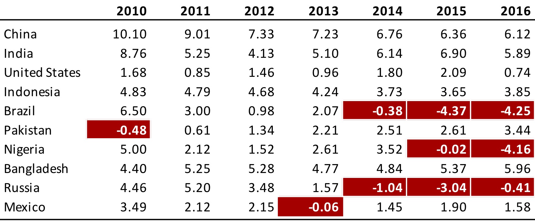
  • Highlight outliers
  • Highlight column headers
  • Use subtle highlights and dividers
  • Use white space between rows and columns
  • Use white space (or dividers) to highlight groups
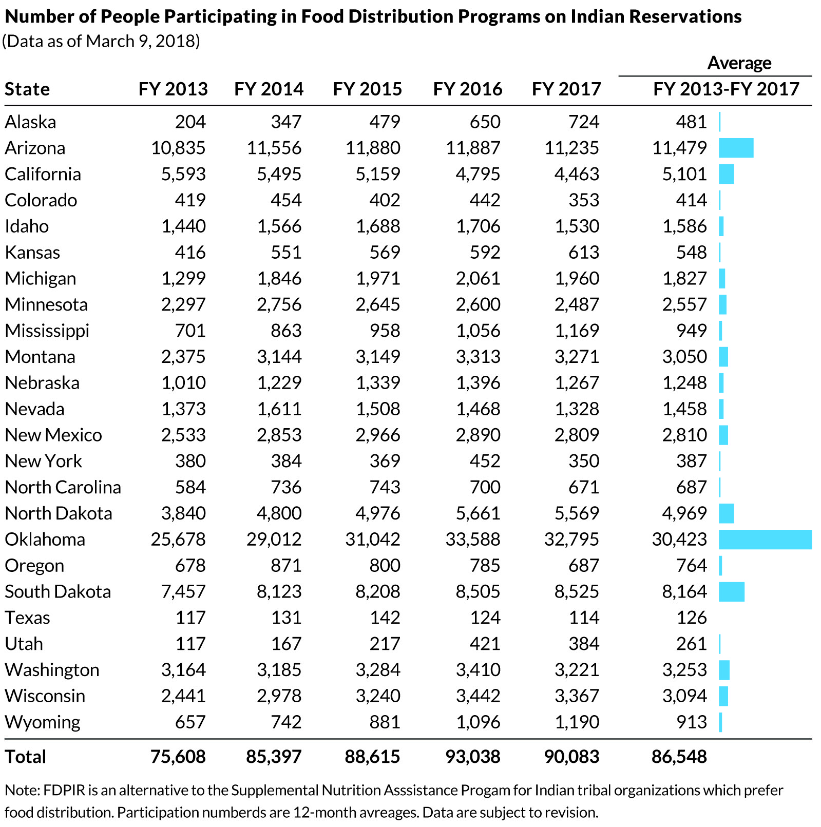
  • Use visualizations for large tables
Afbeelding
Highlights in a table. Via twitter.com/jschwabish/status/1290324966190338049/photo/2
Afbeelding
Visualizations in a table. Via twitter.com/jschwabish/status/1290325409570197509/photo/3
Afbeelding
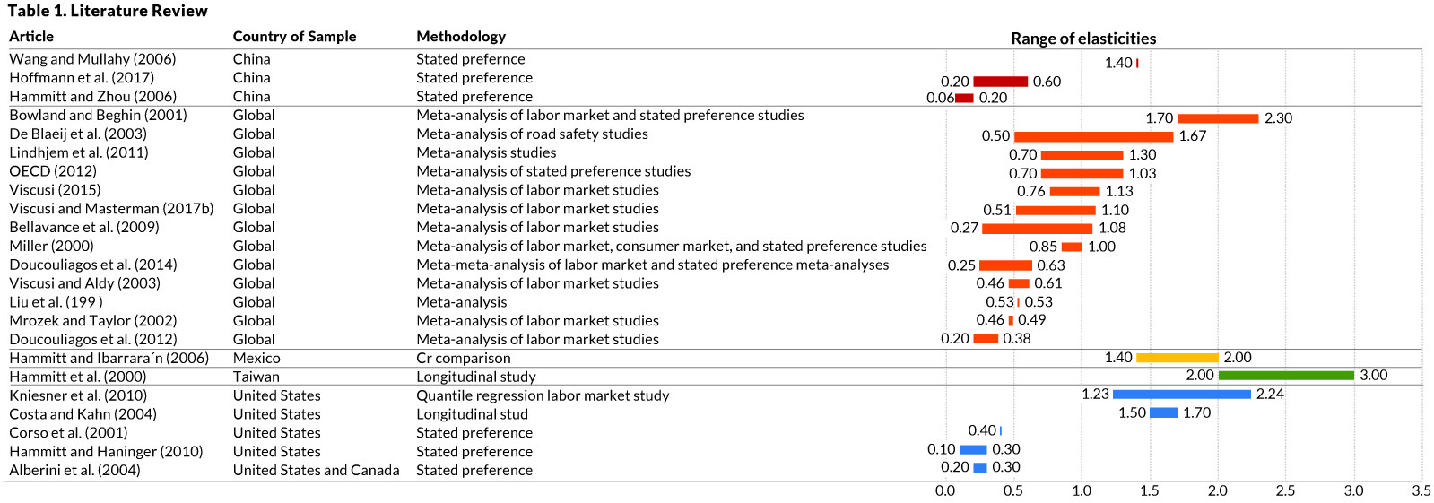
Example of a well-organized table. Via twitter.com/jschwabish/status/1290325663543627784/photo/2

4 thoughts on “10 Guidelines to Better Table Design

Leave a Reply

Fill in your details below or click an icon to log in:

WordPress.com Logo

You are commenting using your WordPress.com account. Log Out /  Change )

Twitter picture

You are commenting using your Twitter account. Log Out /  Change )

Facebook photo

You are commenting using your Facebook account. Log Out /  Change )

Connecting to %s