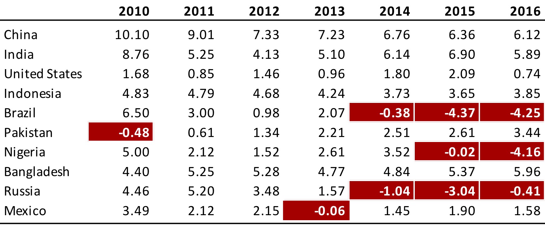
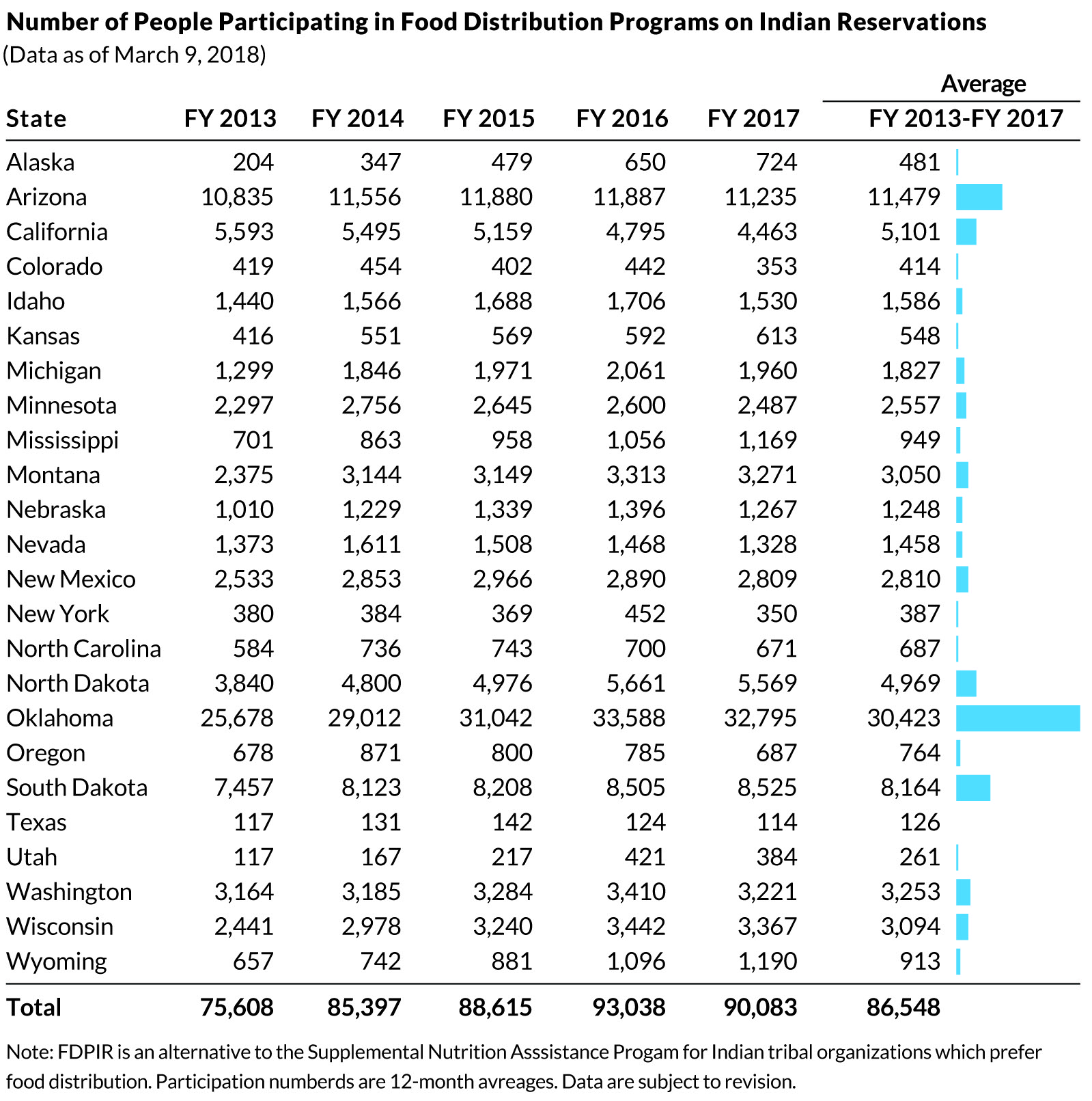
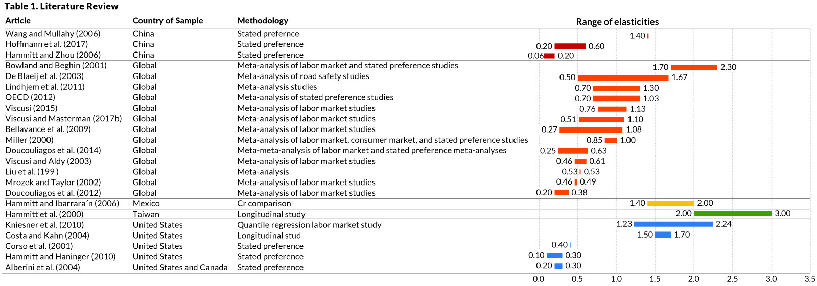
Jon Schwabisch recently proposed ten guidelines for better table design.
Next to the academic paper, Jon shared his recommendations in a Twitter thread.
Let me summarize them for you:
- Right-align your numbers
- Left-align your texts
- Use decimals appropriately (one or two is often enough)
- Display units (e.g., $, %) sparsely (e.g., only on first row)
- Highlight outliers
- Highlight column headers
- Use subtle highlights and dividers
- Use white space between rows and columns
- Use white space (or dividers) to highlight groups
- Use visualizations for large tables