Category: best practices

How to confuse your shareholders by bad data visualization

How to confuse your shareholders by bad data visualization

Like many people during the COVID19 crisis, I turned to the stock market as a new hobby.

Like the ignorant investor that I am, I thought it wise to hop on the cloud computing bandwagon.

Hence, I bought, among others, a small position in Rackspace Technologies.

A long way down

Now, my Rackspace shares have plummeted in price since I bought them.
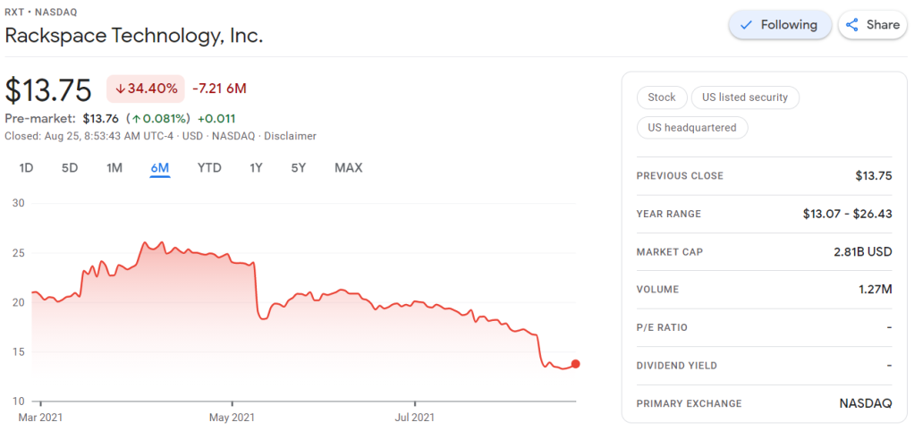
Screenshot of Google Finance on August 25th 2021: https://www.google.com/finance/quote/RXT:NASDAQ?sa=X&ved=2ahUKEwjxqdr0oczyAhWKtqQKHZk3A90Q_AUoAXoECAEQAw&window=6M

Obviously, this is less than ideal for me, but also, I should not be surprised.

Clearly, I knew nothing about the company I bought shares in. Apparently they are going through some big time reorganization, and this is not good price-wise.

Fast forward to yesterday.

Doing research

To re-evalute my investment, I thought it wise to have a look at Rackspace’s Quarterly Report.

According to Investopedia: quarterly report is a summary or collection of unaudited financial statements, such as balance sheets, income statements, and cash flow statements, issued by companies every quarter (three months). In addition to reporting quarterly figures, these statements may also provide year-to-date and comparative (e.g., last year’s quarter to this year’s quarter) results. Publicly-traded companies must file their reports with the Securities Exchange Committee (SEC).

Fortunately these quarterly reports are readily available on the investors relation page, and they are not that hard to read once you have seen a few.

Visualizing financial data

I was excited to see that Rackspace offered their financial performance in bite-sized bits to me as a laymen, through their usage of nice visualizations of the financial data.

Please take a moment to process the below copy of page 11 of their 2021 Q2 report:
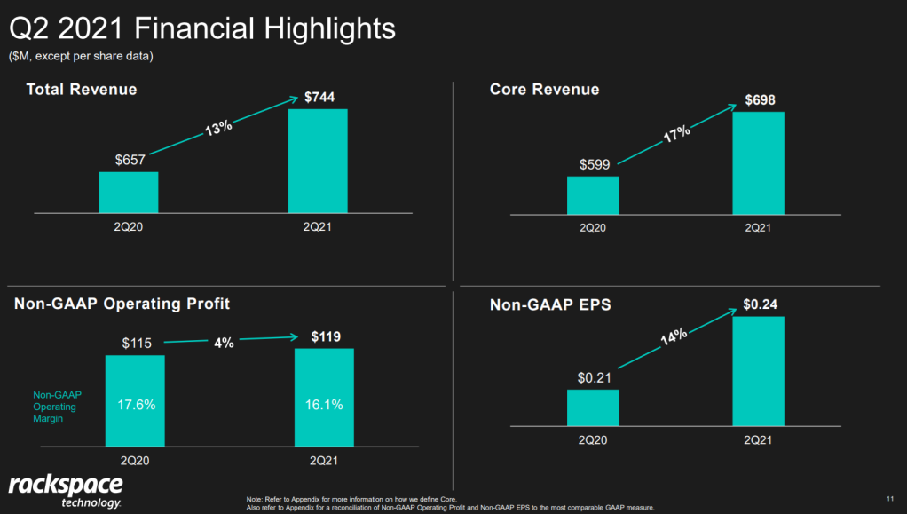
Screenshot of page 11 of the 2021 Q2 Quarterly Report of Rackspace Technologies: https://ir.rackspace.com/static-files/474fde80-f203-4227-a438-57b062992d46

Though… the longer I looked at these charts… the more my head started to hurt…

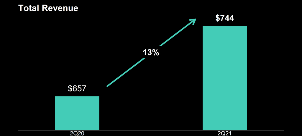
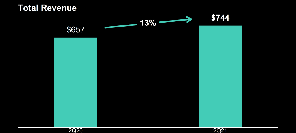
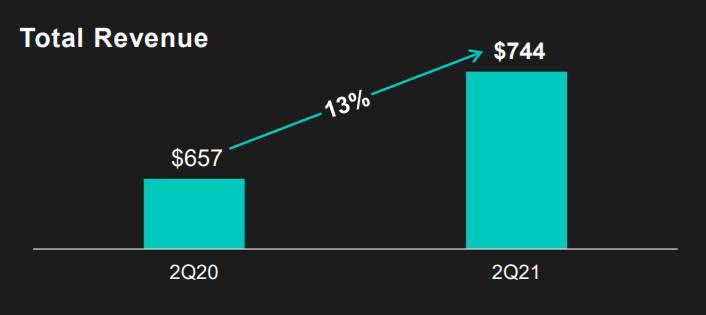
How can the growth line be about the same in the three charts Total Revenue (top-left), Core Revenue (top-right), and Non-GAAP EPS (bottom-right)? They represent different increments: 13%, 17%, and 14% respectively.

Zooming in on the top left: how does the $657 revenue of 2Q20 fit inside the $744 revenue of 2Q21 almost three times?!

The increase is only 13%, not 300%!
Screenshot of page 11 of the 2021 Q2 Quarterly Report of Rackspace Technologies: https://ir.rackspace.com/static-files/474fde80-f203-4227-a438-57b062992d46

Recreating the problem

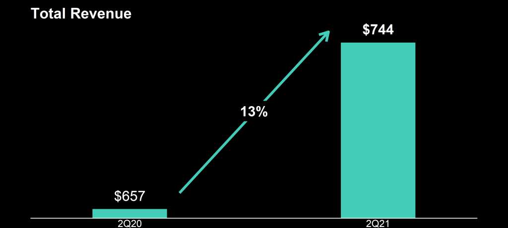
I decided to recreate the vizualizations of the quarterly report.

To see what the visualization should have actually looked like. And to see how they could have made this visualization worse.

You can find the R ggplot2 code for these plots here on Github.

If you know me, you know I can’t do something 50%, so I decided to make the plots look as closely to the original Rackspace design as possible.

Here are the results:
Here are all three combined, along with two simple questions:
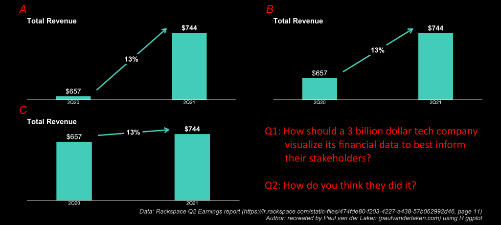
This I shared on social media (LinkedIn, Twitter), to ask for people’s opinions:

And I tagged Rackspace and offered them my help!

I hope they’re not offended and respond : )

Computerphile on Cyber Security

Computerphile on Cyber Security

Computerphile is a Youtube sister channel of Numberphile. Where Numberphile’s videos are about the magic behind match and numbers, Computerphile’s videos are all about computers and computer stuff. I recommend both channels in general, and have watched many of their videos already.

Yet, over the past weeks I specifically enjoyed what seems to be several series of videos on Cyber Security related topics.

What makes a good password?

One series is all about passwords.

What are strong passwords, which are bad? How can hackers crack yours? And how do websites secure user passwords?

The videos below are in somewhat of the right order and they make for an interesting insight in the world of password management. They give you advice on how to pick you password, and even a nice tool to check whether your password has ever been leaked.

Probably, you will want to change your password afterwards!

Hacking and attacking

If you are up to no good, please do not watch this second series, which revolves all around hacks and computer attacks.

How do people get access to a websites database? How can we prevent it? How can we recognize security dangers?

You might know of SQL injections, but do you know what a slow loris attack is? Or how ransomware works? Or what exploitX is?

These videos nicely continue the line of a previous post on Try Hack Me’s Cyber Security Challenges, where you can learn how computers work and where there vulnerabilities lie.

Practical Tools for Human-Centered Design

Practical Tools for Human-Centered Design

Google’s guidebook to human-centered AI design refered to the Design Kit, containing numerous helpful tools to help you design products with user experience in mind.

The design kit website contains many practical methods, tools, case studies and much more resources to help you in the design process.

Screenshot of designkit.org/methods

Human-centered design is a practical, repeatable approach to arriving at innovative solutions. Think of these Methods as a step-by-step guide to unleashing your creativity, putting the people you serve at the center of your design process to come up with new answers to difficult problems.

The design kit methods section provides some seriously handy guidelines to help you design your products with the customer in mind. A step-by-step process guideline is offered, as well as neat worksheets to records the information you collect in the process, and a video explanation of the method.

Example method screenshot from designkit.org/methods/frame-your-design-challenge
Google’s Responsible AI Practices

Google’s Responsible AI Practices

As a company that uses a lot of automation, optimization, and machine learning in their day-to-day business, Google is set on developing AI in a socially responsible way.

Fortunately for us, Google decided to share their principles and best practices for us to read.

Google’s Objectives for AI applications

The details behind the seven objectives below you can find here.

  1. Be socially beneficial.
  2. Avoid creating or reinforcing unfair bias.
  3. Be built and tested for safety.
  4. Be accountable to people.
  5. Incorporate privacy design principles.
  6. Uphold high standards of scientific excellence.
  7. Be made available for uses that accord with these principles.

Moreover, there are several AI technologies that Google will not build:

Google’s best practices for Responsible AI

For the details behind these six best practices, read more here.

  1. Use a Human-centered approach (see also here)
  2. Identify multiple metrics to assess training and monitoring
  3. When possible, directly examine your raw data
  4. Understand the limitations of your dataset and model
  5. Test, Test, Test,
  6. Continue to monitor and update the system after deployment
10 Tips for Effective Dashboard Design by Deloitte

10 Tips for Effective Dashboard Design by Deloitte

My colleague prof. Jack van Wijk pointed me towards these great guidelines by Deloitte on how to design an effective dashboard.

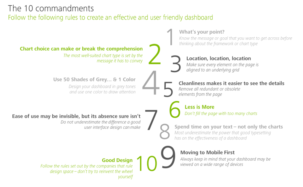
Some of these rules are more generally applicable to data visualization. Yet, the Deloitte 10 commandments form a good checklist when designing a dashboard.

Here’s my interpretation of the 10 rules:

  1. Know your message or goal
  2. Choose the chart that conveys your message best
  3. Use a grid to bring order to your dashboard
  4. Use color only to highlight and draw attention
  5. Remove unneccessary elements
  6. Avoid information overload
  7. Design for ease of use
  8. Text is as important as charts
  9. Design for multiple devices (desktop, tablet, mobile, …)
  10. Recycle good designs (by others)

In terms of recycling the good work by others operating in the data visualization field, check out:

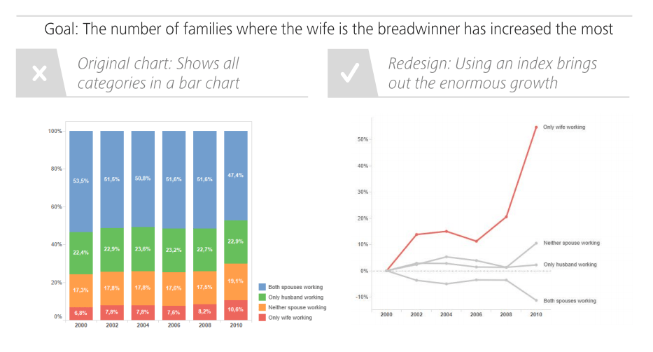
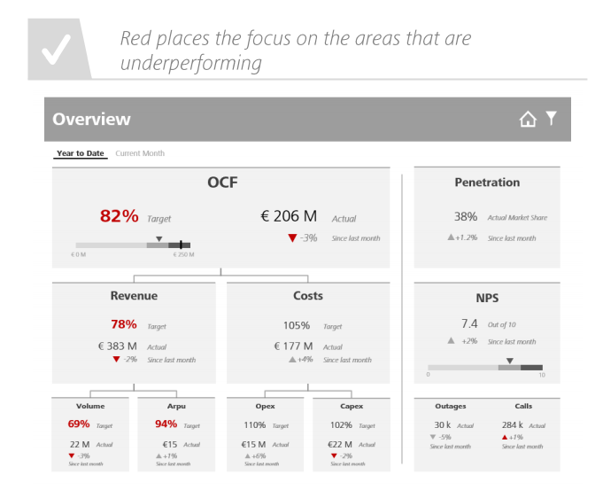
I just love how Deloitte uses example visualizations to help convey what makes a good (dashboard) chart:

Screenshot from the Deloitte slidedeck
Google’s Guidebook for Developing AI Product Development

Google’s Guidebook for Developing AI Product Development

I came across another great set of curated resources by one of the teams at Google:

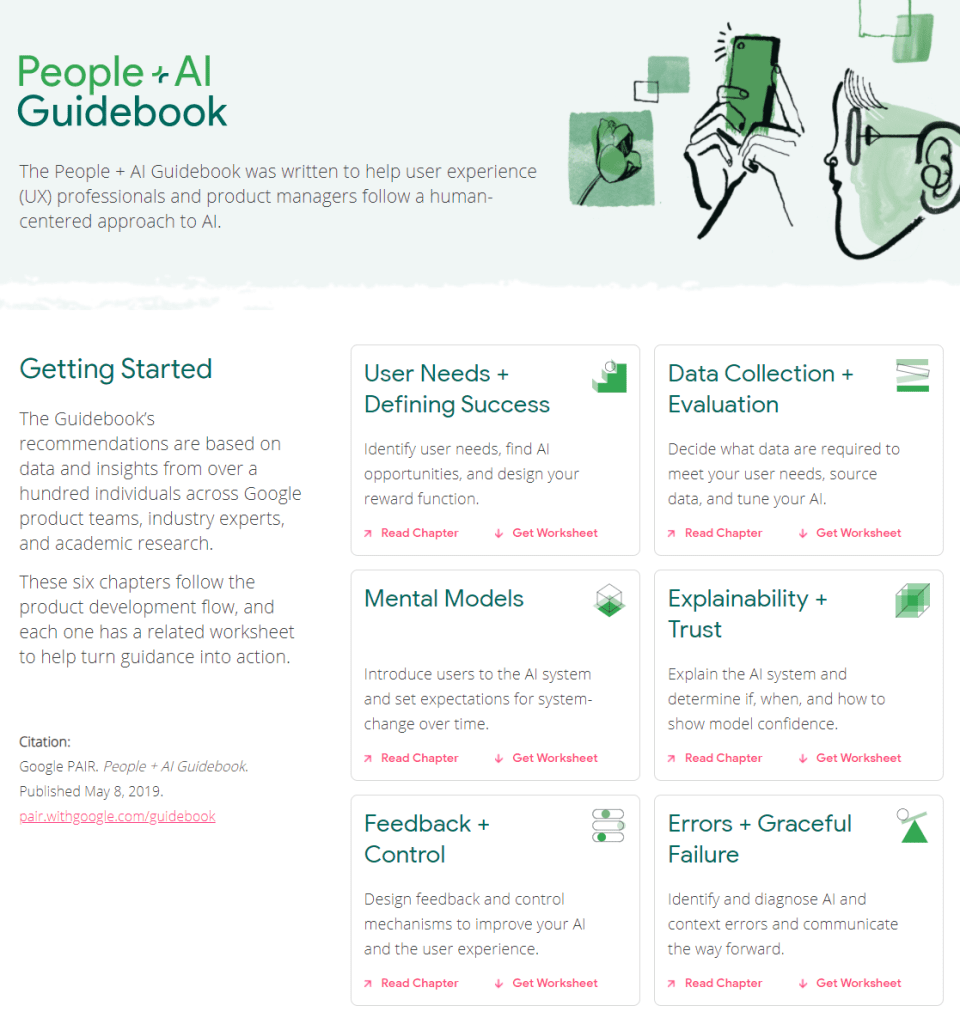
The People + AI Guidebook.

The People + AI Guidebook was written to help user experience (UX) professionals and product managers follow a human-centered approach to AI.

The Guidebook’s recommendations are based on data and insights from over a hundred individuals across Google product teams, industry experts, and academic research.

These six chapters follow the product development flow, and each one has a related worksheet to help turn guidance into action.

The People & AI guidebook is one of the products of the major PAIR project team (People & AI Research).

Here are the direct links to the six guidebook chapters:

Links to the related worksheets you can find here.