Tag: tips

10 Tips for Effective Dashboard Design by Deloitte

10 Tips for Effective Dashboard Design by Deloitte

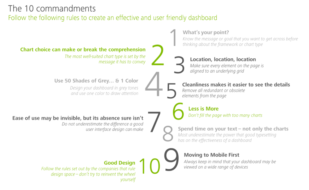
My colleague prof. Jack van Wijk pointed me towards these great guidelines by Deloitte on how to design an effective dashboard.

Some of these rules are more generally applicable to data visualization. Yet, the Deloitte 10 commandments form a good checklist when designing a dashboard.

Here’s my interpretation of the 10 rules:

  1. Know your message or goal
  2. Choose the chart that conveys your message best
  3. Use a grid to bring order to your dashboard
  4. Use color only to highlight and draw attention
  5. Remove unneccessary elements
  6. Avoid information overload
  7. Design for ease of use
  8. Text is as important as charts
  9. Design for multiple devices (desktop, tablet, mobile, …)
  10. Recycle good designs (by others)

In terms of recycling the good work by others operating in the data visualization field, check out:

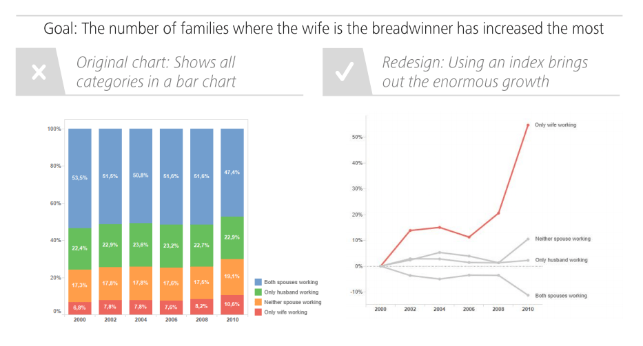
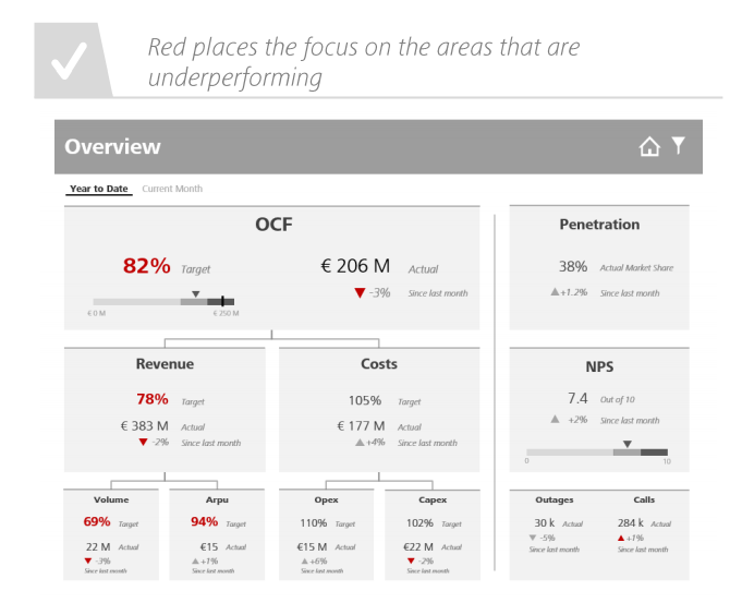
I just love how Deloitte uses example visualizations to help convey what makes a good (dashboard) chart:

Screenshot from the Deloitte slidedeck
100 Python pandas tips and tricks

100 Python pandas tips and tricks

Working with Python’s pandas library often?

This resource will be worth its length in gold!

Kevin Markham shares his tips and tricks for the most common data handling tasks on twitter. He compiled the top 100 in this one amazing overview page. Find the hyperlinks to specific sections below!

Quicklinks to categories

Kevin even made a video demonstrating his 25 most useful tricks:

How Do I…? R Code Snippets by Sharon Machlis

How Do I…? R Code Snippets by Sharon Machlis

Sharon Machlis is the author of Practical R for Mass Communication and Journalism. In writing this book, she obviously wrote a lot of R code. Now, Sharon has been nice enough to share all 195 tricks and tips she came across during her writing with us, via this handy table.

Sharon’s list contains many neat tricks, some of which less well-known base functions, others features of more niche packages. Here’s the ones I am definitely adding to my R tricks overview and want to highlight here as well:

  • Categorize values into interval cut()
  • Convert numbers that came in as strings with commas to R numbers with readr::parse_number(mydf$mycol)
  • Create a searchable, sortable HTML table in 1 line of code with DT::datatable(mydf, filter = 'top')
  • Display a fraction between 0 and 1 as a percentage with scales::percent(myfraction)
  • Generate a vector of 1:length(myvec) with seq_along(myvec)

And as if one list was not enough, scrolling through her Twitter feed, I found another R tips and tricks list by Sharon:

R tips and tricks

R tips and tricks

Below are a dozen of very specific R tips and tricks. Some are valuable, useful, or boost your productivity. Others are just geeky funny. 

More general helpful R packages and resources can be found in this list.

If you have additions, please comment below or contact me!

Completely new to R? → Start here!

Table of Contents


Join 1,405 other followers

RStudio

Many more shortkeys available here online, and in your RStudio under Tools → Keyboard Shortcuts Help.

General

Disclaimer: This page contains one or more links to Amazon.
Any purchases made through those links provide us with a small commission that helps to host this blog.

Useful base functions

Back to Table of Contents

R Markdown

Data manipulation

Data visualization

Back to Table of Contents

Fun

Easter eggs

Join 1,405 other followers

Back to Table of Contents

rstudio::conf 2018 summary

rstudio::conf 2018 summary

rstudio::conf is the yearly conference when it comes to R programming and RStudio. In 2017, nearly 500 people attended and, last week, 1100 people went to the 2018 edition. Regretfully, I was on holiday in Cardiff and missed out on meeting all my #rstats hero’s. Just browsing through the #rstudioconf Twitter-feed, I already learned so many new things that I decided to dedicate a page to it!

Fortunately, you can watch the live streams taped during the conference:

Two people have collected the slides of most rstudio::conf 2018 talks, which you can acces via the Github repo’s of matthewravey and by simecek. People on Twitter have particularly recommended teach the tidyverse to beginners (by David Robinson), the lesser known stars of the tidyverse (by Emily Robinson), the future of time series and financial analysis in the tidyverse (by Davis Vaughan of business-science.io), Understanding Principal Component Analysis (by Julia Silge), and Deploying TensorFlow models (by Javier Luraschi). Nevertheless, all other presentations are definitely worth checking out as well!

One of the workshops deserves an honorable mention. Jenny Bryan presented on What they forgot to teach you about R, providing some excellent advice on reproducible workflows. It elaborates on her earlier blog on project-oriented workflows, which you should read if you haven’t yet. Some best pRactices Jenny suggests:

  • Restart R often. This ensures your code is still working as intended. Use Shift-CMD-F10 to do so quickly in RStudio.
  • Use stable instead of absolute paths. This allows you to (1) better manage your imports/exports and folders, and (2) allows you to move/share your folders without the code breaking. For instance, here::here("data","raw-data.csv") loads the raw-data.csv-file from the data folder in your project directory. If you are not using the here package yet, you are honestly missing out! Alternatively you can use fs::path_home()normalizePath() will make paths work on both windows and mac. You can usebasename instead of strsplit to get name of file from a path.
  • To upload an existing git directory to GitHub easily, you can usethis::use_github().
  • If you include the below YAML header in your .R file, you can easily generate .md files for you github repo.
#' ---
#' output: github_document
#' ---
  • Moreover, Jenny proposed these useful default settings for knitr:
knitr::opts_chunk$set(
collapse = TRUE,
comment = "#>",
out.width = "100%"
)

Another of Jenny Bryan‘s talks was named Data Rectangling and although you might not get much out of her slides without her presenting them, you should definitely try the associated repurrrsive tutorial if you haven’t done so yet. It’s a poweR up for any useR!

Here’s a Shiny dashboard made by Garrick Aden-Buie including all the #rstudioconf tweets so you can browse the posts yourself. If you want to download the tweets, Mike Kearney (author of rtweet) shares the data here on his Github. Some highlights:

These probably only present a minimal portion of the thousands of tips and tricks you could have learned by simply attending rstudio::conf. I will definitely try to attend next year’s edition. Nevertheless, I hope the above has been useful. If I missed out on any tips, presentations, tweets, or other materials, please reply below, tweet me or pop me a message!

A note on Pie Charts

A note on Pie Charts

A table is nearly always better than a dumb pie chart; the only worse design than a pie chart is several of them […] pie charts should never be used.

Edward Tufte in the Visual Display of Quantitative Information

Stop using pie charts, they are evil!

title of Bernard Marr’s LinkedIn post

I hate pie charts. I mean, really hate them.

Cole Nussbaumer in death to pie charts

Many people have criticized the pie chart. The most important critique is that we, humans, are good in comparing lengths and heights, but angles and areas not so much. The following three charts by Kristin Henry demonstrate the phenomenon. Can you spot how the two pie charts below are different? 

And how about now?

OK, I admit that the order of the categories matters quite a lot in the chart above. But alternatively, you can transform the pie charts into grouped bar charts, that will immediately show the difference: 

In general, pie charts should be avoided when a large number of items is considered. Simple pie charts displaying 2-3 categories or one category as opposed to the others may work just fine, but when displaying more data, it is better to choose a different chart type. Oracle hosted a different example some years back:

Data Visualization - Pie Chart Angles

Fortunately, there is some constructive criticism as well. Cole Nussbaumer of storytellingwithdata.com provides some good alternatives to pie charts and David Robinson of VarianceExplained.org does provides alternative charts specifically in R. Datawrapper.de discusses when pie charts may come in handy and when they should definately not be used. Finally, the below GIF funnily shows the steps in which pie charts can be improved:

Pie charts have been used for jokes before, arguably their only good purpose:

Image result for the only good use of a pie chart
(image from Denovo Group)

On a final note, there do seem to be even worse visualizations of data than pie charts:

Data Visualization - Stacked Donut Chart
This monstrosity is apparently called a stacked donut chart (OpenDataScience.com)