
I found this amazing website data-to-viz.com that helps you select the right data visualization or chart type for your data.
Got numeric data? Two variables? No inherent order? Just a few data points? Pick a boxplot, histogram, or scatterplot!

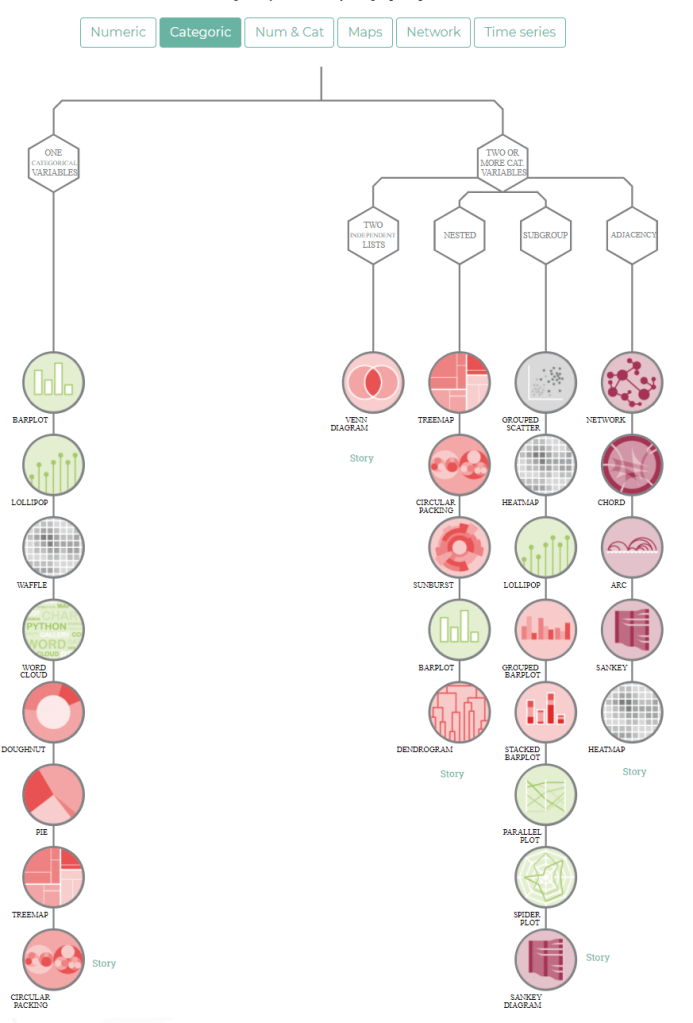
Categorical data? There’s a seperate decision tree for those!
There’s a whole world of possible chart types you can choose from. The website explains you how they work and when to use which type.

The website also warns you for some common mistakes in data visualization.

The cover image is a poster you can buy to support the authors of data-viz.com!
