Category: design

A New Piece in my Algorithmic Art Collection

A New Piece in my Algorithmic Art Collection

Those who have been following me for some time now will know that I am a big fan of generative art: art created through computers, mathematics, and algorithms.

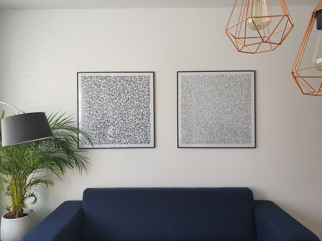
Several years back, my now wife bought me my first piece for my promotion, by Marcus Volz.

And several years after that, I made my own attempt at a second generative art piece, again inspired by the work of Marcus on what he dubbed Metropolis.

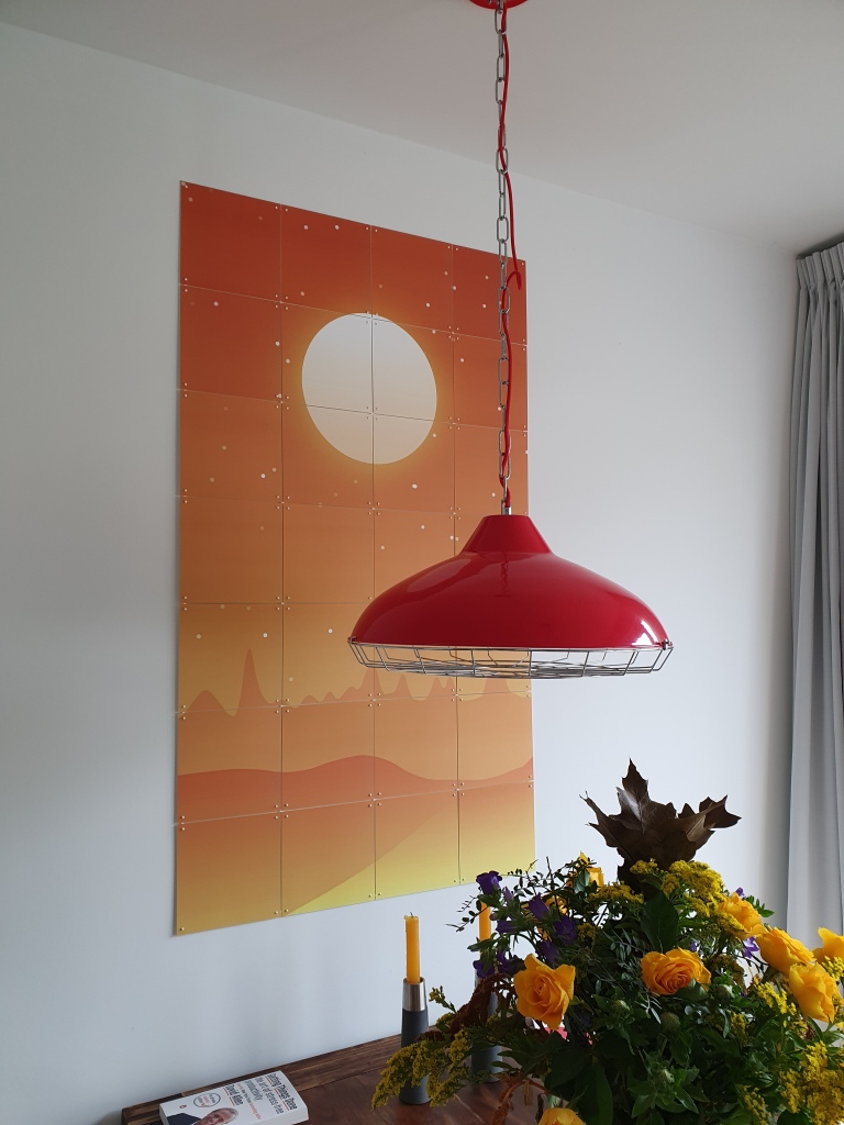
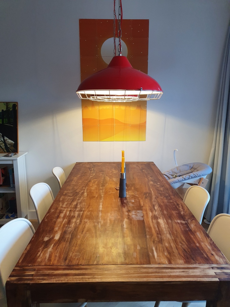
Now, our living room got a third addition in terms of the generative art, this time by Nicholas Rougeux.

Nicholas I bumped into on twitter, triggered by his collection of “Lunar Landscapes” (my own interpretation).

Nicholas was hesistant to sell me a piece and insisted that this series was not finished yet.

Yet, I already found it wonderful and lovely to look at and after begging Nicholas to sell us one of his early pieces, I sent it over to ixxi to have it printed and hanged it on our wall above our dinner table.

If you’re interested in Nicholas’ work, have a look at c82.net

Infographic of Psychological Biases in Decision Making

Infographic of Psychological Biases in Decision Making

I just love psychological experiments around our human biases.

In this case, Dan White visualized some of the psychological biases mentioned in Richard Shotton‘s book The Choice Factory“.

These biases make for irrational human behavior in the way we make daily decisions.

For example, you will be prepared to pay more for a cookie, when there are less of them in the jar. The generic principle here is that we assign higher valuations to objects under conditions of scarcity.

Once you are aware of such psychological biases, you will start to notice how they are (mis)used nearly everywhere these days. Particularly in sales and marketing. In restaurants, shops, online, and in virtually any case where we act as a consumer, we are subconciously influenced to make certain purchasing decision.

Nudging, is what they call these attempts to manipulate your behavior.

Maybe not so ethical, but still these infographics look amazing and these biases are good to be aware of!

Disclaimer: This page contains one or more links to Amazon.
Any purchases made through those links provide us with a small commission that helps to host this blog.

Color curves: Choose a color palette with gradient

Color curves: Choose a color palette with gradient

Jan-Willem Tulp pointed out this amazing tool to choose a color palette: https://colorcurves.app

You can choose between either a continuous palette or a discrete palette, with groups that is.

Here’s an example of an exponential color curve for a continuous palette using colorcurves.app:

There are numerous functions you can use to make your “gradient color curve“.

Similarly, you can specify the lightness of the different colors along your curve.

Here’s another example, of an color arc for a categorical / discrete palette using colorcurves.app:

Practical Tools for Human-Centered Design

Practical Tools for Human-Centered Design

Google’s guidebook to human-centered AI design refered to the Design Kit, containing numerous helpful tools to help you design products with user experience in mind.

The design kit website contains many practical methods, tools, case studies and much more resources to help you in the design process.

Screenshot of designkit.org/methods

Human-centered design is a practical, repeatable approach to arriving at innovative solutions. Think of these Methods as a step-by-step guide to unleashing your creativity, putting the people you serve at the center of your design process to come up with new answers to difficult problems.

The design kit methods section provides some seriously handy guidelines to help you design your products with the customer in mind. A step-by-step process guideline is offered, as well as neat worksheets to records the information you collect in the process, and a video explanation of the method.

Example method screenshot from designkit.org/methods/frame-your-design-challenge
Select the right data visualization or chart type

Select the right data visualization or chart type

I found this amazing website data-to-viz.com that helps you select the right data visualization or chart type for your data.

Got numeric data? Two variables? No inherent order? Just a few data points? Pick a boxplot, histogram, or scatterplot!

Categorical data? There’s a seperate decision tree for those!

There’s a whole world of possible chart types you can choose from. The website explains you how they work and when to use which type.

The website also warns you for some common mistakes in data visualization.

The cover image is a poster you can buy to support the authors of data-viz.com!

10 Tips for Effective Dashboard Design by Deloitte

10 Tips for Effective Dashboard Design by Deloitte

My colleague prof. Jack van Wijk pointed me towards these great guidelines by Deloitte on how to design an effective dashboard.

Some of these rules are more generally applicable to data visualization. Yet, the Deloitte 10 commandments form a good checklist when designing a dashboard.

Here’s my interpretation of the 10 rules:

  1. Know your message or goal
  2. Choose the chart that conveys your message best
  3. Use a grid to bring order to your dashboard
  4. Use color only to highlight and draw attention
  5. Remove unneccessary elements
  6. Avoid information overload
  7. Design for ease of use
  8. Text is as important as charts
  9. Design for multiple devices (desktop, tablet, mobile, …)
  10. Recycle good designs (by others)

In terms of recycling the good work by others operating in the data visualization field, check out:

I just love how Deloitte uses example visualizations to help convey what makes a good (dashboard) chart:

Screenshot from the Deloitte slidedeck