Continuing my recent line of posts on data visualization resources, I found another repository in my inbox: OriginLab’s GraphGallery!
If I’m being honest, I would personally advice you to look at the dataviz project instead, if you haven’t heard of that one yet.
However, OriginLab might win in terms of sentiment. It has this nostalgic look of the ’90s, and apparently people really used it during that time. Nevertheless, despite looking old, the repo seems to be quite extensive, with nearly 400 different types of data visualizations:
Quantity isn’t everything though, as some of the 400 entries are disgustingly horrible:
There’s so much wrong with this graph…
What I do like about this OriginLab repo is that it has an option to sort its contents using a random order. This really facilitates discovery of new pearls:
Thanks to Maarten Lambrechts for sharing this resource on twitter a while back!
This visualisation tool I've never heard of is used by "500.000 scientists and engineers" and has an amazing gallery of 388 different chart types and variations https://t.co/0N3Td6jhqlpic.twitter.com/A7g4DeEGEv
Last week I cohosted a professional learning course on data visualization at JADS. My fellow host was prof. Jack van Wijk, and together we organized an amazing workshop and poster event. Jack gave two lectures on data visualization theory and resources, and mentioned among others treevis.net, a resource I was unfamiliar with up until then.
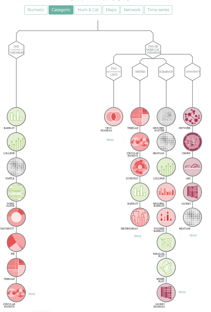
treevis.net is a lot like the dataviz project in the sense that it is an extensive overview of different types of data visualizations. treevis is unique, however, in the sense that it is focused on specifically visualizations of hierarchical data: multi-level or nested data structures.
Hans-Jörg Schulz — professor of Computer Science at Aarhus University in Denmark — maintains the treevis repo. At the moment of writing, he has compiled over 300 different types of hierachical data visualizations and displays them on this website.
As an added bonus, the repo is interactive as there are several ways to filter and look for the visualization type that best fits your data and needs.
Most resources come with added links to the original authors and the original papers they were first published in, so this is truly a great resources for those interested in doing a deep dive into data visualization. Do have a look yourself!
In my data visualization courses, I often refer to the hierarchy of visual encoding proposed by Cleveland and McGill. In their 1984 paper, Cleveland and McGill proposed the table below, demonstrating to what extent different visual encodings of data allow readers of data visualizations to accurately assess differences between data values.
DOI: 10.2307/2288400
Since then, this table has been used and copied by many data visualization experts, and adapted to more visually appealing layouts. Like this one by Alberto Cairo, referred to in a blog by Maarten Lambrechts:
Now, this brings me to the point of this current blog, in which I want to share an older post by Maarten Lambrechts. I came across Maarten’s post only yesterday, but it touches on many topics and content that I’ve covered earlier on my own website or during my courses. It’s mainly about the relative effectiveness and efficiency of using dots/points in data visualizations.
Basically, dots are often the most accurate and to the point (pun intended). With the latter, I mean in terms of inkt used, dots/points are more efficient than bars, or as Maarten says:
Points go beyond where lines and bars stop. Sounds weird, especially for those who remember from their math classes that a line is an infinite collection of points. But in visualization, points can do so much more then lines. Here are seven reasons why you should use more dot graphs, with some examples.
Maarten touches on the research of Cleveland and McGill, on a PLOS article advocating avoiding bars for continuous data, and on how to redesign charts to make use of more efficiënt dot/point encodings. I really loved this one redesign example Maarten shares. Unfortunately, it is in Dutch, but both graphs show pretty much the same data, though the simpler one better communicates the main message.
Do have a look at the rest of Maarten’s original blog post. I love how he ends it with some practical advice: A nice lookup table for those looking how to efficiently use points/dots to represent their n-dimensional data:
For comparisons of a single dimension across many categories: 1-dimensional scatterplot.
For detecting of skewed or bimodal distributions in 2 variables: connect 1-dimensional scatterplots (slopegraphs)
For showing relationships between 2 variables: 2-dimensional scatterplots.
For representing 4-dimensional data (3 numeric, 1 categorical or 4 numerical): bubble charts. Can also be used for 3 numerical dimensions or 2 numeric and 1 categorical value.
For representing 4-dimensional data + time: animated bubble chart (aka Rosling-graph)
Amy’s list includes many references to the best practices used by some of the leading data journalism companies, such as the BBC, or professional data companies like Salesforce and IBM.
As I’m worried that this great repository may not stand the test of time on the current Google Docs location, here are the base URLs once more:
Wanting to broaden your scope and learn a new programming language? This great workshop was given at EARL 2018 by Mango Solutions and helps R programmers transition into Python building on their existing R knowledge. The workshop includes exercises that introduce you to the key concepts of Python and some of its most powerful packages for data science, including numpy, pandas, sklearn, and seaborn.
Have a look at the associated workshop guide that walk you through the assignments, or at the github repo with all materials in Jupyter notebooks.