Continuing my recent line of posts on data visualization resources, I found another repository in my inbox: OriginLab’s GraphGallery!
If I’m being honest, I would personally advice you to look at the dataviz project instead, if you haven’t heard of that one yet.
However, OriginLab might win in terms of sentiment. It has this nostalgic look of the ’90s, and apparently people really used it during that time. Nevertheless, despite looking old, the repo seems to be quite extensive, with nearly 400 different types of data visualizations:
Quantity isn’t everything though, as some of the 400 entries are disgustingly horrible:
There’s so much wrong with this graph…
What I do like about this OriginLab repo is that it has an option to sort its contents using a random order. This really facilitates discovery of new pearls:
Thanks to Maarten Lambrechts for sharing this resource on twitter a while back!
This visualisation tool I've never heard of is used by "500.000 scientists and engineers" and has an amazing gallery of 388 different chart types and variations https://t.co/0N3Td6jhqlpic.twitter.com/A7g4DeEGEv
Lisa Charlotte Rost of DataWrapper often writes about data visualization and lately she has focused on the (im)proper use of color in visualization. In this recent blog, she gives a bunch of great tips and best practices, some of which I copied below:
Xeno.graphics is the collection of unusual charts and maps Maarten Lambrechts maintains. It’s a repository of novel, innovative, and experimental visualizations to inspire you, to fight xenographphobia, and popularize new chart types.
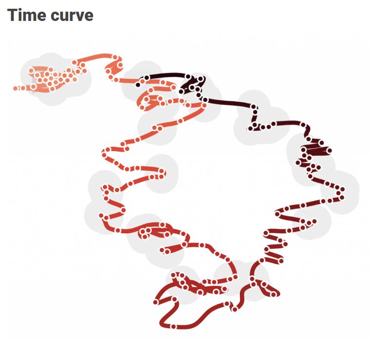
For instance, have you ever before heard of a time curve? These are very useful to visualize the development of a relationship over time.
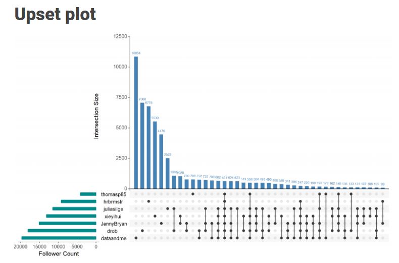
Time curves are based on the metaphor of folding a timeline visualization into itself so as to bring similar time points close to each other. This metaphor can be applied to any dataset where a similarity metric between temporal snapshots can be defined, thus it is largely datatype-agnostic. [https://xeno.graphics/time-curve]The upset plot is another example of an upcoming visualization. It can demonstrate the overlap or insection in a dataset. For instance, in the social network of #rstats twitter heroes, as the below example from the Xenographics website does.
Understanding relationships between sets is an important analysis task. The major challenge in this context is the combinatorial explosion of the number of set intersections if the number of sets exceeds a trivial threshold. To address this, we introduce UpSet, a novel visualization technique for the quantitative analysis of sets, their intersections, and aggregates of intersections. [https://xeno.graphics/upset-plot/]The below necklace map is new to me too. What it does precisely is unclear to me as well.
In a necklace map, the regions of the underlying two-dimensional map are projected onto intervals on a one-dimensional curve (the necklace) that surrounds the map regions. Symbols are scaled such that their area corresponds to the data of their region and placed without overlap inside the corresponding interval on the necklace. [https://xeno.graphics/necklace-map/]There are hundreds of other interestingcharts, maps, figures, and plots, so do have a look yourself. Moreover, the xenographics collection is still growing. If you know of one that isn’t here already, please submit it. You can also expect some posts about certain topics around xenographics.