Past months, multiple companies shared their approaches to data visualization and their lessons learned.
Click the companies in the list below to jump to their respective section
Financial Times
The Financial Times (FT) released a searchable database of the many data visualizations they produced over the years. Some lovely examples include:


BBC
The BBC released a free cookbook for data visualization using R programming. Here is the associated Medium post announcing the book.
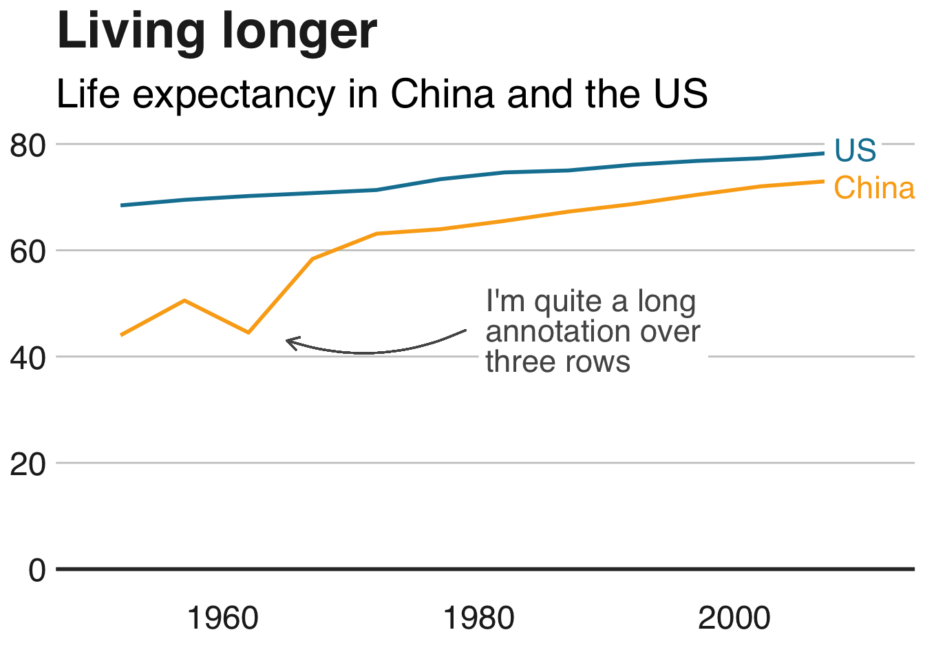
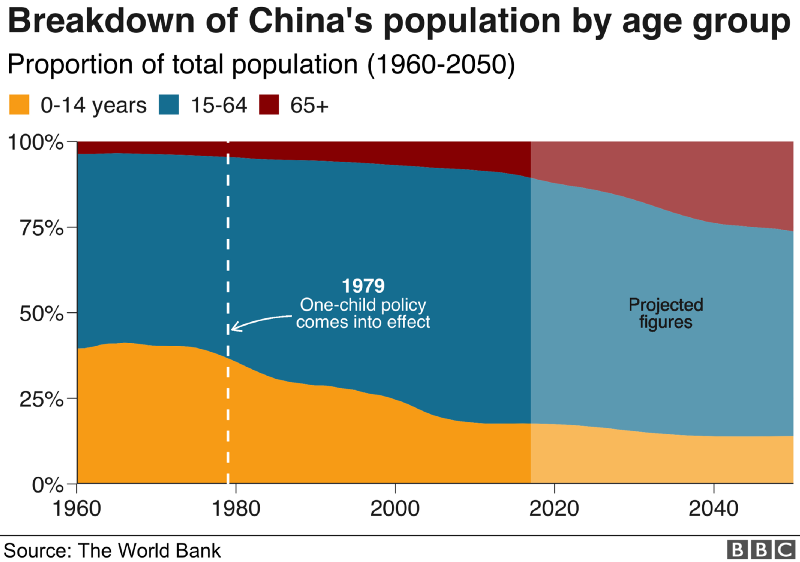
The BBC data team developed an R package (bbplot) which makes the process of creating publication-ready graphics in their in-house style using R’s ggplot2 library a more reproducible process, as well as making it easier for people new to R to create graphics.
Apart from sharing several best practices related to data visualization, they walk you through the steps and R code to create graphs such as the below:
Economist
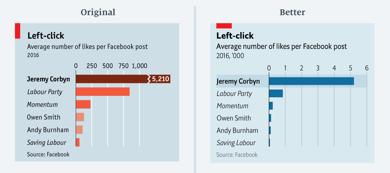
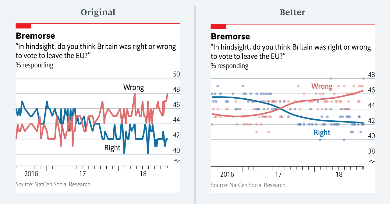
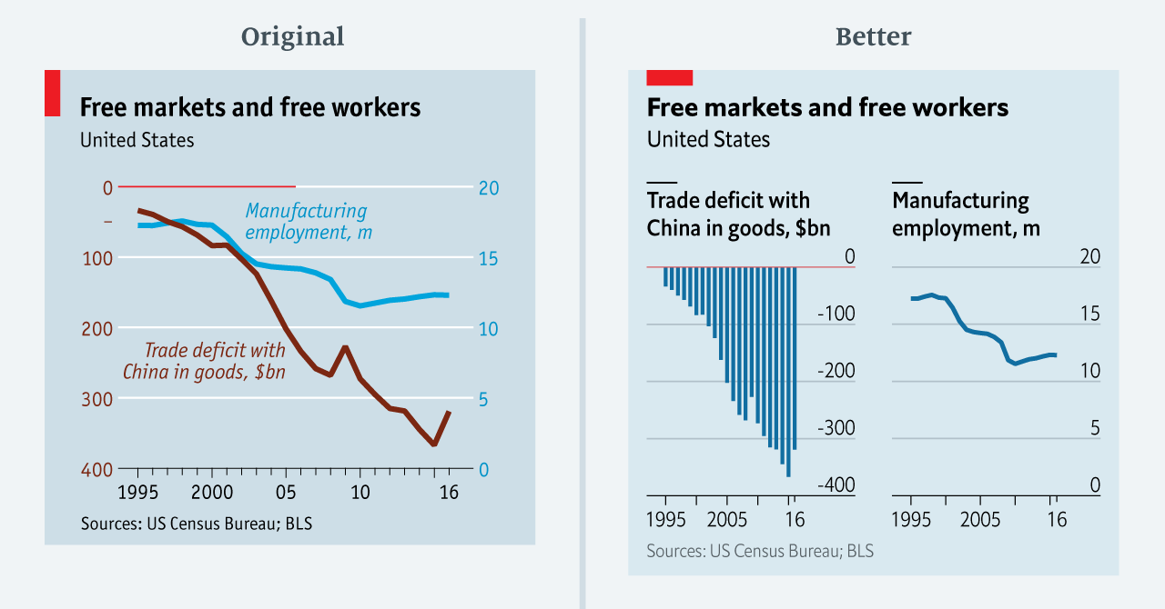
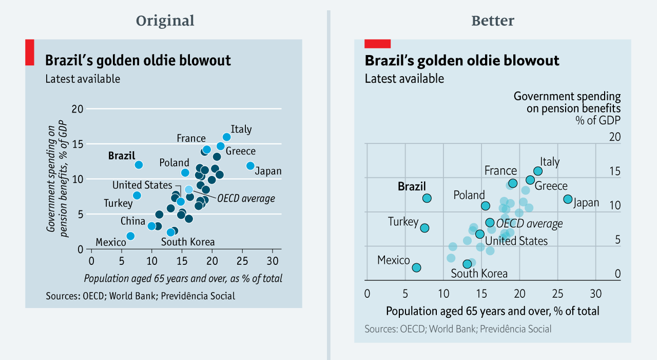
The data team at the Economist also felt a need to share their lessons learned via Medium. They show some of their most misleading, confusing, and failing graphics of the past years, and share the following mistakes and their remedies:
- Truncating the scale (image #1 below)
- Forcing a relationship by cherry-picking scales
- Choosing the wrong visualisation method (image #2 below)
- Taking the “mind-stretch” a little too far (image #3 below)
- Confusing use of colour (image #4 below)
- Including too much detail
- Lots of data, not enough space
Moreover, they share the data behind these failing and repaired data visualizations:
FiveThirtyEight
I could not resist including this (older) overview of the 52 best charts FiveThirtyEight claimed they made.
All 538’s data visualizations are just stunningly beautiful and often very
ingenious, using new chart formats to display complex patterns. Moreover, the range of topics they cover is huge. Anything ranging from their traditional background — politics — to great cover stories on sumo wrestling and pricy wine.


