Tag: turnover

Analytics in HR case study: Behind the scenes

Analytics in HR case study: Behind the scenes

Past week, Analytics in HR published a guest blog about one of my People Analytics projects which you can read here. In the blog, I explain why and how I examined the turnover of management trainees in light of the international work assignments they go on.

For the analyses, I used a statistical model called a survival analysis – also referred to as event history analysis, reliability analysis, duration analysis, time-to-event analysis, or proporational hazard models. It estimates the likelihood of an event occuring at time t, potentially as a function of certain data.

The sec version of surival analysis is a relatively easy model, requiring very little data. You can come a long way if you only have the time of observation (in this case tenure), and whether or not an event (turnover in this case) occured. For my own project, I had two organizations, so I added a source column as well (see below).

# LOAD REQUIRED PACKAGES ####
library(tidyverse)
library(ggfortify)
library(survival)

# SET PARAMETERS ####
set.seed(2)
sources = c("Organization Red","Organization Blue")
prob_leave = c(0.5, 0.5)
prob_stay = c(0.8, 0.2)
n = 60

# SIMULATE DATASETS ####
bind_rows(
  tibble(
    Tenure = sample(1:80, n*2, T),
    Source = sample(sources, n*2, T, prob_leave),
    Turnover = T
  ),
  tibble(
    Tenure = sample(1:85, n*25, T),
    Source = sample(sources, n*25, T, prob_stay),
    Turnover = F
  )
) ->
  data_surv

# RUN SURVIVAL MODEL ####
sfit <- survfit(Surv(data_surv$Tenure, event = data_surv$Turnover) ~ data_surv$Source)

# PLOT  SURVIVAL ####
autoplot(sfit, censor = F, surv.geom = 'line', surv.size = 1.5, conf.int.alpha = 0.2) +
  scale_x_continuous(breaks = seq(0, max(data_surv$Tenure), 12)) +
  coord_cartesian(xlim = c(0,72), ylim = c(0.4, 1)) +
  scale_color_manual(values = c("blue", "red")) +
  scale_fill_manual(values = c("blue", "red")) +
  theme_light() +
  theme(legend.background = element_rect(fill = "transparent"),
        legend.justification = c(0, 0),
        legend.position = c(0, 0),
        legend.text = element_text(size = 12)
        ) +
  labs(x = "Length of service", 
       y = "Percentage employed",
       title = "Survival model applied to the retention of new trainees",
       fill = "",
       color = "")
survival_plot
The resulting plot saved with ggsave, using width = 8 and height = 6.

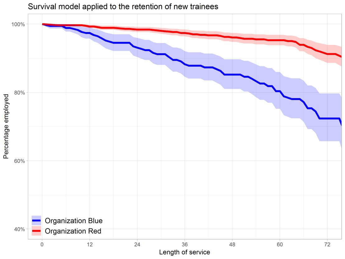
Using the code above, you should be able to conduct a survival analysis and visualize the results for your own projects. Please do share your results!

Predicting Employee Turnover at SIOP 2018

The 2018 annual Society for Industrial and Organizational Psychology (SIOP) conference featured its first-ever machine learning competition. Teams competed for several months in predicting the enployee turnover (or churn) in a large US company. A more complete introduction as presented at the conference can be found here. All submissions had to be open source and the winning submissions have been posted in this GitHub repository. The winning teams consist of analysts working at WalMart, DDI, and HumRRO. They mostly built ensemble models, in Python and/or R, combining algorithms such as (light) gradient boosted trees, neural networks, and random forest analysis.

Job-Switching Behaviors in the USA

Job-Switching Behaviors in the USA

Nathan Yau – the guy behind the wonderful visualizations of FlowingData.com – has been looking into job market data more and more lately. For his latest project, he took data of the Current Population Survey (2011-2016) a survey run by the US Census Bureau and Bureau of Labor Statistics. This survey covers many topics, but Nathan specifically looked into people’s current occupation and what they were doing the year before.

For his first visualization, Nathan examined the percentage of people switching jobs (a statistic he dubs the switching rate). Only occupations with over 100 survey responses are shown:

switchrate.png
Nathan concludes that jobs that come with higher salaries and require more training, education, and experience have lower switching rates. The interactive visualization can be found on FlowingData.com

Next Nathan looked into job moves within job categories, as he hypothesizes that people who decide to switch jobs look for something similar.

switchcategories.png
Nathan concludes that job categories with lower entry boundaries are subjected to more leavers. Original on FlowingData.com

The above results in the main question of the blog: Given you have a certain job, what are the possible jobs to switch to? The following interactive bar charts gives the top 20 jobs people with a specific job switched to. In the original blog you can specify a job to examine or ask for a random suggestion. I searched for “analyst” in the picture below, and apparently HR professional would be a good next challenge.

switchchoices.png
The interactive visualization can be found on FlowingData.com

Nathan got the data here, prepared it in R, and used d3.js for the visualizations. I’d have loved to see this data in a network-kind of flowchart or a Markov-chain. For more of Nathan’s work, please visit his FlowingData website.