Finding predictive patterns in your dataset with one line of code!
Today — March 2nd 2021 — my first R package was published on the comprehensive R archive network (CRAN).
ppsr is the R implementation of the Predictive Power Score (PPS).
The PPS is an asymmetric, data-type-agnostic score that can detect linear or non-linear relationships between two variables. You can read more about the concept in earlier blog posts (here and here), or here on Github, or via Medium.
With the ppsr package live on CRAN, it is now super easy to install the package and examine the predictive relationships in your dataset:
Update March, 2021: My R package for the predictive power score (ppsr) is live on CRAN! Try install.packages("ppsr") in your R terminal to get the latest version.
A few months ago, I wrote about the Predictive Power Score (PPS): a handy metric to quickly explore and quantify the relationships in a dataset.
As a social scientist, I was taught to use a correlation matrix to describe the relationships in a dataset. Yet, in my opinion, the PPS provides three handy advantages:
PPS works for any type of data, also nominal/categorical variables
PPS quantifies non-linear relationships between variables
PPS acknowledges the asymmetry of those relationships
# You can get the official version from CRAN:
install.packages("ppsr")

## Or you can get the development version from GitHub:
# install.packages('devtools')
# devtools::install_github('https://github.com/paulvanderlaken/ppsr')
Usage
The ppsr package has three main functions that compute PPS:
score() – which computes an x-y PPS
score_predictors() – which computes X-y PPS
score_matrix() – which computes X-Y PPS
Visualizing PPS
Subsequently, there are two main functions that wrap around these computational functions to help you visualize your PPS using ggplot2:
visualize_predictors() – producing a barplot of all X-y PPS
visualize_matrix() – producing a heatmap of all X-Y PPS
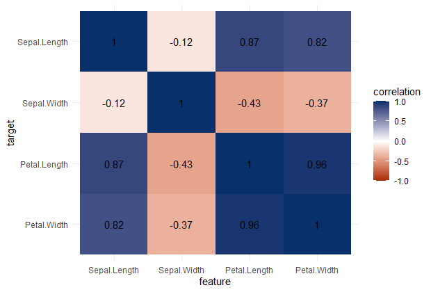
PPS matrix for iris
Note that Species is a nominal/categorical variable, with three character/text options.
A correlation matrix would not be able to show us that the type of iris Species can be predicted extremely well by the petal length and width, and somewhat by the sepal length and width. Yet, particularly sepal width is not easily predicted by the type of species.
Correlation matrix for iris
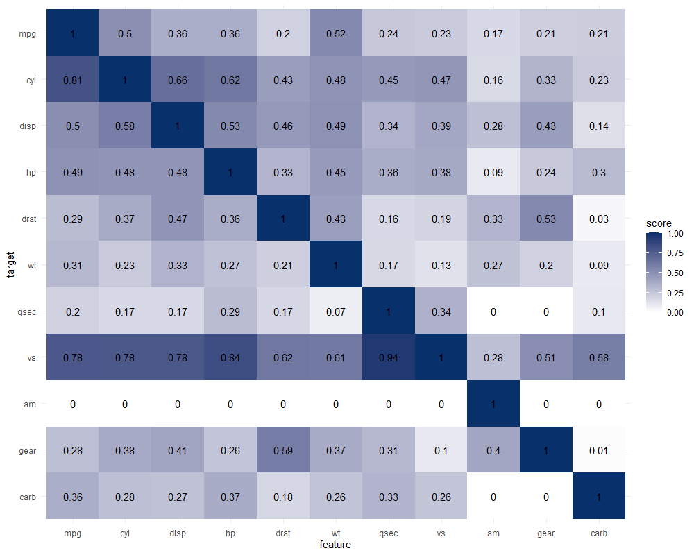
Exploring mtcars
It takes about 10 seconds to run 121 decision trees with visualize_matrix(mtcars). Yet, the output is much more informative than the correlation matrix:
cyl can be much better predicted by mpg than the other way around
the classification of vs can be done well using nearly all variables as predictors, except for am
yet, it’s hard to predict anything based on the vs classification
a cars’ am can’t be predicted at all using these variables
PPS matrix for mtcars
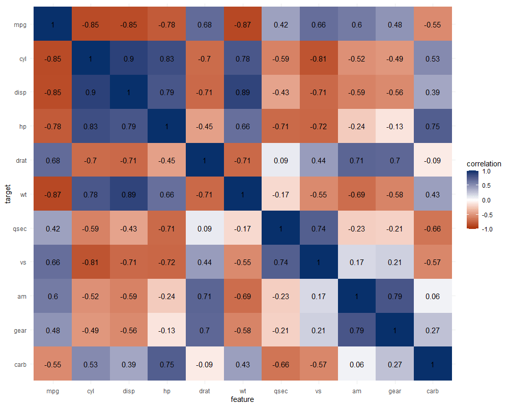
The correlation matrix does provides insights that are not provided by the PPS matrix. Most importantly, the sign and strength of any linear relationship that may exist. For instance, we can deduce that mpg relates strongly negatively with cyl.
Yet, even though half of the matrix does not provide any additional information (due to the symmetry), I still find it hard to derive the most important relations and insights at a first glance.
Moreover, the rows and columns for vs and am are not very informative in this correlation matrix as it contains pearson correlations coefficients by default, whereas vs and am are binary variables. The same can be said for cyl, gear and carb, which contain ordinal categories / integer data, so you can discuss the value of these coefficients depicted here.
Correlation matrix for mtcars
Exploring trees
In R, there are many datasets built in via the datasets package. Let’s explore some using the ppsr::visualize_matrix() function.
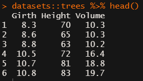
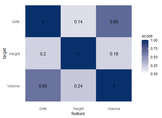
datasets::trees has data on 31 trees’ girth, height and volume.
visualize_matrix(datasets::trees) shows that both girth and volume can be used to predict the other quite well, but not perfectly.
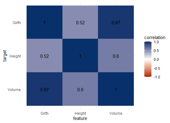
Let’s have a look at the correlation matrix.
The scores here seem quite higher in general. A near perfect correlation between volume and girth.
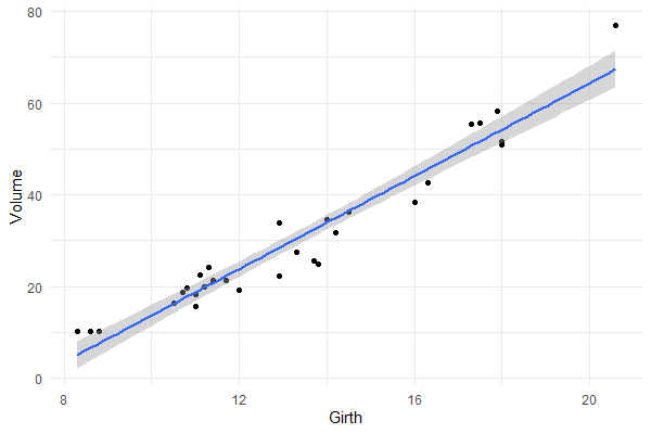
Is it near perfect though? Let’s have a look at the underlying data and fit a linear model to it.
You will still be pretty far off the real values when you use a linear model based on Girth to predict Volume. This is what the original PPS of 0.65 tried to convey.
Actually, I’ve run the math for this linaer model and the RMSE is still 4.11. Using just the mean Volume as a prediction of Volume will result in 16.17 RMSE. If we map these RMSE values on a linear scale from 0 to 1, we would get the PPS of our linear model, which is about 0.75.
So, actually, the linear model is a better predictor than the decision tree that is used as a default in the ppsr package. That was used to generate the PPS matrix above.
Yet, the linear model definitely does not provide a perfect prediction, even though the correlation may be near perfect.
Conclusion
In sum, I feel using the general idea behind PPS can be very useful for data exploration.
Particularly in more data science / machine learning type of projects. The PPS can provide a quick survey of which targets can be predicted using which features, potentially with more complex than just linear patterns.
Yet, the old-school correlation matrix also still provides unique and valuable insights that the PPS matrix does not. So I do not consider the PPS so much an alternative, as much as a complement in the toolkit of the data scientist & researcher.
Enjoy the R package, or the Python module for that matter, and let me know if you see any improvements!
This blog highlights a recent PNAS paper in which 457 data scientists and academic scholars were challenged use machine learning to predict life outcomes using a rich dataset.
Yet, I can not summarize the result better than this tweet by the author of the paper:
If hundreds of scientists created predictive algorithms with high-quality data, how well would the best predict life outcomes? Not very well. Fragile Families Challenge: paper in PNAS w 112 authors https://t.co/WxDJbw0joz & Special Collection of Socius https://t.co/WM9f4oYaABpic.twitter.com/ZPFChD79VR
Over 750 scientific papers have used the Fragile Families dataset.
The dataset is famous for its richness of cohort (survey) data on the included families’ lives and their childrens’ upbringings. It includes a whopping 12.942 variables!!
Some of these variables reflect interesting life outcomes of the included families.
For instance, the childrens’ grade point averages (GPA) and grit, but also whether the family was ever evicted or experienced hardship, or whether their primary caregiver had received job training or was laid off at work.
You can read more about the exact data contents in the paper’s appendix.
Now Matthew and his co-authors shared this enormous dataset with over 160 teams consisting of 457 academics researchers and data scientists alike. Each of them well versed in statistics and predictive modelling.
These data scientists were challenged with this task: by all means possible, make the most predictive model for the six life outcomes (i.e., GPA, conviction, etc).
The scientists could use all the Fragile Families data, and any algorithm they liked, and their final model and its predictions would be compared against the actual life outcomes in a holdout sample.
According to the paper, many of these teams used machine-learning methods that are not typically used in social science research and that explicitly seek to maximize predictive accuracy.
Now, here’s the summary again:
If hundreds of [data] scientists created predictive algorithms with high-quality data, how well would the best predict life outcomes?
Not very well.
@msalganik
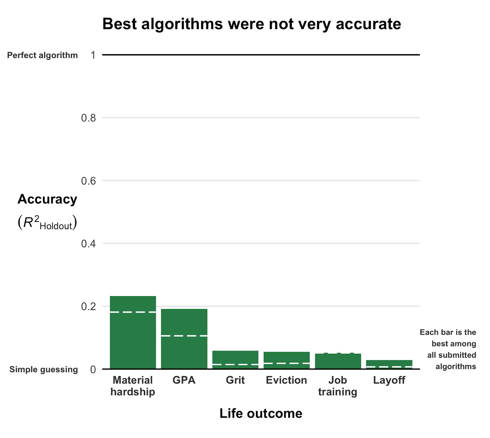
Even the best among the 160 teams’ predictions showed disappointing resemblance of the actual life outcomes. None of the trained models/algorithms achieved an R-squared of over 0.25.
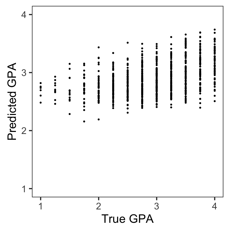
Wondering what these best R-squared of around 0.20 look like? Here’s the disappointg reality of plot C enlarged: the actual TRUE GPA’s on the x-axis, plotted against the best team’s predicted GPA’s on the y-axis.
Sure, there’s some relationship, with higher actual scores getting higher (average) predictions. But it ain’t much.
Moreover, there’s very little variation in the predictions. They all clump together between the range of about 2.1 and 3.8… that’s not really setting apart the geniuses from the less bright!
Matthew sums up the implications quite nicely in one of his tweets:
For policymakers deploying predictive algorithms in high-stakes decisions, our result is a reminder of a basic fact: one should not assume that algorithms predict well. That must be demonstrated with transparent, empirical evidence.
According to Matthew this “collective failure of 160 teams” is hard to ignore. And it failure highlights the understanding vs. predicting paradox: these data have been used to generate knowledge on how the world works in over 750 papers, yet few checked to see whether these same data and the scientific models would be useful to predict the life outcomes we’re trying to understand.
I was super excited to read this paper and I love the approach. It is actually quite closely linked to a series of papers I have been working on with Brian Spisak and Brian Doornenbal on trying to predict which people will emerge as organizational leaders. (hint: we could not really, at least not based on their personality)
Apparently, others were as excited as I am about this paper, as Filiz Garip already published a commentary paper on this research piece. Unfortunately, it’s behind a paywall so I haven’t read it yet.
Moreover, if you want to learn more about the approaches the 160 data science teams took in modelling these life outcomes, here are twelve papers in which some teams share their attempts.
Very curious to hear what you think of the paper and its implications. You can access it here, and I’d love to read your comments below.
Update March, 2021: My R package for the predictive power score (ppsr) is live on CRAN! Try install.packages("ppsr") in your R terminal to get the latest version.
Last week, I shared this Medium blog on PPS — or Predictive Power Score — on my LinkedIn and got so many enthousiastic responses, that I had to share it with here too.
Basically, the predictive power score is a normalized metric (values range from 0 to 1) that shows you to what extent you can use a variable X (say age) to predict a variable Y (say weight in kgs).
A PPS high score of, for instance, 0.85, would show that weight can be predicted pretty good using age.
A low PPS score, of say 0.10, would imply that weight is hard to predict using age.
The PPS acts a bit like a correlation coefficient we’re used too, but it is also different in many ways that are useful to data scientists:
PPS also detects and summarizes non-linear relationships
PPS is assymetric, so that it models Y ~ X, but not necessarily X ~ Y
PPS can summarize predictive value of / among categorical variables and nominal data
However, you may argue that the PPS is harder to interpret than the common correlation coefficent:
PPS can reflect quite complex and very different patterns
Therefore, PPS are hard to compare: a 0.5 may reflect a linear relationship but also many other relationships
PPS are highly dependent on the used algorithm: you can use any algorithm from OLS to CART to full-blown NN or XGBoost. Your algorithm hihgly depends the patterns you’ll detect and thus your scores
PPS are highly dependent on the the evaluation metric (RMSE, MAE, etc).
Here’s an example picture from the original blog, showing a case in which PSS shows the relevant predictive value of Y ~ X, whereas a correlation coefficient would show no relationship whatsoever:
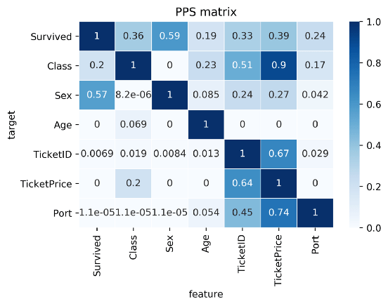
Here’s two more pictures from the original blog showing the differences with a standard correlation matrix on the Titanic data:
I highly suggest you readthe original blog for more details and information, and that you check out the associated Python packageppscore:
Installing the package:
pip install ppscore
Calculating the PPS for a given pandas dataframe:
import ppscore as pps
pps.score(df, "feature_column", "target_column")
You can also calculate the whole PPS matrix:
pps.matrix(df)
There’s no R package yet, but it should not be hard to implement this general logic.
Florian Wetschoreck — the author — already noted that there may be several use cases where he’d think PPS may add value:
Find patterns in the data [red: data exploration]: The PPS finds every relationship that the correlation finds — and more. Thus, you can use the PPS matrix as an alternative to the correlation matrix to detect and understand linear or nonlinear patterns in your data. This is possible across data types using a single score that always ranges from 0 to 1.
Feature selection: In addition to your usual feature selection mechanism, you can use the predictive power score to find good predictors for your target column. Also, you can eliminate features that just add random noise. Those features sometimes still score high in feature importance metrics. In addition, you can eliminate features that can be predicted by other features because they don’t add new information. Besides, you can identify pairs of mutually predictive features in the PPS matrix — this includes strongly correlated features but will also detect non-linear relationships.
Detect information leakage: Use the PPS matrix to detect information leakage between variables — even if the information leakage is mediated via other variables.
Data Normalization: Find entity structures in the data via interpreting the PPS matrix as a directed graph. This might be surprising when the data contains latent structures that were previously unknown. For example: the TicketID in the Titanic dataset is often an indicator for a family.
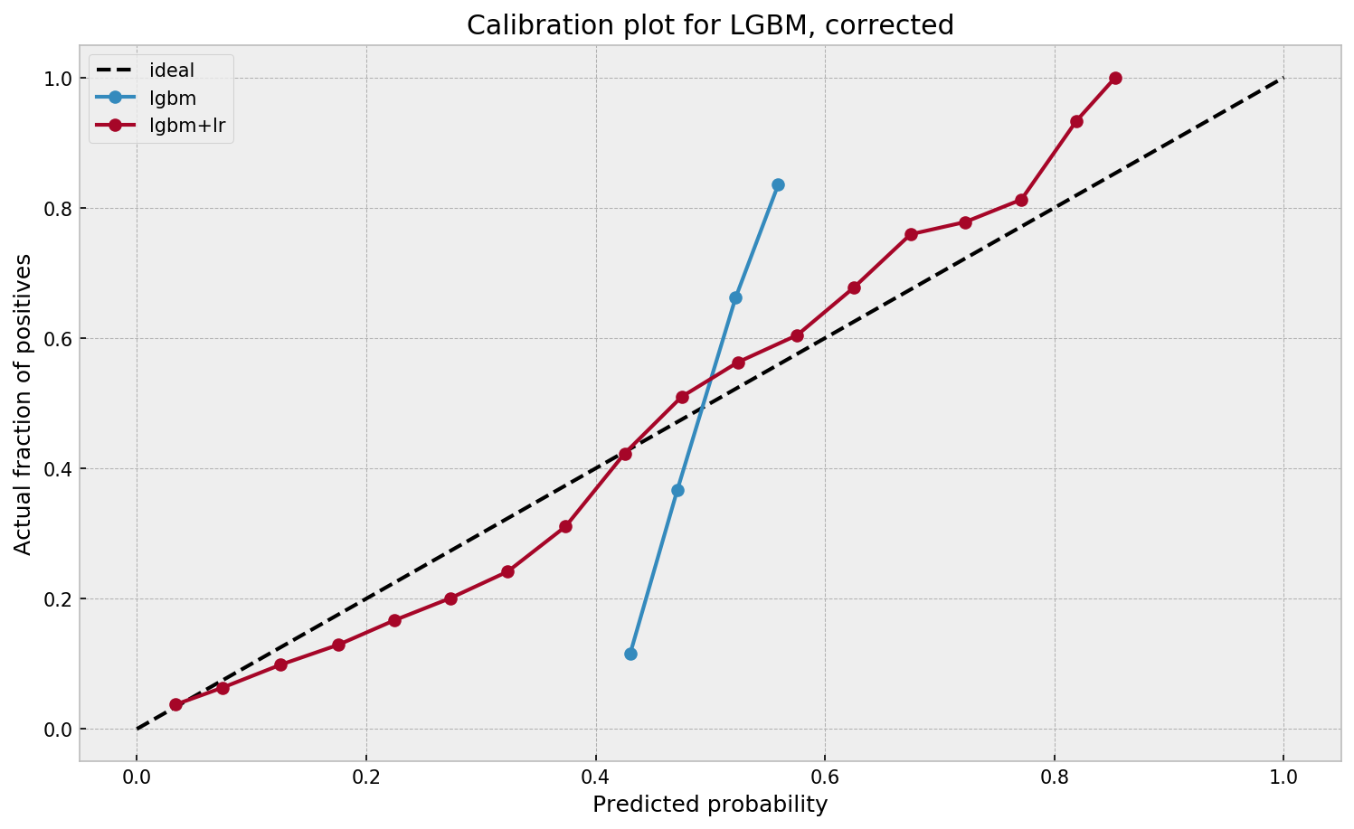
I found this interesting blog by Guilherme Duarte Marmerola where he shows how the predictions of algorithmic models (such as gradient boosted machines, or random forests) can be calibrated by stacking a logistic regression model on top of it: by using the predicted leaves of the algorithmic model as features / inputs in a subsequent logistic model.
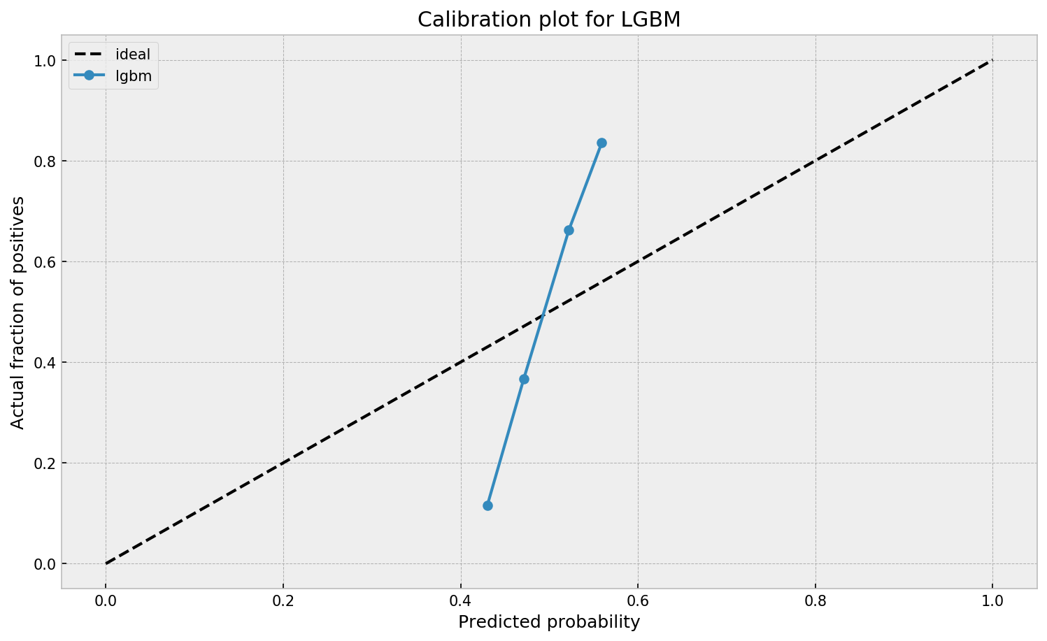
When working with ML models such as GBMs, RFs, SVMs or kNNs (any one that is not a logistic regression) we can observe a pattern that is intriguing: the probabilities that the model outputs do not correspond to the real fraction of positives we see in real life.
This is visible in the predictions of the light gradient boosted machine (LGBM) Guilherme trained: its predictions range only between ~ 0.45 and ~ 0.55. In contrast, the actual fraction of positive observations in those groups is much lower or higher (ranging from ~ 0.10 to ~0.85).
I highly recommend you look at Guilherme’s code to see for yourself what’s happening behind the scenes, but basically it’s this:
Train an algorithmic model (e.g., GBM) using your regular features (data)
Retrieve the probabilities GBM predicts
Retrieve the leaves (end-nodes) in which the GBM sorts the observations
Turn the array of leaves into a matrix of (one-hot-encoded) features, showing for each observation which leave it ended up in (1) and which not (many 0’s)
Basically, until now, you have used the GBM to reduce the original features to a new, one-hot-encoded matrix of binary features
Now you can use that matrix of new features as input for a logistic regression model predicting your target (Y) variable
Apparently, those logistic regression predictions will show a greater spread of probabilities with the same or better accuracy
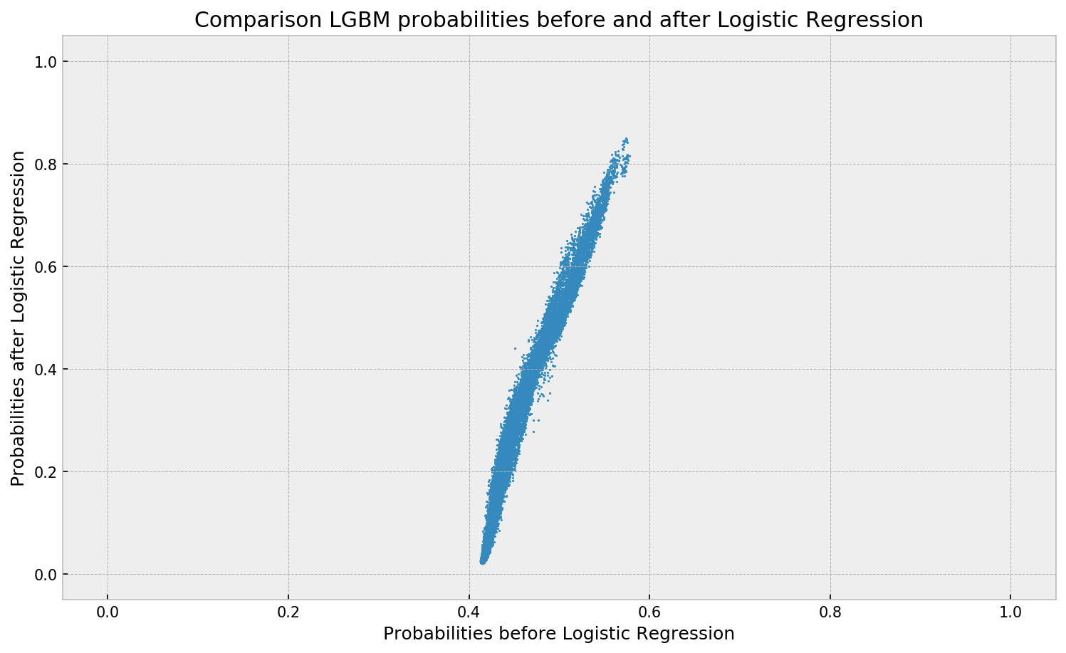
Here’s a visual depiction from Guilherme’s blog, with the original GBM predictions on the X-axis, and the new logistic predictions on the Y-axis.
As you can see, you retain roughly the same ordering, but the logistic regression probabilities spread is much larger.
Now according to Guilherme and the Facebook paper he refers to, the accuracy of the logistic predictions should not be less than those of the original algorithmic method.
Much better. The calibration plot of lgbm+lr is much closer to the ideal. Now, when the model tells us that the probability of success is 60%, we can actually be much more confident that this is the true fraction of success! Let us now try this with the ET model.
In his blog, Guilherme shows the same process visually for an Extremely Randomized Trees model, so I highly recommend you read the original article. Also, you can find the complete code on his GitHub.
A receiver operating characteristic (ROC) curve displays how well a model can classify binary outcomes. An ROC curve is generated by plotting the false positive rate of a model against its true positive rate, for each possible cutoff value. Often, the area under the curve (AUC) is calculated and used as a metric showing how well a model can classify data points.
If you’re interest in learning more about ROC and AUC, I recommend this short Medium blog, which contains this neat graphic:
Dariya Sydykova, graduate student at the Wilke lab at the University of Texas at Austin, shared some great visual animations of how model accuracy and model cutoffs alter the ROC curve and the AUC metric. The quotes and animations are from the associated github repository.
ROC & AUC
The plot on the left shows the distributions of predictors for the two outcomes, and the plot on the right shows the ROC curve for these distributions. The vertical line that travels left-to-right is the cutoff value. The red dot that travels along the ROC curve corresponds to the false positive rate and the true positive rate for the cutoff value given in the plot on the left.
The traveling cutoff demonstrates the trade-off between trying to classify one outcome correctly and trying to classify the other outcome correcly. When we try to increase the true positive rate, we also increase the false positive rate. When we try to decrease the false positive rate, we decrease the true positive rate.
The shape of an ROC curve changes when a model changes the way it classifies the two outcomes.
The animation [below] starts with a model that cannot tell one outcome from the other, and the two distributions completely overlap (essentially a random classifier). As the two distributions separate, the ROC curve approaches the left-top corner, and the AUC value of the curve increases. When the model can perfectly separate the two outcomes, the ROC curve forms a right angle and the AUC becomes 1.
Precision-Recall
Two other metrics that are often used to quantify model performance are precision and recall.
Precision (also called positive predictive value) is defined as the number of true positives divided by the total number of positive predictions. Hence, precision quantifies what percentage of the positive predictions were correct: How correct your model’s positive predictions were.
Recall (also called sensitivity) is defined as the number of true positives divided by the total number of true postives and false negatives (i.e. all actual positives). Hence, recall quantifies what percentage of the actual positives you were able to identify: How sensitive your model was in identifying positives.
Dariya also made some visualizations of precision-recall curves:
Precision-recall curves also displays how well a model can classify binary outcomes. However, it does it differently from the way an ROC curve does. Precision-recall curve plots true positive rate (recall or sensitivity) against the positive predictive value (precision).
In the middle, here below, the ROC curve with AUC. On the right, the associated precision-recall curve.
Similarly to the ROC curve, when the two outcomes separate, precision-recall curves will approach the top-right corner. Typically, a model that produces a precision-recall curve that is closer to the top-right corner is better than a model that produces a precision-recall curve that is skewed towards the bottom of the plot.
Class imbalance
Class imbalance happens when the number of outputs in one class is different from the number of outputs in another class. For example, one of the distributions has 1000 observations and the other has 10. An ROC curve tends to be more robust to class imbalanace that a precision-recall curve.
In this animation [below], both distributions start with 1000 outcomes. The blue one is then reduced to 50. The precision-recall curve changes shape more drastically than the ROC curve, and the AUC value mostly stays the same. We also observe this behaviour when the other disribution is reduced to 50.
Here’s the same, but now with the red distribution shrinking to just 50 samples.
Dariya invites you to use these visualizations for educational purposes:
Please feel free to use the animations and scripts in this repository for teaching or learning. You can directly download the gif files for any of the animations, or you can recreate them using these scripts. Each script is named according to the animation it generates (i.e. animate_ROC.r generates ROC.gif, animate_SD.r generates SD.gif, etc.).
Want to learn more about the different evaluation metrics for machine learning? Here’s a nice how-to guide by Neptune.ai demonstrating different metrics applied in Python.