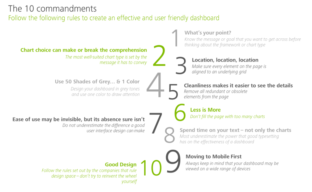
My colleague prof. Jack van Wijk pointed me towards these great guidelines by Deloitte on how to design an effective dashboard.
Some of these rules are more generally applicable to data visualization. Yet, the Deloitte 10 commandments form a good checklist when designing a dashboard.
Here’s my interpretation of the 10 rules:
- Know your message or goal
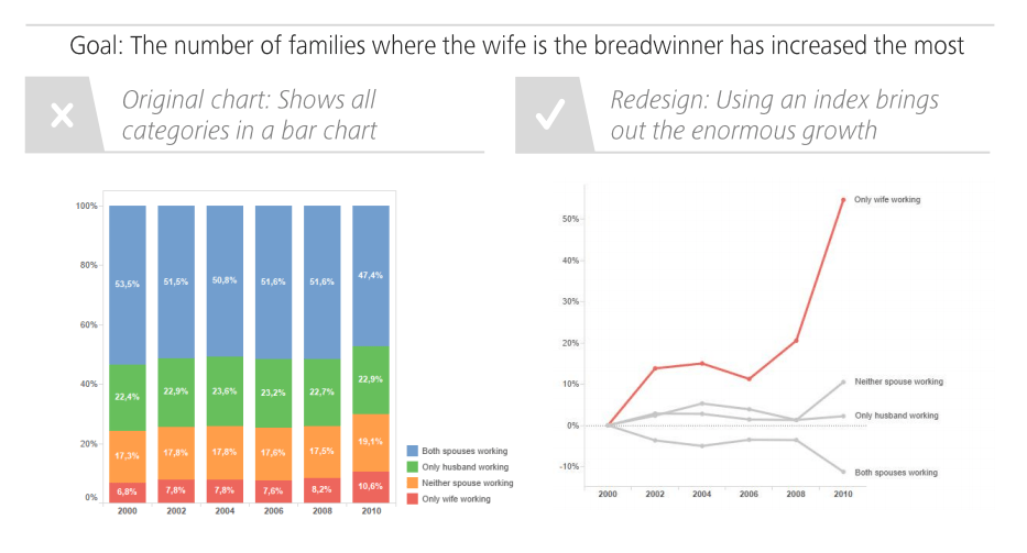
- Choose the chart that conveys your message best
- Use a grid to bring order to your dashboard
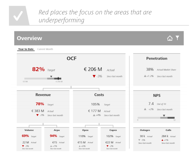
- Use color only to highlight and draw attention
- Remove unneccessary elements
- Avoid information overload
- Design for ease of use
- Text is as important as charts
- Design for multiple devices (desktop, tablet, mobile, …)
- Recycle good designs (by others)
In terms of recycling the good work by others operating in the data visualization field, check out:
- What leading companies do in terms of data visualization
- What style guides others are using when designing data visualizations
- What thought leaders are sharing
- What not to do in a data visualization
- How to design the tables of your dashboard
I just love how Deloitte uses example visualizations to help convey what makes a good (dashboard) chart:


