Maarten Lambrechts is a data journalist I closely follow online, with great delight. Recently, he shared on Twitter his slidedeck on the 18 most common data visualization pitfalls. You will probably already be familiar with most, but some (like #14) were new to me:
- Save pies for dessert
- Don’t cut bars
- Don’t cut time axes
- Label directly
- Use colors deliberately
- Avoid chart junk
- Scale circles by area
- Avoid double axes
- Correlation is no causality
- Don’t do 3D
- Sort on the data
- Tell the story
- 1 chart, 1 message
- Common scales on small mult’s
- #Endrainbow
- Normalise data on maps
- Sometimes best map is no map
- All maps lie
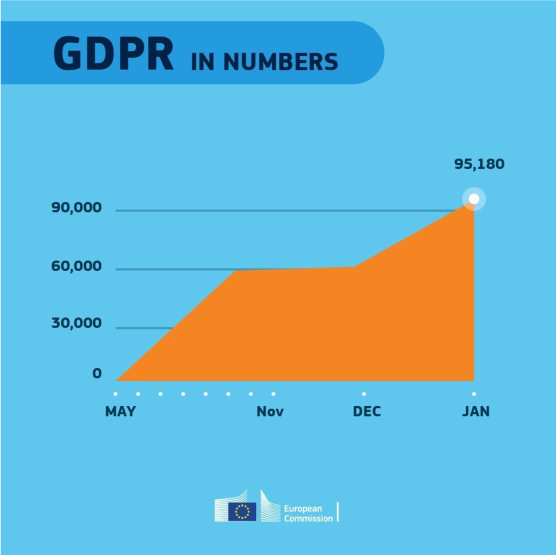
Even though most of these 18 rules below seem quite obvious, even the European Commissions seems to break them every now and then: