Aleszu Bajak at Storybench.org published a great demonstration of the power of text mining. He used the R tidytext package to analyse 150,000 wine reviews which Zach Thoutt had scraped from Wine Enthusiast in November of 2017.
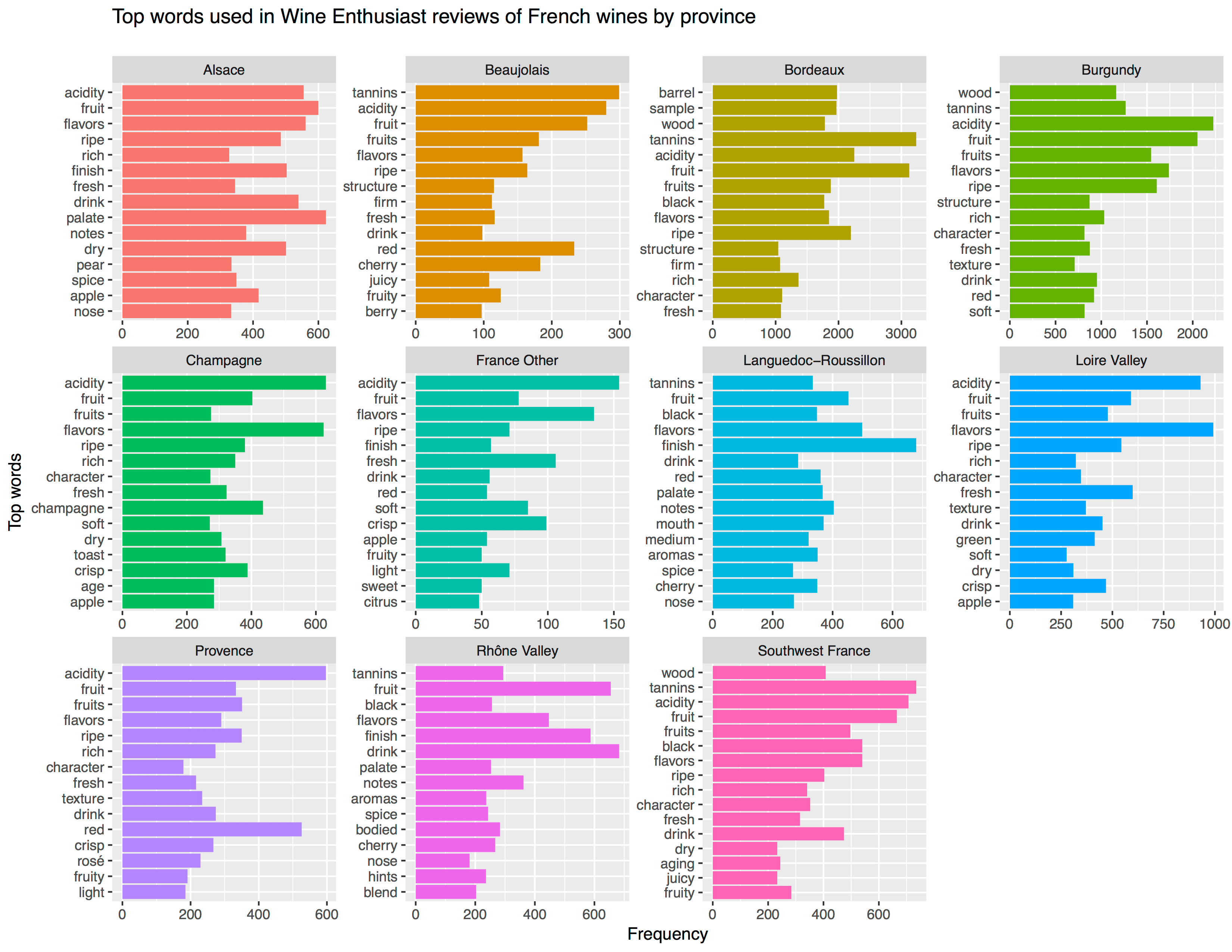
Aleszu started his analysis on only the French wines, with a simple word count per region:
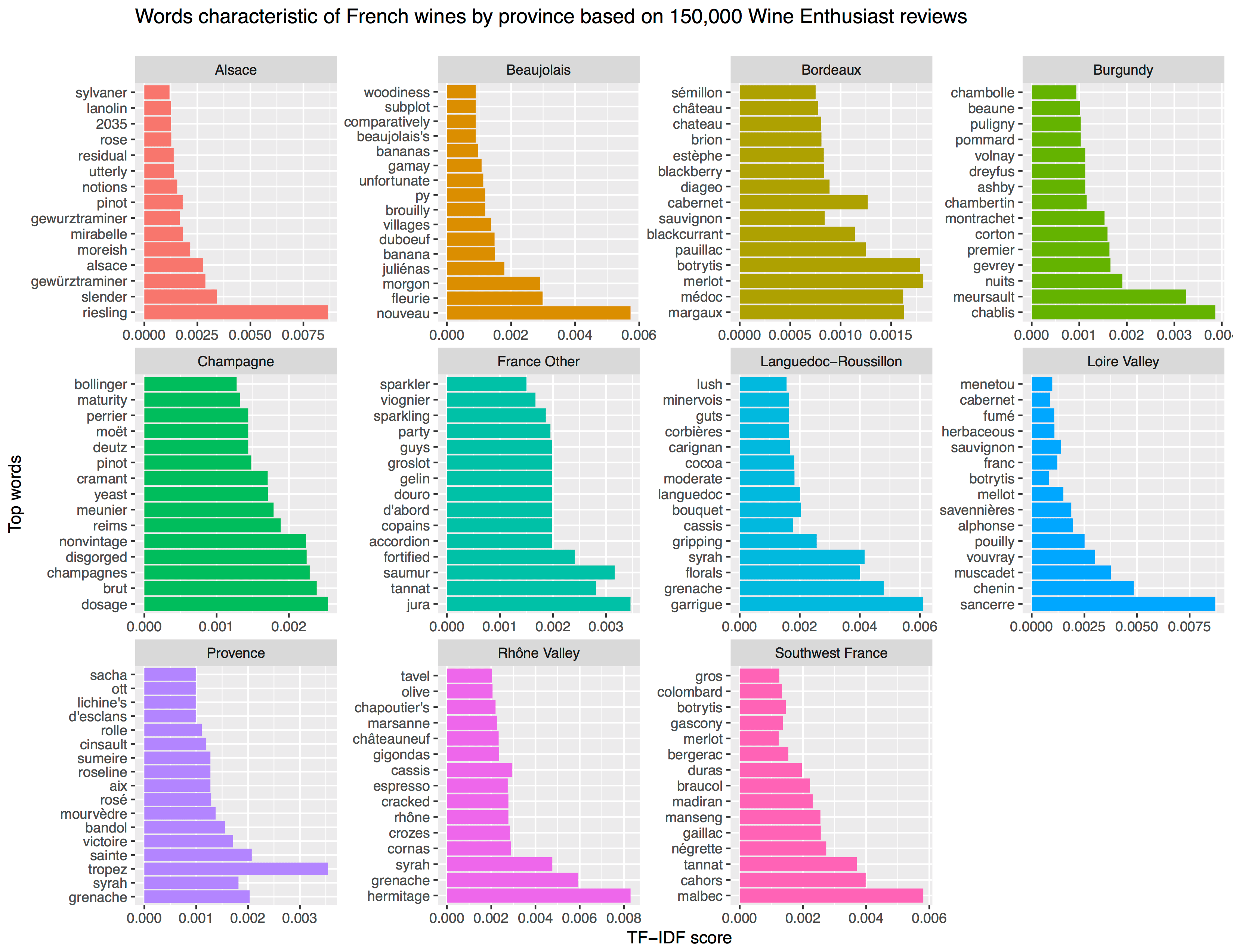
[orginal blog]Next, he applied TF-IDF to surface the words that are most characteristic for specific French wine regions — words used often in combination with that specific region, but not in relation to other regions.
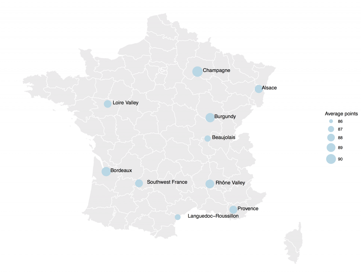
[orginal blog]The data also contained some price information, which Aleszu mapped France with ggplot2 and the maps package to demonstrate which French wine regions are generally more costly.
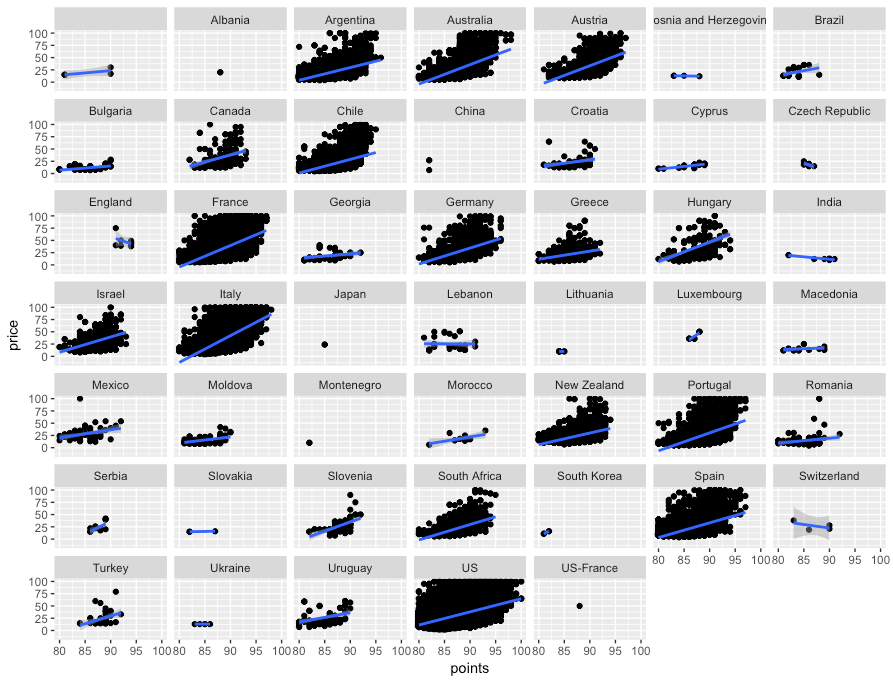
[orginal blog]On the full dataset, Alezsu also demonstrated that there is a strong relationship between price and points, meaning that, in general, more expensive wines seem to get better reviews:
Kaggle conducts industry-wide surveys to assess the state of data science and machine learning. Over 17,000 individuals worldwide participated in the survey, myself included, and 171 countries and territories are represented in the data.
There is an ongoing debate regarding whether R or Python is better suited for Data Science (probably the latter, but I nevertheless prefer the former). The thousands of responses to the Kaggle survey may provide some insights into how the preferences for each of these languages are dispersed over the globe. At least, that was what I thought when I wrote the code below.
### PAUL VAN DER LAKEN### 2017-10-31### KAGGLE DATA SCIENCE SURVEY### VISUALIZING WORLD WIDE RESPONSES### AND PYTHON/R PREFERENCES# LOAD IN LIBRARIESlibrary(ggplot2)library(dplyr)library(tidyr)library(tibble)# OPTIONS & STANDARDIZATIONoptions(stringsAsFactors=F)theme_set(theme_light())dpi=600w=12h=8wm_cor=0.8hm_cor=0.8capt="Kaggle Data Science Survey 2017 by paulvanderlaken.com"# READ IN KAGGLE DATAmc<-read.csv("multipleChoiceResponses.csv")%>%as.tibble()# READ IN WORLDMAP DATAworldMap<-map_data(map="world")%>%as.tibble()# ALIGN KAGGLE AND WORLDMAP COUNTRY NAMESmc$Country[!mc$Country%in%worldMap$region]%>%unique()worldMap$region%>%unique()%>%sort(F)mc$Country[mc$Country=="United States"]<-"USA"mc$Country[mc$Country=="United Kingdom"]<-"UK"mc$Country[grepl("China|Hong Kong", mc$Country)]<-"China"# CLEAN UP KAGGLE DATAlvls=c("","Rarely", "Sometimes", "Often", "Most of the time")labels=c("NA", lvls[-1])ind_data<-mc%>%select(Country, WorkToolsFrequencyR, WorkToolsFrequencyPython)%>%mutate(WorkToolsFrequencyR=factor(WorkToolsFrequencyR,
levels=lvls, labels=labels))%>%mutate(WorkToolsFrequencyPython=factor(WorkToolsFrequencyPython,
levels=lvls, labels=labels))%>%filter(!(Country==""|is.na(WorkToolsFrequencyR)|is.na(WorkToolsFrequencyPython)))# AGGREGATE TO COUNTRY LEVELcountry_data<-ind_data%>%group_by(Country)%>%summarize(N=n(),
R=sum(WorkToolsFrequencyR%>%as.numeric()),
Python=sum(WorkToolsFrequencyPython%>%as.numeric()))# CREATE THEME FOR WORLDMAP PLOTtheme_worldMap<-theme(plot.background=element_rect(fill="white"),
panel.border=element_blank(),
panel.grid=element_blank(),
panel.background=element_blank(),
legend.background=element_blank(),
legend.position=c(0, 0.2),
legend.justification=c(0, 0),
legend.title=element_text(colour="black"),
legend.text=element_text(colour="black"),
legend.key=element_blank(),
legend.key.size=unit(0.04, "npc"),
axis.text=element_blank(),
axis.title=element_blank(),
axis.ticks=element_blank())
After aligning some country names (above), I was able to start visualizing the results. A first step was to look at the responses across the globe. The greener the more responses and the grey countries were not represented in the dataset. A nice addition would have been to look at the response rate relative to country population.. any volunteers?
Now, let’s look at how frequently respondents use Python and R in their daily work. I created two heatmaps: one excluding the majority of respondents who indicated not using either Python or R, probably because they didn’t complete the survey.
# AGGREGATE DATA TO WORKTOOL RESPONSESworktool_data<-ind_data%>%group_by(WorkToolsFrequencyR, WorkToolsFrequencyPython)%>%count()# HEATMAP OF PREFERRED WORKTOOLSggplot(worktool_data, aes(x=WorkToolsFrequencyR, y=WorkToolsFrequencyPython))+geom_tile(aes(fill=log(n)))+geom_text(aes(label=n), col="black")+scale_fill_gradient(low="red", high="yellow")+labs(title="Heatmap of Python and R usage",
subtitle="Most respondents indicate not using Python or R (or did not complete the survey)",
caption=capt,
fill="Log(N)")
# HEATMAP OF PREFERRED WORKTOOLS# EXCLUSING DOUBLE NA'Sworktool_data%>%filter(!(WorkToolsFrequencyPython=="NA"&WorkToolsFrequencyR=="NA"))%>%ungroup()%>%mutate(perc=n/sum(n))%>%ggplot(aes(x=WorkToolsFrequencyR, y=WorkToolsFrequencyPython))+geom_tile(aes(fill=n))+geom_text(aes(label=paste0(round(perc,3)*100,"%")), col="black")+scale_fill_gradient(low="red", high="yellow")+labs(title="Heatmap of Python and R usage (non-users excluded)",
subtitle="There is a strong reliance on Python and less users focus solely on R",
caption=capt,
fill="N")
Okay, now let’s map these frequency data on a worldmap. Because I’m interested in the country level differences in usage, I look at the relative usage of Python compared to R. So the redder the country, the more Python is used by Data Scientists in their workflow whereas R is the preferred tool in the bluer countries. Interesting to see, there is no country where respondents really use R much more than Python.
# WORLDMAP OF RELATIVE WORKTOOL PREFERENCEggplot(country_data)+geom_map(data=worldMap,
aes(map_id=region, x=long, y=lat),
map=worldMap, fill="grey")+geom_map(aes(map_id=Country, fill=Python/R),
map=worldMap, size=0.3)+scale_fill_gradient(low="blue", high="red", name="Python/R")+theme_worldMap+labs(title="Relative usage of Python to R per country",
subtitle="Focus on Python in Russia, Israel, Japan, Ukraine, China, Norway & Belarus",
caption=capt)+coord_equal()
Countries are color-coded for their relative preference for Python (red/purple) or R (blue) as a Data Science tool. 167 out of 171 countries (98%) demonstrate a value of > 1, indicating a preference for Python over R.
Thank you for reading my visualization report. Please do try and extract some other interesting insights from the data yourself.