Tag: internet

Building a realistic Reddit AI that get upvoted in Python

Building a realistic Reddit AI that get upvoted in Python

Sometimes I find these AI / programming hobby projects that I just wished I had thought of…

Will Stedden combined OpenAI’s GPT-2 deep learning text generation model with another deep-learning language model by Google called BERT (Bidirectional Encoder Representations from Transformers) and created an elaborate architecture that had one purpose: posting the best replies on Reddit.

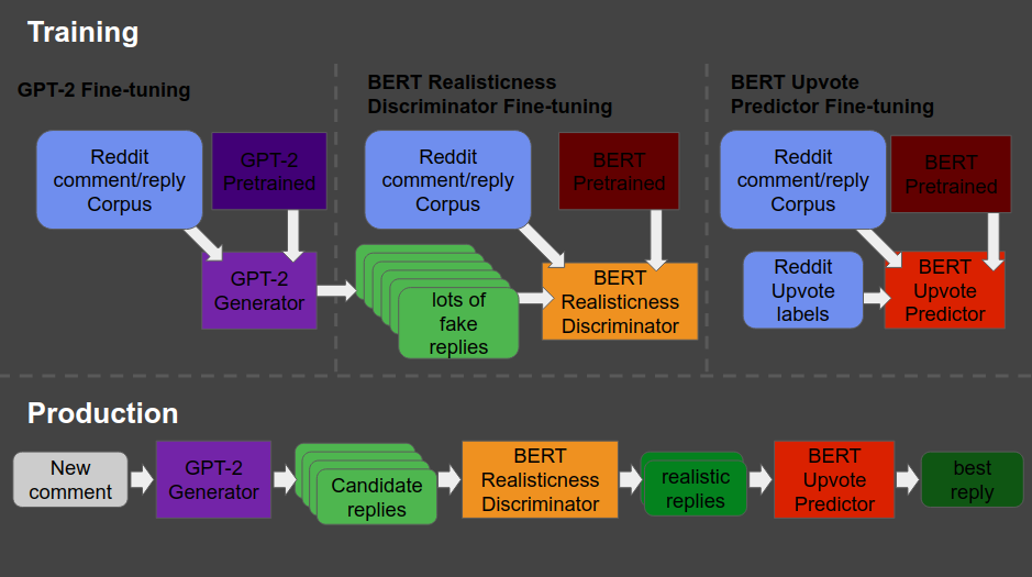
The architecture is shown at the end of this post — copied from Will’s original blog here. Moreover, you can read this post for details regarding the construction of the system. But let me see whether I can explain you what it does in simple language.

The below is what a Reddit comment and reply thread looks like. We have str8cokane making a comment to an original post (not in the picture), and then tupperware-party making a reply to that comment, followed by another reply by str8cokane. Basically, Will wanted to create an AI/bot that could write replies like tupperware-party that real people like str8cokane would not be able to distinguish from “real-people” replies.

Note that with 4 points, str8cokane‘s original comments was “liked” more than tupperware-party‘s reply and str8cokane‘s next reply, which were only upvoted 2 and 1 times respectively.

gpt2-bert on China
Example reddit comment and replies (via bonkerfield.org/)

So here’s what the final architecture looks like, and my attempt to explain it to you.

  1. Basically, we start in the upper left corner, where Will uses a database (i.e. corpus) of Reddit comments and replies to fine-tune a standard, pretrained GPT-2 model to get it to be good at generating (red: “fake”) realistic Reddit replies.
  2. Next, in the upper middle section, these fake replies are piped into a standard, pretrained BERT model, along with the original, real Reddit comments and replies. This way the BERT model sees both real and fake comments and replies. Now, our goal is to make replies that are undistinguishable from real replies. Hence, this is the task the BERT model gets. And we keep fine-tuning the original GPT-2 generator until the BERT discriminator that follows is no longer able to distinguish fake from real replies. Then the generator is “fooling” the discriminator, and we know we are generating fake replies that look like real ones!
    You can find more information about such generative adversarial networks here.
  3. Next, in the top right corner, we fine-tune another BERT model. This time we give it the original Reddit comments and replies along with the amount of times they were upvoted (i.e. sort of like likes on facebook/twitter). Basically, we train a BERT model to predict for a given reply, how much likes it is going to get.
  4. Finally, we can go to production in the lower lane. We give a real-life comment to the GPT-2 generator we trained in the upper left corner, which produces several fake replies for us. These candidates we run through the BERT discriminator we trained in the upper middle section, which determined which of the fake replies we generated look most real. Those fake but realistic replies are then input into our trained BERT model of the top right corner, which predicts for every fake but realistic reply the amount of likes/upvotes it is going to get. Finally, we pick and reply with the fake but realistic reply that is predicted to get the most upvotes!
What Will’s final architecture, combining GPT-2 and BERT, looked like (via bonkerfield.org)

The results are astonishing! Will’s bot sounds like a real youngster internet troll! Do have a look at the original blog, but here are some examples. Note that tupperware-party — the Reddit user from the above example — is actually Will’s AI.

COMMENT: 'Dune’s fandom is old and intense, and a rich thread in the cultural fabric of the internet generation' BOT_REPLY:'Dune’s fandom is overgrown, underfunded, and in many ways, a poor fit for the new, faster internet generation.'
bot responds to specific numerical bullet point in source comment

Will ends his blog with a link to the tutorial if you want to build such a bot yourself. Have a try!

Moreover, he also notes the ethical concerns:

I know there are definitely some ethical considerations when creating something like this. The reason I’m presenting it is because I actually think it is better for more people to know about and be able to grapple with this kind of technology. If just a few people know about the capacity of these machines, then it is more likely that those small groups of people can abuse their advantage.

I also think that this technology is going to change the way we think about what’s important about being human. After all, if a computer can effectively automate the paper-pushing jobs we’ve constructed and all the bullshit we create on the internet to distract us, then maybe it’ll be time for us to move on to something more meaningful.

If you think what I’ve done is a problem feel free to email me , or publically shame me on Twitter.

Will Stedden via bonkerfield.org/2020/02/combining-gpt-2-and-bert/

Two Tinder Experiments: An Unequal Economy

Two Tinder Experiments: An Unequal Economy

I’ve seen a fair share of Tinder experiments come by, for instance, someone A/B-testing attractiveness with and without facial hair, but these new two posts on Medium are the best I’ve come across so far.

In his first experiment, this self-proclaimed worst online dater went catfishing. He made a Tinder account using stock photos of attractive and less attractive and old and young guys, looking and sampled some like ratio’s.

Basically, his conclusion was that “Tinder actually can work, but pretty much only if you are an attractive guy”

In the second experiment, the author decided to treat Tinder as an economy and study it as an (socio-)economist would:

The wealth of an economy is quantified in terms its currency. […] In Tinder the currency is “likes”. […] Wealth in Tinder is not distributed equally. Attractive guys have more wealth in the Tinder economy (get more “likes”) than unattractive guys do. […] An unequal wealth distribution is to be expected, but there is a more interesting question: What is the degree of this unequal wealth distribution and how does this inequality compare to other economies?

Original Medium Post by Worst Online Dater

The author notes some caveats of this analysis. First and foremost, the data was collected in quite an unethical way, by asking questions to 27 of the matches with the fake accounts the author set up. Moreover, self-report bias is quite likely, as it’s easy to lie on Tinder. Still, the results are quite amusing:

Basically, “the bottom 80% of men are fighting over the bottom 22% of women and the top 78% of women are fighting over the top 20% of men”

Via Medium

The Lorenz curve shows the proportion of wealth owned by the bottom x% of a population. If wealth was equally distributed the curve would be perfectly diagonal (a 45 degree slope). The steeper the slope, the less inequal an economy. The below shows the curve for a perfectly equal economy, the US economy, and the estimated Tinder economy:

Via Medium

Similarly, the Gini coefficient can be used to represent the wealth equality of an economy. It ranges from 0 to 1, where 0 corresponds with perfect equality (everybody has the same wealth) and 1 corresponds with perfect inequality (one dictator with all the wealth). While most European countries, and even the US, score quite low on this Gini index, the Tinder economy is estimated to be much more towards the lower end.

Via Medium

Finally, based on the collected data, the author was able to reduce Tinder Male Attractiveness to a function of the number of likes received:

Via Medium

According to my last post, the most attractive men will be liked by only approximately 20% of all the females on Tinder. […] Unfortunately, this percentage decreases rapidly as you go down the attractiveness scale. According to this analysis a man of average attractiveness can only expect to be liked by slightly less than 1% of females (0.87%). This equates to 1 “like” for every 115 females.

The good news is that if you are only getting liked by a few girls on Tinder you shouldn’t take it personally. You aren’t necessarily unattractive. You can be of above average attractiveness and still only get liked by a few percent of women on Tinder. The bad news is that if you aren’t in the very upper echelons of Tinder wealth (i.e. attractiveness) you aren’t likely to have much success using Tinder. You would probably be better off just going to a bar or joining some coed recreational sports team.

Original Medium Post by Worst Online Dater

A/B testing and Statistics at Etsy, by Emily Robinson

A/B testing and Statistics at Etsy, by Emily Robinson

Generating numbers is easy; generating numbers you should trust is hard!

Emily Robinson is a data scientist at Etsy, an e-commerce website for handmade and vintage products. In the #rstats community, Emily is nearly as famous as her brother David Robinson, whom we know from the tidytext R-package.

Like any large tech company, Etsy relies heavily on statistics to improve their way of doing business. In their case, data from real-life experiments provide the business intelligence that allow effective decision-making. For instance, they experiment with the layout of their buttons, with the text shown near products, or with the suggestions made after a search query. To detect whether such changes have (ever so) small effects on Etsy’s KPI’s (e.g., conversion), data scientists such as Emily rely on traditional A/B testing.

In a 40-minute presentation, Emily explains how statistical issues such as skewed distributions, outliers, and power are dealt with at Etsy, among others using bootstrapping and simulations. Moreover, 30 minutes in Emily shares her lessons when it comes to working with (less stats-savvy) business stakeholders. For instance, how to help identify and transform business questions into data questions back into business solutions, or how to deal with the desire to peek at the results of experiments early.

Overall, I can the presentation below, the slides of which you find on Emily’s GitHub.


Kaggle Data Science Survey 2017: Worldwide Preferences for Python & R

Kaggle Data Science Survey 2017: Worldwide Preferences for Python & R

Kaggle conducts industry-wide surveys to assess the state of data science and machine learning. Over 17,000 individuals worldwide participated in the survey, myself included, and 171 countries and territories are represented in the data.

There is an ongoing debate regarding whether R or Python is better suited for Data Science (probably the latter, but I nevertheless prefer the former). The thousands of responses to the Kaggle survey may provide some insights into how the preferences for each of these languages are dispersed over the globe. At least, that was what I thought when I wrote the code below.

View the Kaggle Kernel here.

### PAUL VAN DER LAKEN
### 2017-10-31
### KAGGLE DATA SCIENCE SURVEY
### VISUALIZING WORLD WIDE RESPONSES
### AND PYTHON/R PREFERENCES

# LOAD IN LIBRARIES
library(ggplot2)
library(dplyr)
library(tidyr)
library(tibble)

# OPTIONS & STANDARDIZATION
options(stringsAsFactors = F)
theme_set(theme_light())
dpi = 600
w = 12
h = 8
wm_cor = 0.8
hm_cor = 0.8
capt = "Kaggle Data Science Survey 2017 by paulvanderlaken.com"

# READ IN KAGGLE DATA
mc <- read.csv("multipleChoiceResponses.csv") %>%
  as.tibble()

# READ IN WORLDMAP DATA
worldMap <- map_data(map = "world") %>% as.tibble()

# ALIGN KAGGLE AND WORLDMAP COUNTRY NAMES
mc$Country[!mc$Country %in% worldMap$region] %>% unique()
worldMap$region %>% unique() %>% sort(F)
mc$Country[mc$Country == "United States"] <- "USA"
mc$Country[mc$Country == "United Kingdom"] <- "UK"
mc$Country[grepl("China|Hong Kong", mc$Country)] <- "China"


# CLEAN UP KAGGLE DATA
lvls = c("","Rarely", "Sometimes", "Often", "Most of the time")
labels = c("NA", lvls[-1])
ind_data <- mc %>% 
  select(Country, WorkToolsFrequencyR, WorkToolsFrequencyPython) %>%
  mutate(WorkToolsFrequencyR = factor(WorkToolsFrequencyR, 
                                      levels = lvls, labels = labels)) %>% 
  mutate(WorkToolsFrequencyPython = factor(WorkToolsFrequencyPython, 
                                           levels = lvls, labels = labels)) %>% 
  filter(!(Country == "" | is.na(WorkToolsFrequencyR) | is.na(WorkToolsFrequencyPython)))

# AGGREGATE TO COUNTRY LEVEL
country_data <- ind_data %>%
  group_by(Country) %>%
  summarize(N = n(),
            R = sum(WorkToolsFrequencyR %>% as.numeric()),
            Python = sum(WorkToolsFrequencyPython %>% as.numeric()))

# CREATE THEME FOR WORLDMAP PLOT
theme_worldMap <- theme(
    plot.background = element_rect(fill = "white"),
    panel.border = element_blank(),
    panel.grid = element_blank(),
    panel.background = element_blank(),
    legend.background = element_blank(),
    legend.position = c(0, 0.2),
    legend.justification = c(0, 0),
    legend.title = element_text(colour = "black"),
    legend.text = element_text(colour = "black"),
    legend.key = element_blank(),
    legend.key.size = unit(0.04, "npc"),
    axis.text = element_blank(), 
    axis.title = element_blank(),
    axis.ticks = element_blank()
  )

After aligning some country names (above), I was able to start visualizing the results. A first step was to look at the responses across the globe. The greener the more responses and the grey countries were not represented in the dataset. A nice addition would have been to look at the response rate relative to country population.. any volunteers?

# PLOT WORLDMAP OF RESPONSE RATE
ggplot(country_data) + 
  geom_map(data = worldMap, 
           aes(map_id = region, x = long, y = lat),
           map = worldMap, fill = "grey") +
  geom_map(aes(map_id = Country, fill = N),
           map = worldMap, size = 0.3) +
  scale_fill_gradient(low = "green", high = "darkgreen", name = "Response") +
  theme_worldMap +
  labs(title = "Worldwide Response Kaggle DS Survey 2017",
       caption = capt) +
  coord_equal()

Worldmap_response.png

Now, let’s look at how frequently respondents use Python and R in their daily work. I created two heatmaps: one excluding the majority of respondents who indicated not using either Python or R, probably because they didn’t complete the survey.

# AGGREGATE DATA TO WORKTOOL RESPONSES
worktool_data <- ind_data %>%
  group_by(WorkToolsFrequencyR, WorkToolsFrequencyPython) %>%
  count()

# HEATMAP OF PREFERRED WORKTOOLS
ggplot(worktool_data, aes(x = WorkToolsFrequencyR, y = WorkToolsFrequencyPython)) +
  geom_tile(aes(fill = log(n))) +
  geom_text(aes(label = n), col = "black") +
  scale_fill_gradient(low = "red", high = "yellow") +
  labs(title = "Heatmap of Python and R usage",
       subtitle = "Most respondents indicate not using Python or R (or did not complete the survey)",
       caption = capt, 
       fill = "Log(N)") 

heatmap_worktools.png

# HEATMAP OF PREFERRED WORKTOOLS
# EXCLUSING DOUBLE NA'S
worktool_data %>%
  filter(!(WorkToolsFrequencyPython == "NA" & WorkToolsFrequencyR == "NA")) %>%
  ungroup() %>%
  mutate(perc = n / sum(n)) %>%
  ggplot(aes(x = WorkToolsFrequencyR, y = WorkToolsFrequencyPython)) +
  geom_tile(aes(fill = n)) +
  geom_text(aes(label = paste0(round(perc,3)*100,"%")), col = "black") +
  scale_fill_gradient(low = "red", high = "yellow") +
  labs(title = "Heatmap of Python and R usage (non-users excluded)",
       subtitle = "There is a strong reliance on Python and less users focus solely on R",
       caption = capt, 
       fill = "N") 

heatmap_worktools_usersonly.png

Okay, now let’s map these frequency data on a worldmap. Because I’m interested in the country level differences in usage, I look at the relative usage of Python compared to R. So the redder the country, the more Python is used by Data Scientists in their workflow whereas R is the preferred tool in the bluer countries. Interesting to see, there is no country where respondents really use R much more than Python.

# WORLDMAP OF RELATIVE WORKTOOL PREFERENCE
ggplot(country_data) + 
  geom_map(data = worldMap, 
           aes(map_id = region, x = long, y = lat),
           map = worldMap, fill = "grey") +
  geom_map(aes(map_id = Country, fill = Python/R),
           map = worldMap, size = 0.3) +
  scale_fill_gradient(low = "blue", high = "red", name = "Python/R") +
  theme_worldMap +
  labs(title = "Relative usage of Python to R per country",
       subtitle = "Focus on Python in Russia, Israel, Japan, Ukraine, China, Norway & Belarus",
       caption = capt) +
  coord_equal() 

Worldmap_relative_usage.png
Countries are color-coded for their relative preference for Python (red/purple) or R (blue) as a Data Science tool. 167 out of 171 countries (98%) demonstrate a value of > 1, indicating a preference for Python over R.

Thank you for reading my visualization report. Please do try and extract some other interesting insights from the data yourself.

If you liked my analysis, please upvote my Kaggle Kernel here!

AI at MIT (2010/2015): Part 1 – Introduction

AI at MIT (2010/2015): Part 1 – Introduction

Massachusetts Institute of Technology (MIT) hosts their entire 2010 course on artificial intelligence / machine learning by Professor Patrick Winston on YouTube. Although some parts seem already kind of dated seven years later, the videos on several evolving topics (e.g., Neural Networks) have been updated in the fall of 2015. The tutorial assignments you can find at the course website. Requirements for the course include experience with Python programming and an understanding of search algorithms (depth-first, breadth-first, uniform-cost, A*), basic probability, state estimation, the chain rule, partial derivatives, and dot products.

Below is the first, introductory lecture, which provides a short introduction to the history and concept of artificial intelligence:
AI is about algorithms enabled by constraints exposed by representations that support models targeted at loops that tie together thinking, perception and action.

Video: Bias in Machine Learning

Video: Bias in Machine Learning

Mainstream media have caught onto the difficulties of machine learning. Most saliently, they just love to report how AI and bots can be as racist, discriminatory, or biased as humans. Some examples:

Instead of arguing to shut down all bots, I would prefer news outlets to to explain what’s really happening. However, this can be quite difficult and complex, especially when the audience has no knowledge of machine learning. Fortunately, I found the video below, where some people at Google provide a really good laymen explanation as to how bias slips into our machine learning models. It covers interaction bias (where the human-machine interactions bias the learner)latent bias (where unobserved patterns in the learning data cause bias), and selection bias (where the selected learning sample isn’t representative of the population). Can you try and figure out which one(s) apply to the news articles above?