I’ve mentioned before that I dislike wordclouds (for instance here, or here) and apparently others share that sentiment. In his recent Medium blog, Daniel McNichol goes as far as to refer to the wordcloud as the pie chart of text data! Among others, Daniel calls wordclouds disorienting, one-dimensional, arbitrary and opaque and he mentions their lack of order, information, and scale.
Wordcloud of the negative characteristics of wordclouds, via Medium
Instead of using wordclouds, Daniel suggests we revert to alternative approaches. For instance, in their Tidy Text Mining with R book, Julia Silge and David Robinson suggest using bar charts or network graphs, providing the necessary R code. Another alternative is provided in Daniel’s blog: the chatterplot!
While Daniel didn’t invent this unorthodox wordcloud-like plot, he might have been the first to name it a chatterplot. Daniel’s chatterplot uses a full x/y cartesian plane, turning the usually only arbitrary though exploratory wordcloud into a more quantitatively sound, information-rich visualization.
R package ggplot’s geom_text() function — or alternatively ggrepel‘s geom_text_repel() for better legibility — is perfectly suited for making a chatterplot. And interesting features/variables for the axis — apart from the regular word frequencies — can be easily computed using the R tidytext package.
Here’s an example generated by Daniel, plotting words simulatenously by their frequency of occurance in comments to Hacker News articles (y-axis) as well as by the respective popularity of the comments the word was used in (log of the ranking, on the x-axis).
[CHATTERPLOTs are] like a wordcloud, except there’s actual quantitative logic to the order, placement & aesthetic aspects of the elements, along with an explicit scale reference for each. This allows us to represent more, multidimensional information in the plot, & provides the viewer with a coherent visual logic& direction by which to explore the data.
I highly recommend the use of these chatterplots over their less-informative wordcloud counterpart, and strongly suggest you read Daniel’s original blog, in which you can also find the R code for the above visualizations.
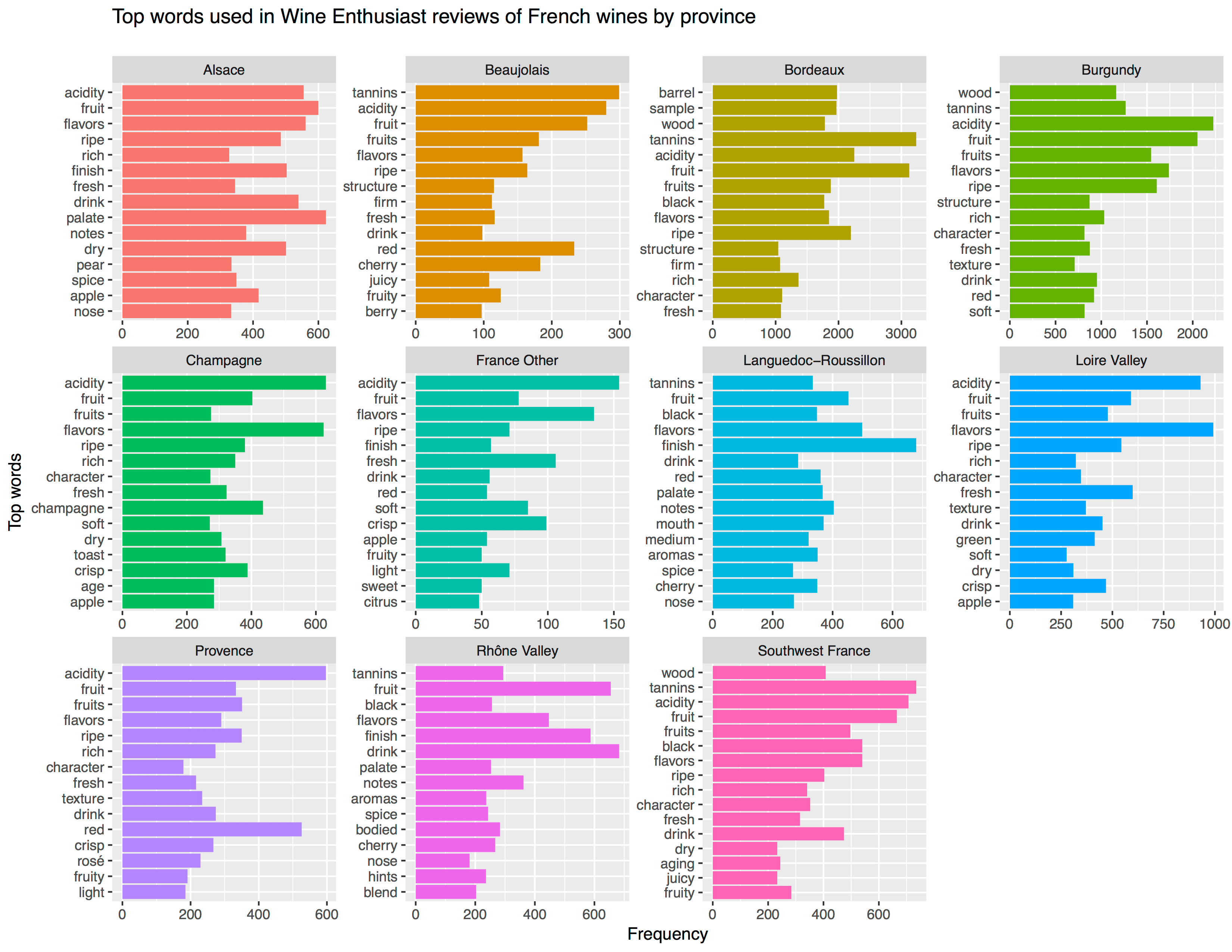
Aleszu Bajak at Storybench.org published a great demonstration of the power of text mining. He used the R tidytext package to analyse 150,000 wine reviews which Zach Thoutt had scraped from Wine Enthusiast in November of 2017.
Aleszu started his analysis on only the French wines, with a simple word count per region:
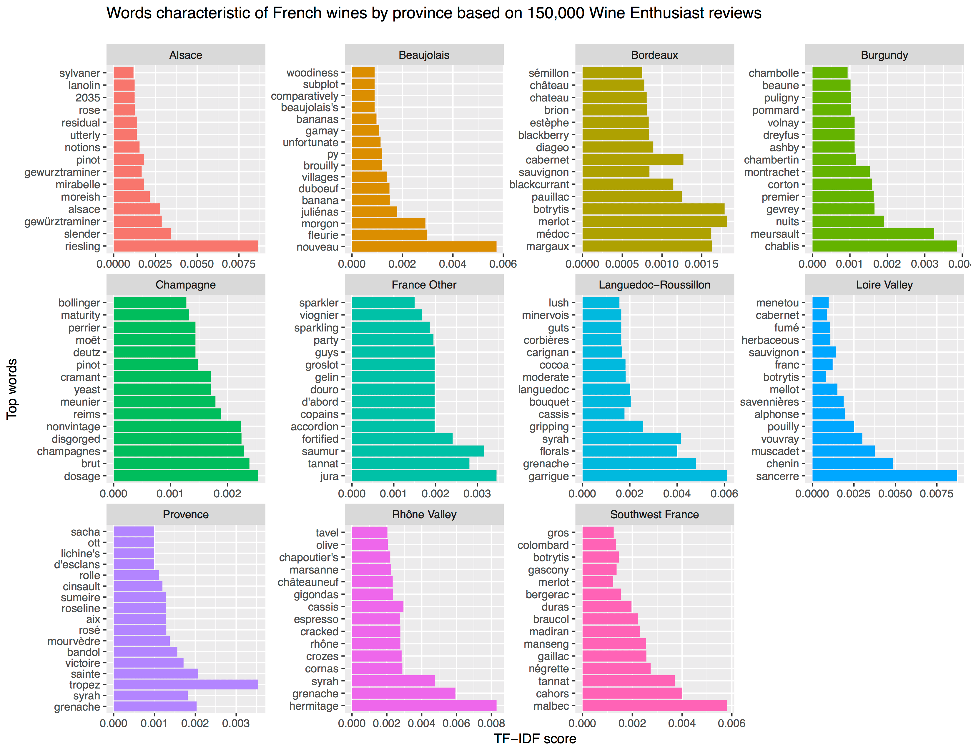
[orginal blog]Next, he applied TF-IDF to surface the words that are most characteristic for specific French wine regions — words used often in combination with that specific region, but not in relation to other regions.
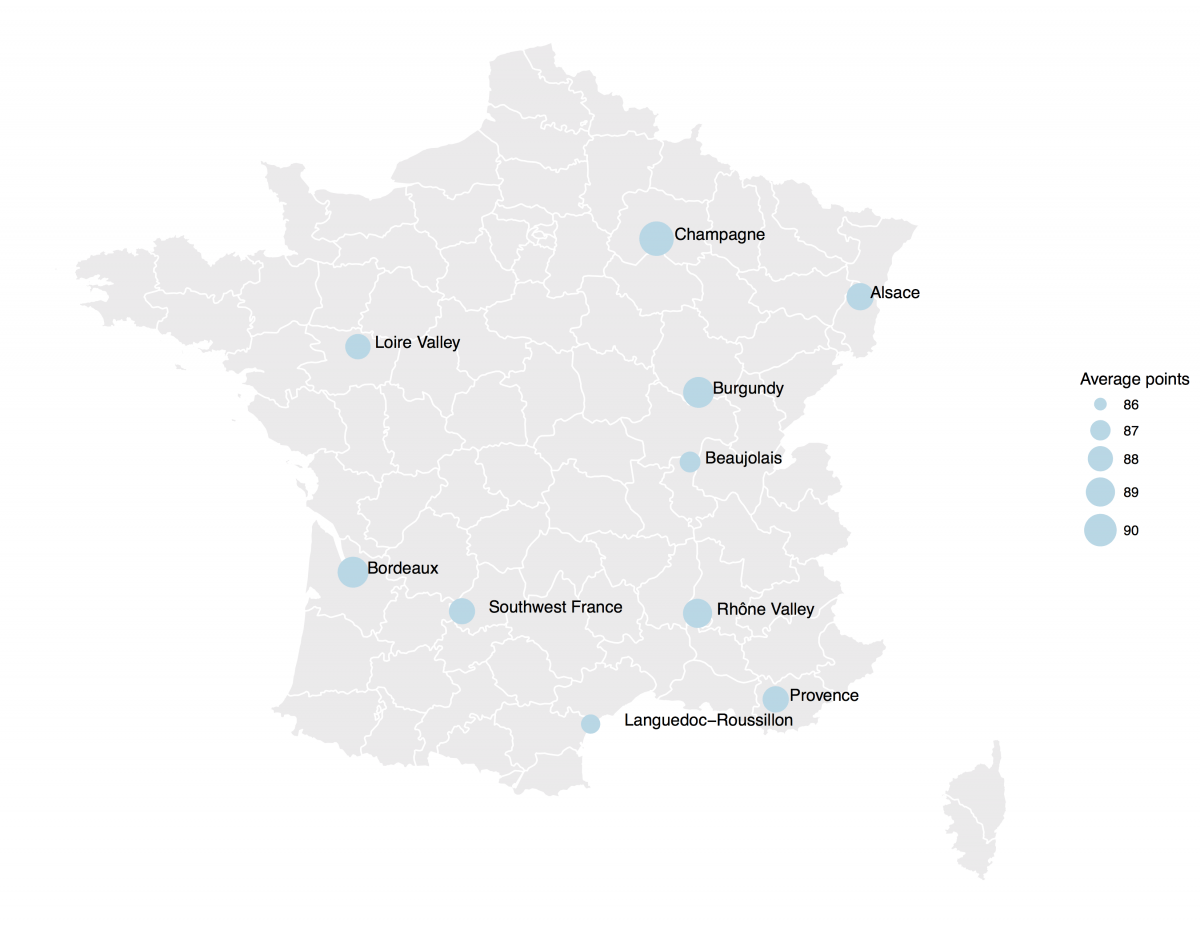
[orginal blog]The data also contained some price information, which Aleszu mapped France with ggplot2 and the maps package to demonstrate which French wine regions are generally more costly.
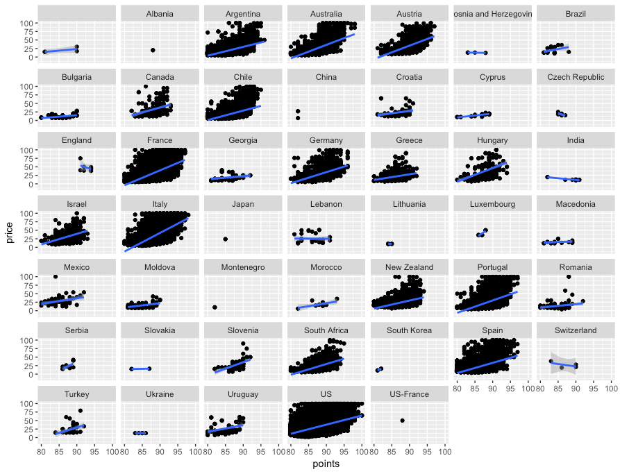
[orginal blog]On the full dataset, Alezsu also demonstrated that there is a strong relationship between price and points, meaning that, in general, more expensive wines seem to get better reviews:
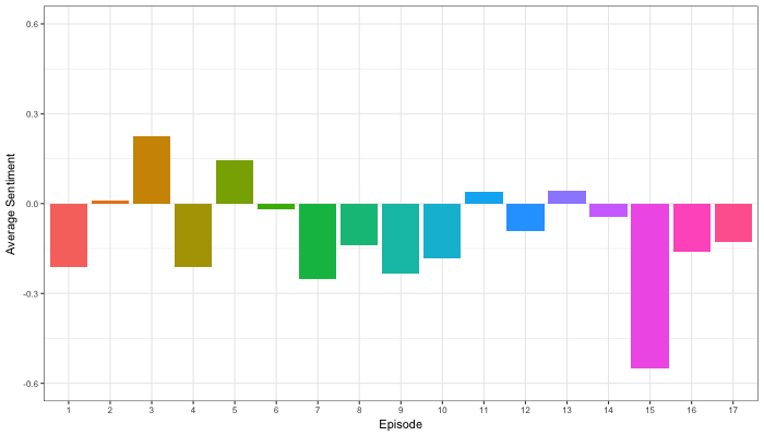
Jordan Dworkin, a Biostatistics PhD student at the University of Pennsylvania, is one of the few million fans of Stranger Things, a 80s-themed Netflix series combining drama, fantasy, mystery, and horror. Awaiting the third season, Jordan was curious as to the emotional voyage viewers went through during the series, and he decided to examine this using a statistical approach. Like I did for the seven Harry Plotter books, Jordan downloaded the scripts of all the Stranger Things episodes and conducted a sentiment analysis in R, of course using the tidyverse and tidytext. Jordan measured the positive or negative sentiment of the words in them using the AFINN dictionary and a first exploration led Jordan to visualize these average sentiment scores per episode:
The average positive/negative sentiment during the 17 episodes of the first two seasons of Stranger Things (from Medium.com)
Jordan jokingly explains that you might expect such overly negative sentiment in show about missing children and inter-dimensional monsters. The less-than-well-received episode 15 stands out, Jordan feels this may be due to a combination of its dark plot and the lack of any comedic relief from the main characters.
Reflecting on the visual above, Jordan felt that a lot of the granularity of the actual sentiment was missing. For a next analysis, he thus calculated a rolling average sentiment during the course of the separate episodes, which he animated using the animation package:
GIF displaying the rolling average (40 words) sentiment per Stranger Things episode (from Medium.com)
Jordan has two new takeaways: (1) only 3 of the 17 episodes have a positive ending – the Season 1 finale, the Season 2 premiere, and the Season 2 finale – (2) the episodes do not follow a clear emotional pattern. Based on this second finding, Jordan subsequently compared the average emotional trajectories of the two seasons, but the difference was not significant:
Smoothed (loess, I guess) trajectories of the sentiment during the episodes in seasons one and two of Stranger Things (from Medium.com)
Potentially, it’s better to classify the episodes based on their emotional trajectory than on the season they below too, Jordan thought next. Hence, he constructed a network based on the similarity (temporal correlation) between episodes’ temporal sentiment scores. In this network, the episodes are the nodes whereas the edges are weighted for the similarity of their emotional trajectories. In that sense, more distant episodes are less similar in terms of their emotional trajectory. The network below, made using igraph (see also here), demonstrates that consecutive episodes (1 → 2, 2 → 3, 3 → 4) are not that much alike:
The network of Stranger Things episodes, where the relations between the episodes are weighted for the similarity of their emotional trajectories (from Medium.com).
Three different emotional trajectories were identified among the 17 Stranger Things episodes in Season 1 and 2 (from Medium.com).
Looking at the average patterns, we can see that group 1 contains episodes that begin and end with neutral emotion and have slow fluctuations in the middle, group 2 contains episodes that begin with negative emotion and gradually climb towards a positive ending, and group 3 contains episodes that begin on a positive note and oscillate downwards towards a darker ending.
Jordan final suggestion is that producers and scriptwriters may consciously introduce these variations in emotional trajectories among consecutive episodes in order to get viewers hooked. If you want to redo the analysis or reuse some of the code used to create the visuals above, you can access Jordan’s R scripts here. I, for one, look forward to his analysis of Season 3!
Two weeks ago, I started the Harry Plotter project to celebrate the 20th anniversary of the first Harry Potter book. I could not have imagined that the first blog would be so well received. It reached over 4000 views in a matter of days thanks to the lovely people in the data science and #rstats community that were kind enough to share it (special thanks to MaraAverick and DataCamp). The response from the Harry Potter community, for instance on reddit, was also just overwhelming
Part 2: Hogwarts Houses
All in all, I could not resist a sequel and in this second post we will explore the four houses of Hogwarts: Gryffindor, Hufflepuff, Ravenclaw, and Slytherin. At the end of today’s post we will end up with visualizations like this:
Various stereotypes exist regarding these houses and a textual analysis seemed a perfect way to uncover their origins. More specifically, we will try to identify which words are most unique, informative, important or otherwise characteristic for each house by means of ratio and tf-idf statistics. Additionally, we will try to estime a personality profile for each house using these characteristic words and the emotions they relate to. Again, we rely strongly on ggplot2 for our visualizations, but we will also be using the treemaps of treemapify. Moreover, I have a special surprise this second post, as I found the orginal Harry Potter font, which will definately make the visualizations feel more authentic. Of course, we will conduct all analyses in a tidy manner using tidytext and the tidyverse.
I hope you will enjoy this blog and that you’ll be back for more. To be the first to receive new content, please subscribe to my website www.paulvanderlaken.com, follow me on Twitter, or add me on LinkedIn. Additionally, if you would like to contribute to, collaborate on, or need assistance with a data science project or venture, please feel free to reach out.
R Setup
All analysis were performed in RStudio, and knit using rmarkdown so that you can follow my steps.
In term of setup, we will be needing some of the same packages as last time. Bradley Boehmke gathered the text of the Harry Potter books in his harrypotter package. We need devtools to install that package the first time, but from then on can load it in as usual. We need plyr for ldply(). We load in most other tidyverse packages in a single bundle and add tidytext. Finally, I load the Harry Potter font and set some default plotting options.
# SETUP ##### LOAD IN PACKAGES# library(devtools)# devtools::install_github("bradleyboehmke/harrypotter")library(harrypotter)library(plyr)library(tidyverse)library(tidytext)# VIZUALIZATION SETTINGS# custom Harry Potter font# http://www.fontspace.com/category/harry%20potterlibrary(extrafont)font_import(paste0(getwd(),"/fontomen_harry-potter"), prompt=F)# load in custom Harry Potter fontwindowsFonts(HP=windowsFont("Harry Potter"))theme_set(theme_light(base_family="HP"))# set default ggplot theme to lightdefault_title="Harry Plotter: References to the Hogwarts houses"# set default titledefault_caption="www.paulvanderlaken.com"# set default captiondpi=600# set default dpi
Importing and Transforming Data
Before we import and transform the data in one large piping chunk, I need to specify some variables.
First, I tell R the house names, which we are likely to need often, so standardization will help prevent errors. Next, my girlfriend was kind enough to help me (colorblind) select the primary and secondary colors for the four houses. Here, the ggplot2 color guide in my R resources list helped a lot! Finally, I specify the regular expression (tutorials) which we will use a couple of times in order to identify whether text includes either of the four house names.
Ok, let’s import the data now. You may recognize pieces of the code below from last time, but this version runs slightly smoother after some optimalization. Have a look at the current data format.
# LOAD IN BOOK TEXT houses_sentences<-list(`Philosophers Stone`=philosophers_stone,
`Chamber of Secrets`=chamber_of_secrets,
`Prisoner of Azkaban`=prisoner_of_azkaban,
`Goblet of Fire`=goblet_of_fire,
`Order of the Phoenix`=order_of_the_phoenix,
`Half Blood Prince`=half_blood_prince,
`Deathly Hallows`=deathly_hallows)%>%# TRANSFORM TO TOKENIZED DATASETldply(cbind)%>%# bind all chapters to dataframemutate(.id=factor(.id, levels=unique(.id), ordered=T))%>%# identify associated bookunnest_tokens(sentence, `1`, token='sentences')%>%# seperate sentencesfilter(grepl(regex_houses, sentence))%>%# exclude sentences without house referencecbind(sapply(houses, function(x)grepl(x, .$sentence)))# identify references# examinemax.char=30# define max sentence lengthhouses_sentences%>%mutate(sentence=ifelse(nchar(sentence)>max.char, # cut off long sentencespaste0(substring(sentence, 1, max.char), "..."),
sentence))%>%head(5)
##                  .id                          sentence gryffindor
## 1 Philosophers Stone "well, no one really knows unt...      FALSE
## 2 Philosophers Stone "and what are slytherin and hu...      FALSE
## 3 Philosophers Stone everyone says hufflepuff are a...      FALSE
## 4 Philosophers Stone "better hufflepuff than slythe...      FALSE
## 5 Philosophers Stone "there's not a single witch or...      FALSE
##   ravenclaw hufflepuff slytherin
## 1     FALSE       TRUE      TRUE
## 2     FALSE       TRUE      TRUE
## 3     FALSE       TRUE     FALSE
## 4     FALSE       TRUE      TRUE
## 5     FALSE      FALSE      TRUE
Transform to Long Format
Ok, looking great, but not tidy yet. We need gather the columns and put them in a long dataframe. Thinking ahead, it would be nice to already capitalize the house names for which I wrote a custom Capitalize() function.
# custom capitalization functionCapitalize=function(text){paste0(substring(text,1,1)%>%toupper(),
substring(text,2))}# TO LONG FORMAThouses_long<-houses_sentences%>%gather(key=house, value=test, -sentence, -.id)%>%mutate(house=Capitalize(house))%>%# capitalize namesfilter(test)%>%select(-test)# delete rows where house not referenced# examinehouses_long%>%mutate(sentence=ifelse(nchar(sentence)>max.char, # cut off long sentencespaste0(substring(sentence, 1, max.char), "..."),
sentence))%>%head(20)
##                   .id                          sentence      house
## 1  Philosophers Stone i've been asking around, and i... Gryffindor
## 2  Philosophers Stone           "gryffindor," said ron. Gryffindor
## 3  Philosophers Stone "the four houses are called gr... Gryffindor
## 4  Philosophers Stone you might belong in gryffindor... Gryffindor
## 5  Philosophers Stone " brocklehurst, mandy" went to... Gryffindor
## 6  Philosophers Stone "finnigan, seamus," the sandy-... Gryffindor
## 7  Philosophers Stone                     "gryffindor!" Gryffindor
## 8  Philosophers Stone when it finally shouted, "gryf... Gryffindor
## 9  Philosophers Stone well, if you're sure -- better... Gryffindor
## 10 Philosophers Stone he took off the hat and walked... Gryffindor
## 11 Philosophers Stone "thomas, dean," a black boy ev... Gryffindor
## 12 Philosophers Stone harry crossed his fingers unde... Gryffindor
## 13 Philosophers Stone resident ghost of gryffindor t... Gryffindor
## 14 Philosophers Stone looking pleased at the stunned... Gryffindor
## 15 Philosophers Stone gryffindors have never gone so... Gryffindor
## 16 Philosophers Stone the gryffindor first years fol... Gryffindor
## 17 Philosophers Stone they all scrambled through it ... Gryffindor
## 18 Philosophers Stone nearly headless nick was alway... Gryffindor
## 19 Philosophers Stone professor mcgonagall was head ... Gryffindor
## 20 Philosophers Stone over the noise, snape said, "a... Gryffindor
Visualize House References
Woohoo, so tidy! Now comes the fun part: visualization. The following plots how often houses are mentioned overall, and in each book seperately.
# set plot width & heightw=10; h=6# PLOT REFERENCE FREQUENCYhouses_long%>%group_by(house)%>%summarize(n=n())%>%# count sentences per houseggplot(aes(x=desc(house), y=n))+geom_bar(aes(fill=house), stat='identity')+geom_text(aes(y=n/2, label=house, col=house), # center textsize=8, family='HP')+scale_fill_manual(values=houses_colors1)+scale_color_manual(values=houses_colors2)+theme(axis.text.y=element_blank(),
axis.ticks.y=element_blank(),
legend.position='none')+labs(title=default_title,
subtitle="Combined references in all Harry Potter books",
caption=default_caption,
x='', y='Name occurence')+coord_flip()
# PLOT REFERENCE FREQUENCY OVER TIME houses_long%>%group_by(.id, house)%>%summarize(n=n())%>%# count sentences per house per bookggplot(aes(x=.id, y=n, group=house))+geom_line(aes(col=house), size=2)+scale_color_manual(values=houses_colors1)+theme(legend.position='bottom',
axis.text.x=element_text(angle=15, hjust=0.5, vjust=0.5))+# rotate x axis textlabs(title=default_title,
subtitle="References throughout the Harry Potter books",
caption=default_caption,
x=NULL, y='Name occurence', color='House')
The Harry Potter font looks wonderful, right?
In terms of the data, Gryffindor and Slytherin definitely play a larger role in the Harry Potter stories. However, as the storyline progresses, Slytherin as a house seems to lose its importance. Their downward trend since the Chamber of Secrets results in Ravenclaw being mentioned more often in the final book (Edit – this is likely due to the diadem horcrux, as you will see later on).
I can’t but feel sorry for house Hufflepuff, which never really gets to involved throughout the saga.
Retrieve Reference Words & Data
Let’s dive into the specific words used in combination with each house. The following code retrieves and counts the single words used in the sentences where houses are mentioned.
# IDENTIFY WORDS USED IN COMBINATION WITH HOUSESwords_by_houses<-houses_long%>%unnest_tokens(word, sentence, token='words')%>%# retrieve wordsmutate(word=gsub("'s", "", word))%>%# remove possesive determinersgroup_by(house, word)%>%summarize(word_n=n())# count words per house# examinewords_by_houses%>%head()
## # A tibble: 6 x 3
## # Groups:   house [1]
##        house        word word_n
##        <chr>       <chr>  <int>
## 1 Gryffindor         104      1
## 2 Gryffindor        22nd      1
## 3 Gryffindor           a    251
## 4 Gryffindor   abandoned      1
## 5 Gryffindor  abandoning      1
## 6 Gryffindor abercrombie      1
Visualize Word-House Combinations
Now we can visualize which words relate to each of the houses. Because facet_wrap() has trouble reordering the axes (because words may related to multiple houses in different frequencies), I needed some custom functionality, which I happily recycled from dgrtwo’s github. With these reorder_within() and scale_x_reordered() we can now make an ordered barplot of the top-20 most frequent words per house.
# custom functions for reordering facet plots# https://github.com/dgrtwo/drlib/blob/master/R/reorder_within.Rreorder_within<-function(x, by, within, fun=mean, sep="___", ...){new_x<-paste(x, within, sep=sep)reorder(new_x, by, FUN=fun)}scale_x_reordered<-function(..., sep="___"){reg<-paste0(sep, ".+$")ggplot2::scale_x_discrete(labels=function(x)gsub(reg, "", x), ...)}# set plot width & heightw=10; h=7;
# PLOT MOST FREQUENT WORDS PER HOUSEwords_per_house=20# set number of top wordswords_by_houses%>%group_by(house)%>%arrange(house, desc(word_n))%>%mutate(top=row_number())%>%# count word top positionfilter(top<=words_per_house)%>%# retain specified top numberggplot(aes(reorder_within(word, -top, house), # reorder by minus top numberword_n, fill=house))+geom_col(show.legend=F)+scale_x_reordered()+# rectify x axis labels scale_fill_manual(values=houses_colors1)+scale_color_manual(values=houses_colors2)+facet_wrap(~house, scales="free_y")+# facet wrap and free y axiscoord_flip()+labs(title=default_title,
subtitle="Words most commonly used together with houses",
caption=default_caption,
x=NULL, y='Word Frequency')
Unsurprisingly, several stop words occur most frequently in the data. Intuitively, we would rerun the code but use dplyr::anti_join() on tidytext::stop_words to remove stop words.
# PLOT MOST FREQUENT WORDS PER HOUSE# EXCLUDING STOPWORDSwords_by_houses%>%anti_join(stop_words, 'word')%>%# remove stop wordsgroup_by(house)%>%arrange(house, desc(word_n))%>%mutate(top=row_number())%>%# count word top positionfilter(top<=words_per_house)%>%# retain specified top numberggplot(aes(reorder_within(word, -top, house), # reorder by minus top numberword_n, fill=house))+geom_col(show.legend=F)+scale_x_reordered()+# rectify x axis labelsscale_fill_manual(values=houses_colors1)+scale_color_manual(values=houses_colors2)+facet_wrap(~house, scales="free")+# facet wrap and free scalescoord_flip()+labs(title=default_title,
subtitle="Words most commonly used together with houses, excluding stop words",
caption=default_caption,
x=NULL, y='Word Frequency')
However, some stop words have a different meaning in the Harry Potter universe. points are for instance quite informative to the Hogwarts houses but included in stop_words.
Moreover, many of the most frequent words above occur in relation to multiple or all houses. Take, for instance, Harry and Ron, which are in the top-10 of each house, or words like table, house, and professor.
We are more interested in words that describe one house, but not another. Similarly, we only want to exclude stop words which are really irrelevant. To this end, we compute a ratio-statistic below. This statistic displays how frequently a word occurs in combination with one house rather than with the others. However, we need to adjust this ratio for how often houses occur in the text as more text (and thus words) is used in reference to house Gryffindor than, for instance, Ravenclaw.
words_by_houses<-words_by_houses%>%group_by(word)%>%mutate(word_sum=sum(word_n))%>%# counts words overallgroup_by(house)%>%mutate(house_n=n())%>%ungroup()%>%# compute ratio of usage in combination with house as opposed to overall# adjusted for house references frequency as opposed to overall frequencymutate(ratio=(word_n/(word_sum-word_n+1)/(house_n/n())))# examinewords_by_houses%>%select(-word_sum, -house_n)%>%arrange(desc(word_n))%>%head()
## # A tibble: 6 x 4
##        house       word word_n     ratio
##        <chr>      <chr>  <int>     <dbl>
## 1 Gryffindor        the   1057  2.373115
## 2  Slytherin        the    675  1.467926
## 3 Gryffindor gryffindor    602 13.076218
## 4 Gryffindor        and    477  2.197259
## 5 Gryffindor         to    428  2.830435
## 6 Gryffindor         of    362  2.213186
# PLOT MOST UNIQUE WORDS PER HOUSE BY RATIOwords_by_houses%>%group_by(house)%>%arrange(house, desc(ratio))%>%mutate(top=row_number())%>%# count word top positionfilter(top<=words_per_house)%>%# retain specified top numberggplot(aes(reorder_within(word, -top, house), # reorder by minus top numberratio, fill=house))+geom_col(show.legend=F)+scale_x_reordered()+# rectify x axis labelsscale_fill_manual(values=houses_colors1)+scale_color_manual(values=houses_colors2)+facet_wrap(~house, scales="free")+# facet wrap and free scalescoord_flip()+labs(title=default_title,
subtitle="Most informative words per house, by ratio",
caption=default_caption,
x=NULL, y='Adjusted Frequency Ratio (house vs. non-house)')
# PS. normally I would make a custom ggplot function
#    when I plot three highly similar graphs
This ratio statistic (x-axis) should be interpreted as follows: night is used 29 times more often in combination with Gryffindor than with the other houses.
Do you think the results make sense:
Gryffindors spent dozens of hours during their afternoons, evenings, and nights in the, often empty, tower room, apparently playing chess? Nevile Longbottom and Hermione Granger are Gryffindors, obviously, and Sirius Black is also on the list. The sword of Gryffindor is no surprise here either.
Hannah Abbot, Ernie Macmillan and Cedric Diggory are Hufflepuffs. Were they mostly hotcurlyblondes interested in herbology? Nevertheless, wild and aggresive seem unfitting for Hogwarts most boring house.
A lot of names on the list of Helena Ravenclaw’s house. Roger Davies, Padma Patil, Cho Chang, Miss S. Fawcett, Stewart Ackerley, Terry Boot, and Penelope Clearwater are indeed Ravenclaws, I believe. Ravenclaw’s Diadem was one of Voldemort horcruxes. AlectoCarrow, Death Eater by profession, was apparently sent on a mission by Voldemort to surprise Harry in Rawenclaw’s common room (source), which explains what she does on this list. Can anybody tell me what bust, statue and spot have in relation to Ravenclaw?
House Slytherin is best represented by Gregory Goyle, one of the members of Draco Malfoy’s gang along with Vincent Crabbe. Pansy Parkinson also represents house Slytherin. Slytherin are famous for speaking Parseltongue and their house’s gem is an emerald. House Gaunt were pure-blood descendants from Salazar Slytherin and apparently Viktor Krum would not have misrepresented the Slytherin values either. Oh, and only the heir of Slytherin could control the monster in the Chamber of Secrets.
Honestly, I was not expecting such good results! However, there is always room for improvement.
We may want to exclude words that only occur once or twice in the book (e.g., Alecto) as well as the house names. Additionally, these barplots are not the optimal visualization if we would like to include more words per house. Fortunately, Hadley Wickham helped me discover treeplots. Let’s draw one using the ggfittext and the treemapify packages.
# set plot width & heightw=12; h=8;
# PACKAGES FOR TREEMAP# devtools::install_github("wilkox/ggfittext")# devtools::install_github("wilkox/treemapify")library(ggfittext)library(treemapify)# PLOT MOST UNIQUE WORDS PER HOUSE BY RATIOwords_by_houses%>%filter(word_n>3)%>%# filter words with few occurancesfilter(!grepl(regex_houses, word))%>%# exclude house namesgroup_by(house)%>%arrange(house, desc(ratio), desc(word_n))%>%mutate(top=seq_along(ratio))%>%filter(top<=words_per_house)%>%# filter top n wordsggplot(aes(area=ratio, label=word, subgroup=house, fill=house))+geom_treemap()+# create treemapgeom_treemap_text(aes(col=house), family="HP", place='center')+# add textgeom_treemap_subgroup_text(aes(col=house), # add house namesfamily="HP", place='center', alpha=0.3, grow=T)+geom_treemap_subgroup_border(colour='black')+scale_fill_manual(values=houses_colors1)+scale_color_manual(values=houses_colors2)+theme(legend.position='none')+labs(title=default_title,
subtitle="Most informative words per house, by ratio",
caption=default_caption)
A treemap can display more words for each of the houses and displays their relative proportions better. New words regarding the houses include the following, but do you see any others?
Slytherin girls laugh out loud whereas Ravenclaw had a few little, pretty girls?
Gryffindors, at least Harry and his friends, got in trouble often, that is a fact.
Yellow is the color of house Hufflepuff whereas Slytherin is green indeed.
Zacherias Smith joined Hufflepuff and Luna Lovegood Ravenclaw.
Why is Voldemort in camp Ravenclaw?!
In the earlier code, we specified a minimum number of occurances for words to be included, which is a bit hacky but necessary to make the ratio statistic work as intended. Foruntately, there are other ways to estimate how unique or informative words are to houses that do not require such hacks.
TF-IDF
tf-idf similarly estimates how unique / informative words are for a body of text (for more info: Wikipedia). We can calculate a tf-idf score for each word within each document (in our case house texts) by taking the product of two statistics:
TF or term frequency, meaning the number of times the word occurs in a document.
IDF or inverse document frequency, specifically the logarithm of the inverse number of documents the word occurs in.
A high tf-idf score means that a word occurs relatively often in a specific document and not often in other documents. Different weighting schemes can be used to td-idf’s performance in different settings but we used the simple default of tidytext::bind_tf_idf().
An advantage of tf-idf over the earlier ratio statistic is that we no longer need to specify a minimum frequency: low frequency words will have low tf and thus low tf-idf. A disadvantage is that tf-idf will automatically disregard words occur together with each house, be it only once: these words have zero idf (log(4/4)) so zero tf-idf.
Let’s run the treemap gain, but not on the computed tf-idf scores.
words_by_houses<-words_by_houses%>%# compute term frequency and inverse document frequencybind_tf_idf(word, house, word_n)# examinewords_by_houses%>%select(-house_n)%>%head()
# PLOT MOST UNIQUE WORDS PER HOUSE BY TF_IDFwords_per_house=30words_by_houses%>%filter(tf_idf>0)%>%# filter for zero tf_idfgroup_by(house)%>%arrange(house, desc(tf_idf), desc(word_n))%>%mutate(top=seq_along(tf_idf))%>%filter(top<=words_per_house)%>%ggplot(aes(area=tf_idf, label=word, subgroup=house, fill=house))+geom_treemap()+# create treemapgeom_treemap_text(aes(col=house), family="HP", place='center')+# add textgeom_treemap_subgroup_text(aes(col=house), # add house namesfamily="HP", place='center', alpha=0.3, grow=T)+geom_treemap_subgroup_border(colour='black')+scale_fill_manual(values=houses_colors1)+scale_color_manual(values=houses_colors2)+theme(legend.position='none')+labs(title=default_title,
subtitle="Most informative words per house, by tf-idf",
caption=default_caption)
This plot looks quite different from its predecessor. For instance, Marcus Flint and Adrian Pucey are added to house Slytherin and Hufflepuff’s main color is indeed not just yellow, but canary yellow. Severus Snape’s dual role is also nicely depicted now, with him in both house Slytherin and house Gryffindor. Do you notice any other important differences? Did we lose any important words because they occured in each of our four documents?
House Personality Profiles (by NRC Sentiment Analysis)
We end this second Harry Plotter blog by examining to what the extent the stereotypes that exist of the Hogwarts Houses can be traced back to the books. To this end, we use the NRC sentiment dictionary, see also the the previous blog, with which we can estimate to what extent the most informative words for houses (we have over a thousand for each house) relate to emotions such as anger, fear, or trust.
The code below retains only the emotion words in our words_by_houses dataset and multiplies their tf-idf scores by their relative frequency, so that we retrieve one score per house per sentiment.
# PLOT SENTIMENT OF INFORMATIVE WORDS (TFIDF)words_by_houses%>%inner_join(get_sentiments("nrc"), by='word')%>%group_by(house, sentiment)%>%summarize(score=sum(word_n/house_n*tf_idf))%>%# compute emotion scoreggplot(aes(x=house, y=score, group=house))+geom_col(aes(fill=house))+# create barplotsgeom_text(aes(y=score/2, label=substring(house, 1, 1), col=house),
family="HP", vjust=0.5)+# add house letter in middlefacet_wrap(~Capitalize(sentiment), scales='free_y')+# facet and free y axisscale_fill_manual(values=houses_colors1)+scale_color_manual(values=houses_colors2)+theme(legend.position='none', # tidy datavizaxis.text.y=element_blank(),
axis.ticks.y=element_blank(),
axis.text.x=element_blank(),
axis.ticks.x=element_blank(),
strip.text.x=element_text(colour='black', size=12))+labs(title=default_title,
subtitle="Sentiment (nrc) related to houses' informative words (tf-idf)",
caption=default_caption,
y="Sentiment score", x=NULL)
The results to a large extent confirm the stereotypes that exist regarding the Hogwarts houses:
Gryffindors are full of anticipation and the most positive and trustworthy.
Hufflepuffs are the most joyous but not extraordinary on any other front.
Ravenclaws are distinguished by their low scores. They are super not-angry and relatively not-anticipating, not-negative, and not-sad.
Slytherins are the angriest, the saddest, and the most feared and disgusting. However, they are also relatively joyous (optimistic?) and very surprising (shocking?).
Conclusion and future work
With this we have come to the end of the second part of the Harry Plotter project, in which we used tf-idf and ratio statistics to examine which words were most informative / unique to each of the houses of Hogwarts. The data was retrieved using the harrypotter package and transformed using tidytext and the tidyverse. Visualizations were made with ggplot2 and treemapify, using a Harry Potter font.
I have several ideas for subsequent posts and I’d love to hear your preferences or suggestions:
I would like to demonstrate how regular expressions can be used to retrieve (sub)strings that follow a specific format. We could use regex to examine, for instance, when, and by whom, which magical spells are cast.
I would like to use network analysis to examine the interactions between the characters. We could retrieve networks from the books and conduct sentiment analysis to establish the nature of relationships. Similarly, we could use unsupervised learning / clustering to explore character groups.
I would like to use topic models, such as latent dirichlet allocation, to identify the main topics in the books. We could, for instance, try to summarize each book chapter in single sentence, or examine how topics (e.g., love or death) build or fall over time.
Finally, I would like to build an interactive application / dashboard in Shiny (another hobby of mine) so that readers like you can explore patterns in the books yourself. Unfortunately, the free on shinyapps.io only 25 hosting hours per month : (
For now, I hope you enjoyed this blog and that you’ll be back for more. To receive new content first, please subscribe to my website www.paulvanderlaken.com, follow me on Twitter, or add me on LinkedIn.
If you would like to contribute to, collaborate on, or need assistance with a data science project or venture, please feel free to reach out
This is reposted from DavisVaughan.com with minor modifications.
Introduction
A while back, I saw a conversation on twitter about how Hadley uses the word “pleased” very often when introducing a new blog post (I couldn’t seem to find this tweet anymore. Can anyone help?). Out of curiosity, and to flex my R web scraping muscles a bit, I’ve decided to analyze the 240+ blog posts that RStudio has put out since 2011. This post will do a few things:
Scrape the RStudio blog archive page to construct URL links to each blog post
Scrape the blog post text and metadata from each post
Use a bit of tidytext for some exploratory analysis
Perform a statistical test to compare Hadley’s use of “pleased” to the other blog post authors
To be able to extract the text from each blog post, we first need to have a link to that blog post. Luckily, RStudio keeps an up to date archive page that we can scrape. Using xml2, we can get the HTML off that page.
Now we use a bit of rvest magic combined with the HTML inspector in Chrome to figure out which elements contain the info we need (I also highly recommend SelectorGadget for this kind of work). Looking at the image below, you can see that all of the links are contained within the main tag as a tags (links).
The code below extracts all of the links, and then adds the prefix containing the base URL of the site.
links <- archive_html %>%
# Only the "main" body of the archive
html_nodes("main") %>%
# Grab any node that is a link
html_nodes("a") %>%
# Extract the hyperlink reference from those link tags# The hyperlink is an attribute as opposed to a node
html_attr("href") %>%
# Prefix them all with the base URL
paste0("http://blog.rstudio.com", .)
head(links)
Now that we have every link, we’re ready to extract the HTML from each individual blog post. To make things more manageable, we start by creating a tibble, and then using the mutate + map combination to created a column of XML Nodesets (we will use this combination a lot). Each nodeset contains the HTML for that blog post (exactly like the HTML for the archive page).
blog_data <- tibble(links)

blog_data <- blog_data %>%
  mutate(main = map(
                    # Iterate through every link
                    .x = links,

                    # For each link, read the HTML for that page, and return the main section
                    .f = ~read_html(.) %>%
                            html_nodes("main")
                    )
         )

select(blog_data, main)
Before extracting the blog post itself, lets grab the meta information about each post, specifically:
Author
Title
Date
Category
Tags
In the exploratory analysis, we will use author and title, but the other information might be useful for future analysis.
Looking at the first blog post, the Author, Date, and Title are all HTML class names that we can feed into rvest to extract that information.
In the code below, an example of extracting the author information is shown. To select a HTML class (like “author”) as opposed to a tag (like “main”), we have to put a period in front of the class name. Once the html node we are interested in has been identified, we can extract the text for that node using html_text().
Finally, notice that if we switch ".author" with ".title" or ".date" then we can grab that information as well. This kind of thinking means that we should create a function for extracting these pieces of information!
extract_info <- function(html, class_name) {
  map_chr(
          # Given the list of main HTMLs
          .x = html,

          # Extract the text we are interested in for each one
          .f = ~html_nodes(.x, class_name) %>%
                  html_text())
}

# Extract the data
blog_data <- blog_data %>%
  mutate(
     author = extract_info(main, ".author"),
     title  = extract_info(main, ".title"),
     date   = extract_info(main, ".date")
    )

select(blog_data, author, date)
## # A tibble: 249 x 2## author date## <chr> <chr>## 1 Jonathan McPherson 2017-08-16## 2 Hadley Wickham 2017-08-15## 3 Gary Ritchie 2017-08-11## 4 Roger Oberg 2017-08-10## 5 Jeff Allen 2017-08-03## 6 Javier Luraschi 2017-07-31## 7 Hadley Wickham 2017-07-13## 8 Roger Oberg 2017-07-12## 9 Garrett Grolemund 2017-07-11## 10 Hadley Wickham 2017-06-27## # ... with 239 more rows
select(blog_data, title)
## # A tibble: 249 x 1## title## <chr>## 1 RStudio 1.1 Preview - Data Connections## 2 rstudio::conf(2018): Contributed talks, e-posters, and diversity scholarshi## 3 RStudio v1.1 Preview: Terminal## 4 Building tidy tools workshop## 5 RStudio Connect v1.5.4 - Now Supporting Plumber!## 6 sparklyr 0.6## 7 haven 1.1.0## 8 Registration open for rstudio::conf 2018!## 9 Introducing learnr## 10 dbplyr 1.1.0## # ... with 239 more rows
Categories and tags
The other bits of meta data that might be interesting are the categories and tags that the post falls under. This is a little bit more involved, because both the categories and tags fall under the same class, ".terms". To separate them, we need to look into the href to see if the information is either a tag or a category (href = “/categories/” VS href = “/tags/”).
The function below extracts either the categories or the tags, depending on the argument, by:
Extracting the ".terms" class, and then all of the links inside of it (a tags).
Checking each link to see if the hyperlink reference contains “categories” or “tags” depending on the one that we are interested in. If it does, it returns the text corresponding to that link, otherwise it returns NAs which are then removed.
The final step results in two list columns containing character vectors of varying lengths corresponding to the categories and tags of each post.
extract_tag_or_cat <- function(html, info_name) {

  # Extract the links under the terms class
  cats_and_tags <- map(.x = html,
                       .f = ~html_nodes(.x, ".terms") %>%
                              html_nodes("a"))

  # For each link, if the href contains the word categories/tags
  # return the text corresponding to that link
  map(cats_and_tags,
    ~if_else(condition = grepl(info_name, html_attr(.x, "href")),
             true      = html_text(.x),
             false     = NA_character_) %>%
      .[!is.na(.)])
}

# Apply our new extraction function
blog_data <- blog_data %>%
  mutate(
    categories = extract_tag_or_cat(main, "categories"),
    tags       = extract_tag_or_cat(main, "tags")
  )

select(blog_data, categories, tags)
Finally, to extract the blog post itself, we can notice that each piece of text in the post is inside of a paragraph tag (p). Being careful to avoid the ".terms" class that contained the categories and tags, which also happens to be in a paragraph tag, we can extract the full blog posts. To ignore the ".terms" class, use the :not() selector.
blog_data <- blog_data %>%
  mutate(
    text = map_chr(main, ~html_nodes(.x, "p:not(.terms)") %>%
                 html_text() %>%
                 # The text is returned as a character vector.
                 # Collapse them all into 1 string.
                 paste0(collapse = " "))
  )

select(blog_data, text)
## # A tibble: 249 x 1## text## <chr>## 1 Today, we’re continuing our blog series on new features in RStudio 1.1. If ## 2 rstudio::conf, the conference on all things R and RStudio, will take place ## 3 Today we’re excited to announce availability of our first Preview Release f## 4 Have you embraced the tidyverse? Do you now want to expand it to meet your ## 5 We’re thrilled to announce support for hosting Plumber APIs in RStudio Conn## 6 We’re excited to announce a new release of the sparklyr package, available ## 7 "I’m pleased to announce the release of haven 1.1.0. Haven is designed to f## 8 RStudio is very excited to announce that rstudio::conf 2018 is open for reg## 9 We’re pleased to introduce the learnr package, now available on CRAN. The l## 10 "I’m pleased to announce the release of the dbplyr package, which now conta## # ... with 239 more rows
Who writes the most posts?
Now that we have all of this data, what can we do with it? To start with, who writes the most posts?
blog_data %>%
  group_by(author) %>%
  summarise(count = n()) %>%
  mutate(author = reorder(author, count)) %>%

  # Create a bar graph of author counts
  ggplot(mapping = aes(x = author, y = count)) +
  geom_col() +
  coord_flip() +
  labs(title    = "Who writes the most RStudio blog posts?",
       subtitle = "By a huge margin, Hadley!") +
  # Shoutout to Bob Rudis for the always fantastic themes
  hrbrthemes::theme_ipsum(grid = "Y")
Tidytext
I’ve never used tidytext before today, but to get our feet wet, let’s create a tokenized tidy version of our data. By using unnest_tokens() the data will be reshaped to a long format holding 1 word per row, for each blog post. This tidy format lends itself to all manner of analysis, and a number of them are outlined in Julia Silge and David Robinson’s Text Mining with R.
## # A tibble: 84,542 x 2## title word## <chr> <chr>## 1 RStudio 1.1 Preview - Data Connections today## 2 RStudio 1.1 Preview - Data Connections we’re## 3 RStudio 1.1 Preview - Data Connections continuing## 4 RStudio 1.1 Preview - Data Connections our## 5 RStudio 1.1 Preview - Data Connections blog## 6 RStudio 1.1 Preview - Data Connections series## 7 RStudio 1.1 Preview - Data Connections on## 8 RStudio 1.1 Preview - Data Connections new## 9 RStudio 1.1 Preview - Data Connections features## 10 RStudio 1.1 Preview - Data Connections in## # ... with 84,532 more rows
Remove stop words
A number of words like “a” or “the” are included in the blog that don’t really add value to a text analysis. These stop words can be removed using an anti_join() with the stop_words dataset that comes with tidytext. After removing stop words, the number of rows was cut in half!
As mentioned at the beginning of the post, Hadley apparently uses the word “pleased” in his blog posts an above average number of times. Can we verify this statistically?
Our null hypothesis is that the proportion of blog posts that use the word “pleased” written by Hadley is less than or equal to the proportion of those written by the rest of the RStudio team.
More simply, our null is that Hadley uses “pleased” less than or the same as the rest of the team.
Let’s check visually to compare the two groups of posts.
pleased <- tokenized_blog %>%
# Group by blog post
group_by(title) %>%
# If the blog post contains "pleased" put yes, otherwise no# Add a column checking if the author was Hadley
mutate(
contains_pleased = case_when(
"pleased" %in% word ~ "Yes",
TRUE ~ "No"),
is_hadley = case_when(
author == "Hadley Wickham" ~ "Hadley",
TRUE ~ "Not Hadley")
) %>%
# Remove all duplicates now
distinct(title, contains_pleased, is_hadley)
pleased %>%
ggplot(aes(x = contains_pleased)) +
geom_bar() +
facet_wrap(~is_hadley, scales = "free_y") +
labs(title = "Does this blog post contain 'pleased'?",
subtitle = "Nearly half of Hadley's do!",
x = "Contains 'pleased'",
y = "Count") +
hrbrthemes::theme_ipsum(grid = "Y")
Is there a statistical difference here?
To check if there is a statistical difference, we will use a test for difference in proportions contained in the R function, prop.test(). First, we need a continency table of the counts. Given the current form of our dataset, this isn’t too hard with the table() function from base R.
contingency_table <- pleased %>%
  ungroup() %>%
  select(is_hadley, contains_pleased) %>%
  # Order the factor so Yes is before No for easy interpretation
  mutate(contains_pleased = factor(contains_pleased, levels = c("Yes", "No"))) %>%
  table()

contingency_table
From our null hypothesis, we want to perform a one sided test. The alternative to our null is that Hadley uses “pleased” more than the rest of the RStudio team. For this reason, we specify alternative = "greater".
10.56% of the rest of the RStudio team’s posts contain “pleased”
With a p-value of 2.04e-11, we reject the null that Hadley uses “pleased” less than or the same as the rest of the team. The evidence supports the idea that he has a much higher preference for it!
Hadley uses “pleased” quite a bit!
About the author
Davis Vaughan is a Master’s student studying Mathematical Finance at the University of North Carolina at Charlotte. He is the other half of Business Science. We develop R packages for financial analysis. Additionally, we have a network of data scientists at our disposal to bring together the best team to work on consulting projects. Check out our website to learn more! He is the coauthor of R packages tidyquant and timetk.
My analysis, shown below, concludes that the Android and iPhone tweets are clearly from different people, posting during different times of day and using hashtags, links, and retweets in distinct ways. What’s more, we can see that the Android tweets are angrier and more negative, while the iPhone tweets tend to be benign announcements and pictures.
Of course, a lot has changed in the last year. Trump was elected and inaugurated, and his Twitter account has become only more newsworthy. So it’s worth revisiting the analysis, for a few reasons:
There is a year of new data, with over 2700 more tweets. And quite notably, Trump stopped using the Android in March 2017. This is why machine learning approaches like didtrumptweetit.com are useful since they can still distinguish Trump’s tweets from his campaign’s by training on the kinds of features I used in my original post.
I’ve found a better dataset: in my original analysis, I was working quickly and used thetwitteRpackage to query Trump’s tweets. I since learned there’s a bug in the package that caused it to retrieve only about half the tweets that could have been retrieved, and in any case, I was able to go back only to January 2016. I’ve since found the truly excellent Trump Twitter Archive, which contains all of Trump’s tweets going back to 2009. Below I show some R code for querying it.
I’ve heard some interesting questions that I wanted to follow up on: These come from the comments on the original post and other conversations I’ve had since. Two questions included what device Trump tended to use before the campaign, and what types of tweets tended to lead to high engagement.
So here I’m following up with a few more analyses of the \@realDonaldTrump account. As I did last year, I’ll show most of my code, especially those that involve text mining with thetidytextpackage (now a published O’Reilly book!). You can find the remainder of the code here.
Updating the dataset
The first step was to find a more up-to-date dataset of Trump’s tweets. The Trump Twitter Archive, by Brendan Brown, is a brilliant project for tracking them, and is easily retrievable from R.
As of today, it contains 31548, including the text, device, and the number of retweets and favourites. (Also impressively, it updates hourly, and since September 2016 it includes tweets that were afterwards deleted).
Devices over time
My analysis from last summer was useful for journalists interpreting Trump’s tweets since it was able to distinguish Trump’s tweets from those sent by his staff. But it stopped being true in March 2017, when Trump switched to using an iPhone.
Let’s dive into at the history of all the devices used to tweet from the account, since the first tweets in 2009.
library(forcats)all_tweets%>%mutate(source=fct_lump(source,5))%>%count(month=round_date(created_at,"month"),source)%>%complete(month,source,fill=list(n=0))%>%mutate(source=reorder(source,-n,sum))%>%group_by(month)%>%mutate(percent=n/sum(n),maximum=cumsum(percent),minimum=lag(maximum,1,0))%>%ggplot(aes(month,ymin=minimum,ymax=maximum,fill=source))+geom_ribbon()+scale_y_continuous(labels=percent_format())+labs(x="Time",y="% of Trump's tweets",fill="Source",title="Source of @realDonaldTrump tweets over time",subtitle="Summarized by month")
A number of different people have clearly tweeted for the \@realDonaldTrump account over time, forming a sort of geological strata. I’d divide it into basically five acts:
Early days: All of Trump’s tweets until late 2011 came from the Web Client.
Other platforms: There was then a burst of tweets from TweetDeck and TwitLonger Beta, but these disappeared. Some exploration (shown later) indicate these may have been used by publicists promoting his book, though some (like this one from TweetDeck) clearly either came from him or were dictated.
Starting the Android: Trump’s first tweet from the Android was in February 2013, and it quickly became his main device.
Campaign: The iPhone was introduced only when Trump announced his campaign by 2015. It was clearly used by one or more of his staff, because by the end of the campaign it made up a majority of the tweets coming from the account. (There was also an iPad used occasionally, which was lumped with several other platforms into the “Other” category). The iPhone reduced its activity after the election and before the inauguration.
Which devices did Trump use himself, and which did other people use to tweet for him? To answer this, we could consider that Trump almost never uses hashtags, pictures or links in his tweets. Thus, the percentage of tweets containing one of those features is a proxy for how much others are tweeting for him.
library(stringr)all_tweets%>%mutate(source=fct_lump(source,5))%>%filter(!str_detect(text,"^(\"|RT)"))%>%group_by(source,year=year(created_at))%>%summarize(tweets=n(),hashtag=sum(str_detect(str_to_lower(text),"#[a-z]|http")))%>%ungroup()%>%mutate(source=reorder(source,-tweets,sum))%>%filter(tweets>=20)%>%ggplot(aes(year,hashtag/tweets,color=source))+geom_line()+geom_point()+scale_x_continuous(breaks=seq(2009,2017,2))+scale_y_continuous(labels=percent_format())+facet_wrap(~source)+labs(x="Time",y="% of Trump's tweets with a hashtag, picture or link",title="Tweets with a hashtag, picture or link by device",subtitle="Not including retweets; only years with at least 20 tweets from a device.")
This suggests that each of the devices may have a mix (TwitLonger Beta was certainly entirely staff, as was the mix of “Other” platforms during the campaign), but that only Trump ever tweeted from an Android.
When did Trump start talking about Barack Obama?
Now that we have data going back to 2009, we can take a look at how Trump used to tweet, and when his interest turned political.
In the early days of the account, it was pretty clear that a publicist was writing Trump’s tweets for him. In fact, his first-ever tweet refers to him in the third person:
Be sure to tune in and watch Donald Trump on Late Night with David Letterman as he presents the Top Ten List tonight!
The first hundred or so tweets follow a similar pattern (interspersed with a few cases where he tweets for himself and signs it). But this changed alongside his views of the Obama administration. Trump’s first-ever mention of Obama was entirely benign:
Staff Sgt. Salvatore A. Giunta received the Medal of Honor from Pres. Obama this month. It was a great honor to have him visit me today.
But his next were a different story. This article shows how Trump’s opinion of the administration turned from praise to criticism at the end of 2010 and in early 2011 when he started spreading a conspiracy theory about Obama’s country of origin. His second and third tweets about the president both came in July 2011, followed by many more.
What changed? Well, it was two months after the infamous 2011 White House Correspondents Dinner, where Obama mocked Trump for his conspiracy theories, causing Trump to leave in a rage. Trump has denied that the dinner pushed him towards politics… but there certainly was a reaction at the time.
all_tweets%>%filter(!str_detect(text,"^(\"|RT)"))%>%group_by(month=round_date(created_at,"month"))%>%summarize(tweets=n(),hashtag=sum(str_detect(str_to_lower(text),"obama")),percent=hashtag/tweets)%>%ungroup()%>%filter(tweets>=10)%>%ggplot(aes(as.Date(month),percent))+geom_line()+geom_point()+geom_vline(xintercept=as.integer(as.Date("2011-04-30")),color="red",lty=2)+geom_vline(xintercept=as.integer(as.Date("2012-11-06")),color="blue",lty=2)+scale_y_continuous(labels=percent_format())+labs(x="Time",y="% of Trump's tweets that mention Obama",subtitle=paste0("Summarized by month; only months containing at least 10 tweets.\n","Red line is White House Correspondent's Dinner, blue is 2012 election."),title="Trump's tweets mentioning Obama")
Between July 2011 and November 2012 (Obama’s re-election), a full 32.3%% of Trump’s tweets mentioned Obama by name (and that’s not counting the ones that mentioned him or the election implicitly, like this). Of course, this is old news, but it’s an interesting insight into what Trump’s Twitter was up to when it didn’t draw as much attention as it does now.
Trump’s opinion of Obama is well known enough that this may be the most redundant sentiment analysis I’ve ever done, but it’s worth noting that this was the time period where Trump’s tweets first turned negative. This requires tokenizing the tweets into words. I do so with the tidytext package created by me and Julia Silge.
all_tweet_words%>%inner_join(get_sentiments("afinn"))%>%group_by(month=round_date(created_at,"month"))%>%summarize(average_sentiment=mean(score),words=n())%>%filter(words>=10)%>%ggplot(aes(month,average_sentiment))+geom_line()+geom_hline(color="red",lty=2,yintercept=0)+labs(x="Time",y="Average AFINN sentiment score",title="@realDonaldTrump sentiment over time",subtitle="Dashed line represents a 'neutral' sentiment average. Only months with at least 10 words present in the AFINN lexicon")
(Did I mention you can learn more about using R for sentiment analysis in our new book?)
Changes in words since the election
My original analysis was on tweets in early 2016, and I’ve often been asked how and if Trump’s tweeting habits have changed since the election. The remainder of the analyses will look only at tweets since Trump launched his campaign (June 16, 2015), and disregards retweets.
library(stringr)campaign_tweets<-all_tweets%>%filter(created_at>="2015-06-16")%>%mutate(source=str_replace(source,"Twitter for ",""))%>%filter(!str_detect(text,"^(\"|RT)"))tweet_words<-all_tweet_words%>%filter(created_at>="2015-06-16")
We can compare words used before the election to ones used after.
What words were used more before or after the election?
Some of the words used mostly before the election included “Hillary” and “Clinton” (along with “Crooked”), though he does still mention her. He no longer talks about his competitors in the primary, including (and the account no longer has need of the #trump2016 hashtag).
Of course, there’s one word with a far greater shift than others: “fake”, as in “fake news”. Trump started using the term only in January, claiming it after some articles had suggested fake news articles were partly to blame for Trump’s election.
As of early August Trump is using the phrase more than ever, with about 9% of his tweets mentioning it. As we’ll see in a moment, this was a savvy social media move.
What words lead to retweets?
One of the most common follow-up questions I’ve gotten is what terms tend to lead to Trump’s engagement.
What words tended to lead to unusually many retweets, or unusually few?
word_summary%>%filter(total>=25)%>%arrange(desc(median_retweets))%>%slice(c(1:20,seq(n()-19,n())))%>%mutate(type=rep(c("Most retweets","Fewest retweets"),each=20))%>%mutate(word=reorder(word,median_retweets))%>%ggplot(aes(word,median_retweets))+geom_col()+labs(x="",y="Median # of retweets for tweets containing this word",title="Words that led to many or few retweets")+coord_flip()+facet_wrap(~type,ncol=1,scales="free_y")
Some of Trump’s most retweeted topics include Russia, North Korea, the FBI (often about Clinton), and, most notably, “fake news”.
Of course, Trump’s tweets have gotten more engagement over time as well (which partially confounds this analysis: worth looking into more!) His typical number of retweets skyrocketed when he announced his campaign, grew throughout, and peaked around his inauguration (though it’s stayed pretty high since).
all_tweets%>%group_by(month=round_date(created_at,"month"))%>%summarize(median_retweets=median(retweet_count),number=n())%>%filter(number>=10)%>%ggplot(aes(month,median_retweets))+geom_line()+scale_y_continuous(labels=comma_format())+labs(x="Time",y="Median # of retweets")
Also worth noticing: before the campaign, the only patch where he had a notable increase in retweets was his year of tweeting about Obama. Trump’s foray into politics has had many consequences, but it was certainly an effective social media strategy.
Conclusion: I wish this hadn’t aged well
Until today, last year’s Trump post was the only blog post that analyzed politics, and (not unrelatedly!) the highest amount of attention any of my posts have received. I got to write up an article for the Washington Post, and was interviewed on Sky News, CTV, and NPR. People have built great tools and analyses on top of my work, with some of my favorites including didtrumptweetit.com and the Atlantic’s analysis. And I got the chance to engage with, well, different points of view.
The post has certainly had some professional value. But it disappoints me that the analysis is as relevant as it is today. At the time I enjoyed my 15 minutes of fame, but I also hoped it would end. (“Hey, remember when that Twitter account seemed important?” “Can you imagine what Trump would tweet about this North Korea thing if we were president?”) But of course, Trump’s Twitter account is more relevant than ever.
I don’t love analysing political data; I prefer writing about baseball, biology, R education, and programming languages. But as you might imagine, that’s the least of the reasons I wish this particular chapter of my work had faded into obscurity.
About the author:
David Robinson is a Data Scientist at Stack Overflow. In May 2015, he received his PhD in Quantitative and Computational Biology from Princeton University, where he worked with Professor John Storey. His interests include statistics, data analysis, genomics, education, and programming in R.