Tag: review

Reviewing year 4 of paulvanderlaken.com

Reviewing year 4 of paulvanderlaken.com

Despite the pandemic, 2020 has been a great year for me.

Professionally, I grew into my role as data science product owner. And next to this, I got more and more freelance side gigs. Mostly teaching, but also some consultancy projects. Unfortunately, all my start-up ideas failed miserably again this year, yet I’ll keep trying : )

Personally, 2020 was also generous to us. We have a family expansion coming in 2021! (Un)Fortunately, the whole quarantaine situation provided a lot of time to make our house baby-ready!

A year in numbers

2020 was also a great year for our blog.

Here are some statistics. We reached 300 followers, on the last day of the year! Who could have imagined that?!

Statistic20192020delta
Views107.828150.59940%
Visitors70.870100.53942%
Followers15930089%
Posts9672-25%
Comments405948%
per post0,420,8297%
Likes11686-26%
per post1,211,19-1%

This tremendous growth of the website is despite me posting a lot less frequently this year.

After a friend’s advice, I started posting less, but more regularly.

Can you spot the pattern in my 2020 posting behavior?

Compare that to my erratic 2019 posting:

Now my readers have got something to look forward to every Tuesday!

Yet, is Tuesday really the best day for me to post my stuff?

You seem to prefer visiting my blog on Wednesdays.

Let me know what you think in the comments!

I am looking forward to what 2021 has in store for my blogging. I guess a baby will result in even less posts… But we’ll just focus on quality over quantity!

I hope I can keep up with the exponential growth:

Best new articles in 2020

There are many ways in which you could define the quality of an article.

For me, the most obvious would be to look at some view-based metric. Something like the number of views, or the number of unique visitors.

Yet, some articles have been online longer than others. So maybe we should focus on the average views per day. Still these you can expect to be increase as articles have been in existance longer.

In my opinion, how an article attract viewers over time tells an interesting story. For instance, how stable are the daily viewer numbers? Are they rising? This is often indicative that external websites link to my article. Which implies it holds valuable information to a specific readership. In turn, this suggests that the article is likely to continue attracting viewers in the future.

Here is an abstract visualization. Every line represents and article. Every line/article starts in the lower left corner. On the x-axis you see the number of days since posting. So lines slowly move right, the longer they have been on my website. On the y-axis you see the total viewers it attracted.

You can see three types of blog articles: (1) articles that attract 90% of their views within the first month, (2) articles that generate a steady flow of visitors, (3) articles that never attract (m)any readers.

Here’s a different way of visualizing those same articles: by their average daily visitors (x) and the standard deviation in daily visitors (y).

Basically, I hope to write articles that get many daily visitors (high x). Yet, I also hope that my articles have either have stable (or preferably increasing) visitor numbers. This would mean that they either score low on y, or that y increases over time.

By these measures, my best articles of 2020 are, in my opinion:

  1. Bayesian statistics using R, Python, & Stan
  2. Automatically create perfect .gitignore file
  3. Create a publication-ready correlation matrix
  4. Simulating and visualizing the Monthy Hall problem in R & Python
  5. How most statistical tests are linear

Best all time reads

For the first time, my blog roll & archives were the most visited page of my website this year! A whopping 13k views!!

With regard to the most visited pages of this year, not much has changed since 2019. We see some golden oldies and I once again conclude that my viewership remains mostly R-based:

  1. R resources
  2. New to R?
  3. R tips and tricks
  4. The house always wins
  5. Simple correlation analysis in R
  6. Visualization innovations
  7. Beating battleships with algorithms and AI
  8. Regular expressions in R
  9. Learn project-based programming
  10. Simpson’s paradox

Which articles haven’t you read?

Did you know you can search for keywords or tags using the main page?

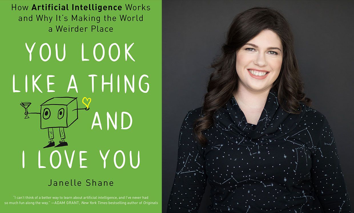
AI Book Review: You look like a thing and I love you

AI Book Review: You look like a thing and I love you

The following are my summary and take-aways from Janelle Shane’s 2019 book named You look like a thing and I love you. Most of the below are excerpts from Janelle’s book, combined, or rewritten by me. For the sake of copyright, just consider everything Janelle’s : )

Image result for things called ai janelle shane

AI weirdness

You look like a thing and I love you is about AI. More specifically, the book is about what AI can and can not do. And how and why AI often fails in miserably hilareous ways.

Janelle has spend her time foing fun experiments with AI. In this book, she shares those experiments along with many real life examples of AIs in practice. While explaining the technical details behind these AIs in an accesible though technically correct way, she informs the reader where, how, and why AIs fail.

Janelle took AIs out of their comfort zone and it produced some hilareously weird results. She proposes five principles of AI Weirdness:

  1. The danger of AI is not that it’s too smart, but that it’s not smart enough
  2. AI has the approximate brainpower of a worm
  3. AI does not really understand the problem you want it to solve
  4. But: AI will do exactly what you tell it to. Or at least it will try its best.
  5. And AI willt ake the path of the least resistance

Definitions: What is (not) AI?

If it seems like AI is everywhere, it’s partly because Artificial Intelligence means lots of things, depending on whether you’re reading science fiction or selling a new app or doing academic research.

To spot an AI in the wild, it’s important to know the difference between machine learning algorithms (what Janelle calls AI in her book) and traditional, rules-based programs.

To solve a problem with a rules-based program, you have to know every step required to complete the program’s task and how to describe each one of those steps. But a machine learning algorithm figures out the rules for itself via trail and error, gauging its success on goals the programmer has specified. As the AI tries to reach this goal, it can discover rules and correlations that the programmer didn’t even know existed. This is what makes AIs attractive problem solvers and is particularly handy if the rules are really complicated or just plain mysterious.

Sometimes an AI’s brilliant problem-solving rules actually rely on mistaken assumptions. Rules that served it well in training but fail miserably when it encountered the real world. While training errors are common in complex AIs, the consequences of these mistakes can be serious.

It’s often not easy to tell when AIs make mistakes. Since we don’t write the rules, they come up with their own, and they don’t write them down or explain them the way a human would.

The difference between succesful AI problem solving and failure usually has a lot to do with the suitability of the task for an AI solution. And there are plenty of tasks for which AI solutions are more efficient than human solutions. But there are also plenty of cases where things go miserably wrong.

Janelle proposes four signs of “AI Doom”, contexts where machine learning will not produce the desired results:

  1. The problem is too hard, broad, or complex
  2. The problem is not what we thought it was
  3. There are sneaky shortcuts to solving the problem
  4. The AI tried to solve the problem learning from flawed data

Programming an AI is almost more like teaching a child than programming a computer.

Explaining how AI works

In her book, Janelle takes us through many example problems which she or others tried to solve using AIs. These example problems are increasingly hilareous, but I assure you that they are technically and didactically sound:

  • Playing tic-tac-toe
  • Managing a cockroach farm
  • Riding a bicycle
  • Rating sandwich deliciousness
  • Tossing a sandwich into a wall
  • Guiding people through a hallway
  • Answering questions regarding photo’s
  • Categorizing doodles
  • Categorizing fish
  • Tossing pancakes
  • Autonomous walking
  • Autonomous driving
  • Playing Pacman

The amazing thing is these ridiculous example problems actually serve a purpose. They are used to explain different algorithms and their applications, strengths, and limitations! Janelle covers a wide variety of algorithms in such a way that anyone new to machine learning would understand, while people with some experience will still be amused.

Janelle talks about artificial neural networks, random forests, and markov chains. Moreover, she explains how activation functions, recurrancy and long short-term memory, evolutionary algorithms and gradient descent work. And all in understandable though technically correct language.

Janelle herself seems particularly fond of generative algorithms. She’s elaborates on having deployed recurrent neural nets, generative adversial networks, and markov chains for a wide variety of generative tasks. In the book, Jabekke explains what went well and went wrong when coming up with new and original…

  • pick-up lines
  • knock-knock jokes
  • names for species of birds
  • perfumes names
  • ice-cream flavors
  • cooking recipes
  • dream descriptions
  • horse drawings
  • Harry Potter scripts
  • cat names
  • Halloween costumes
  • elementary school blueprints
  • names for Benedict Cumberbatch
  • Dungeons and Dragons spells
  • pie recipes

Where does AI fail?

Janelle’s book is lingered with examples of failing AI. As a matter of fact, the whole book seems like an ode to how machine learning can and will inevitably fail. Particularly in the latter chapters, Janelle covers many limitations of and issues with AI in much detail:

  • class imbalance
  • overfitting
  • unrealistic simulation conditions
  • data quality issues
  • self-fullfilling prophecies
  • undesirable reward function optimization
  • missing the obvious
  • catastrophic forgetting
  • human biases in the data
  • machine bias
  • math-washing / bias laundering
  • bias amplification
  • adversarial attacks

Definite recommendation

I have yet to come across a book that explain AI in this much detail and in a manner as accessible and entertaining as Janelle Shane does in You look like a thing and I love you. Janelle makes machine learning and AI understandable for a wide public without passing on the deeper technical details. Taking a critical stance, she provides a good overview of the strenghts and weaknesses of AI, and a realistic outlook for the future to come. This book is not looking for sensation or hype, although reading it will be a most amusing experience for the more technical as well as the lay reader.

I highly recommend you reward yourself with a copy!

Become a data-driven Sommelier by text mining wine reviews

Become a data-driven Sommelier by text mining wine reviews

Aleszu Bajak at Storybench.org published a great demonstration of the power of text mining. He used the R tidytext package to analyse 150,000 wine reviews which Zach Thoutt had scraped from Wine Enthusiast in November of 2017.

Aleszu started his analysis on only the French wines, with a simple word count per region:

[orginal blog]
Next, he applied TF-IDF to surface the words that are most characteristic for specific French wine regions — words used often in combination with that specific region, but not in relation to other regions.

[orginal blog]
The data also contained some price information, which Aleszu mapped France with ggplot2 and the maps package to demonstrate which French wine regions are generally more costly.

[orginal blog]
On the full dataset, Alezsu also demonstrated that there is a strong relationship between price and points, meaning that, in general, more expensive wines seem to get better reviews:

[orginal blog]
The full script and more details you can find in the orginal blog.

HR Analytics: Een 7e zintuig voor de moderne HR-professional

HR Analytics: Een 7e zintuig voor de moderne HR-professional

Wat gebeurt er in Nederland op het gebied van HR Analytics? Dit nieuwe boek laat zien wat enkele Nederlandse organisaties de afgelopen jaren daadwerkelijk hebben ondernomen. De verschillende auteurs, waaronder ik mij mag scharen, geven een kijkje in de praktijkwereld van het onderbouwen van HR-beslissingen aan de hand van diverse databronnen en analysetechnieken. Ze verklaren daarmee HR Analytics niet heilig, maar wie als HR- professional waarde wil toevoegen aan de business, kan er veel aan hebben. Het credo is dan: weet wat je moet doen, wees alert op de valkuilen en beschouw HR Analytics als een zevende zintuig naast je andere zintuigen. Met dit extra zintuig kun je als HR- professional scherper waarnemen wat het echte HR-probleem is, en wat mogelijk de oplossing is.

Het boek ‘HR Analytics’ is voor de moderne HR-professional die nieuwsgierig is naar wat analytics kan bij dragen aan zijn of haar professionaliteit. De voorbeelden en verhalen uit de praktijk leveren verschillende leerpunten en inzichten die helpen bij een meer analytische benadering van de diverse HR beleidsthema’s rondom recruitment, loopbanen, arbeidsvoorwaarden, training en opleiding of engagement. Het is een duwtje in de rug op weg naar HR Analytics als een toevoeging aan het HR-vak. Niet als vervanging.

Wiemer Renkema, recensist op managementboeken.nl, heeft het boek inmiddels gelezen en vat de inhoud mooi samen:

In de tien hoofdstukken van het boek komen de belangrijkste HR analytics voorbij, zoals die voor recruitment, carrièreontwikkeling, medewerkerstevredenheid en beloning. De lezer kan zelf de relevantie van ieder onderwerp bepalen en gericht de informatie zoeken die voor hem van belang is. Bij ieder onderwerp gaan de schrijvers in op alle kernvragen, wat het boek een overzichtelijke en makkelijk leesbare structuur geeft.

[…]

Je hebt geen lange adem nodig om HR analytics. Een 7e zintuig voor de moderne HR-professional te lezen. Wat een praktisch, compleet en goed geschreven boek is dit!

Wiemer Renkema, recensist [link]

Hier kun je een deel van het introductiehoofdstuk inzien om te kijken of het boek iets voor jou is.

Sentiment Analysis: Analyzing Lexicon Quality and Estimation Errors

Sentiment Analysis: Analyzing Lexicon Quality and Estimation Errors

Sentiment analysis is a topic I cover regularly, for instance, with regard to Harry PlotterStranger Things, or Facebook. Usually I stick to the three sentiment dictionaries (i.e., lexicons) included in the tidytext R package (Bing, NRC, and AFINN) but there are many more one could use. Heck, I’ve even tried building one myself using a synonym/antonym network (unsuccessful, though a nice challenge). Two lexicons that did become famous are SentiWordNet, accessible via the lexicon R package, and the Loughran lexicon, designed specifically for the analysis of shareholder reports.

Josh Yazman did the world a favor and compared the quality of the five lexicons mentioned above. He observed their validity in relation to the millions of restaurant reviews in the Yelp dataset. This dataset includes both textual reviews and 1 to 5 star ratings. Here’s a summary of Josh’s findings, including two visualizations (read Josh’s full blog + details here):

  • NRC overestimates the positive sentiment.
  • AFINN also provides overly positive estimates, but to a lesser extent.
  • Loughran seems unreliable altogether (on Yelp data).
  • Bing estimates are accurate as long as texts are long enough (e.g., 200+ words).
  • SentiWordNet‘s estimates are mostly valid and precise, also on shorter texts, but may include minor outliers.

Sentiment scores by Yelp rating, estimated using each lexicon. [original]
The average sentiment score estimated using lexicons, where words are randomly sampled from the Yelp dataset. Note that, although both NRC and Bing scores are relatively positive on average, they also demonstrate a larger spread of scores (which is a good thing if you assume that reviews vary in terms of sentiment). [original]
On a more detailed level, David Robinson demonstrated how to uncover performance errors or quality issues in lexicons, in his 2016 blog on the AFINN lexicon. Using only the most common words (i.e., used in 200+ reviews for at least 10 businesses) of the same Yelp dataset, David visualized the inconsistencies between the AFINN sentiment lexicon and the Yelp ratings in two very smart and appealing ways:

center
Words’ AFINN sentiment score by the average rating of the reviews they used in [original]
As the figure above shows, David found a strong positive correlations between the sentiment score assigned to words in the AFINN lexicon and the way they are used in Yelp reviews. However, there are some exception – words that did not have the same meaning in the lexicon and the observed data. Examples of words that seem to cause errors are die and bomb (both negative AFINN scores but used in positive Yelp reviews) or, the other way around, joke and honor (positive AFINN scores but negative meanings on Yelp).

center
A graph of the frequency with which words are used in reviews, by the average rating of the reviews they occur in, colored for their AFINN sentiment score [original]
With the graph above, it is easy to see what words cause inaccuracies. Blue words should be in the upper section of this visual while reds should be closer to the bottom. If this is not the case, a word likely has a different meaning in the lexicon respective to how it’s used on Yelp. These lexicon-data differences become increasingly important as words are located closer to the right side of the graph, which means they more frequently screw up your sentiment estimates. For instance, fine, joke, fuck and hope cause much overestimation of positive sentiment while fresh is not considered in the positive scores it entails and die causes many negative errors.

TL;DR: Sentiment lexicons vary in terms of their quality/performance. If your texts are short (few hundred words) you might be best off using Bing (tidytext). In other cases, opt for SentiWordNet (lexicon), which considers a broader vocabulary. If possible, try to evaluate inaccuracies, outliers, and/or prediction errors via data visualizations.