
Last week, Google released Facets, their new, open source visualization tool. Facets consists of two interfaces that allow users to investigate their data at different levels.
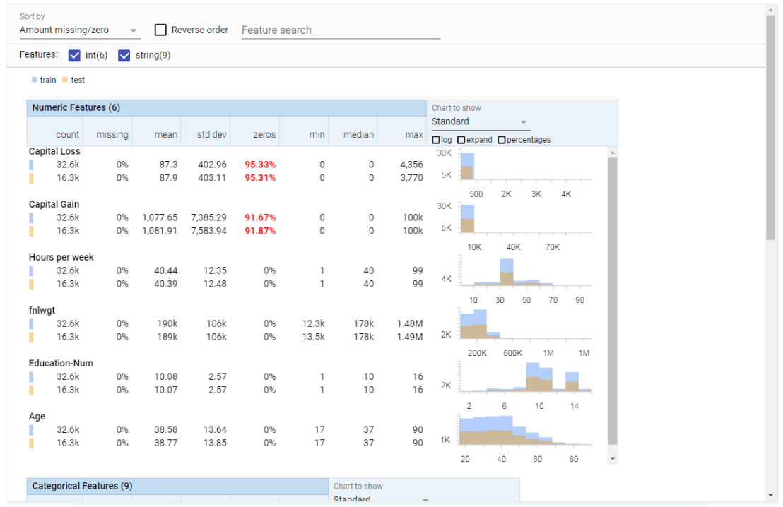
Facets Overview provides users with a quick understanding of the distribution of values across the variables in their dataset. Overview is especially helpful in detecting unexpected values, missing values, unbalanced distributions, and skewed distributions. Overview will detect all kinds of statistics for every column (i.e., variable) in your dataset, along with some simple vizualizations, such as histograms.
Dive is the name of the second interface of Facets. It provides an intuitive dashboard in which users can explore relationships between data points across the different variables in their dataset. The dashboard is easy to customize and users can control the position, color, and visual representation of each data point based on the underlying values.

Moreover, if the data points have images associated with them, these images can be used as the visual representations of the data points. The latter is especially helpful when Facets is used for its actual purpose: aiding in machine learning processes. The below GIF demonstrates how Facets Dive spots incorrectly labelled images with ease, allowing users to zoom in on a case-by-case level, for instance, to identify a frog that has been erroneously labelled as a cat.

To use a demo version of the tools with your own data, visit the Facets website. For more details, visit the Facets website or Google’s Research blog on Facets.

Did you try integrating your own data with Facets Tool?
LikeLike
Yes, on the Facets website (https://pair-code.github.io/facets/) at the bottom you can load in your own data and play around!
LikeLike
Thanks Paul.. I too tried the upload feature
LikeLike