Finding predictive patterns in your dataset with one line of code!
Today — March 2nd 2021 — my first R package was published on the comprehensive R archive network (CRAN).
ppsr is the R implementation of the Predictive Power Score (PPS).
The PPS is an asymmetric, data-type-agnostic score that can detect linear or non-linear relationships between two variables. You can read more about the concept in earlier blog posts (here and here), or here on Github, or via Medium.
With the ppsr package live on CRAN, it is now super easy to install the package and examine the predictive relationships in your dataset:
Update March, 2021: My R package for the predictive power score (ppsr) is live on CRAN! Try install.packages("ppsr") in your R terminal to get the latest version.
A few months ago, I wrote about the Predictive Power Score (PPS): a handy metric to quickly explore and quantify the relationships in a dataset.
As a social scientist, I was taught to use a correlation matrix to describe the relationships in a dataset. Yet, in my opinion, the PPS provides three handy advantages:
PPS works for any type of data, also nominal/categorical variables
PPS quantifies non-linear relationships between variables
PPS acknowledges the asymmetry of those relationships
# You can get the official version from CRAN:
install.packages("ppsr")

## Or you can get the development version from GitHub:
# install.packages('devtools')
# devtools::install_github('https://github.com/paulvanderlaken/ppsr')
Usage
The ppsr package has three main functions that compute PPS:
score() – which computes an x-y PPS
score_predictors() – which computes X-y PPS
score_matrix() – which computes X-Y PPS
Visualizing PPS
Subsequently, there are two main functions that wrap around these computational functions to help you visualize your PPS using ggplot2:
visualize_predictors() – producing a barplot of all X-y PPS
visualize_matrix() – producing a heatmap of all X-Y PPS
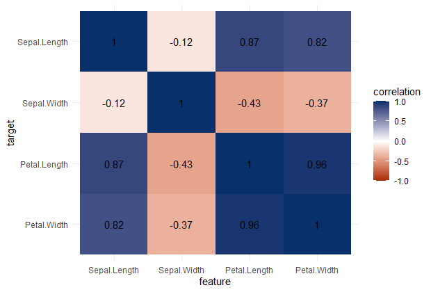
PPS matrix for iris
Note that Species is a nominal/categorical variable, with three character/text options.
A correlation matrix would not be able to show us that the type of iris Species can be predicted extremely well by the petal length and width, and somewhat by the sepal length and width. Yet, particularly sepal width is not easily predicted by the type of species.
Correlation matrix for iris
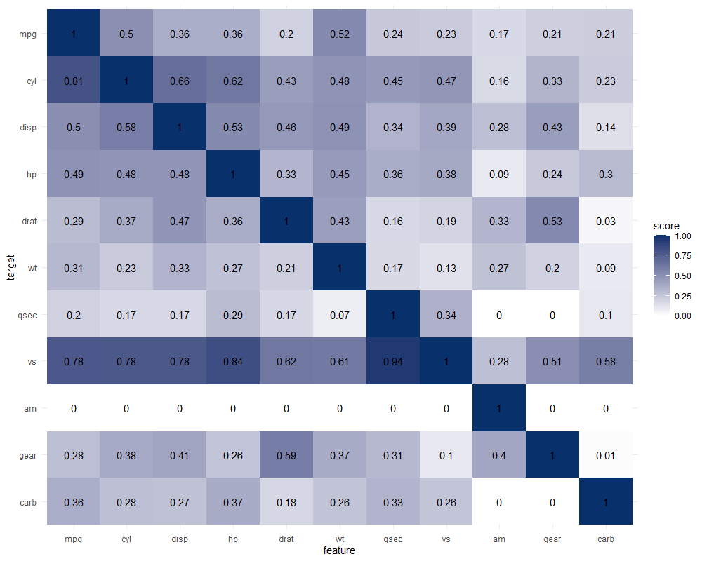
Exploring mtcars
It takes about 10 seconds to run 121 decision trees with visualize_matrix(mtcars). Yet, the output is much more informative than the correlation matrix:
cyl can be much better predicted by mpg than the other way around
the classification of vs can be done well using nearly all variables as predictors, except for am
yet, it’s hard to predict anything based on the vs classification
a cars’ am can’t be predicted at all using these variables
PPS matrix for mtcars
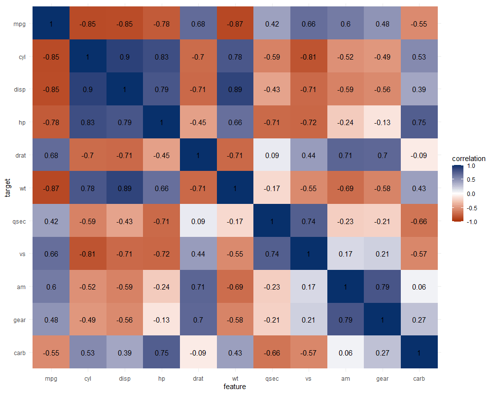
The correlation matrix does provides insights that are not provided by the PPS matrix. Most importantly, the sign and strength of any linear relationship that may exist. For instance, we can deduce that mpg relates strongly negatively with cyl.
Yet, even though half of the matrix does not provide any additional information (due to the symmetry), I still find it hard to derive the most important relations and insights at a first glance.
Moreover, the rows and columns for vs and am are not very informative in this correlation matrix as it contains pearson correlations coefficients by default, whereas vs and am are binary variables. The same can be said for cyl, gear and carb, which contain ordinal categories / integer data, so you can discuss the value of these coefficients depicted here.
Correlation matrix for mtcars
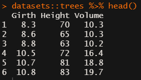
Exploring trees
In R, there are many datasets built in via the datasets package. Let’s explore some using the ppsr::visualize_matrix() function.
datasets::trees has data on 31 trees’ girth, height and volume.
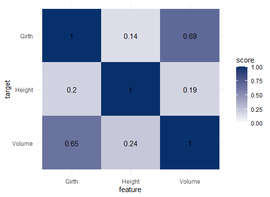
visualize_matrix(datasets::trees) shows that both girth and volume can be used to predict the other quite well, but not perfectly.
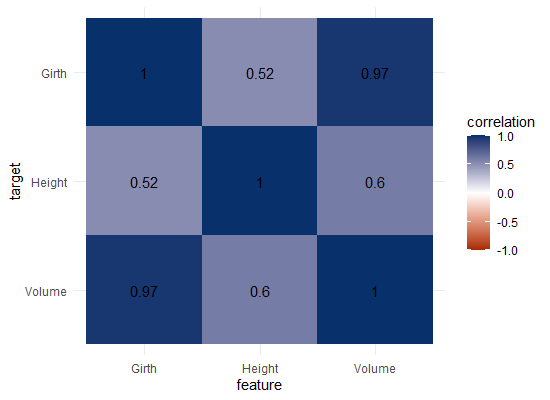
Let’s have a look at the correlation matrix.
The scores here seem quite higher in general. A near perfect correlation between volume and girth.
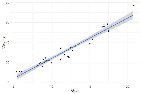
Is it near perfect though? Let’s have a look at the underlying data and fit a linear model to it.
You will still be pretty far off the real values when you use a linear model based on Girth to predict Volume. This is what the original PPS of 0.65 tried to convey.
Actually, I’ve run the math for this linaer model and the RMSE is still 4.11. Using just the mean Volume as a prediction of Volume will result in 16.17 RMSE. If we map these RMSE values on a linear scale from 0 to 1, we would get the PPS of our linear model, which is about 0.75.
So, actually, the linear model is a better predictor than the decision tree that is used as a default in the ppsr package. That was used to generate the PPS matrix above.
Yet, the linear model definitely does not provide a perfect prediction, even though the correlation may be near perfect.
Conclusion
In sum, I feel using the general idea behind PPS can be very useful for data exploration.
Particularly in more data science / machine learning type of projects. The PPS can provide a quick survey of which targets can be predicted using which features, potentially with more complex than just linear patterns.
Yet, the old-school correlation matrix also still provides unique and valuable insights that the PPS matrix does not. So I do not consider the PPS so much an alternative, as much as a complement in the toolkit of the data scientist & researcher.
Enjoy the R package, or the Python module for that matter, and let me know if you see any improvements!
Update March, 2021: My R package for the predictive power score (ppsr) is live on CRAN! Try install.packages("ppsr") in your R terminal to get the latest version.
Last week, I shared this Medium blog on PPS — or Predictive Power Score — on my LinkedIn and got so many enthousiastic responses, that I had to share it with here too.
Basically, the predictive power score is a normalized metric (values range from 0 to 1) that shows you to what extent you can use a variable X (say age) to predict a variable Y (say weight in kgs).
A PPS high score of, for instance, 0.85, would show that weight can be predicted pretty good using age.
A low PPS score, of say 0.10, would imply that weight is hard to predict using age.
The PPS acts a bit like a correlation coefficient we’re used too, but it is also different in many ways that are useful to data scientists:
PPS also detects and summarizes non-linear relationships
PPS is assymetric, so that it models Y ~ X, but not necessarily X ~ Y
PPS can summarize predictive value of / among categorical variables and nominal data
However, you may argue that the PPS is harder to interpret than the common correlation coefficent:
PPS can reflect quite complex and very different patterns
Therefore, PPS are hard to compare: a 0.5 may reflect a linear relationship but also many other relationships
PPS are highly dependent on the used algorithm: you can use any algorithm from OLS to CART to full-blown NN or XGBoost. Your algorithm hihgly depends the patterns you’ll detect and thus your scores
PPS are highly dependent on the the evaluation metric (RMSE, MAE, etc).
Here’s an example picture from the original blog, showing a case in which PSS shows the relevant predictive value of Y ~ X, whereas a correlation coefficient would show no relationship whatsoever:
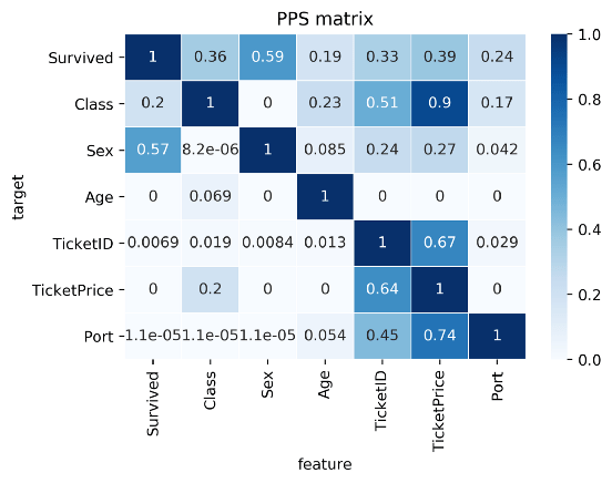
Here’s two more pictures from the original blog showing the differences with a standard correlation matrix on the Titanic data:
I highly suggest you readthe original blog for more details and information, and that you check out the associated Python packageppscore:
Installing the package:
pip install ppscore
Calculating the PPS for a given pandas dataframe:
import ppscore as pps
pps.score(df, "feature_column", "target_column")
You can also calculate the whole PPS matrix:
pps.matrix(df)
There’s no R package yet, but it should not be hard to implement this general logic.
Florian Wetschoreck — the author — already noted that there may be several use cases where he’d think PPS may add value:
Find patterns in the data [red: data exploration]: The PPS finds every relationship that the correlation finds — and more. Thus, you can use the PPS matrix as an alternative to the correlation matrix to detect and understand linear or nonlinear patterns in your data. This is possible across data types using a single score that always ranges from 0 to 1.
Feature selection: In addition to your usual feature selection mechanism, you can use the predictive power score to find good predictors for your target column. Also, you can eliminate features that just add random noise. Those features sometimes still score high in feature importance metrics. In addition, you can eliminate features that can be predicted by other features because they don’t add new information. Besides, you can identify pairs of mutually predictive features in the PPS matrix — this includes strongly correlated features but will also detect non-linear relationships.
Detect information leakage: Use the PPS matrix to detect information leakage between variables — even if the information leakage is mediated via other variables.
Data Normalization: Find entity structures in the data via interpreting the PPS matrix as a directed graph. This might be surprising when the data contains latent structures that were previously unknown. For example: the TicketID in the Titanic dataset is often an indicator for a family.
A recent open access paper by Nicholas Tierney and Dianne Cook — professors at Monash University — deals with simpler handling, exploring, and imputation of missing values in data.They present new methodology building upon tidy data principles, with a goal to integrating missing value handling as an integral part of data analysis workflows. New data structures are defined (like the nabular) along with new functions to perform common operations (like gg_miss_case).
These new methods have bundled among others in the R packages naniar and visdat, which I highly recommend you check out. To put in the author’s own words:
The naniar and visdat packages build on existing tidy tools and strike a compromise between automation and control that makes analysis efficient, readable, but not overly complex. Each tool has clear intent and effects – plotting or generating data or augmenting data in some way. This reduces repetition and typing for the user, making exploration of missing values easier as they follow consistent rules with a declarative interface.
The below showcases some of the highly informational visuals you can easily generate with naniar‘s nabulars and the associated functionalities.
For instance, these heatmap visualizations of missing data for the airquality dataset. (A) represents the default output and (B) is ordered by clustering on rows and columns. You can see there are only missings in ozone and solar radiation, and there appears to be some structure to their missingness.
Another example is this upset plot of the patterns of missingness in the airquality dataset. Only Ozone and Solar.R have missing values, and Ozone has the most missing values. There are 2 cases where both Solar.R and Ozone have missing values.
You can also generate a histogram using nabular data in order to show the values and missings in Ozone. Values are imputed below the range to show the number of missings in Ozone and colored according to missingness of ozone (‘Ozone_NA‘). This displays directly that there are approximately 35-40 missings in Ozone.
Alternatively, scatterplots can be easily generated. Displaying missings at 10 percent below the minimum of the airquality dataset. Scatterplots of ozone and solar radiation (A), and ozone and temperature (B). These plots demonstrate that there are missings in ozone and solar radiation, but not in temperature.
Finally, this parallel coordinate plot displays the missing values imputed 10% below range for the oceanbuoys dataset. Values are colored by missingness of humidity. Humidity is missing for low air and sea temperatures, and is missing for one year and one location.
Xeno.graphics is the collection of unusual charts and maps Maarten Lambrechts maintains. It’s a repository of novel, innovative, and experimental visualizations to inspire you, to fight xenographphobia, and popularize new chart types.
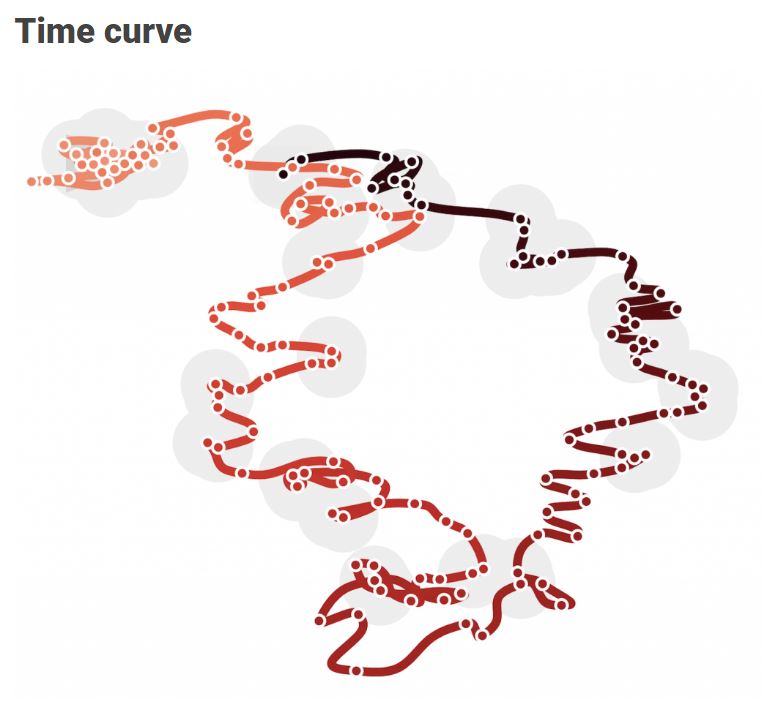
For instance, have you ever before heard of a time curve? These are very useful to visualize the development of a relationship over time.
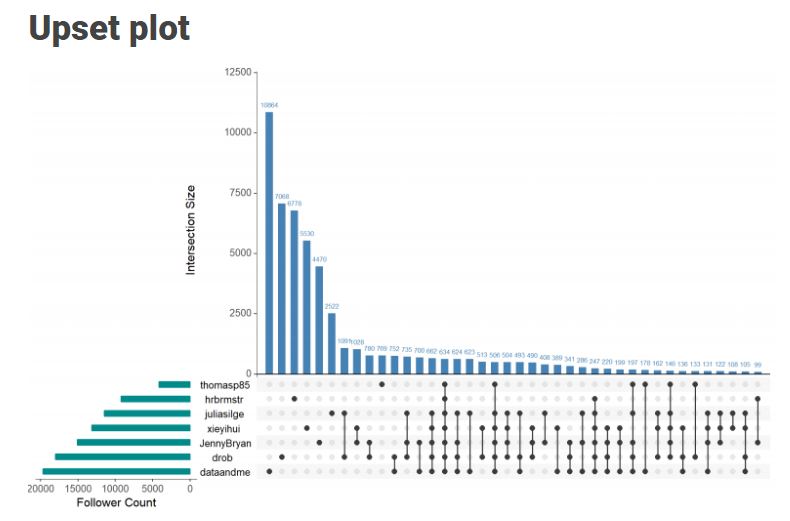
Time curves are based on the metaphor of folding a timeline visualization into itself so as to bring similar time points close to each other. This metaphor can be applied to any dataset where a similarity metric between temporal snapshots can be defined, thus it is largely datatype-agnostic. [https://xeno.graphics/time-curve]The upset plot is another example of an upcoming visualization. It can demonstrate the overlap or insection in a dataset. For instance, in the social network of #rstats twitter heroes, as the below example from the Xenographics website does.
Understanding relationships between sets is an important analysis task. The major challenge in this context is the combinatorial explosion of the number of set intersections if the number of sets exceeds a trivial threshold. To address this, we introduce UpSet, a novel visualization technique for the quantitative analysis of sets, their intersections, and aggregates of intersections. [https://xeno.graphics/upset-plot/]The below necklace map is new to me too. What it does precisely is unclear to me as well.
In a necklace map, the regions of the underlying two-dimensional map are projected onto intervals on a one-dimensional curve (the necklace) that surrounds the map regions. Symbols are scaled such that their area corresponds to the data of their region and placed without overlap inside the corresponding interval on the necklace. [https://xeno.graphics/necklace-map/]There are hundreds of other interestingcharts, maps, figures, and plots, so do have a look yourself. Moreover, the xenographics collection is still growing. If you know of one that isn’t here already, please submit it. You can also expect some posts about certain topics around xenographics.
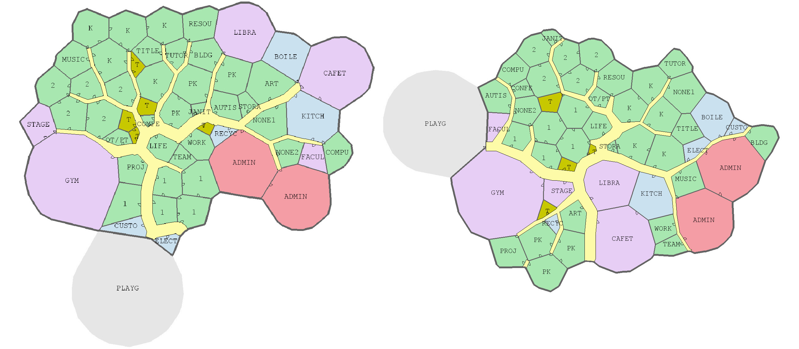
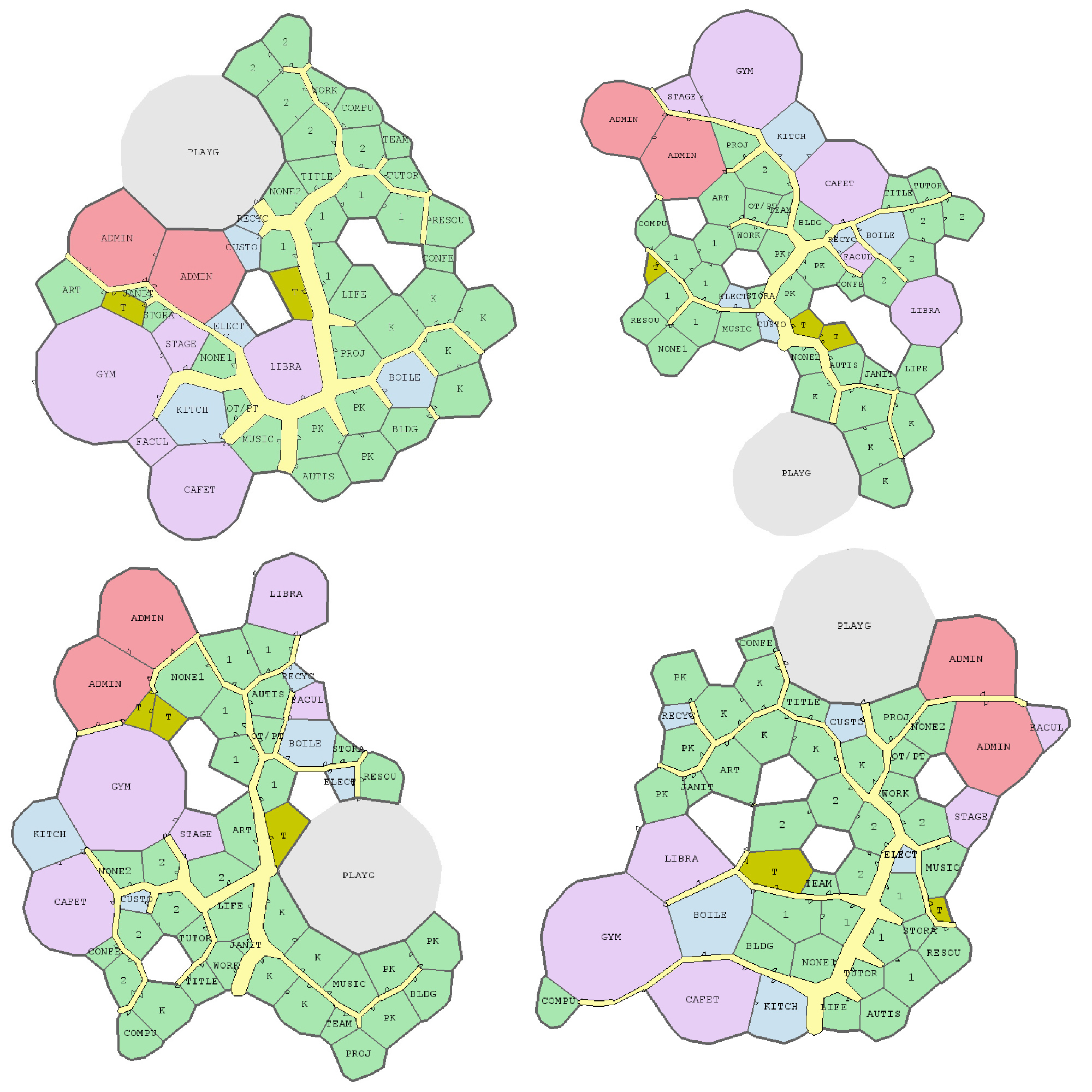
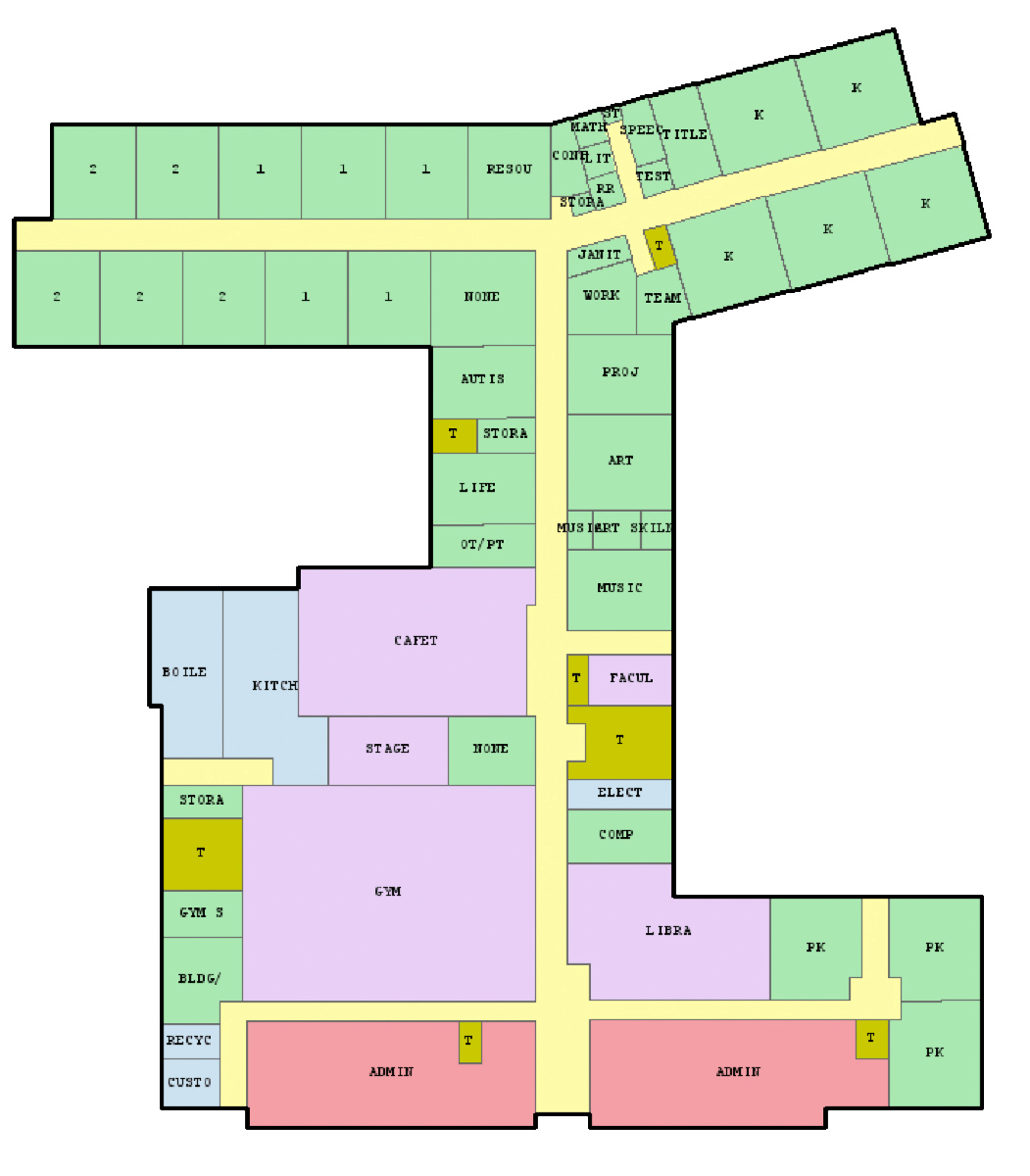
Joel Simon is the genius behind an experimental project exploring optimized school blueprints. Joel used graph-contraction and ant-colony pathing algorithms as growth processes, which could generate elementary school designs optimized for all kinds of characteristics: walking time, hallway usage, outdoor views, and escape routes just to name a few.
Two generated designs, minimizing the traffic flow (left) as well as escape routes (right) [original]Other designs tried to maximize the number of windows, resulting in seemingly random open courtyards [original]
The original floor plan [original]Definitely check out the original write-up if you are interested in the details behind the generation process! Or have a look at some of Joel’s other projects.


 Alternatively, scatterplots can be easily generated. Displaying missings at 10 percent below the minimum of the airquality dataset. Scatterplots of ozone and solar radiation (A), and ozone and temperature (B). These plots demonstrate that there are missings in ozone and solar radiation, but not in temperature.