
2018 seemed to be the year of challenges going viral on the web. Most of them were plain stupid and/or dangerous. However, one viral challenge I did like: #100DaysOfCode
1. Code minimum an hour every day for the next 100 days.
2. Tweet your progress every day with the #100DaysOfCode hashtag.
3. Each day, reach out to at least two people on Twitter who are also doing the challenge
100 Days of Code rulebook
Many (aspiring) programming professionals competed in this challenge, sharing their learning journeys in domains from web development, machine learning, or data visualization.
With this blog, I wanted to share two of those learning journeys that stood out for me.
Machine learning
First, there’s Avik Jain’s 100 days of Machine Learning code repository on Github. Avik’s repository contains all learning activities he followed during the 53 days of programming he completed. Some of Avik’s entries really stood out, and I particularly liked his educational infographics:


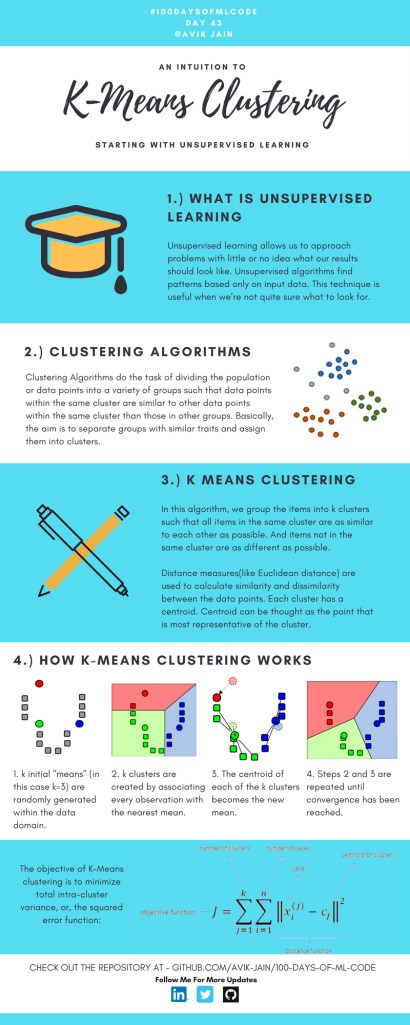

Just look at the wonderful design and visual aids on this decision tree for dummies infographic, pseudocode and all:

Apart from the infographics, Avik also links to many very well produced tutorials that helped him improve his machine learning skills. Such as the free Python for Data Science Handbook Avik worked through, or this Youtube tutorial on deep learning in Python with Tensorflow and Keras:
Although Avik didn’t seem to have completed the full 100 days, many others did.
Data visualization
I have blogged about Hannah Yan Han‘s 100 days of code project before, but she definately deserves another mention here. Her 100 days revolved around data science, data visualization, and storytelling using both R and Python. You can find her #100DaysOfCode Medium page here, and her associated Github repository here.
For example, one day Hannah explored where instant noodles come from, how they are served, and whether people like them or not.
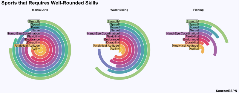
A different day she would examine which sports are the thoughest:
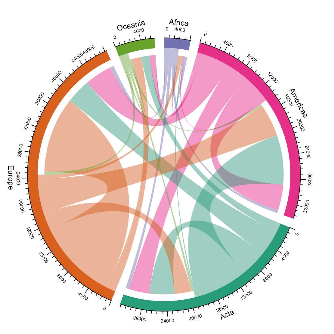
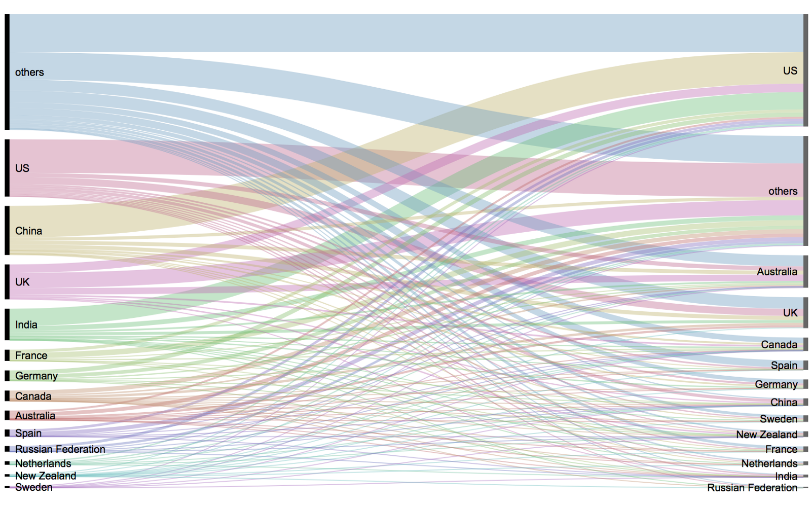
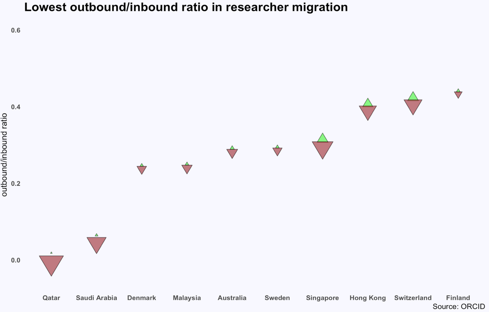
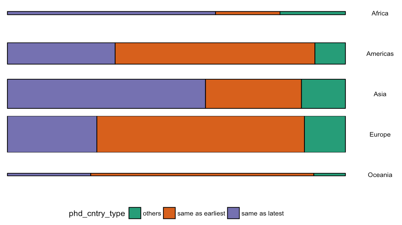
Or how scientific researchers migrate across the globe:
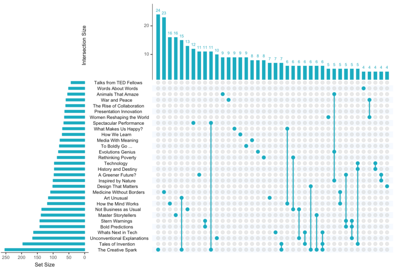
Hannah used many different plot types in those 100 days. Also some lesser known ones, like these upset plots on TED talk data:

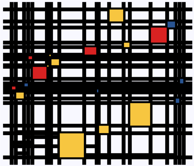
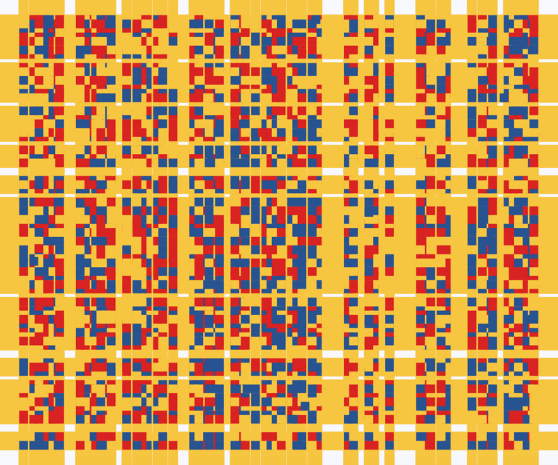
Heck, she even made her own R package to generate Mondriaan-like paintings on one of the days:
What I found so great about Hannah’s project is that she picked a novel dataset every couple of days. Moreover, she used a extremely large variety of different visualization formats. All visuals were equally beautiful, but Hannah made sure to pick the right one for the purpose she was trying to serve. If you are interested in data visualization, you seriously should check out Hannah’s 100DaysOfCode Medium page.
