Grant McDermott developed this new R package I wish I had thought of: parttree
parttree includes a set of simple functions for visualizing decision tree partitions in R with ggplot2. The package is not yet on CRAN, but can be installed from GitHub using:
Using the familiar ggplot2 syntax, we can simply add decision tree boundaries to a plot of our data.
In this example from his Github page, Grant trains a decision tree on the famous Titanic data using the parsnip package. And then visualizes the resulting partition / decision boundaries using the simple function geom_parttree()
library(parsnip)
library(titanic) ## Just for a different data set
set.seed(123) ## For consistent jitter
titanic_train$Survived = as.factor(titanic_train$Survived)
## Build our tree using parsnip (but with rpart as the model engine)
ti_tree =
  decision_tree() %>%
  set_engine("rpart") %>%
  set_mode("classification") %>%
  fit(Survived ~ Pclass + Age, data = titanic_train)
## Plot the data and model partitions
titanic_train %>%
  ggplot(aes(x=Pclass, y=Age)) +
  geom_jitter(aes(col=Survived), alpha=0.7) +
  geom_parttree(data = ti_tree, aes(fill=Survived), alpha = 0.1) +
  theme_minimal()
Super awesome!
This visualization precisely shows where the trained decision tree thinks it should predict that the passengers of the Titanic would have survived (blue regions) or not (red), based on their age and passenger class (Pclass).
This will be super helpful if you need to explain to yourself, your team, or your stakeholders how you model works. Currently, only rpart decision trees are supported, but I am very much hoping that Grant continues building this functionality!
However, paletteer is by far my favorite package for customizing your colors in R!
The paletteer package offers direct access to 1759 color palettes, from 50 different packages!
After installing and loading the package, paletteer works as easy as just adding one additional line of code to your ggplot:
install.packages("paletteer")
library(paletteer)

install.packages("ggplot2")
library(ggplot2)

ggplot(iris, aes(Sepal.Length, Sepal.Width, color = Species)) +
  geom_point() +
  scale_color_paletteer_d("nord::aurora")
paletteer offers a combined collection of hundreds of other color palettes offered in the R programming environment, so you are sure you will find a palette that you like! Here’s the list copied below, but this github repo provides more detailed information about the package contents.
2018 seemed to be the year of challengesgoing viral on the web. Most of them were plain stupid and/or dangerous. However, one viral challenge I did like: #100DaysOfCode
1. Code minimum an hour every day for the next 100 days.
2. Tweet your progress every day with the #100DaysOfCode hashtag.
3. Each day, reach out to at least two people on Twitter who are also doing the challenge
Many (aspiring) programming professionals competed in this challenge, sharing their learning journeys in domains from web development, machine learning, or data visualization.
With this blog, I wanted to share two of those learning journeys that stood out for me.
Machine learning
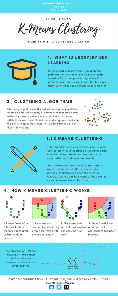
First, there’s Avik Jain’s 100 days of Machine Learning code repository on Github. Avik’s repository contains all learning activities he followed during the 53 days of programming he completed. Some of Avik’s entries really stood out, and I particularly liked his educational infographics:
Just look at the wonderful design and visual aids on this decision tree for dummies infographic, pseudocode and all:
Day 23: Decision trees for dummies. This just looks fabulous right?!
Although Avik didn’t seem to have completed the full 100 days, many others did.
Data visualization
I have blogged about Hannah Yan Han‘s 100 days of code project before, but she definately deserves another mention here. Her 100 days revolved around data science, data visualization, and storytelling using both R and Python. You can find her #100DaysOfCode Medium page here, and her associated Github repository here.
For example, one day Hannah explored where instant noodles come from, how they are served, and whether people like them or not.
What I found so great about Hannah’s project is that she picked a novel dataset every couple of days. Moreover, she used a extremely large variety of different visualization formats. All visuals were equally beautiful, but Hannah made sure to pick the right one for the purpose she was trying to serve. If you are interested in data visualization, you seriously should check out Hannah’s 100DaysOfCode Medium page.
ungeviz is a new R package by Claus Wilke, whom you may know from his amazing work and books on Data Visualization. The package name comes from the German word “Ungewissheit”, which means uncertainty. You can install the developmental version via:
devtools::install_github("clauswilke/ungeviz")
The package includes some bootstrapping functionality that, when combined with ggplot2 and gganimate, can produce some seriousy powerful visualizations. For instance, take the below piece of code:
data(BlueJays, package="Stat2Data")
# set up bootstrapping object that generates 20 bootstraps# and groups by variable `KnownSex`bs<-ungeviz::bootstrapper(20, KnownSex)
ggplot(BlueJays, aes(BillLength, Head, color=KnownSex)) +
geom_smooth(method="lm", color=NA) +
geom_point(alpha=0.3) +# `.row` is a generated column providing a unique row number# to all rows in the bootstrapped data frame
geom_point(data=bs, aes(group= .row)) +
geom_smooth(data=bs, method="lm", fullrange=TRUE, se=FALSE) +
facet_wrap(~KnownSex, scales="free_x") +
scale_color_manual(values= c(F="#D55E00", M="#0072B2"), guide="none") +
theme_bw() +
transition_states(.draw, 1, 1) +
enter_fade() +
exit_fade()
Here’s what’s happening:
Claus loads in the BlueJays dataset, which contains some data on birds.
He then runs the ungezviz::bootstrapper function to generate a new dataset of bootstrapped samples.
Next, Claus uses ggplot2::geom_smooth(method = "lm") to run a linear model on the orginal BlueJays dataset, but does not color in the regression line (color = NA), thus showing only the confidence interval of the model.
Moreover, Claus uses ggplot2::geom_point(alpha = 0.3) to visualize the orginal data points, but slightly faded.
Subsequent, for each of the bootstrapped samples (group = .row), Claus again draws the data points (unfaded), and runs linear models while drawing only the regression line (se = FALSE).
Using ggplot2::facet_wrap, Claus seperates the data for BlueJays$KnownSex.
Using gganimate::transition_states(.draw, 1, 1), Claus prints each linear regression line to a row of the bootstrapped dataset only one second, before printing the next.
The result an astonishing GIF of the regression lines that could be fit to bootstrapped subsamples of the BlueJays data, along with their confidence interval:
One example of the practical use of ungeviz, original on its GitHub page
Another valuable use of the new package is the visualization of uncertainty from fitted models, for example as confidence strips. The below code shows the powerful combination of broom::tidy with ungeviz::stat_conf_strip to visualize effect size estimates of a linear model along with their confidence intervals.
library(broom)
#> #> Attaching package: 'broom'#> The following object is masked from 'package:ungeviz':#> #> bootstrapdf_model<- lm(mpg~disp+hp+qsec, data=mtcars) %>%
tidy() %>%
filter(term!="(Intercept)")
ggplot(df_model, aes(estimate=estimate, moe=std.error, y=term)) +
stat_conf_strip(fill="lightblue", height=0.8) +
geom_point(aes(x=estimate), size=3) +
geom_errorbarh(aes(xmin=estimate-std.error, xmax=estimate+std.error), height=0.5) +
scale_alpha_identity() +
xlim(-2, 1)
Visualizing effect size estimates with ungeviz, via its GitHub page
Very curious to see where this package develops into. What use cases can you think of?
This pearl had been resting in my inbox for quite a while before I was able to add it to my R resources list. Citing its GitHub page, ggstatsplot is an extension of ggplot2 package for creating graphics with details from statistical tests included in the plots themselves and targeted primarily at behavioral sciences community to provide a one-line code to produce information-rich plots. The package is currently maintained and still under development by Indrajeet Patil. Nevertheless, its functionality is already quite impressive. You can download the latest stable version via:
utils::install.packages(pkgs="ggstatsplot")
Or download the development version via:
devtools::install_github(
repo="IndrajeetPatil/ggstatsplot", # package path on GitHubdependencies=TRUE, # installs packages which ggstatsplot depends onupgrade_dependencies=TRUE# updates any out of date dependencies
)
The package currently supports many different statistical plots, including:
This function creates either a violin plot, a box plot, or a mix of two for between-group or between-condition comparisons and additional detailed results from statistical tests can be added in the subtitle. The simplest function call looks like the below, but much more complex information can be added and specified.
set.seed(123) # to get reproducible results
# the functions work approximately the same as ggplot2
ggstatsplot::ggbetweenstats(
data=datasets::iris,
x=Species,
y=Sepal.Length,
messages=FALSE
) +
# and can be adjusted using the same, orginal function calls
ggplot2::coord_cartesian(ylim= c(3, 8)) +ggplot2::scale_y_continuous(breaks= seq(3, 8, by=1))
All pictures copied from the GitHub page of ggstatsplot [original]
ggscatterstats
Not all plots are ggplot2-compatible though, for instance, ggscatterstats is not. Nevertheless, it produces a very powerful plot in my opinion.
All pictures copied from the GitHub page of ggstatsplot [original]
ggcormat
ggcorrmat is also quite impressive, producing correlalograms with only minimal amounts of code as it wraps around ggcorplot. The defaults already produces publication-ready correlation matrices:
ggstatsplot::ggcorrmat(
data=datasets::iris,
corr.method="spearman",
sig.level=0.005,
cor.vars=Sepal.Length:Petal.Width,
cor.vars.names= c("Sepal Length", "Sepal Width", "Petal Length", "Petal Width"),
title="Correlalogram for length measures for Iris species",
subtitle="Iris dataset by Anderson",
caption= expression(
paste(
italic("Note"),
": X denotes correlation non-significant at ",
italic("p "),
"< 0.005; adjusted alpha"
)
)
)
All pictures copied from the GitHub page of ggstatsplot [original]
ggcoefstats
Finally, ggcoefstats is a wrapper around GGally::ggcoef, creating a plot with the regression coefficients’ point estimates as dots with confidence interval whiskers. Here’s an example with some detailed specifications:
ggstatsplot::ggcoefstats(
x=stats::lm(formula=mpg~am*cyl,
data=datasets::mtcars),
point.color="red",
vline.color="#CC79A7",
vline.linetype="dotdash",
stats.label.size=3.5,
stats.label.color= c("#0072B2", "#D55E00", "darkgreen"),
title="Car performance predicted by transmission and cylinder count",
subtitle="Source: 1974 Motor Trend US magazine"
) +ggplot2::scale_y_discrete(labels= c("transmission", "cylinders", "interaction")) +ggplot2::labs(x="regression coefficient",
y=NULL)
All pictures copied from the GitHub page of ggstatsplot [original]I for one am very curious to see how Indrajeet will further develop this package, and whether academics will start using it as a default in publishing.