Tag: medium

ML Model Degradation, and why work only just starts when you reach production

ML Model Degradation, and why work only just starts when you reach production

The assumption that a Machine Learning (ML) project is done when a trained model is put into production is quite faulty. Neverthless, according to Alexandre Gonfalonieri — artificial intelligence (AI) strategist at Philips — this assumption is among the most common mistakes of companies taking their AI products to market.

Actually, in the real world, we see pretty much the opposite of this assumption. People like Alexandre therefore strongly recommend companies keep their best data scientists and engineers on a ML project, especially after it reaches production!

Why?

If you’ve ever productionized a model and really started using it, you know that, over time, your model will start performing worse.

In order to maintain the original accuracy of a ML model which is interacting with real world customers or processes, you will need to continuously monitor and/or tweak it!

In the best case, algorithms are retrained with each new data delivery. This offers a maintenance burden that is not fully automatable. According to Alexandre, tending to machine learning models demands the close scrutiny, critical thinking, and manual effort that only highly trained data scientists can provide.

This means that there’s a higher marginal cost to operating ML products compared to traditional software. Whereas the whole reason we are implementing these products is often to decrease (the) costs (of human labor)!

What causes this?

Your models’ accuracy will often be at its best when it just leaves the training grounds.

Building a model on relevant and available data and coming up with accurate predictions is a great start. However, for how long do you expect those data — that age by the day — continue to provide accurate predictions?

Chances are that each day, the model’s latent performance will go down.

This phenomenon is called concept drift, and is heavily studied in academia but less often considered in business settings. Concept drift means that the statistical properties of the target variable, which the model is trying to predict, change over time in unforeseen ways.

In simpler terms, your model is no longer modelling the outcome that it used to model. This causes problems because the predictions become less accurate as time passes.

Particularly, models of human behavior seem to suffer from this pitfall.

The key is that, unlike a simple calculator, your ML model interacts with the real world. And the data it generates and that reaches it is going to change over time. A key part of any ML project should be predicting how your data is going to change over time.

Read more about concept drift here.

Via

How do we know when our models fail?

You need to create a monitoring strategy before reaching production!

According to Alexandre, as soon as you feel confident with your project after the proof-of-concept stage, you should start planning a strategy for keeping your models up to date.

How often will you check in?

On the whole model, or just some features?

What features?

In general, sensible model surveillance combined with a well thought out schedule of model checks is crucial to keeping a production model accurate. Prioritizing checks on the key variables and setting up warnings for when a change has taken place will ensure that you are never caught by a surprise by a change to the environment that robs your model of its efficacy.

Alexandre via

Your strategy will strongly differ based on your model and your business context.

Moreover, there are many different types of concept drift that can affect your models, so it should be a key element to think of the right strategy for you specific case!

Image result for concept drift
Different types of model drift (via)

Let’s solve it!

Once you observe degraded model performance, you will need to redesign your model (pipeline).

One solution is referred to as manual learning. Here, we provide the newly gathered data to our model and re-train and re-deploy it just like the first time we build the model. If you think this sounds time-consuming, you are right. Moreover, the tricky part is not refreshing and retraining a model, but rather thinking of new features that might deal with the concept drift.

A second solution could be to weight your data. Some algorithms allow for this very easily. For others you will need to custom build it in yourself. One recommended weighting schema is to use the inversely proportional age of the data. This way, more attention will be paid to the most recent data (higher weight) and less attention to the oldest of data (smaller weight) in your training set. In this sense, if there is drift, your model will pick it up and correct accordingly.

According to Alexandre and many others, the third and best solution is to build your productionized system in such a way that you continuously evaluate and retrain your models. The benefit of such a continuous learning system is that it can be automated to a large extent, thus reducing (the human labor) maintance costs.

Although Alexandre doesn’t expand on how to do these, he does formulate the three steps below:

Via the original blog

In my personal experience, if you have your model retrained (automatically) every now and then, using a smart weighting schema, and keep monitoring the changes in the parameters and for several “unit-test” cases, you will come a long way.

If you’re feeling more adventureous, you could improve on matters by having your model perform some exploration (at random or rule-wise) of potential new relationships in your data (see for instance multi-armed bandits). This will definitely take you a long way!

Solving concept drift (via)
#100DaysOfCode: Machine Learning & Data Visualization

#100DaysOfCode: Machine Learning & Data Visualization

2018 seemed to be the year of challenges going viral on the web. Most of them were plain stupid and/or dangerous. However, one viral challenge I did like: #100DaysOfCode

1. Code minimum an hour every day for the next 100 days.

2. Tweet your progress every day with the #100DaysOfCode hashtag.

3. Each day, reach out to at least two people on Twitter who are also doing the challenge

100 Days of Code rulebook

Many (aspiring) programming professionals competed in this challenge, sharing their learning journeys in domains from web development, machine learning, or data visualization.

With this blog, I wanted to share two of those learning journeys that stood out for me.

Machine learning

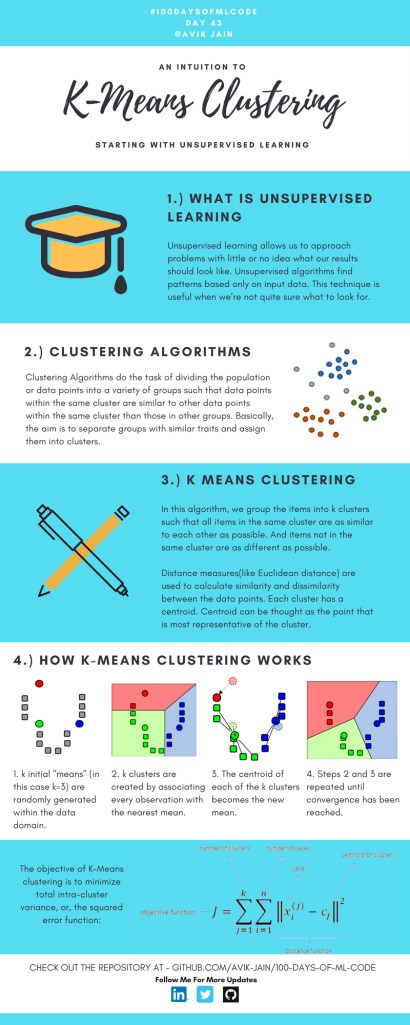
First, there’s Avik Jain’s 100 days of Machine Learning code repository on Github. Avik’s repository contains all learning activities he followed during the 53 days of programming he completed. Some of Avik’s entries really stood out, and I particularly liked his educational infographics:

Just look at the wonderful design and visual aids on this decision tree for dummies infographic, pseudocode and all:

Day 23: Decision trees for dummies. This just looks fabulous right?!

Apart from the infographics, Avik also links to many very well produced tutorials that helped him improve his machine learning skills. Such as the free Python for Data Science Handbook Avik worked through, or this Youtube tutorial on deep learning in Python with Tensorflow and Keras:

Although Avik didn’t seem to have completed the full 100 days, many others did.

Data visualization

I have blogged about Hannah Yan Han‘s 100 days of code project before, but she definately deserves another mention here. Her 100 days revolved around data science, data visualization, and storytelling using both R and Python. You can find her #100DaysOfCode Medium page here, and her associated Github repository here.

For example, one day Hannah explored where instant noodles come from, how they are served, and whether people like them or not.

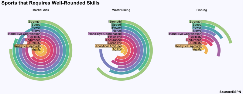
A different day she would examine which sports are the thoughest:

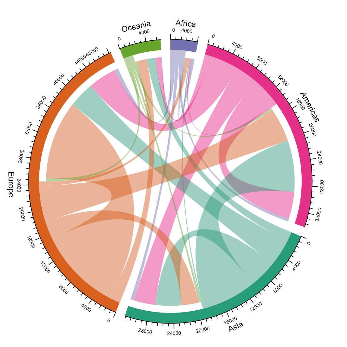
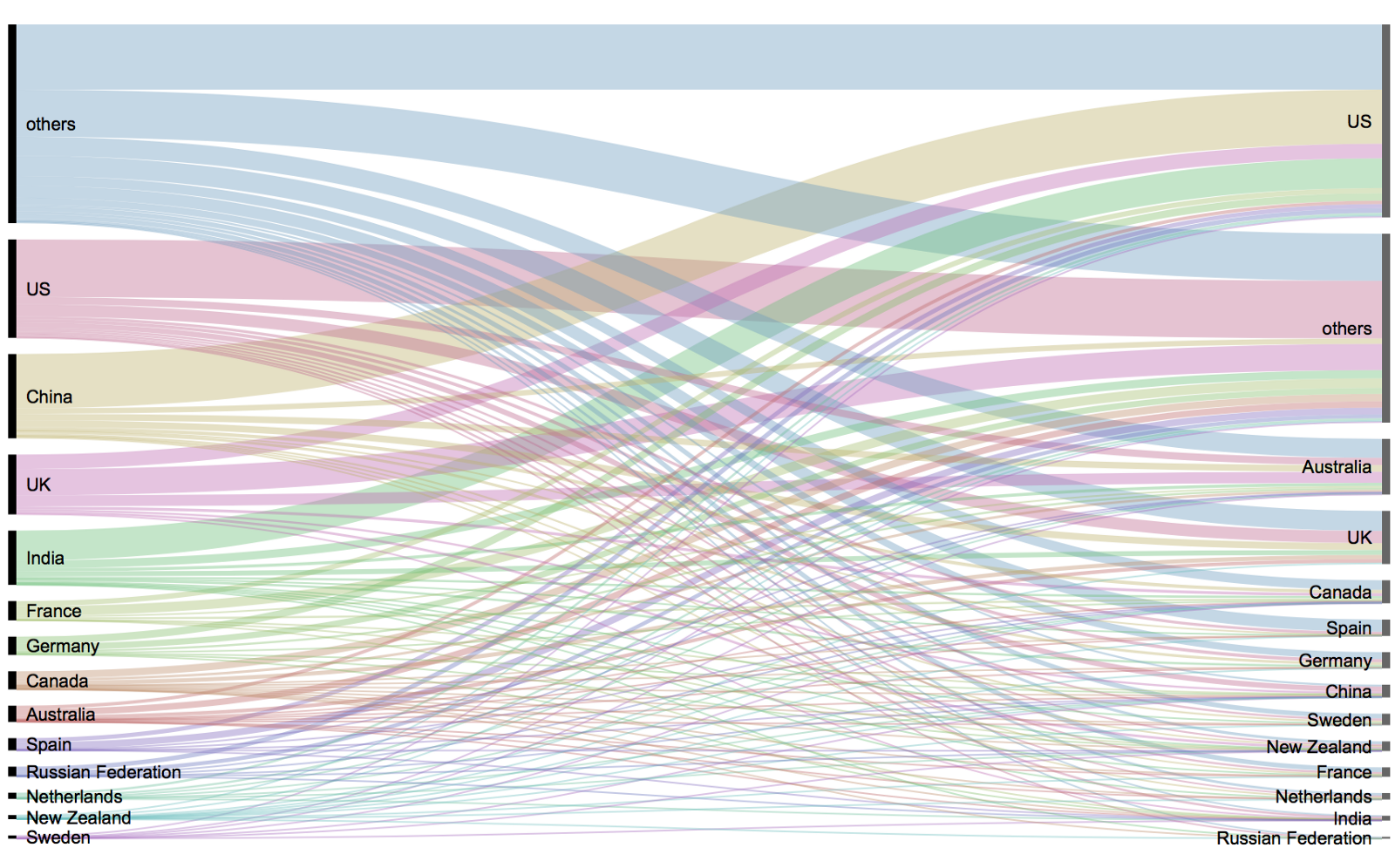
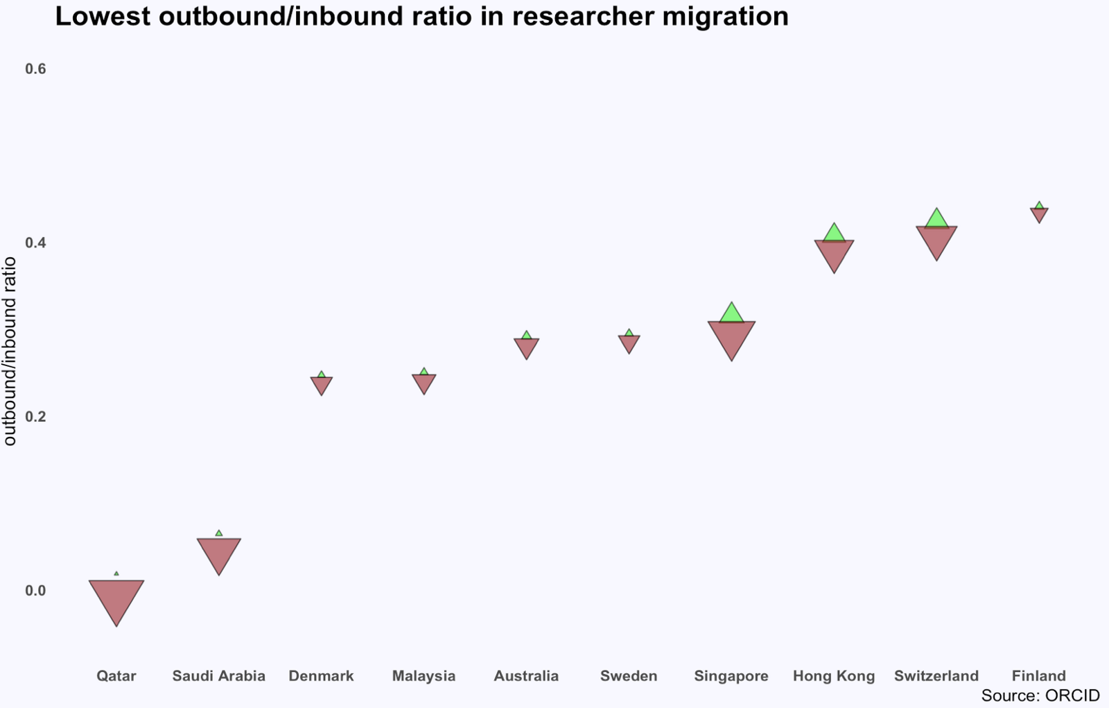
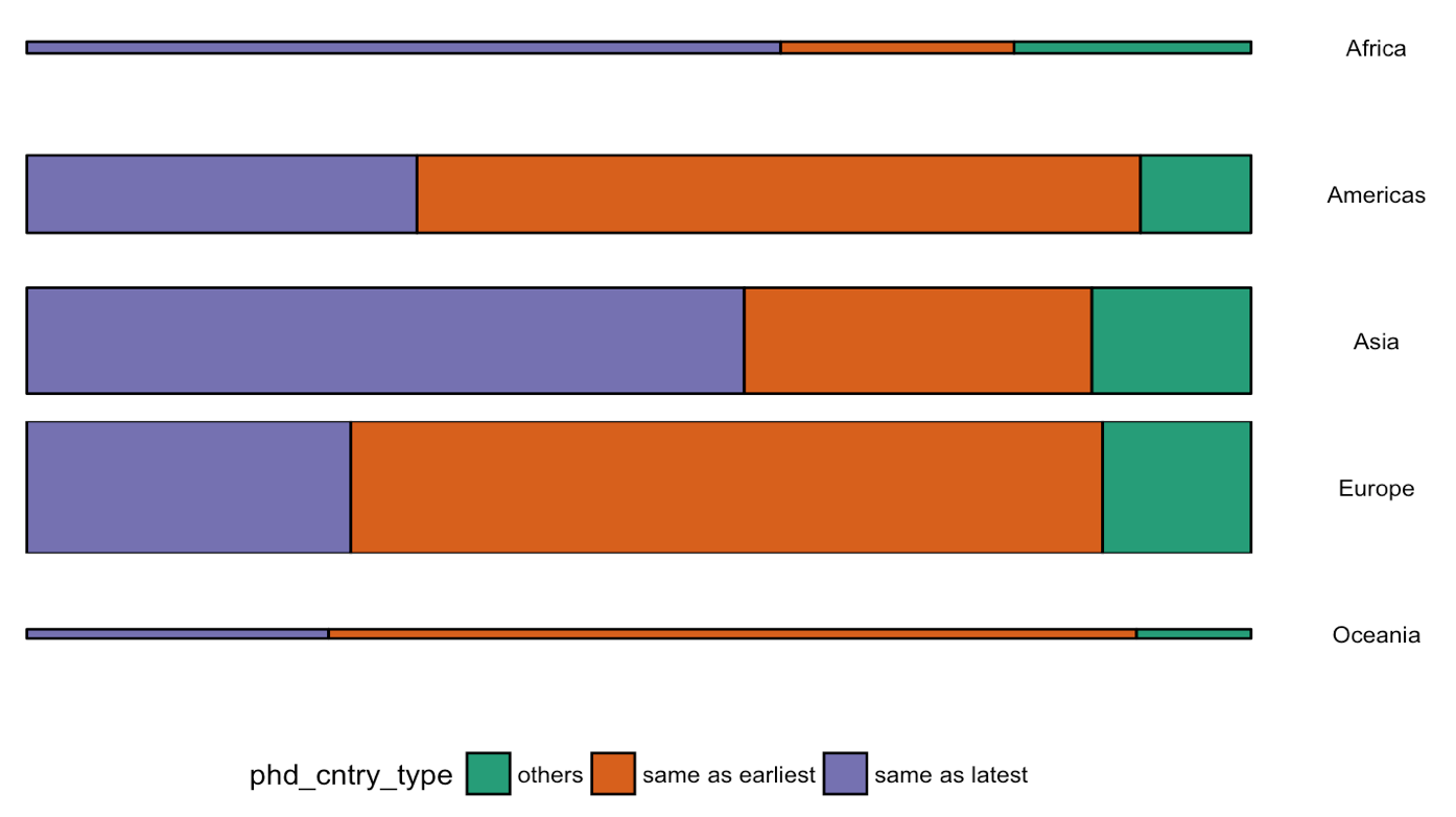
Or how scientific researchers migrate across the globe:

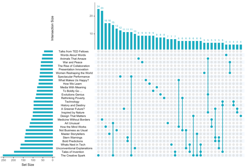
Hannah used many different plot types in those 100 days. Also some lesser known ones, like these upset plots on TED talk data:

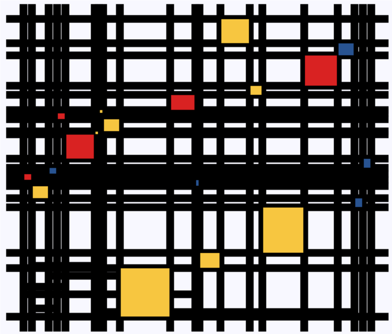
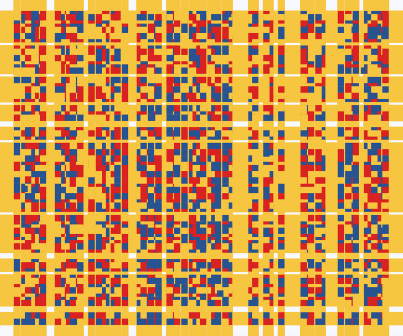
Heck, she even made her own R package to generate Mondriaan-like paintings on one of the days:

What I found so great about Hannah’s project is that she picked a novel dataset every couple of days. Moreover, she used a extremely large variety of different visualization formats. All visuals were equally beautiful, but Hannah made sure to pick the right one for the purpose she was trying to serve. If you are interested in data visualization, you seriously should check out Hannah’s 100DaysOfCode Medium page.

Chatterplots

Chatterplots

I’ve mentioned before that I dislike wordclouds (for instance here, or here) and apparently others share that sentiment. In his recent Medium blog, Daniel McNichol goes as far as to refer to the wordcloud as the pie chart of text data! Among others, Daniel calls wordclouds disorienting, one-dimensional, arbitrary and opaque and he mentions their lack of order, information, and scale. 

Wordcloud of the negative characteristics of wordclouds, via Medium

Instead of using wordclouds, Daniel suggests we revert to alternative approaches. For instance, in their Tidy Text Mining with R book, Julia Silge and David Robinson suggest using bar charts or network graphs, providing the necessary R code. Another alternative is provided in Daniel’s blogthe chatterplot!

While Daniel didn’t invent this unorthodox wordcloud-like plot, he might have been the first to name it a chatterplot. Daniel’s chatterplot uses a full x/y cartesian plane, turning the usually only arbitrary though exploratory wordcloud into a more quantitatively sound, information-rich visualization.

R package ggplot’s geom_text() function — or alternatively ggrepel‘s geom_text_repel() for better legibility — is perfectly suited for making a chatterplot. And interesting features/variables for the axis — apart from the regular word frequencies — can be easily computed using the R tidytext package. 

Here’s an example generated by Daniel, plotting words simulatenously by their frequency of occurance in comments to Hacker News articles (y-axis) as well as by the respective popularity of the comments the word was used in (log of the ranking, on the x-axis).

[CHATTERPLOTs arelike a wordcloud, except there’s actual quantitative logic to the order, placement & aesthetic aspects of the elements, along with an explicit scale reference for each. This allows us to represent more, multidimensional information in the plot, & provides the viewer with a coherent visual logic& direction by which to explore the data.

Daniel McNichol via Medium

I highly recommend the use of these chatterplots over their less-informative wordcloud counterpart, and strongly suggest you read Daniel’s original blog, in which you can also find the R code for the above visualizations.

Sentiment Analysis of Stranger Things Seasons 1 and 2

Sentiment Analysis of Stranger Things Seasons 1 and 2

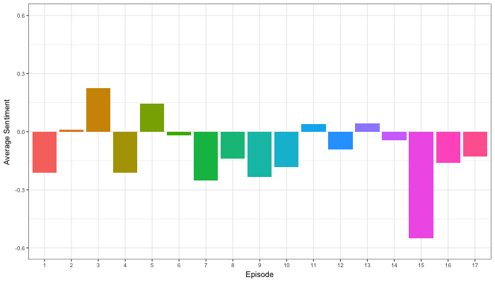
Jordan Dworkin, a Biostatistics PhD student at the University of Pennsylvania, is one of the few million fans of Stranger Things, a 80s-themed Netflix series combining drama, fantasy, mystery, and horror. Awaiting the third season, Jordan was curious as to the emotional voyage viewers went through during the series, and he decided to examine this using a statistical approach. Like I did for the seven Harry Plotter books, Jordan downloaded the scripts of all the Stranger Things episodes and conducted a sentiment analysis in R, of course using the tidyverse and tidytext. Jordan measured the positive or negative sentiment of the words in them using the AFINN dictionary and a first exploration led Jordan to visualize these average sentiment scores per episode:

The average positive/negative sentiment during the 17 episodes of the first two seasons of Stranger Things (from Medium.com)

Jordan jokingly explains that you might expect such overly negative sentiment in show about missing children and inter-dimensional monsters. The less-than-well-received episode 15 stands out, Jordan feels this may be due to a combination of its dark plot and the lack of any comedic relief from the main characters.

Reflecting on the visual above, Jordan felt that a lot of the granularity of the actual sentiment was missing. For a next analysis, he thus calculated a rolling average sentiment during the course of the separate episodes, which he animated using the animation package:

GIF displaying the rolling average (40 words) sentiment per Stranger Things episode (from Medium.com)

Jordan has two new takeaways: (1) only 3 of the 17 episodes have a positive ending – the Season 1 finale, the Season 2 premiere, and the Season 2 finale – (2) the episodes do not follow a clear emotional pattern. Based on this second finding, Jordan subsequently compared the average emotional trajectories of the two seasons, but the difference was not significant:

Smoothed (loess, I guess) trajectories of the sentiment during the episodes in seasons one and two of Stranger Things (from Medium.com)

Potentially, it’s better to classify the episodes based on their emotional trajectory than on the season they below too, Jordan thought next. Hence, he constructed a network based on the similarity (temporal correlation) between episodes’ temporal sentiment scores. In this network, the episodes are the nodes whereas the edges are weighted for the similarity of their emotional trajectories. In that sense, more distant episodes are less similar in terms of their emotional trajectory. The network below, made using igraph (see also here), demonstrates that consecutive episodes (1 → 2, 2 → 3, 3 → 4) are not that much alike:

The network of Stranger Things episodes, where the relations between the episodes are weighted for the similarity of their emotional trajectories (from Medium.com).

A community detection algorithm Jordan ran in MATLAB identified three main trajectories among the episodes:

Three different emotional trajectories were identified among the 17 Stranger Things episodes in Season 1 and 2 (from Medium.com).

Looking at the average patterns, we can see that group 1 contains episodes that begin and end with neutral emotion and have slow fluctuations in the middle, group 2 contains episodes that begin with negative emotion and gradually climb towards a positive ending, and group 3 contains episodes that begin on a positive note and oscillate downwards towards a darker ending.

– Jordan on Medium.com

Jordan final suggestion is that producers and scriptwriters may consciously introduce these variations in emotional trajectories among consecutive episodes in order to get viewers hooked. If you want to redo the analysis or reuse some of the code used to create the visuals above, you can access Jordan’s R scripts here. I, for one, look forward to his analysis of Season 3!

Facial Recognition Challenge: Chad Smith & Will Ferrell

Facial Recognition Challenge: Chad Smith & Will Ferrell

The below summarizes Part 4 of a medium.com series by Adam Geitgey.
Check out the original articles: Part 1Part 2Part 3Part 4Part 5Part 6Part 7 and Part 8!

Adam Geitgey likes to write about computers and machine learning. He explains machine learning as “generic algorithms that can tell you something interesting about a set of data without you having to write any custom code specific to the problem. Instead of writing code, you feed data to the generic algorithm and it builds its own logic based on the data.” (Part 1)


Adam’s visual explanation of two machine learning applications (original from Part 1)

In the fourth part of his series on machine learning Adam touches on Facial Recognition. Facebook is one of the companies using such algorithms in real-time, allowing them to recognize your friends’ faces after you’ve tagged them only a few times. Facebook reports they recognize faces with 97% accuracy, which is comparable to our own, human facial recognition abilities!

Facebook’s algorithms recognizing and automatically tagging Adam’s family. Helpful or creepy? (original from Part 4)


Adam decided to put up a challenge: would a facial recognition algorithm be able to distinguish Will Ferrell (famous actor) from Chad Smith (famous rock musician)? Indeed, these two celebrities look very much alike:

Image result for will ferrell chad smith
Chad Smith (left) and Will Ferell (right) on www.rollingstone.com

If you want to train such an algorithm, Adam explain, you need to overcome a series of related problems:

  1. First, look at a picture and find all the faces in it
  2. Second, focus on each face and be able to understand that even if a face is turned in a weird direction or in bad lighting, it is still the same person.
  3. Third, be able to pick out unique features of the face that you can use to tell it apart from other people— like how big the eyes are, how long the face is, etc.
  4. Finally, compare the unique features of that face to all the people you already know to determine the person’s name.

(Adam Geitgey, Part 4)


How the facial recognition algorithm steps might work (original from Part 4)

To detect the faces, Adam used Histograms of Oriented Gradients (HOG). All input pictures were converted to black and white (because color is not needed) and then every single pixel in our image is examined, one at a time. Moreover, for every pixel, the algorithm examined the pixels directly surrounding it:

Illustration of the algorithm as it would take in a black and white photo of Will Ferrel (original from Part 4)

The algorithm then checks, for every pixel, in which direction the picture is getting darker and draws an arrow (a gradient) in that direction.

Illustration of how algorithm would reduce a black and white photo of Will Ferrel to gradients (original from Part 4)

However, to do this for every single pixel would require too much processing power, so Adam broke up pictures in 16 by 16 pixel squares. The result is a very simple representation that does capture the basic structure of the original face, based on which we can now spot faces in pictures. Moreover, because we used gradients, the result will be similar regardless of the lighting of the picture.

The original image turned into a HOG representation (original from Part 4)

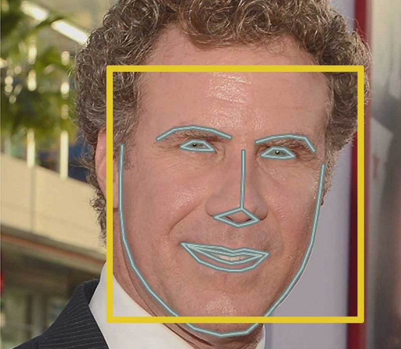
Now that the computer can spot faces, we need to make sure that it knows that two perspectives of the same face represent the same person. Adam uses landmarks for this: 68 specific points that exist on every face. An algorithm can then be trained to find these points on any face:

The 68 points on the image of Will Ferrell (original from Part 4)

Now the computer knows where the chin, the mouth and the eyes are, the image can be scaled and rotated to center it as best as possible:

The image of Will Ferrell transformed (original from Part 4)

Adam trained a Deep Convolutional Neural Network to generate 128 measurements for each face that best distinguish it from faces of other people. This network needs to train for several hours, going through thousands and thousands of face pictures. If you want to try this step yourself, Adam explains how to run OpenFace’s lua script. This study at Google provides more details, but it basically looks like this:

The training process visualized (original from Part 4)

After hours of training, the neural net will output 128 numbers accurately representing the specific face put in. Now, all you need to do is check which face in your database is most closely resembled by those 128 numbers, and you have your match! Many algorithms can do this final check, and Adam trained a simple linear SVM classifier on twenty pictures of Chad Smith, Will Ferrel, and Jimmy Falon (the host of a talkshow they both visited).

In the end, Adam’s machine had learned to distinguish these three people – two of whom are nearly indistinguishable with the human eye – in real-time:

Adam Geitgey’s facial recognition algorithm in action: providing real time classifications of the faces of lookalikes Chad Smith and Will Ferrel at Jimmy Falon’s talk show (original from Part 4

You can find Adam on LinkedIn, or on Twitter at @ageitgey, and I strongly recommend you examine his series on machine learning on Medium.com (Part 1). Moreover, Adam released a Python library called face_recognition, arguably easier to install and use than OpenFace, as well as a pre-configured virtual machine with face_recognition, OpenCV, TensorFlow and lots of other deep learning tools pre-installed.