Category: research

Generating images from scratch: Parallel Multiscale Autoregressive Density Estimation

Generating images from scratch: Parallel Multiscale Autoregressive Density Estimation

A while ago, I blogged about this new algorithm, pix2code, which takes in pictures of graphical user interfaces and outputs the underlying code. Today, I discovered another fantastic algorithm, by Scott Reed and his colleagues at Google Deepmind. txt2pix would be a catchy name for this algorithm, as it can take in a fairly complex sentence (e.g., “a grey bird with a black head, orange eyes, and a yellow beak“) and generate a completely new and unique image based on its content. In their recently published paper, they elaborate on the algorithms inner workings.

Deepmind.png
An example of the training and generation process reported in the paper

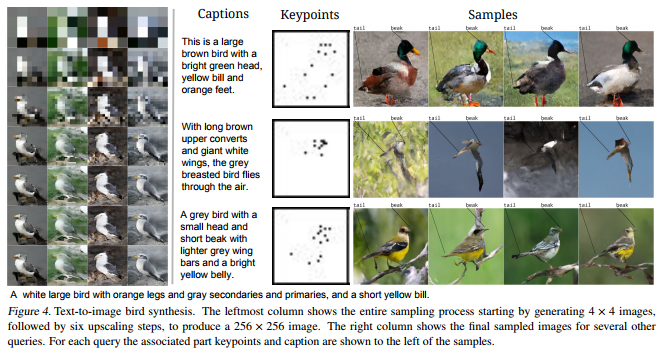
Scott and his team have been working on this project for quite some time. The early version of the algorithm generated an image one pixel at a time, but it had difficulties generating large or high-quality images. After picking a starting pixel to generate, any consecutively generated pixel the algorithm generates needs to align with its neighbours. For example, if pixel A is the first pixel in the generation of the yellow beak of a bird, any pixels that are created in the neighbourhood of that pixel should take into account that pixel A is trying to visualize a yellow beak, and behave accordingly: either continuing the beak, or ending the beak and starting on another element of the image.

The problem with such an iterative approach (i.e., pixel by pixel) is that it can take a very long time for a computer to generate an image. Considering that a fairly small image, say 256 by 256 pixels, already contains 65.536 pixels, each of which needs to be generated while considering all its neighbours and keeping in mind the bigger picture. In the most recent, updated version of the algorithm, Scott and his team have allowed the generation of multiple unrelated pixels simultaneously at different ‘zones’ of the image. Hence the Parallel in Parallel Multiscale Autoregressive Density Estimation. With this parallel approach, the algorithm can now generate the pixels representing the yellow beak in one area of the image, while simultaneously generating pixels for the bird’s wings and the branch it’s sitting on at different sections of the image. This speeds up the process quite extensively, demanding less computation time, thus allowing for quicker image generation.

I can definitely recommend that you check out Scott Reeds’ twitter feed for some amazing animated GIFs of the generation process:

If you want to know more details behind the algorithm but do not fancy reading the entire paper, I recommend this short explanation video by Károly Zsolnai-Fehér (what a name!) of Two Minute papers:

pix2code: teaching AI to build apps

Last May, Tony Beltramelli of Ulzard Technologies presented his latest algorithm pix2code at the NIPS conference. Put simply, the algorithm looks at a picture of a graphical user interface (i.e., the layout of an app), and determines via an iterative process what the underlying code likely looks like.

Afbeeldingsresultaat voor user interface
Graphical user interface examples (Google Images)

Please watchUlzard’s pix2code demo video or the third-party summary at the bottom of this blog. My undertanding is that pix2code is based on convolutional and recurrent neural networks (long explanation video) in combination with long short-term memory (short explanation video). Based on a single input image, pix2code can generate code that is 77% accurate and it works for three of the larger platforms (i.e. iOS, Android and web-based technologies).

The input and output of pix2code

Obviously, this is groundbreaking technology. When further developed, pix2code not only increases the speed with which society is automated/robotized but it also further expands the automation to more complex and highly needed tasks, such as programming and web/app development.

Here you can read the full academic paper on pix2code.

Below is the official demo reviewed by another data enthusiast with commentary and some additional food for thought.

Read here some of my other blogs on neural networks and robotization:

TACIT: An open-source Text Analysis, Crawling, and Interpretation Tool

Click here for the original PDF: TACIT 2017


The first programs for (scientific) text mining are already over 50 years old. More recent efforts, such as the Linguistic Inquiry Word Count (LIWC; Tausczik & Pennebaker, 2010), have greatly improved our text analytical capabilities. Moreover, several single-purpose programs have been developed, which also consider syntactic text structures (e.g., Syntactic Complexity Analyzer [Lu, 2010], TAALES [Kyle & Crossley, 2015]).However, the widespread use of many of these programs has been hampered by two major barriers.

First, considerable technical expertise is required, which obstructs researchers without statistical backgrounds. For example, packages such as tm in R (Meyer et al., 2015) have been developed to conduct natural-language processing, but the steep learning curve forms a challenge. Additionally, the constant increase of computational processing power and the proliferation of new algorithms makes it difficult for researchers to maintain working knowledge of state-of-the-art methods.

Alternatively, most of the existing user-friendly NLP programs (and packages), such as RapidMiner (Akthar & Hahne, 2012), SAS Text Miner (Abell, 2014), or SPSS Modeler (IBM Corp., 2011), charge either a large software fee up front or a subscription fee. The cost of these programs can be prohibitively expensive for junior researchers and researchers looking to integrate new techniques into their research toolbox.

In the attached article, TACIT is introduced: Text Analysis, Crawling and Investigation Tool. TACIT is an open-source architecture that establishes a pipeline between the various stages of text-based research by integrating tools for text mining, data cleaning, and analysis under a single user-friendly architecture. In addition to being prepackaged with a range of easily applied, cutting-edge methods, TACIT’s design also allows other researchers to write their own plugins.

The authors’ hope is that TACIT can facilitate the integration and use of advancements in computational linguistics in psychological research, and by doing so can help researchers make use of the ever-growing documents of our social discourse in ways that have previously not been possible.

Outliers 101

Data Science Project Life-cycle
Data science project cycle according to http://www.DataScienceCentral.com

Data preparation forms a large part of every data science project. Claims go to extremes, stating that 80-95% of the workload for data scientists consists of data preparation.

Outlier detection is one of the actions that make up this preparation phase. It is the process by which the analyst takes a closer look at the data and observes whether there are data points that behave differently. Such anomalies we call outliers and depending on the nature of the outlier the analyst might (not) want to handle them before continuing on to the modeling phase.

Outliers exist for several reasons, including:

  • The data may be incorrect.
  • The data may be missing but has not been registered as such.
  • The data may belong to a different sample.
  • The data may have (more) extreme underlying distributions (than expected).

Moreover, there are various types of outliers:

  • Point outliers are individual data points that are different from the rest of the dataset. This is the most common outlier in practice. An example would be a person of 2.10 meters tall in a dataset of sampled population lengths.
  • Contextual outliers are individual data points that would not necessarily be outliers based on their value but are because of the combination of their value with their current context. An example would be an outside temperature of 25 degrees Celcius, which is not necessarily weird but is most definitely unusual during the December month.
  • Collective outliers are collections of data points that are collective different from the rest of the data sample. Again, the individual data points would not necessarily be outliers based on their individual value but are because of their values combined. An example would be a prolonged period of extreme drought. Where days without rain may not be outliers necessarily, a long stretch without precipitation can be considered an anomaly.

There is no rigid definition of what makes a data point an outlier. One could even state that determining whether or not a data point is an outlier is a quite subjective exercise. Nevertheless, there are multiple approaches and best practices to detecting (potential) outliers.

  • Univariate outliers: When a case or data point has an extreme value on a single variable, we refer to it as a univariate outlier. Standardized values (Z-scores) are a frequently used method to detect univariate outliers on continuous variables. However, here the researcher will have to determine a certain threshold. For example, (-)3.29 is frequently used, where data points whose Z-value lies beyond this value are considered outliers. Here, chances would be 0.005%, or 1 in 2000, of obtaining this value if the variable follows a normal distribution. As you can see, the larger the dataset, the more likely you are to find such extreme values.
  • Bi- & multivariate outliers: A combination of unusual values on multiple variables simultaneously is referred to as a multivariate outlier. Here, a bivariate outlier is an outlier based on two variables. Normally you’d first check and handle univariate outliers, before turning to bi- or multivariate outliers. The process here is somewhat more complicated than for univariate outliers, and there are multiple approaches one can take (e.g. distance, leverage, discrepancy, influence). For example, you can look at the distance of each data point in the multivariate space (X1 to Xp) compared to the other data points in that space. If the distance is larger than a certain threshold, the data point can be considered a multivariate outlier, as it is that much different from the rest of the data considering multiple variables simultaneously.
  • Visualization: In trying to detect univariate outliers, data visualizations may come in handy. For example, histograms or frequency distributions will quickly demonstrate any data point that has unusually high or low values. Boxplots can similarly hint at values that fall only just outside of the expected range or are really extreme outliers. Boxplots combine visualization with model-based detected.
  • Model-based: Apart from the above-mentioned standardization with Z-values, there are multiple model-based methods for outlier detection. Most assume that the data follows a normal or Gaussian distribution, and hence identify which data points are unlikely based on the data’s mean and standard deviation. Examples are Dixon’s Q-test, Tukey’s test, Thompson Tau test, and Grubb’s test.
  • Grouped data: If there is a grouping variable involved in the analysis (e.g., logistic regression, analyses of variance) then the data of each group can best be assessed for outliers separately. What can be considered an outlier in one group is not necessarily an unusual observation in a different group. If the analysis to be performed does not contain a grouping variable (e.g., linear regression, SEM), then the complete dataset can be assessed for outliers as a whole.

There are several ways to handle outliers:

  • Keep them as is.
  • Exclude the data point (i.e., censoring/trimming/truncating).
  • Replace the data point with a missing value.
  • Replace the data point by the nearest ‘regular’ value (i.e., Winsoring).
  • Run models both with and without outliers.
  • Run model corrections within the analysis (only possible in specific models)

There are several reasons why you may not want to deal with outliers: 

  • When taking a large sample, outliers are part of what one would expect.
  • Outliers may be part of the explanation for the phenomena under investigation
  • Several machine learning and modeling techniques are robust to outliers or may be able to correct for them.

To end on a light note, Malcolm Gladwell wrote a wonderful book called Outliers. In it, he examines the factors for personal success; the reasons why “outliers” such as Bill Gates have become so stinkingly wealthy. He goes to show that these successful people are not necessarily random anomalies or outliers, but that there are perfectly sensible explanations for their success.


References and further reading:

Statistics Visually Explained

Statistical literacy is essential to our data-driven society. Analytics has been and continues to be a game changer in many business fields, among other Human Resources. Yet, for all the increased importance and demand for statistical competence, the pedagogical approaches in statistics have barely changed.

Seeing Theory is a project designed and created by Daniel Kunin with support from Brown University’s Royce Fellowship Program. The goal of the project is to make statistics more accessible to a wider range of students through interactive visualizations.

Using JavaScript, the researchers have made statistics both intuitive and beautiful at the same time.

seeing theory

Expanding the methodological toolbox of HRM researchers

Expanding the methodological toolbox of HRM researchers

Update 26-10-2017: the paper has been published open access and is freely available here: http://onlinelibrary.wiley.com/doi/10.1002/hrm.21847/abstract.  

The HR technology landscape is evolving rapidly and with it, the HR function is becoming more and more data-driven (though not fast enough, some argue). HRM research, however, is still characterized by a strong reliance on general linear models like linear regression and ANOVA. In our forthcoming article in the special issue on Workforce Analytics of Human Resource Management, my co-authors and I argue that HRM research would benefit from an outside-in perspective, drawing on techniques that are commonly used in fields other than HRM.

Our article first outlines how the current developments in the measurement of HRM implementation and employee behaviors and cognitions may cause the more traditional statistical techniques to fall short. Using the relationship between work engagement and performance as a worked example, we then provide two illustrations of alternative methodologies that may benefit HRM research:

Using latent variables, bathtub models are put forward as the solution to examine multi-level mechanisms with outcomes at the team or organizational level without decreasing the sample size or neglecting the variation inherent in employees’ responses to HRM activities (see figure 1). Optimal matching analysis is proposed as particularly useful to examine the longitudinal patterns that occur in repeated observations over a prolonged timeframe. We describe both methods in a fair amount of detail, touching on elements such as the data requirements all the way up to the actual modeling steps and limitations.


figure-bathtub-model
An illustration of the two parts of a latent bathtub model.


I want to thank my co-authors and Shell colleagues Zsuzsa Bakk, Vasileios Giagkoulas, Linda van Leeuwen, and Esther Bongenaar for writing this, in my own biased opinion, wonderful article with me and I hope you will enjoy reading it as much as we did writing it.

Link to pre-publication