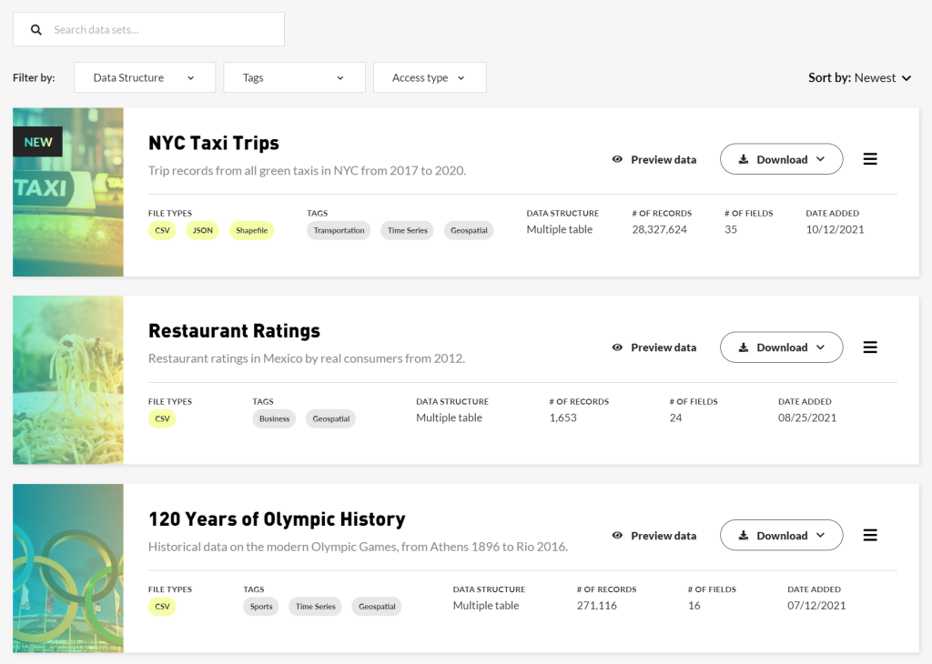
They offer 21 datasets including a range of different data (time series, geospatial, user preferences) on a variety of topics like business, sports, wine, financial stocks, transportation and whatnot.
This is a great starting point if you want to practice your data science, machine learning and analysis skills on real life data!
Maven Analytics provides e-learnings in analysis and programming software. To provide a practical learning experience, their courses are often accompanied by real-life datasets for students to analyze.
A few years back I completed my dissertation on data-driven Human Resource Management.
This specialized field is often dubbed HR analytics, for basically it’s the application of analytics to the topic of human resources.
Yet, as always in a specialized and hyped field, diifferent names started to emerge. The term People analytics arose, as did Workforce analytics, Talent analytics, and many others.
I addressed this topic in the introduction to my Ph.D. thesis and because I love data visualization, I decided to make a visual to go along with it.
So I gathered some Google Trends data, added a nice locally smoothed curve through it, and there you have it. As the original visual was so well received that it was even cited in this great handbook on HR analytics. With almost three years passed now, I decided it was time for an update. So here’s the 2021 version.
If you would compare this to the previous version, the trends look quite different. In the previous version, People Analytics had the dominant term since 2011 already.
Unfortunately, that’s not something I can help. Google indexes these search interest ratings behind the scenes, and every year or so, they change how they are calculated.
In my dissertation, I wrote the following on the topic:
This process of internally examining the impact of HRM activities goes by many different labels. Contemporary popular labels include people analytics (e.g., Green, 2017; Kane, 2015), HR analytics (e.g., Lawler, Levenson, & Boudreau, 2004; Levenson, 2005; Rasmussen & Ulrich, 2015; Paauwe & Farndale, 2017), workforce analytics (e.g., Carlson & Kavanagh, 2018; Hota & Ghosh, 2013; Simón & Ferreiro, 2017), talent analytics (e.g., Bersin, 2012; Davenport, Harris, & Shapiro, 2010), and human capital analytics (e.g., Andersen, 2017; Minbaeva, 2017a, 2017b; Levenson & Fink, 2017; Schiemann, Seibert, & Blankenship, 2017). Other variations including metrics or reporting are also common (Falletta, 2014) but there is consensus that these differ from the analytics-labels (Cascio & Boudreau, 2010; Lawler, Levenson, & Boudreau, 2004). While HR metrics would refer to descriptive statistics on a single construct, analytics involves exploring and quantifying relationships between multiple constructs.
Yet, even within analytics, a large variety of labels is used interchangeably. For instance, the label people analytics is favored in most countries globally, except for mainland Europe and India where HR analytics is used most (Google Trends, 2018). While human capital analytics seems to refer to the exact same concept, it is used almost exclusively in scientific discourse. Some argue that the lack of clear terminology is because of the emerging nature of the field (Marler & Boudreau, 2017). Others argue that differences beyond semantics exist, for instance, in terms of the accountabilities the labels suggest, and the connotations they invoke (Van den Heuvel & Bondarouk, 2017). In practice, HR, human capital, and people analytics are frequently used to refer to analytical projects covering the entire range of HRM themes whereas workforce and talent analytics are commonly used with more narrow scopes in mind: respectively (strategic) workforce planning initiatives and analytical projects in recruitment, selection, and development. Throughout this dissertation, I will stick to the label people analytics, as this is leading label globally, and in the US tech companies, and thus the most likely label to which I expect the general field to converge.
MIT researchers have spent years developing the new drag-and-drop analytics tools they call Northstar.
Northstar is an interactive data science platform that rethinks how people interact with data. It empowers users without programming experience, background in statistics or machine learning expertise to explore and mine data through an intuitive user interface, and effortlessly build, analyze, and evaluate machine learning (ML) pipelines.
Northstar starts as a blank, white interface. Users upload datasets into the system, which appear in a “datasets” box on the left. Any data labels will automatically populate a separate “attributes” box below. There’s also an “operators” box that contains various algorithms, as well as the new AutoML tool. All data are stored and analyzed in the cloud.
While Northstar looks insanely cool and promising, I do worry about putting such power in the hands of people who may not have much experience with statistics and/or machine learning. We all know how easily errors and bias may slip into data-driven processes, so I am curious to see how these next-gen kind of tools will be deployed and used.
Josh Starmer is assistant professor at the genetics department of the University of North Carolina at Chapel Hill.
But more importantly: Josh is the mastermind behind StatQuest!
StatQuest is a Youtube channel (and website) dedicated to explaining complex statistical concepts — like data distributions, probability, or novel machine learning algorithms — in simple terms.
Once you watch one of Josh’s “Stat-Quests”, you immediately recognize the effort he put into this project. Using great visuals, a just-about-right pace, and relateable examples, Josh makes statistics accessible to everyone. For instance, take this series on logistic regression:
And do you really know what happens under the hood when you run a principal component analysis? After this video you will:
Or are you more interested in learning the fundamental concepts behind machine learning, then Josh has some videos for you, for instance on bias and variance or gradient descent:
With nearly 200 videos and counting, StatQuest is truly an amazing resource for students ‘and teachers on topics related to statistics and data analytics. For some of the concepts, Josh even posted videos running you through the analysis steps and results interpretation in the R language.
StatQuest started out as an attempt to explain statistics to my co-workers – who are all genetics researchers at UNC-Chapel Hill. They did these amazing experiments, but they didn’t always know what to do with the data they generated. That was my job. But I wanted them to understand that what I do isn’t magic – it’s actually quite simple. It only seems hard because it’s all wrapped up in confusing terminology and typically communicated using equations. I found that if I stripped away the terminology and communicated the concepts using pictures, it became easy to understand.
Over time I made more and more StatQuests and now it’s my passion on YouTube.
Xeno.graphics is the collection of unusual charts and maps Maarten Lambrechts maintains. It’s a repository of novel, innovative, and experimental visualizations to inspire you, to fight xenographphobia, and popularize new chart types.
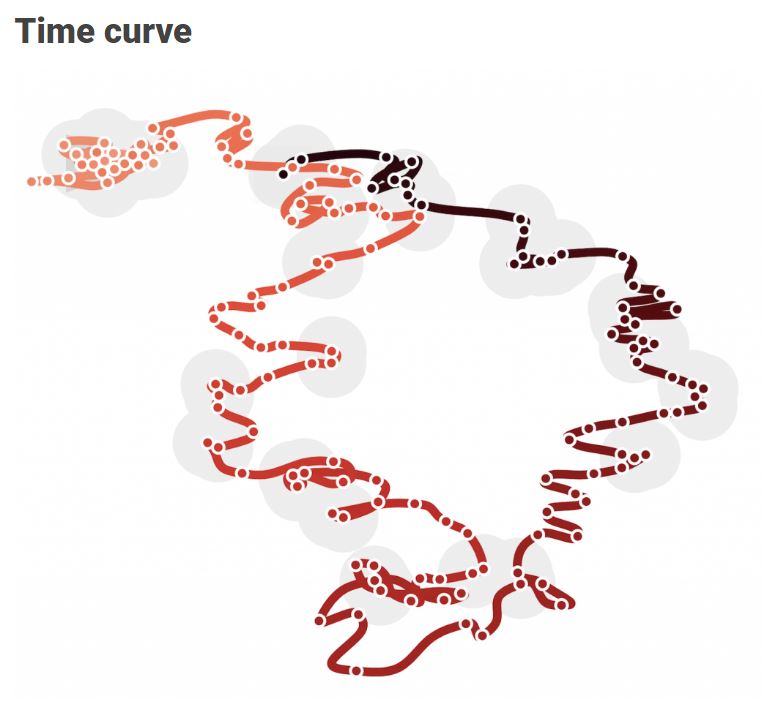
For instance, have you ever before heard of a time curve? These are very useful to visualize the development of a relationship over time.
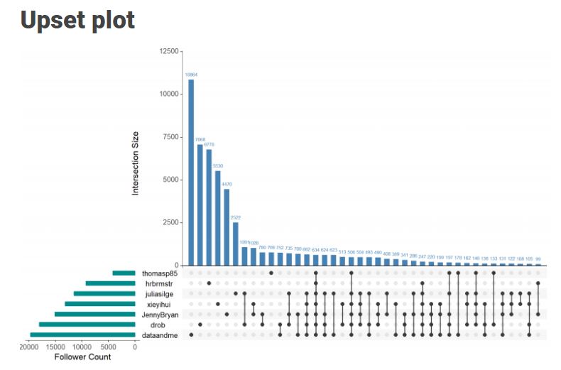
Time curves are based on the metaphor of folding a timeline visualization into itself so as to bring similar time points close to each other. This metaphor can be applied to any dataset where a similarity metric between temporal snapshots can be defined, thus it is largely datatype-agnostic. [https://xeno.graphics/time-curve]The upset plot is another example of an upcoming visualization. It can demonstrate the overlap or insection in a dataset. For instance, in the social network of #rstats twitter heroes, as the below example from the Xenographics website does.
Understanding relationships between sets is an important analysis task. The major challenge in this context is the combinatorial explosion of the number of set intersections if the number of sets exceeds a trivial threshold. To address this, we introduce UpSet, a novel visualization technique for the quantitative analysis of sets, their intersections, and aggregates of intersections. [https://xeno.graphics/upset-plot/]The below necklace map is new to me too. What it does precisely is unclear to me as well.
In a necklace map, the regions of the underlying two-dimensional map are projected onto intervals on a one-dimensional curve (the necklace) that surrounds the map regions. Symbols are scaled such that their area corresponds to the data of their region and placed without overlap inside the corresponding interval on the necklace. [https://xeno.graphics/necklace-map/]There are hundreds of other interestingcharts, maps, figures, and plots, so do have a look yourself. Moreover, the xenographics collection is still growing. If you know of one that isn’t here already, please submit it. You can also expect some posts about certain topics around xenographics.