There are many tools to connect virtually with your coworkers. Think of Teams, Zoom, Google Meet, or Slack. And during the recent pandemic, we have seen their usage surge. Yet, most of these tools try to recreating the office experience using video conference calls.
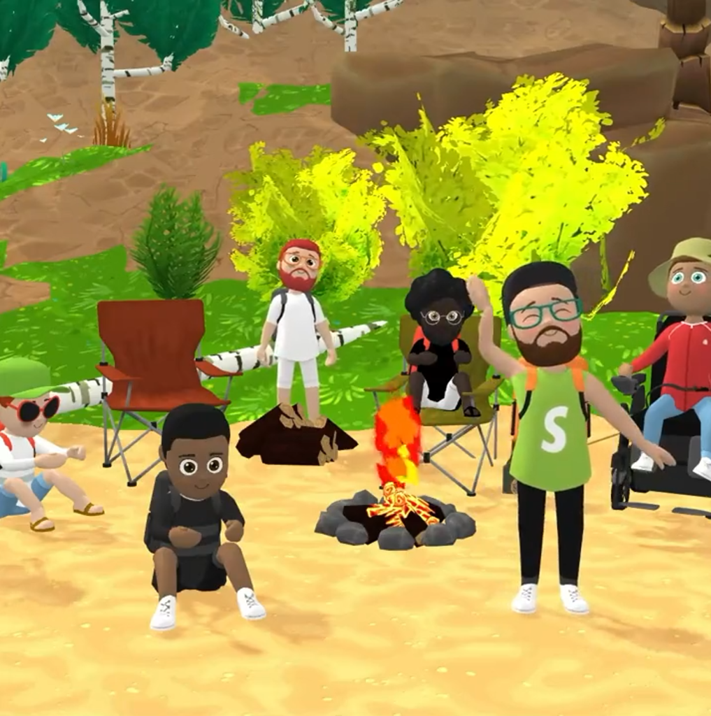
At Shopify, Daniel Beauchamp and his team took a different approach. They created SHOPIFY PARTY: a fullblown virtual world designed for social play and hanging out.
We built an internal game at Shopify to make virtual hangouts more fun. It’s called Shopify Party, and I’d love to tell you all about it 👇🏻 [1/6] pic.twitter.com/DwzxwWty3V
Here, Shopify employees can now play games during their 1:1s, standups, and other team events. They can hold boat races, log jumps, dance contests, exploration hikes, or just chill with their coworkers by a virtual campfire.
This must provide an incredible boost for the employee experience, well-being, and for forming workplace relationships in general!
The virtual environment is created in Unity and runs right in the webbrowser through use of WebGL.
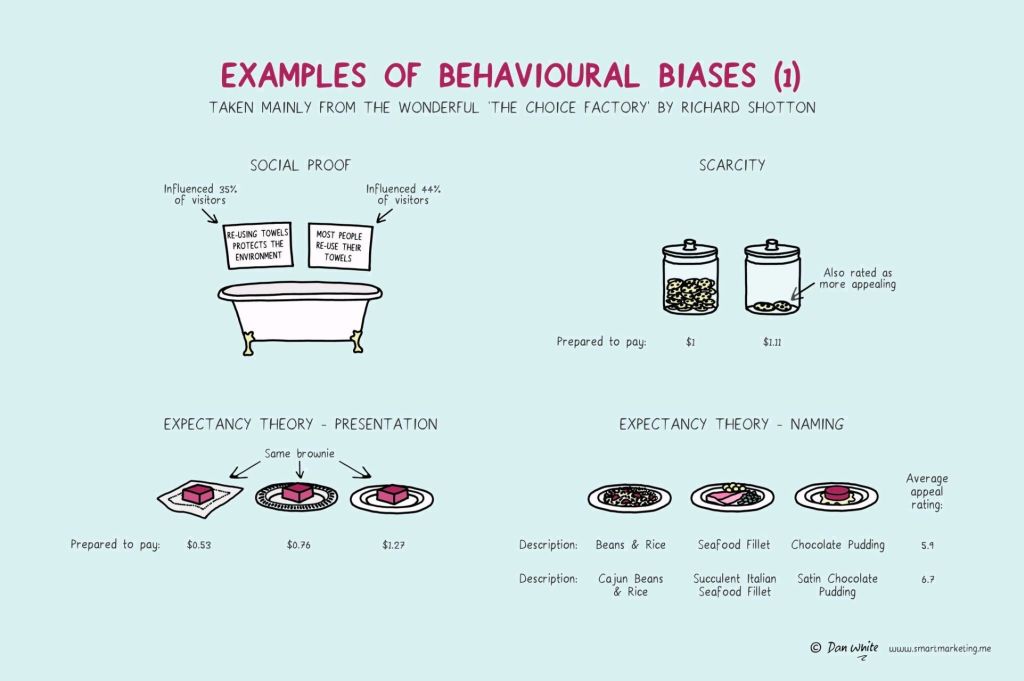
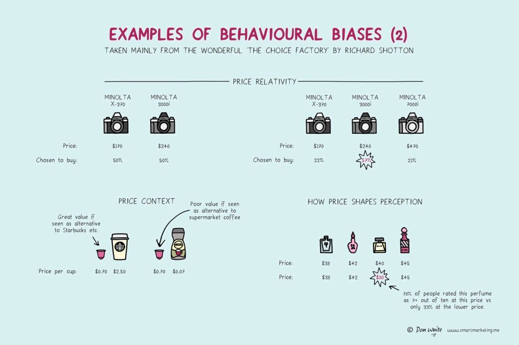
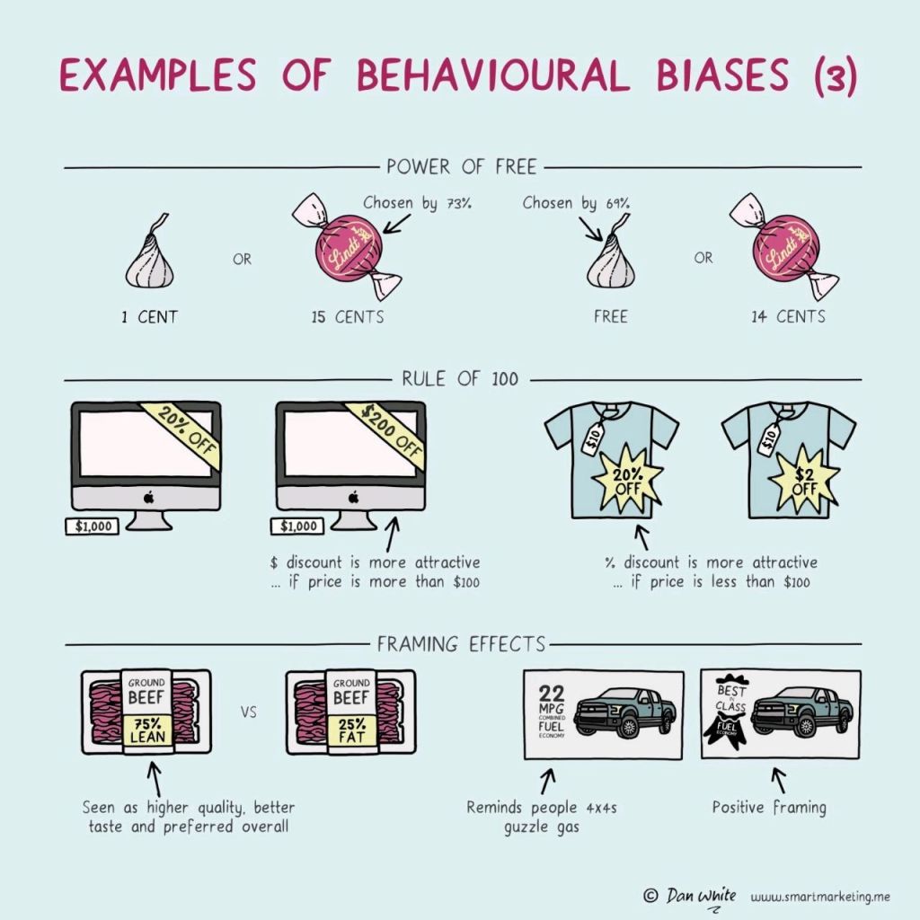
I just love psychological experiments around our human biases.
In this case, Dan White visualized some of the psychological biases mentioned in Richard Shotton‘s book “The Choice Factory“.
These biases make for irrational human behavior in the way we make daily decisions.
For example, you will be prepared to pay more for a cookie, when there are less of them in the jar. The generic principle here is that we assign higher valuations to objects under conditions of scarcity.
Once you are aware of such psychological biases, you will start to notice how they are (mis)used nearly everywhere these days. Particularly in sales and marketing. In restaurants, shops, online, and in virtually any case where we act as a consumer, we are subconciously influenced to make certain purchasing decision.
Nudging, is what they call these attempts to manipulate your behavior.
Maybe not so ethical, but still these infographics look amazing and these biases are good to be aware of!
Disclaimer: This page contains one or more links to Amazon. Any purchases made through those links provide us with a small commission that helps to host this blog.
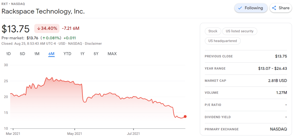
Obviously, this is less than ideal for me, but also, I should not be surprised.
Clearly, I knew nothing about the company I bought shares in. Apparently they are going through some big time reorganization, and this is not good price-wise.
According to Investopedia: A quarterly report is a summary or collection of unaudited financial statements, such as balance sheets, income statements, and cash flow statements, issued by companies every quarter (three months). In addition to reporting quarterly figures, these statements may also provide year-to-date and comparative (e.g., last year’s quarter to this year’s quarter) results. Publicly-traded companies must file their reports with the Securities Exchange Committee (SEC).
Fortunately these quarterly reports are readily available on the investors relation page, and they are not that hard to read once you have seen a few.
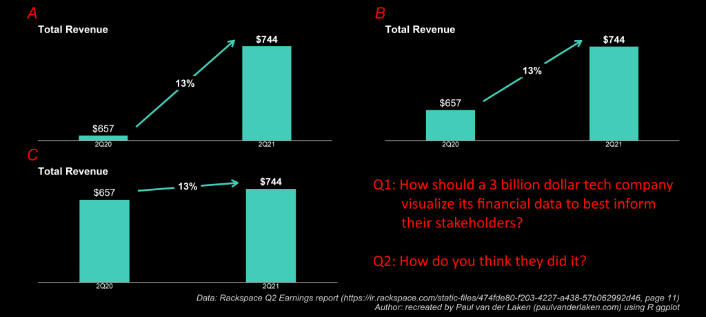
Visualizing financial data
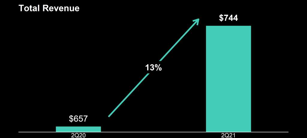
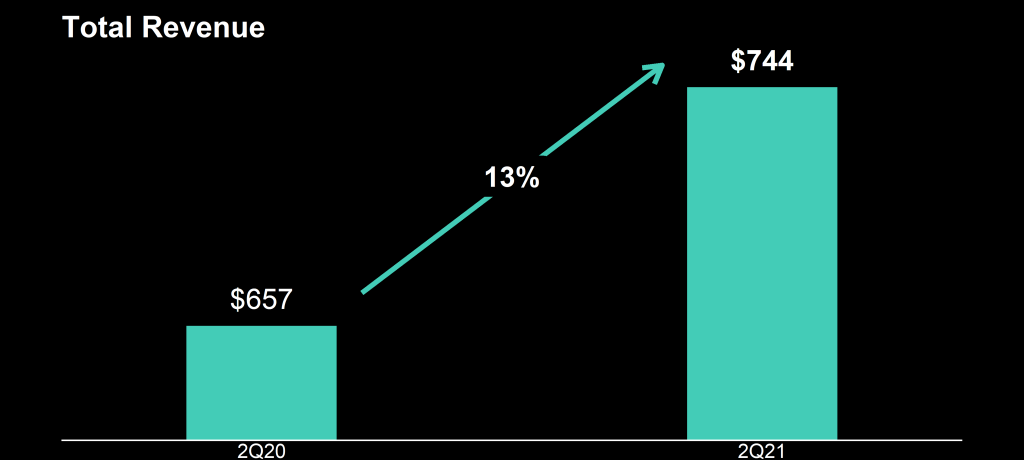
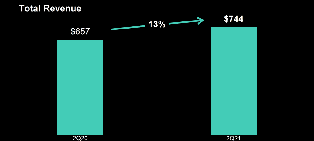
I was excited to see that Rackspace offered their financial performance in bite-sized bits to me as a laymen, through their usage of nice visualizations of the financial data.
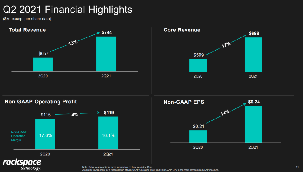
Please take a moment to process the below copy of page 11 of their 2021 Q2 report:
Though… the longer I looked at these charts… the more my head started to hurt…
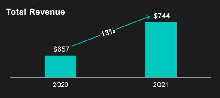
How can the growth line be about the same in the three charts Total Revenue (top-left), Core Revenue (top-right), and Non-GAAP EPS (bottom-right)? They represent different increments: 13%, 17%, and 14% respectively.
Zooming in on the top left: how does the $657 revenue of 2Q20 fit inside the $744 revenue of 2Q21 almost three times?!
OpenCV is open-source library with tools and functionalities that support computer vision. It allows your computer to use complex mathematics to detect lines, shapes, colors, text and what not.
OpenCV was originally developed by Intel in 2000 and sometime later someone had the bright idea to build a Python module on top of it.
Using a simple…
pip install opencv-python
…you can now use OpenCV in Python to build advanced computer vision programs.
And this is exactly what many professional and hobby programmers are doing. Specifically, to get their computer to play (and win) mobile app games.
ZigZag
In ZigZag, you are a ball speeding down a narrow pathway and your only mission is to avoid falling off.
Using OpenCV, you can get your computer to detect objects, shapes, and lines.
This guy set up an emulator on his computer, so the computer can pretend to be a mobile device. Then he build a program using Python’s OpenCV module to get a top score
You can find the associated code here, but note that will need to set up an emulator yourself before being able to run this code.
Kick Ya Chop
In Kick Ya Chop, you need to stomp away parts of a tree as fast as you can, without hitting any of the branches.
This guy uses OpenCV to perform image pattern matching to allow his computer to identify and avoid the trees braches. Find the code here.
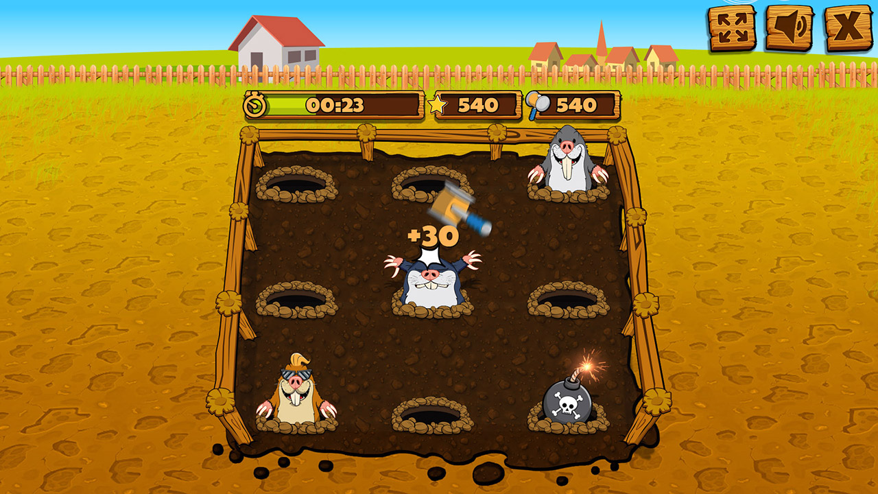
Whack ‘Em All
We all know how to play Whack a Mole, and now this computer knows how to too. Code here.
Pong
This last game also doesn’t need an introduction, and you can find the code here.
Is this machine learning or AI?
If you’d ask me, the videos above provide nice examples of advanced automation. But there’s no real machine learning or AI involved.
Yes, sure, the OpenCV package uses pre-trained neural networks under the hood, and you can definitely call those machine learning. But the programmers who now use the opencv library just leverage the knowledge stored in those network to create very basal decision rules.
IF pixel pattern of mole
THEN whack!
ELSE no whack.
To me, it’s only machine learning when there’s really some learning going on. A feedback loop with performance improvement. And you may call it AI, IMO, when the feedback loop is more or less autonomous.
Fortunately, programmers have also been taking a machine learning/AI approach to beating games. Specifically using reinforcement learning. Think of famous applications like AlphaGo and AlphaStar. But there are also hobby programmers who use similar techniques. For example, to get their computer to obtain highscores on Trackmania.
In a later post, I’ll dive into those in more detail.
Good teachers are rare, so when you find one, cherish him or her.
Anders Brownworth is an exemplar teacher. I found this tutorial by his hand on what constitutes a blockchain, and it is by far the best explanation of the concept(s) I have seen this far.
Anders breaks down the material for total newbies, explaining one concept at a time. You are taken from a hash, to a block, to a blockchain, to distribution, tokens, and a coinbase.
Great work Anders, and too good of a resource not to share!
Now, hold on to your hat, as you can access this blockchain application yourself and play around with the concepts like Anders does in the video.