Tag: database

History of the Modern Python Dictionary – by Raymond Hettinger

History of the Modern Python Dictionary – by Raymond Hettinger

Raymond Hettinger is one of the core Python developers whose talks I’ve featured on my blog before. And rightfully so, as Raymond’s presentations are unarguably entertaining and deeply insightful from an technical perspective.

In this recorded talk at the 2016 Annual Holiday Party for Python Devs in San Fransisco Bay Area, Raymond walks us through the history and development of dictionaries and hash tables uses example code in Python.

Python’s dictionaries are stunningly good. Over the years, many great ideas have combined together to produce the modern implementation in Python 3.6. This fun talk is given by Raymond Hettinger, the Python core developer responsible for the set implementation and who designed the compact-and-ordered dict implemented in CPython for Python 3.6 and in PyPy for Python 2.7. He will use pictures and little bits of pure python code to explain all of the key ideas and how they evolved over time. He will also include newer features such as key-sharing, compaction, and versioning. This talk is important because it is the only public discussion of the state of the art as of Python 3.6. Even experienced Python users are unlikely to know the most recent innovations.

This talk is for all Python programmers. It is designed to be fully understandable for a beginner (it starts from first principles) but to have new information even for Python experts (how key-sharing works, how the compact-ordered patch works, how dict versioning works). At the end of this talk, you can confidently say that you know how modern Python dictionaries work and what it means for your code.

https://www.youtube.com/watch?v=p33CVV29OG8
Google Fonts: 915 free font families

Google Fonts: 915 free font families

Looking for a custom typeface to use in your data visualizations? Google Fonts is an awesome databank of nearly a thousands font families you can access, download, and use for free.

If you’re into design, the website includes a blog featuring articles on font design.

Google Fonts among others provided the font for my dissertation cover so I definitely recommend it.

Learn from the Pros: How media companies visualize data

Learn from the Pros: How media companies visualize data

Past months, multiple companies shared their approaches to data visualization and their lessons learned.

Click the companies in the list below to jump to their respective section


Financial Times

The Financial Times (FT) released a searchable database of the many data visualizations they produced over the years. Some lovely examples include:

Graphic showing what May needs to happen to get her deal over the line when MPs vote on Friday
Data visualization belonging to a recent Brexit piece by the FT, viahttps://www.ft.com/graphics
Dutch housing graphic
Searching the FT database for European House Prices via https://www.ft.com/graphics returns this map of the Netherlands.

BBC

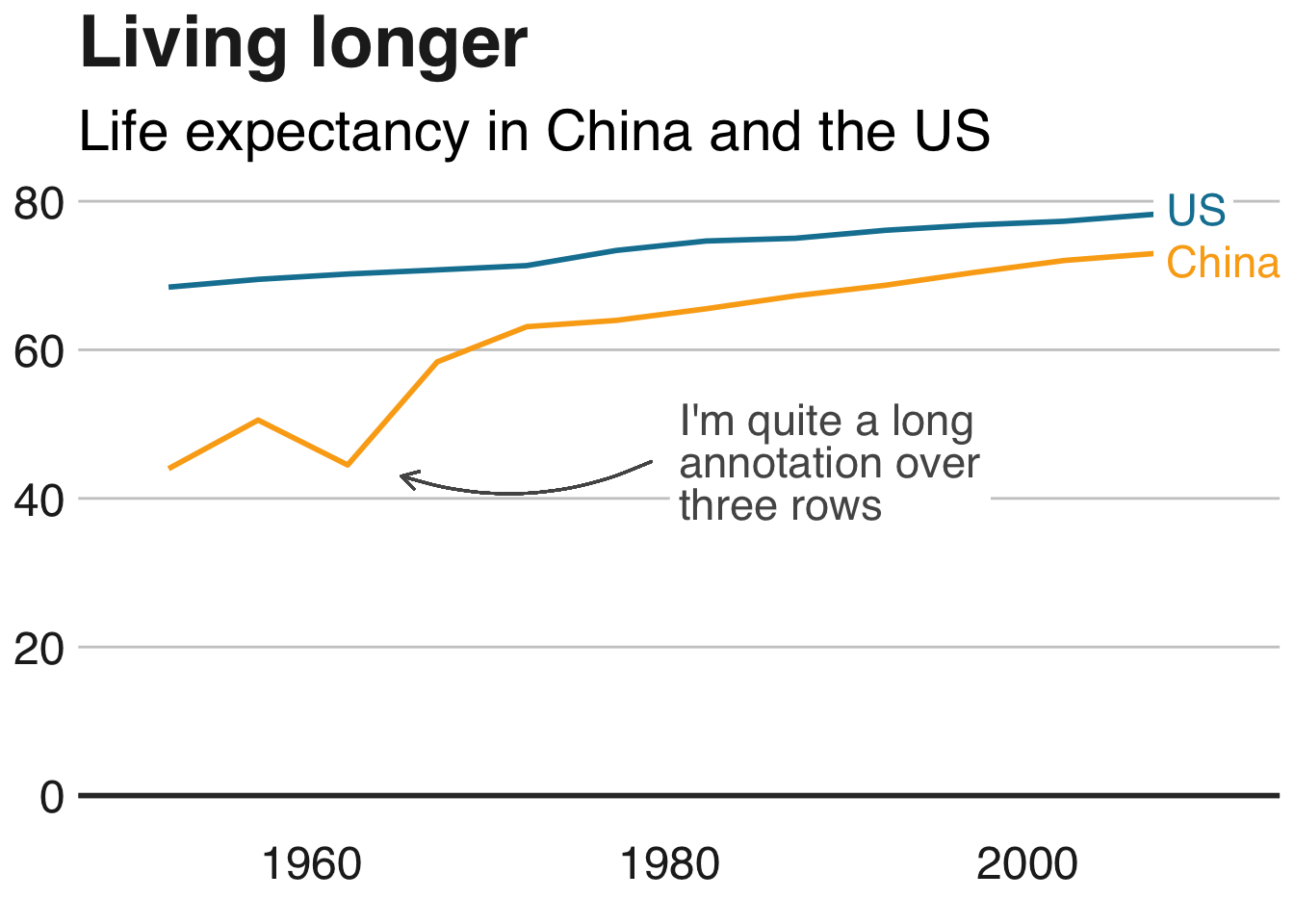
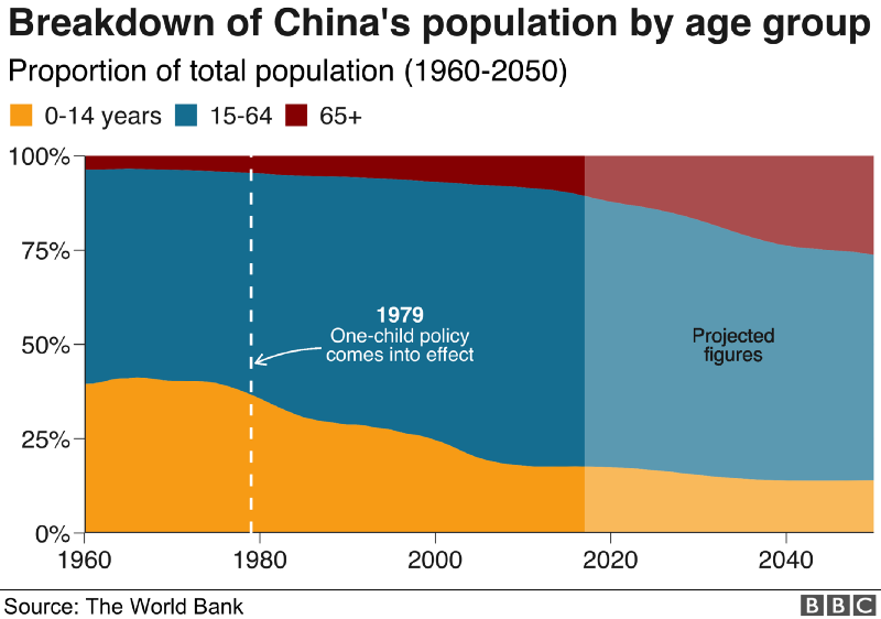
The BBC released a free cookbook for data visualization using R programming. Here is the associated Medium post announcing the book.

The BBC data team developed an R package (bbplot) which makes the process of creating publication-ready graphics in their in-house style using R’s ggplot2 library a more reproducible process, as well as making it easier for people new to R to create graphics.

Apart from sharing several best practices related to data visualization, they walk you through the steps and R code to create graphs such as the below:

One of the graphs the BBC cookbook will help you create, via https://bbc.github.io/rcookbook/

Economist

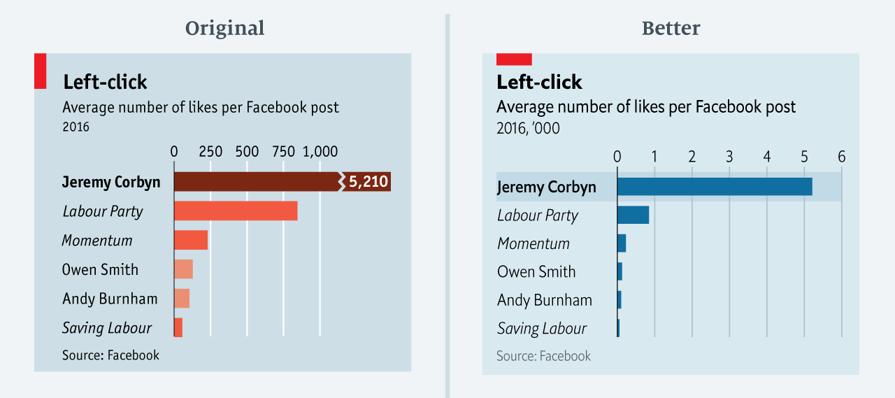
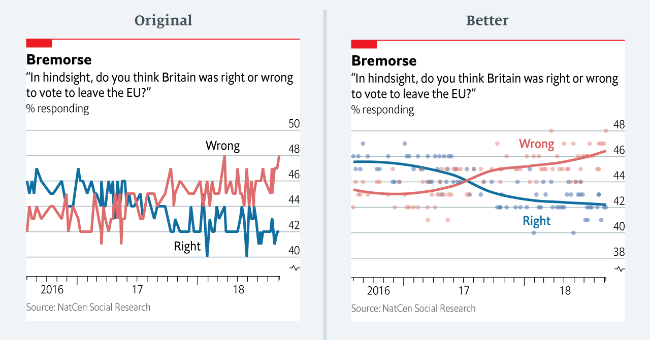
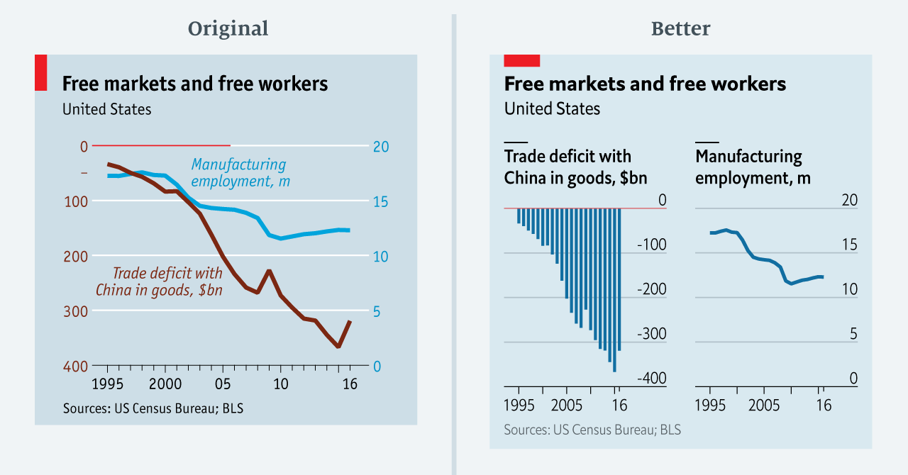
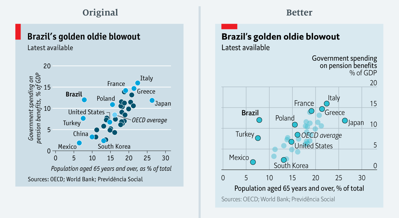
The data team at the Economist also felt a need to share their lessons learned via Medium. They show some of their most misleading, confusing, and failing graphics of the past years, and share the following mistakes and their remedies:

  • Truncating the scale (image #1 below)
  • Forcing a relationship by cherry-picking scales
  • Choosing the wrong visualisation method (image #2 below)
  • Taking the “mind-stretch” a little too far (image #3 below)
  • Confusing use of colour (image #4 below)
  • Including too much detail
  • Lots of data, not enough space

Moreover, they share the data behind these failing and repaired data visualizations:

Via https://medium.economist.com/mistakes-weve-drawn-a-few-8cdd8a42d368

FiveThirtyEight

I could not resist including this (older) overview of the 52 best charts FiveThirtyEight claimed they made.

All 538’s data visualizations are just stunningly beautiful and often very
ingenious, using new chart formats to display complex patterns. Moreover, the range of topics they cover is huge. Anything ranging from their traditional background — politics — to great cover stories on sumo wrestling and pricy wine.

Viahttps://fivethirtyeight.com/features/the-52-best-and-weirdest-charts-we-made-in-2016/
Via https://fivethirtyeight.com/features/the-52-best-and-weirdest-charts-we-made-in-2016/ You should definitely check out the original cover story via https://projects.fivethirtyeight.com/sumo/
Via https://fivethirtyeight.com/features/the-52-best-and-weirdest-charts-we-made-in-2016/

Papers with Code: State-of-the-Art

Papers with Code: State-of-the-Art

OK, this is a really great find!

The website PapersWithCode.com lists all scientific publications of which the codes are open-sourced on GitHub. Moreover, you can sort these papers by the stars they accumulated on Github over the past days.

The authors, @rbstojnic and @rosstaylor90, just made this in their spare time. Thank you, sirs!

Papers with Code allows you to quickly browse state-of-the-art research on GANs and the code behind them, for instance. Alternatively, you can browse for research and code on sentiment analysis or LSTMs